Philly Fed Continues to Rebound
Following up on yesterday’s New York Fed reading on the manufacturing sector, this morning we got the manufacturing numbers from the neighboring Philadelphia Federal Reserve bank region. Similar to the Empire Fed’s reading for six months out, the Philly Fed’s index for General Business Conditions pulled back a bit in July falling to 24.1 from 27.5 in June. In absolute terms, that was the least volatile one month swing in the index since November of last year. Additionally, although it indicates a slower rate of improvement in July than June, it still indicates that the region’s manufacturing sector expanded for a second consecutive month after three months of contractionary activity.
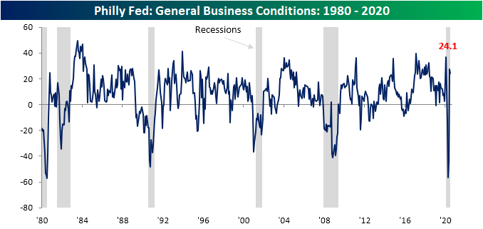
Although the headline number fell in July, the internals paint a much more positive picture. Almost every category is now showing an expansionary reading with the exception of Inventories and Delivery Times, though both of those in contraction is not necessarily negative. Granted negative readings of these two, as well as a sizeable drop in Shipments, did contribute to the weakness in the July headline number.
This month’s release indicated solid overall demand with New Orders surging to 23 from 16.7 last month. Unfilled Orders also rose; moving back into expansion territory after four months of contraction. Meanwhile, Shipments were down 10 points to 15.3, but that is still a firmly expansionary reading.

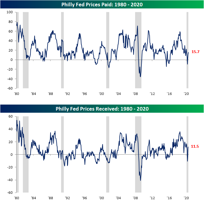
In addition to the strong levels of those indices, respondents reaffirmed the strength in demand by reporting higher prices for the second month in a row in terms of both prices received and paid.
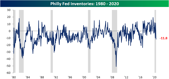
As previously mentioned, both Delivery Times and Inventories showed contractionary readings this month, but that again is not necessarily a bad thing. The Philly Fed’s index on delivery times has fluctuated between positive and negative readings in recent months while other Federal Reserve regions have seen their equivalent readings surge to extremely elevated readings (albeit lower more recently) pointing to supply chain disruptions and longer lead times. The tip into negative territory for the Philly Fed’s index of Delivery Times indicates shorter delivery times and potentially some further normalization in supply chains. Additionally, the index for Inventories fell to its lowest level since September of 2016. That indicates large inventory drawdowns which reasonably can be evaluated as a result of a pick up in demand given the increase in other areas of the survey.

As with yesterday’s Empire Fed report, one of the major highlights of this month’s Philly Fed report was the massive increase in readings on employment. The index for Number of Employees and Average Workweek were the categories to see the biggest increases in this month’s survey returning to positive territory. For these two respective indices, this month’s gains were also some of the largest of all reports since the beginning of the survey. In fact, for both indices, there have only been two months with higher monthly increases. For both indices, one of those months was this past May’s report. As for the other month, the other larger monthly gain for the index for Number of Employees was May of 1975 and for Average Workweek it was June of 1970. These huge jumps also bring both indices into the upper 90th percentiles of all readings. In other words, Philly area manufacturers seem to have not only brought people back to work but also are returning to longer workweeks. Click here to view Bespoke’s premium membership options for our best research available.

Muddled Jobless Claims
The Department of Labor released weekly jobless claims this morning and the results were mixed. For initial claims, they remain stubbornly above 1 million at 1.3 million. That was above expectations of 1.25 million but was still another decrease week over week, making it a record fifteenth streak week with lower jobless claims on a seasonally adjusted basis. This week was also yet another example of how even though claims are improving, the pace of improvement has slowed dramatically. In fact, claims only fell 10K this week. That is the smallest decline of these past 15 weeks.
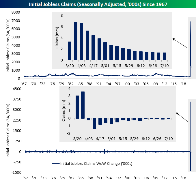
Although the seasonally adjusted number showed a small improvement, actual reported claims on a non-seasonally adjusted basis actually rose from 1.395 million to 1.503 million. That was the highest reading since the first week of June. Additionally, that increase was the first time that jobless claims (NSA) rose since the last week of March, snapping a record streak of 13 consecutive weeks with lower claims.

Given continuing claims are lagged an additional week, they would not reflect that uptick as that reading continued to fall. Seasonally adjusted continuing jobless claims now total 17.34 million which is the lowest since the second week of April.

Looking at claims on a state by state basis, the main drivers of higher NSA claims this week have been some of the states with the largest increases in COVID cases like California, Georgia, and Florida. In the case of Florida, it saw a massive increase in first time jobless filings, nearly doubling from 66,941 last week to 129,408 this week. Meanwhile, Texas is bucking that trend with one of the largest improvements in claims despite higher case counts. As for continuing claims in the week ending July 4th, Florida, California, Georgia, Pennsylvania, and Texas, have all seen the largest increases in continuing claims. New York, North Carolina, and Texas on the other hand have seen the biggest declines. Click here to view Bespoke’s premium membership options for our best research available.

First Expansionary Empire Fed Since February
The New York Federal Reserve released its July reading on the manufacturing sector this morning and for the first time since February, the headline index indicated that activity rose month-over-month in the region. Not only was it the first expansionary reading (those above 0), but at +17.2, it was also the highest level of the index since November 2018 when it stood at +21.1. This month also marked a third consecutive monthly increase.
Although the index for present conditions is showing some of the strongest levels of the past couple of years with another uptick in July, optimism for the next six months pulled back. The index for general business conditions six months in the future fell to 38.4 from a multi-year high of 56.5 in June. That 18.1 point decline was the largest since March’s 21.7 point decline and the ninth-largest decline of all months.
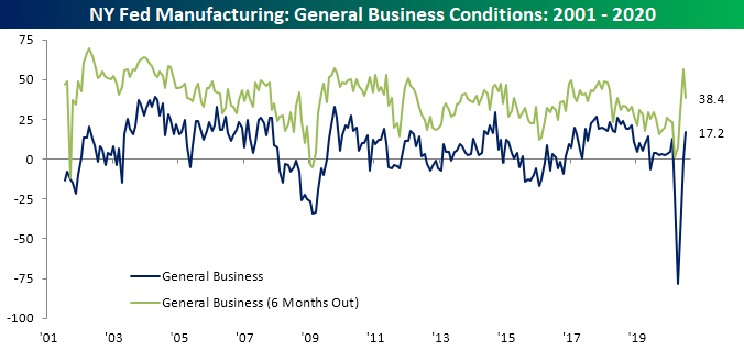
While the pickup in activity was not as large as last month, for multiple individual categories the gains were still in the 90th percentile or better of all periods. Conversely, the declines in the indices for expectations for General Business Conditions, New Orders, and Shipments were all in the bottom decile of all readings. This month’s report also marked a turn for a few components as they changed from contractionary to expansionary. This was the case for the indices for General Business Conditions, New Orders, and Number of Employees. Now more than half are expansionary.

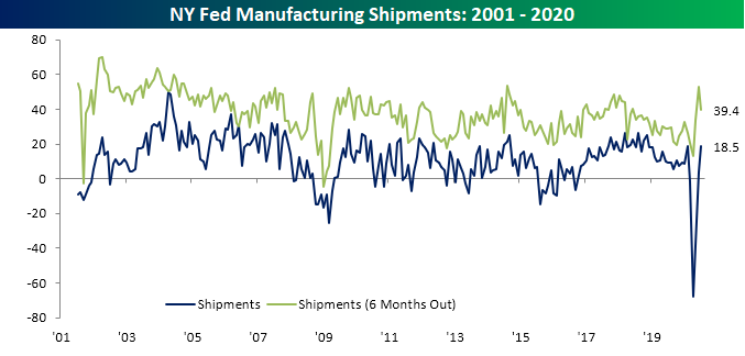
The two indices that rose the most this month were those for New Orders and Shipments. For the index for New Orders, it was the first non-contractionary reading since February, and for Shipments, it marked back to back readings above 0.

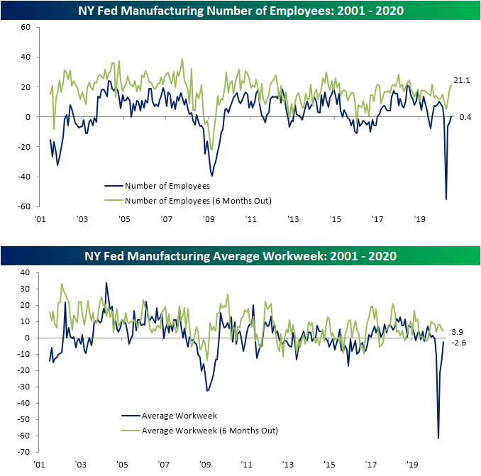
One major positive of this month’s report was the reading on employment. After four straight months of a greater share of manufacturers reporting decreases in employment, July marked an equal share of companies reporting an increase in employment as a decrease (21.9%). Additionally, the reading for future expectations rose to its highest level since August of last year indicating companies are at least expecting to increase hiring in the near future. Although employment was stabilized, average workweek did continue to fall, albeit, not by as much as previous months. Start a two-week free trial to Bespoke Institutional to access our interactive economic indicators monitor and much more.
The Most Volatile Stocks on Earnings
Bespoke’s Earnings Explorer tool is all an investor needs to navigate what is usually a messy period each quarter — earnings season. The Earnings Explorer tool provides a full calendar of upcoming reports along with detailed historical earnings information for individual stocks that ties the data up into a nice bow that you can use to make informed decisions. You can use the tool to search for historical reports and summary data for individual stocks, or use our screening page to find stocks that typically beat or miss estimates, raise or lower guidance, or trade higher or lower in reaction to earnings. It’s also a great way to track macro earnings trends to see how strong or weak reports have been coming in lately as well as how strong or weak share price reactions to earnings have been. We urge you to try out our Earnings Explorer if you have never used it. You can do so with a two-week free trial to Bespoke Institutional.
Below is a chart included on our Earnings Explorer page that shows the number of earnings reports by day over the upcoming month. As shown, the next three weeks will consistently see dozens of reports per day.

At the start of each earnings season, we provide a few lists of important stocks set to report in the coming weeks. Below is a list of the 35 largest stocks set to report over the next month. For each stock, we include its current consensus analyst EPS and sales estimate along with its historical EPS beat rate and its average one-day share price change on its earnings reaction day (on an absolute basis). This lets you see how volatile a stock typically is in reaction to its earnings report.
Of the 35 largest stocks set to report, Apple (AAPL), Facebook (FB), Johnson & Johnson (JNJ), Mastercard (MA), Cisco (CSCO), and AbbVie (ABBV) have topped analyst EPS estimates the most often at 89% of the time or more. In terms of share price volatility, stocks like Netflix (NFLX), Tesla (TSLA), and Amazon (AMZN) typically experience a one-day move of more than 8% (in either direction) on their earnings reaction days. On the flip side, stocks like JNJ, Verizon (VZ), Exxon Mobil (XOM), and Chevron (CVX) typically see a one-day change of less than 2% on their earnings reaction days.
On an average basis, the 35 largest stocks set to report over the next month are much less volatile on their earnings reaction days than all stocks set to report. Whereas all stocks set to report over the next month have historically seen their share prices average a one-day move of +/-5.57%, the average one-day move of the 35 largest stocks in reaction to earnings is just +/-3.84%. In terms of beat rates, the largest stocks typically exceed EPS estimates at a much higher rate than average as well (75% vs. 61.5%).

Moving on, below is our list of the 35 stocks set to report over the next month that typically see the biggest moves in reaction to earnings. To make the list, the stock must have at least five years worth of quarterly earnings reports. Each of the stocks listed below typically moves at least 11% up or down on its earnings reaction day (the first trading day following its earnings report). The Container Store (TCS) is the most volatile stock on earnings with an average one-day change of +/-16.8% after it reports. TCS is scheduled to report after the close on Tuesday, July 28th.
The next most volatile stocks in reaction to earnings which all average one-day moves of more than 15% are Enphase Energy (ENPH), Groupon (GRPN), and Infinera (INFN). While GRPN and INFN are both down 20%+ YTD, ENPH is up 113.9% on the year, which means expectations for its upcoming report on 7/30 will be sky-high.
Other notables on the list of most volatile stocks in reaction to earnings include Wayfair (W), Yelp (YELP), LendingTree (TREE), Chegg (CHGG), Twitter (TWTR), Netflix (NFLX), Etsy (ETSY), and Grubhub (GRUB).
As shown in the table, Netflix (NFLX) is by far the largest stock on the list with a market cap of $230 billion. The next largest stock on the list — Twitter — has a market cap that’s just a tenth of NFLX. Even though it’s now an established blue-chip S&P 500 company, NFLX still typically sees huge moves when it reports its quarterly numbers. We’ll get to see how the stock reacts to its Q2 2020 report soon as NFLX is set to report Thursday after the close. Earnings definitely do not usually give shareholders a chance to “Netflix and chill.” We urge you to try out our Earnings Explorer tool today! It’s a must-have during earnings season. One of the benefits of the tool is it allows you to create a custom earnings release calendar for just the stocks that you follow most closely. You’ll never be blindsided by an earnings report again. Simply start a two-week free trial to Bespoke Institutional to gain access to our Earnings Explorer tool now.

STOXX 50 Breaking Out
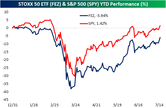
While there has been a great focus on the run-up of the largest American equities, the biggest European stocks have also been on the rise in recent weeks. The STOXX 50 (FEZ) is made up of some of the largest companies by market capitalization in the broader Euro STOXX index. In May and the first week of June, FEZ ripped higher before stalling out around 8.5% away from the January 1st 52-week high at $37.24. After sitting below that June high for the rest of June and first half of July, FEZ is finally looking to make a new high today. It is trading up over 2% pre-market which would send it over 1.5% above that June 8th high.
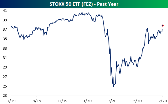
The STOXX 50 is also breaking out in terms of relative strength versus the US—S&P 500 (SPY)—based on where FEZ and SPY are trading pre-market. For most of the past year, FEZ has underperformed SPY as shown in the relative strength chart below. That reversed sharply in May but the dynamic hit the pause button in June as the line trended sideways. With FEZ up over 3% this morning and SPY up 1.35% pre-market, the relative strength line is looking to finally make a new high.
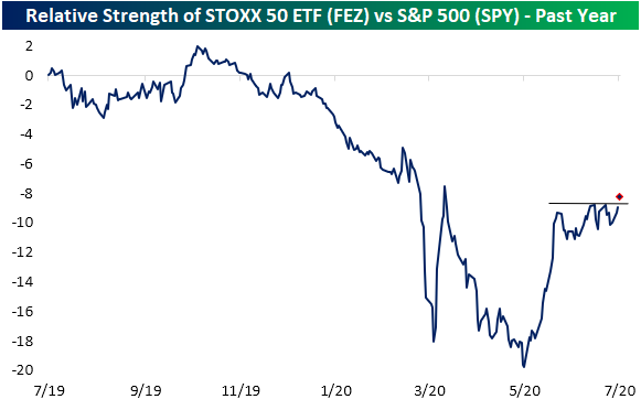
While FEZ has been outperforming a bit recently, on a year to date basis the US remains the better performer of the two. In the first quarter SPY never fell as much as FEZ and the subsequent rally currently leaves SPY up on the year while FEZ is down just under 6%. The only day that FEZ had better performance YTD than SPY was on January 2nd. Click here to view Bespoke’s premium membership options for our best research available.
Bespoke CNBC Appearance (7/15/20)
Bespoke’s Paul Hickey appeared on CNBC’s Worldwide Exchange this morning to discuss the latest news driving markets higher. To view the segment, please click on the image below. Like what you see? Click here to view Bespoke’s premium membership options for our best research available.
Tax Day Cometh. Wait. What Month is This?
It may be July but due to the government shutdowns this Spring, the Federal deadline for filing taxes was delayed by three months. With that in mind, the table below summarizes the performance of the S&P 500 in the weeks leading up to and after the Federal tax deadline over the last twenty years. Obviously, the major caveat is that the performance numbers shown from prior years are for the month of April, while this year is the only time the deadline has been in July.
Historically speaking, the S&P 500’s performance in the weeks leading up to the Federal tax deadline have been positive but hardly anything worth writing home about. In the two weeks leading up to the tax deadline, the S&P 500 averaged a gain of 0.05% but with gains less than half of the time (9 out of 20). In the week leading up to the tax deadline, the results were nearly identical at +0.06% with gains exactly half of the time. With the backdrop of those historical results, the S&P 500’s performance leading up to tax day this year has been better than average with a gain of 1.87% over the last two weeks and 0.14% over the last week.
While returns leading up to the tax deadline haven’t been anything special, returns one and two weeks after the tax deadline have been much stronger than average. One week after the Federal tax deadline, the S&P 500 has averaged a gain of 0.87%, and two weeks later the average gain has been 1.50%. The market has also been pretty consistent to the upside in the days after tax day as the S&P 500 has been up three-quarters of the time. Americans were reportedly quick to put their stimulus checks into the market back in the Spring, so will they double-down with their refund checks? Like what you see? Click here to view Bespoke’s premium membership options for our best research available.

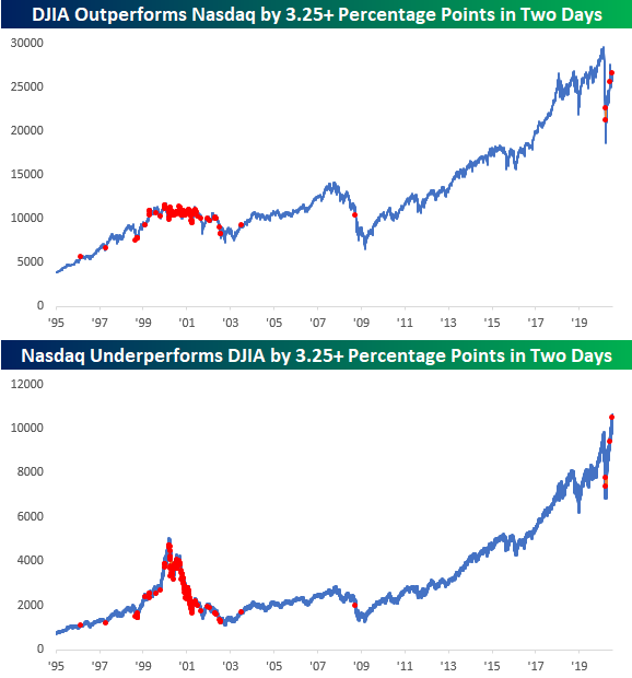
A Dow in Nasdaq’s Clothing
The last two trading days have certainly been out of the ordinary in terms of relative performance between the Nasdaq and the Dow. Since Friday’s close, the Nasdaq is down 1.2% while the Dow is up 2.2%. That performance spread of 3.4 percentage points in the last two trading days is the widest gap between the two indices (in the Dow’s favor) since May and then in March. While there have been two prior occurrences in the last three and a half months, if you take a longer view, this type of short-term outperformance by the Dow has been uncommon. Before the occurrences in March and May, you have to go all the way back to September 2008 to find the last occurrence and then before that July 2003.
Before 2002 and going back to the late 1990s, there were a number of occurrences on both the way up and even more so on the way down. Given the market’s performance following the last time we saw a high frequency of periods with similar performance gaps, let’s hope the performance disparity of the last two days doesn’t become a trend. Like what you see? Click here to view Bespoke’s premium membership options for our best research available.
Big Winners Driving The Market In 2020
So far this year, the US equity market has been a story of big winners…and then the other 99% of the market.
Seven S&P 500 stocks stand out in terms of contribution, with the “Big Five” tech or tech adjacent names (AAPL, AMZN, FB, GOOG, MSFT) and two others that get a bit less discussion (NFLX, NVDA) each accounting for at least a +0.3 percentage point impact on the overall index performance this year. On average, these top seven are up 45% YTD, versus an 11% decline for the rest of the index. That’s why the equal-weighted S&P 500 is underperforming so badly: the majority of stocks are way, way behind a furious rally in some of the biggest names.
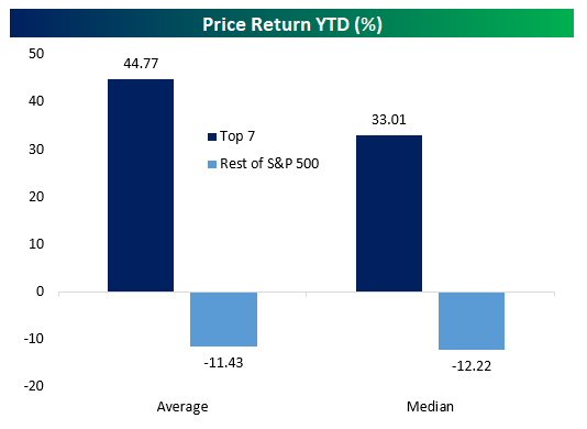
Currently, the top seven stocks by contribution have added 6.7% to the index in 2020, which itself is still down a bit over 1% on the year. That means that the rest of the stocks in the index have cost the S&P 500 over 8% in 2020. We went into further detail on contribution to total earnings as well as YTD gains in last night’s Closer report, which is available to Bespoke Institutional members. Click here to start a two-week free trial.

US Citi Surprise Index Continues to Surge
Just about a month ago, we noted how the Citi Economic Surprise Index for the United States reached a new record high as economic data broadly rebounded. In the time since then, the US surprise index has left that record in the dust. Since the first new record high on June 15th, the US index has not just continued to rise but has more than doubled with 19 of the past 22 days marking a fresh record high!
Likely helped by the US strength at least in part, the index for the entire globe has also entirely recovered. The global index is at its highest level since March of 2017 and in the 98th percentile of all readings since the start of the index in 2003. Meanwhile, that strength has not been echoed in the indices for the Eurozone and Emerging Markets. The Eurozone index fell sharply in the first half of the year. Although it has staged a rapid recovery since mid-June, it is still negative meaning reports are generally missing forecasts. Although it never fell as sharply as other areas of the globe, the index for emerging markets likewise remains in negative territory and in the bottom 13% of all readings. Click here to view Bespoke’s premium membership options for our best research available.
