Big Blue Beats
Yesterday after the close, IBM reported second-quarter results. Big Blue beat on both the top and bottom line with EPS coming in at $2.18 compared to estimates of $2.09 and revenues were $401.9 million above estimates. Although IBM beat on both the top and bottom line this quarter, EPS and sales have been grinding lower over the past several years as shown in the charts from our Earnings Explorer below. In fact, this quarter still marked EPS down 31% YoY and sales down over 5% YoY.


When it comes to stock price reaction, that beat comes during what has historically been the strongest quarter for IBM. Q2 earnings days have averaged the largest gains of any quarter in terms of the gap up, open to close change, and full-day change. Not only does Q2 experience the largest gains but it is also the quarter that IBM trades higher the most frequently. IBM has traded higher on Q2 earning days 72% of the time. Conversely, IBM has only seen shares trade higher on its Q1 report in April just 21% of the time.

Turning to today, the stock was trading up as much as 6.85% post-market shortly after earnings came out but has reversed some of those gains overnight and is now looking to gap up by 4.75%. That would make for the seventh-largest gap up on earnings for IBM since at least 2001. None of those other largest gaps up happened on a Q2 earnings report.
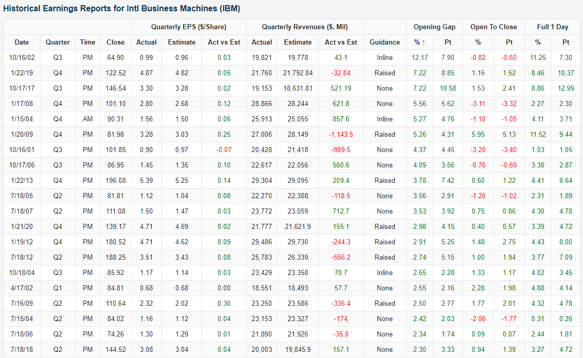
Looking through the history of IBM in our Earnings Explorer database, IBM has beaten both EPS and revenues 30 times. On average, the stock has gapped up 0.67% to be met with minor selling during the day to finish up 0.65%. Of those 30 times, the 6 occurrences in Q2 have seen even stronger returns which seems to be holding true today.

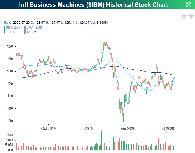
As for where today’s gap up will leave IBM, the stock has been trading in a range for the past few months. In early June, there was a breakout of that range which never held. After returning to the bottom end of said range, IBM has been rallying into earnings closing yesterday at the top of the range and just below its 200-DMA. The gap up on earnings is looking to bring the stock out of that range, above its 200-DMA for the first time since early June, and back up to levels just below its June 8th high. Click here to view Bespoke’s premium membership options for our best research available.
Recapping Monday’s Bad Breadth
By just about all accounts, Monday’s breadth was extremely weak for a day on which the S&P 500 rallied 0.84%. In terms of sector performance, just three sectors were up over 1%, while four declined more than 1%. If you account for rounding, the 0.96% decline for Consumer Staples would make it five!

The chart of sector performance doesn’t even tell the entire story. While Consumer Discretionary was up the most yesterday at +3.14%, when Amazon.com (AMZN) comprises more than a quarter of the entire sector, it’s 8% rally can mask a lot of underlying weakness. The chart below shows the percent of stocks in each sector that finished the day in positive territory. As shown, barely a third of Consumer Discretionary stocks were even up yesterday! Technology and Communication Services were the only other sectors that outperformed the S&P 500 yesterday, and while breadth was extremely positive in tech-land, in Communication Services things weren’t much better than they were in the Consumer Discretionary sector. Besides Technology, Health Care was the only other sector that managed to see more than half of its components finish the day in positive territory.
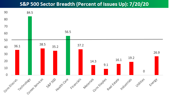
Looking at breadth among sectors can show a bit of a misleading picture as so much market cap is concentrated into just a few sectors, while four other sectors (Energy, Materials, Real Estate, and Utilities) all have weightings of 3% or less in the S&P 500. Broadening out the picture a bit more, the chart below breaks down Monday’s performance by Industry Groups. At this level, breadth was still weak on Monday but not as bad as the picture on the sector level suggests. While five industry groups finished the day up over 1%, there were still seven that finished the day down over 1%. Still a large number, but not quite as extreme as the sector numbers would suggest. Like what you see? Click here to view Bespoke’s premium membership options for our best research available.

Bespoke’s Morning Lineup – 7/21/20 – The Haves and the Have Nots
See what’s driving market performance around the world in today’s Morning Lineup. Bespoke’s Morning Lineup is the best way to start your trading day. Read it now by starting a two-week free trial to Bespoke Premium. CLICK HERE to learn more and start your free trial.
Risk assets around the globe are rallying again this morning on news that the European Council has reached an agreement to a budget and COVID recovery package. The key point of the agreement is that EU fiscal policy will be backed by mutual taxation and will be used as a fiscal stabilizer.
Be sure to check out today’s Morning Lineup for a rundown of the latest stock-specific news of note, global economic data, improved trends related to the COVID-19 outbreak, and much more.

By now you’ve heard about how uneven yesterday’s rally in the market was. While the S&P 500 was up nearly 1%, the majority of stocks in the index were actually down on the day. The chart of sector performance for the day sums things up pretty well. Consumer Discretionary (pretty much entirely the result of Amazon) was up over 3%, Technology tacked on over 2.5%, and Communication Services rallied over 1.25%. Every other sector, though, was down on the day. Not only were they down, but they were down sharply. In fact, four sectors were down over 1% even though the S&P 500 rallied 0.84%. Depending on the sectors you’re overweight in, yesterday was either really good or really bad.

Amazon (AMZN) Ships the S&P Higher
The S&P 500 finished up 0.84% on Monday and the index had mega-cap stocks to thank for its gains as the majority of stocks in the S&P 500 actually finished the day lower. In fact, Amazon (AMZN) was the best performing stock in the S&P 500 having its best day since 12/26/18 rallying just under 8%. That gain alone was responsible for nearly 40 basis points of the S&P’s 84 bps gain. That means Amazon accounted for just under half of the S&P 500’s gains today. That compares to the rest of the trillion-dollar club—Microsoft (MSFT), Apple (AAPL), and Alphabet (GOOG)—which added a collective 45.81 bps to the S&P 500. Again that is an impressive contribution when compared to the other 174 stocks that rose today, which collectively only added 53.13 bps. The remaining stocks dragged on the index by 54.45 bps. The stocks that dragged the index down the most included energy names like Exxon Mobil (XOM) and Chevron (CVX), Medtronic (MDT), Philip Morris (PM), and Coca Cola (KO). In other words, big days for the largest stocks helped to dramatically boost performance masking what was overall mediocre day for most stocks. Click here to view Bespoke’s premium membership options for our best research available.

This Week’s Economic Indicators – 7/20/20
Last week was a strong one for economic data with more than half of releases either beating estimates or improving from the prior period for those with no forecasts. The Treasury’s monthly budget statement was the only release on Monday, and it showed a massive increase to the deficit. Small business optimism tipped back above 100 the following day, also coming in above expectations of 97.8. CPI was the other major release on Tuesday. More inflation data followed up with import and export prices on Wednesday. Both showed further declines in June. The New York Fed’s Manufacturing reading for July exceeded estimates, rising to 17.2 while the neighboring Philly Fed showed a slight decline from 27.5 24.1. June’s Retail Sales report for June showed strong growth in sales across the board with both the headline and core measures beating estimates. Homebuilder sentiment was also strong in a later release that same morning, rising from 58 to 72. Some disappointing housing numbers rounded out the week with misses for both starts and permits.

This week, economic data will take a backseat with a lighter calendar as earnings take center stage. Although there was nothing released today, there are a dozen releases scattered throughout the rest of the week. Included in these releases will be more housing data in the form of new and existing home sales and FHFA home prices, claims, the Kansas City Fed’s activity index, and preliminary Markit PMIs. Click here to view Bespoke’s premium membership options for our best research available.

Bespoke’s Morning Lineup – 7/20/20 – Tech Gives Other Sectors a Chance
See what’s driving market performance around the world in today’s Morning Lineup. Bespoke’s Morning Lineup is the best way to start your trading day. Read it now by starting a two-week free trial to Bespoke Premium. CLICK HERE to learn more and start your free trial.
Futures are modestly lower this morning, although the Nasdaq is modestly outperforming. The big news so far this morning is progress among EU members regarding a stimulus package for the region, and that has the euro trading at four-month highs versus the dollar. That’s the big news now, but the big news later could be the release of phase one COVID vaccine data out of AstraZeneca and the University of Oxford.
Be sure to check out today’s Morning Lineup for a rundown of the latest stock-specific news of note, the latest on the EU stimulus package, global economic data, trends related to the COVID-19 outbreak, and much more.
It’s been a good couple of months for the Technology sector of late, so it’s a bit out of the ordinary to see coming into a new week that Technology was the big laggard in the prior week. While the majority of sectors were up well over 1% last week, Technology was down a full percent. That kind of underperformance from the sector has been uncommon recently, but last week’s pullback proves once again that no sector, not even tech, is immune to the laws of gravity. While Technology lagged badly, sectors like Industrials, Materials, Health Care, and Utilities were all up over 4%.

Bespoke Brunch Reads: 7/19/20
Welcome to Bespoke Brunch Reads — a linkfest of the favorite things we read over the past week. The links are mostly market related, but there are some other interesting subjects covered as well. We hope you enjoy the food for thought as a supplement to the research we provide you during the week.
While you’re here, join Bespoke Premium for 3 months for just $95 with our 2020 Annual Outlook special offer.
COVID
Consumer Appetite for Cars, Homes Bolsters U.S. Economy by Sarah Chaney (WSJ)
Recent data has suggested strong demand for items that are typically financed thanks to rock-bottom interest rates like 30 year mortgages, which fell below 3% for the first time ever this week. [Link; paywall]
As Europe’s Economies Reopen, Consumers Go on a Spending Spree by Liz Alderman (NYT)
Payroll subsidy programs in Europe designed to function similarly to – though typically more comprehensively than – the US PPP program have helped keep consumers primed for a recovery in spending. [Link; soft paywall]
Booze
Teens are dressing up as mask-wearing grandmas to try to score alcohol by Marisa Dellatto (NY Post)
With masks making it harder to identify each other, underage drinkers have kitted themselves out as the elderly in an effort to obtain drink. [Link; auto-playing video]
Diageo to launch Johnnie Walker whisky in paper bottles in 2021 (Reuters)
Paper bags are out, paper bottles are in. Diageo will ship plastic-free whiskey bottles starting next year as the company tries to cut down on plastic waste; the bottles are fully recyclable. [Link]
Media
You’re Doomscrolling Again. Here’s How to Snap Out of It. by Brian X. Chen (NYT)
Bad news related to politics, COVID, or other negative events can be a semi-addictive pursuit, but there are ways to break out of the parade of darkness that so easily dominates social media feeds. [Link; soft paywall]
Newsroom or PAC? Liberal group muddies online information wars by Alex Thompson (Politico)
A new initiative is working to push liberal perspectives into social media feeds via targeted advertising, giving the appearance of being an unbiased news source. [Link]
Amenities
Desperate for a pool? You can now rent a private one by the hour by Diana Olick (CNBC)
A new app offers users the opportunity to rent out backyard pools for a price, giving families the opportunity for a little fun in the sun without laying out five figures to re-make their backyard permanently. [Link]
Connecticut Bet Big on the Suburbs. That Might Finally Pay Off. by Joseph De Avila and Jon Kamp (WSJ)
Connecticut faced years of challenges as residents opted not to live in suburbs near New York, but the COVID shock is putting new life in the leafy greenery of and spacious living that were shirked in the post-crisis years. [Link; paywall]
Regional Affairs
Why North Carolina Is the Most Linguistically Diverse U.S. State by Dan Nosowitz (Pocket/Atlas Obscura)
North Carolina’s geography has driven a unique milieu of regional English dialects which are in the process of flattening towards more standard regional or national accents. [Link]
Chance of big San Andreas earthquake increased by Ridgecrest temblors, study suggests by Rong-Gong Lin II (LAT)
Recent earthquakes in Ridgecrest may be dangerous signs about the chance of further earthquakes around the San Andreas fault, specifically the Garlock fault which runs along the Mojave Desert. [Link]
Investing
The False Bargain of Passive Investing (Applied Finance Capital Management)
An argument that passive indices generate negative alpha compared to other options, which may hold water but ignores the problem of identifying outperformance ex-ante as opposed to via backtest. [Link]
COVID
Universal Masking to Prevent SARS-CoV-2 Transmission—The Time Is Now by John T. Brook, Jay C. Butler, and Robert R. Redfield (JAMA Network)
The authors use mask orders for health care workers and later all persons in-hospital to identify changes in transmission rate thanks to masks. Simply put, universal masking makes a huge difference for transmission rates even in environments with high viral load. [Link]
Weird News
155-Acre College Campus (Maltz Auctions)
Ever thought of owning your own college? For the low price of $3mm (minimum bid), you can have a 155 acres in rural Vermont complete with library, solar panels for power, a biofuel heating system, and more! [Link]
Comedy
Desus And Mero Have Conquered Comedy by Carrie Battan (The NYer)
A profile of the dynamic Bronx duo whose unique brand of rapid-fire, familiar, and self-conscious comedy has achieved legendary status. [Link; soft paywall]
Read Bespoke’s most actionable market research by joining Bespoke Premium today! Get started here.
Have a great weekend!
The Good and the Bad from Earnings This Week
Earnings season began at the start of this week with Pepsi (PEP) and the first of the major US banks and brokers reporting Q2 numbers. It was a light week with only 32 companies reporting through Thursday, but in the coming weeks, we’ll see 100+ reports on multiple trading days.
From our Earnings Explorer tool, below is a recap of the results from this week’s earnings reports. 78% of companies that reported this week beat consensus analyst EPS estimates, while 72% topped consensus sales estimates. Those are both strong numbers. In terms of future projections, 16% of companies raised guidance, and not one company lowered guidance. That’s rare even with the very low number of reports so far.
While guidance and beat rates were strong, investors still used earnings reports as an opportunity to sell. The average one-day share price change this week for companies in reaction to their earnings reports was a decline of 0.57%. All of those declines came on the initial gap down at the open, however. After averaging a gap down of 0.76% at the open of trading following the earnings release, the average stock that reported gained 0.21% from the open to the close. (The gap down of 0.76% and the open to close gain of 0.21% adds up to the full-day decline of 0.57% mentioned earlier.)

Below is a table showing all 32 companies that reported Q2 numbers this week (through Thursday). The list is sorted by one-day share price reaction from best to worst. Alcoa (AA) had the best price reaction to earnings this week with a gain of 6.39% yesterday. WNS Global (WNS) put up the second-biggest gain at 6.36%. The next best-performing stocks in reaction to earnings this week only gained 3%+ — USB and HOMB. Other stocks that reported this week that gained in response to their earnings reports include Morgan Stanley (MS), Goldman Sachs (GS), Taiwan Semi (TSM), Johnson & Johnson (JNJ), and JP Morgan (JPM).
On the downside, AngioDynamics (ANGO) saw the worst share price reaction to earnings this week when it fell 11.51% on Thursday. Sleep Number (SNBR) was second-worst with a one-day drop of 9.19% yesterday as well.
While MS, GS, and JPM all posted gains in reaction to earnings this week, other banks like Citi (C), Wells Fargo (WFC), and Bank of America (BAC) reacted negatively with each falling 4% or more. Click here to view Bespoke’s premium membership options for our best research available. Our Earnings Explorer tool that gives you access to the information in this post is available fully at the Bespoke Institutional level.

Bespoke’s Morning Lineup – 7/17/20 – Role Reversals
See what’s driving market performance around the world in today’s Morning Lineup. Bespoke’s Morning Lineup is the best way to start your trading day. Read it now by starting a two-week free trial to Bespoke Premium. CLICK HERE to learn more and start your free trial.
After trading modestly lower most of the night, futures have been rebounding as we approach the close and are now in positive territory. The Nasdaq, which was down yesterday, is looking to avoid its first back to back declines in two months. On the economic front, Housing Starts and Building Permits were mixed with Starts modestly exceeding forecasts while Permits missed.
Be sure to check out today’s Morning Lineup for a rundown of the latest stock-specific news of note, the latest earnings reports, global economic data, trends related to the COVID-19 outbreak, and much more.
Market performance so far this week has been a complete reversal of roles from what we’ve been used to. At the top of the list, cyclical groups have uncharacteristically been leading the way higher as Autos & Auto Parts is up close to 10% while Capital Goods, Insurance, and Transportation have all seen gains of more than 5%. To the downside, groups that have normally topped lists like this are at the bottom with tech-related groups, Media, and Retail (mostly Amazon) all down so far on the week. Whether this trend has any durability remains to be seen, but these groups got a bit ahead of themselves, and their pullback serves as a reminder that their prices can go in more than one direction.

Stable Sentiment
Sentiment changes were relatively uneventful this week. Bullish sentiment rose 3.68 percentage points to 30.84%. That is a second straight weekly increase for bullish sentiment and the first time that it has risen above 30% since June 11th. That is still below the historical average of ~38%, but for the first time in four weeks, bullish sentiment came within one standard deviation of its long-term average.

The gains in bullish sentiment were met with a smaller gain in bearish sentiment which rose from 42.67% to 45.37%. Although higher, that is right in the middle of the past month’s range and not any sort of significant uptick week over week. But unlike bullish sentiment which is finally back within a standard deviation of its historical average, bearish sentiment remains elevated above its historical average of 30.5% by one standard deviation for a fifth consecutive week. That has now been the case for 17 of the past 20 weeks.

The gains to bulls and bears borrowed from those formerly reporting as neutral. Neutral sentiment fell 6.38 percentage points this week. That was the largest week over week decline since the first week of March. Now at 23.79%, neutral sentiment has reversed all of its gains of the past month and a half as it sits at its lowest level since May 7th. Click here to view Bespoke’s premium membership options for our best research available.
