Impressive Reading From The Philly Fed
Of the several strong economic data points to have been released today, perhaps the strongest relative to expectations was the Philadelphia Fed’s monthly survey on the region’s manufacturing sector. The headline index was expected to rise from 11.1 to 11.8. Instead, it more than doubled expectations rising to 26.5. That is the highest reading since last February just before the pandemic’s full impact was felt. Overall, the report showed the region’s manufacturing sector experienced strong growth in January with accelerating growth in demand, prices, and employment.

In the table below, we break down the various sub-indices of the report. Nearly every component experienced a month over month increase that ranks in the top few percentiles of their respective histories. That also left most indices in the top decile of their historic ranges. That compares to last month in which most readings were far more moderate. Although most indices for current conditions saw impressive readings, the indices for expectations were much more mixed with a larger number falling than rising MoM. Given every one of these indices remains positive, though, the region’s manufacturers still have an overall optimistic outlook.
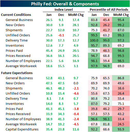
Of all the sub-indices, the New Orders index saw one of the most significant increases in January rising 28.1 percentage points from a barely expansionary reading of 1.9 to a much stronger reading of 30. Going back over the past couple of years, the only times this index was higher was in October (32.9) and February (30.7) of last year. That indicates very strong new order growth after a slowdown in December.
Similarly, the index for unfilled orders was the only index in contractionary territory (those below zero) last month, but there was a massive improvement this month as the index surged to a reading of 25.6. Both the level of the index and the monthly change stand in the top 1% of all readings going back through the history of the survey which began in 1968. The only times the index has been higher was in August of 1972 (26) and January (29.6) and March (45.1) of 1973. In other words, New Orders remain strong while Unfilled Orders are bouncing back at a historic rate,

While the unfilled orders index reached one of the highest readings on record, the index for Delivery Times actually hit a new record. The index rose 12.7 points to a record high of 30; surpassing the previous record of 21.3 from October of 2017. Higher readings in this index indicate that supplier lead times are longer and vice versa for lower readings. That means a historic number of respondents are seeing delays in their supply chains.

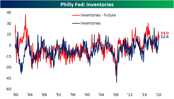
Perhaps to get ahead of the growing demand and longer lead times, businesses are also reporting higher inventories. That index rose to the highest level since September of 2019 which also stands in the top 5% of all readings in the history of the data.
Given the stronger demand and tighter supply lines, prices have also been accelerating. Both Prices Paid and Prices Received experienced some of their largest monthly increases on record after rising 20.5 points in January. At 45.4, the index for Prices Paid is at its highest level since August of 2018. Those price increases are also getting passed along to customers as the index for Prices Received is at the highest level since February of 1989. These results echo some other hints of more inflationary conditions like the New York Fed’s readings last week and the ISM services and manufacturing report earlier this month. Click here to view Bespoke’s premium membership options for our best research available.

Housing Closes Out 2020 on a Positive Note
Housing closed out 2020 on an extremely positive note as both Housing Starts and Building Permits topped forecasts by more than 100K. Since 2002, there have only been ten other months where both reports topped forecasts by more than 100K, and today’s report was the third time it happened in the last 12 months!
The table below breaks down the details of the December report in terms of both single and multi-family units and regions. One of the clear areas of strength was in single-family starts and permits. On a y/y basis, both were up over 25%, and relative to November, starts were up 12% while permits rose 7.8%. Multi-family units, meanwhile, both saw declines with notable weakness in multi-family starts. On a regional basis, most areas of the country saw strength although starts and permits were down m/m and y/y in the Northeast.

Given its overall size, you can easily make the case that as goes the housing market, so goes the economy, and history tends to bear this out. The top chart shows the 12-month average of Housing Starts going back to 1967 with recessions overlaid in gray. With the exception of the latest downturn, every prior recession was preceded by a rollover in Housing Starts. Given the sudden onset of the pandemic, housing played no role in the current recession, but once the lockdowns started, the residential housing market wasn’t immune to the weakness. Whatever weakness there was didn’t last long. As shown in the second chart below, less than a year after the recession started, both the 12-month average of Housing Starts and Building Permits have now moved back above their pre-pandemic highs.


While Housing Starts and Building Permits are both at new multi-year highs, on a population-adjusted basis, they’re still closer to levels typically associated with recessions than expansions. After adjusting for population growth, Housing Starts would need to come in above 1.9 million just to keep up with population growth.

As for the stocks of homebuilders, the performance of the iShares Home Construction ETF (ITB) tends to track trends in Housing Starts and Building Permits pretty closely, so it’s no surprise that it also traded to a new all-time high on Thursday for the first time in three months. As long as interest rates don’t see a sudden spike higher, trends in place for the residential housing market remain positive. Click here to view Bespoke’s premium membership options for our best research available.


Moderating Sentiment
Last week, there was a reporting error in weekly sentiment from the AAII. To account for this, the previous week’s readings (week of January 7th) have been adjusted. This week, reporting is back to normal with bullish sentiment coming in at 42.5%. That is down from the prior adjusted reading of 45.2%. Bullish sentiment has now fallen twice in a row and is at the lowest level since the first week of November. Granted, that is still elevated at 4.5 percentage points above the historical average.

While bullish sentiment has declined, bearish sentiment has been on the rise. Bearish sentiment rose to 34.5% from 31.7% in the most recent week. That is the highest level of bearish sentiment since the end of October. Just like bullish sentiment, it is also slightly above the historical average reading in the bearish sentiment of 30.6%.

With the inverse moves in bullish and bearish sentiment, the bull-bear spread has continued to moderate. This week it sits at 8 which is the lowest reading since the first week of November. Even though it has moved lower, this week was the eleventh consecutive week in which the spread was positive meaning bullish sentiment has outweighed bearish sentiment. This week’s reading is slightly higher than the historical average reading of 7.35 indicating that overall sentiment continues to favor optimists but not to as historically extreme of a degree as the past couple of months.

With bullish and bearish sentiment experiencing nearly identical sized moves, neutral sentiment went little changed this week falling 0.1 percentage points. At 23%, neutral sentiment has declined in back to back to back weeks and is now at the lowest level since the week of November 12th when it dipped below 20%. Click here to view Bespoke’s premium membership options for our best research available.

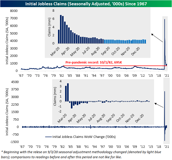
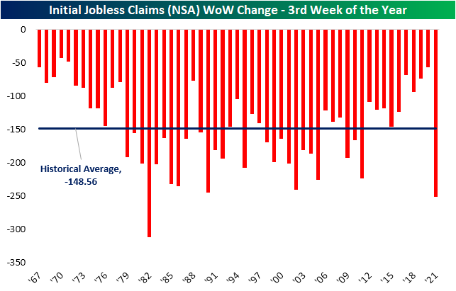
Claims Breathe A Sigh of Relief
Initial jobless claims have been on the rise over the past couple of months with last week’s original reading of 965K marking the highest level in claims since August. While claims remain well above where they have been over the past several months, there was a significant improvement this week. Not only was last week’s number revised down to 926K, but claims for the current week also dropped down to 900K instead of the forecasted reading of 935K.
That improvement was echoed in the non-seasonally adjusted number which fell to 960.7K after rising back above 1 million last week. Again, although that is an improvement, the level of claims still remains at an elevated level relative to the past several months.
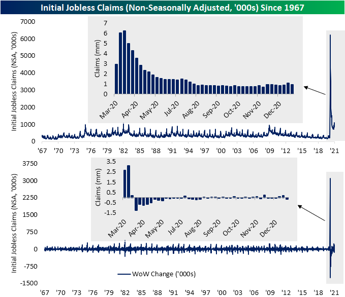
Additionally, looking at seasonality it should come as absolutely no surprise that unadjusted claims were lower week over week. As shown in the chart below, since the data begins in 1967 there has not been a single year in which the current week of the year (3rd) did not see claims move lower.
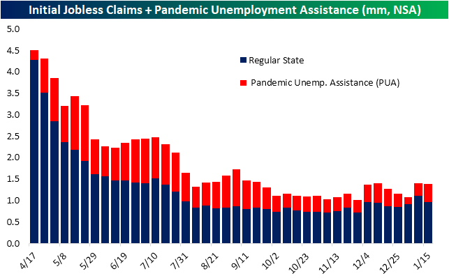
Factoring in other programs, namely Pandemic Unemployment Assistance (PUA), the improvement was much less impressive. Total claims did fall but only from 1.397 million down to 1.384 million. That means a large uptick in PUA claims made up the difference for the drop in regular state claims. PUA claims rose from 284.9K last week to 423.73K this week. That was the highest reading in PUA claims since the week of December 11th. As we have noted in recent weeks, there have been some irregularities in the reporting of PUA claims on a state-by-state basis likely as a result of the timing of the signing of the recent spending bill. That larger uptick this week could be some catchup from lapses in the past few weeks.
Lagged one week to initial jobless claims, continuing claims likewise made a move lower that exceeded expectations in the most recent week. The previous week’s number was revised down to 5.181 million from 5.271 million. This week, claims were expected to tick higher up to 5.3 million. Instead, claims dropped down to 5.054 million; a new low for the pandemic.

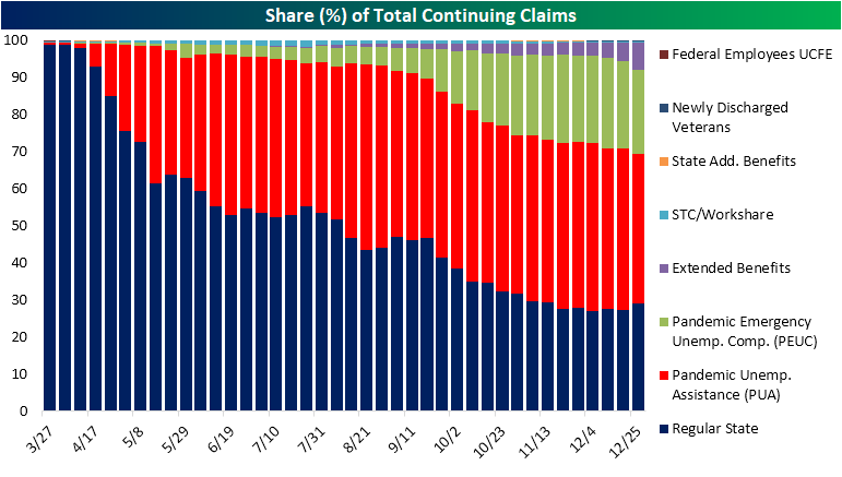
The most recent week’s data available for continuing claims across all programs is for the first week of 2021. To start off 2021, total claims across all programs dropped sharply from 18.442 million down to 16.028 million. Taking a closer look at that week, regular state claims had risen 384.7K which was offset by big declines in PUA and PEUC programs, each of which fell by well over 1 million. While at first glance that may seem like a major improvement, we would note that there likely is a bit more nuance in the decline. More likely, that decline had to do with a mix of issues with reporting around the holidays and the timing of the spending bill which had extended these programs originally slated to expire at the end of 2020. Click here to view Bespoke’s premium membership options for our best research available.

Homebuilder Sentiment Disappoints
The NAHB’s reading on homebuilder confidence was expected to go unchanged at a very strong reading of 86 in January. Instead, the NAHB’s headline index fell down to a reading of 83. Although that is lower, it remains well above any pre-pandemic reading. In other words, homebuilders are less confident than they have been in the past couple of months but sentiment remains overwhelmingly positive.

Even after falling two months in a row, the overall market index and most of its sub-indices remain near record highs. As for the regional indices, there is a bit more variation. The index for the Northeast has seen the sharpest decline falling 10 points in January. That is tied with August of 2018 for the seventh-largest month over month decline on record. While still in the top decile of historical readings, it is far lower than the other regions. On the other hand, albeit lower, the Midwest and the West are the two regions that remain at the highest ends of their historical ranges.


With earnings season underway, the next month will see the vast majority of the S&P 1500 homebuilder stocks report earnings. The snapshot below is from our Custom Portolfios tool. This should give more color to the overall picture for homebuilders. As for the companies reporting, only one, MDC Holdings (MDC) has averaged a full day decline in response to earnings. Additionally, historic beat rates are generally pretty strong across the board. Click here to view Bespoke’s premium membership options for our best research available.

New Highs for Purchase Applications
One of the few economic data points released today was weekly mortgage applications from the Mortgage Bankers Association (MBA), and the data was positive. Seasonally adjusted purchases rose 2.7% week over week to the highest level since the last week of November of 2008. That eclipses the previous high of the cycle from late November of last year.
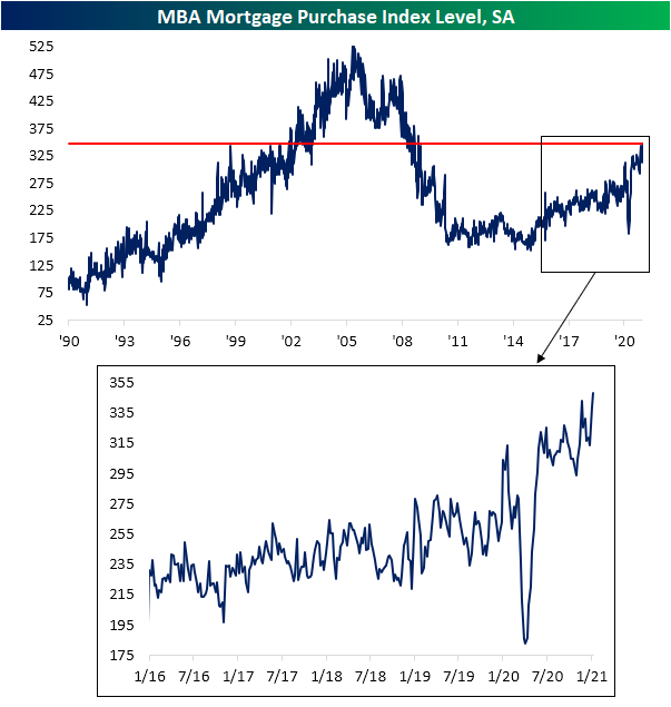
On an unadjusted basis, the average level of mortgage purchase applications is off to its strongest start to a year (through the first three weeks) since 2008. As shown in the second chart below, the seasonal bottom for purchase applications typically occurs at end of each year. With that now in the rearview, purchases have been following the seasonal trend higher. This increase typically lasts throughout the rest of winter and peaks in the spring (usually in late April/early May as indicated by the blue dots). So far in 2021, purchase applications are not only following that seasonal pattern but are also running at a stronger pace than other years of the past decade.


While purchase applications were stronger, refinance activity took a step back in the most recent week. The Refinance index dropped 4.72% week over week. Although that is lower, outside of last week it is still at some of the highest levels since last March’s spike higher. That is also around levels not seen since the spring of 2013.

In terms of related stocks’ reaction to this data, initially this morning, that stronger reading in mortgage purchases led mortgage REITS as proxied by the iShares Mortgage Real Estate ETF (REM) to nearly break out from the past couple of month’s range. but the rally was stopped in its tracks by the release of the weaker than expected homebuilder sentiment reading from the NAHB. Meanwhile, perhaps a bit ironically, the S&P Homebuilders (XHB) have continued to rally, rising 2.37% to a new 52-week high.Click here to view Bespoke’s premium membership options for our best research available.


Presidential First Days
It’s Inauguration Day, and so far equities are welcoming in the new administration with a gain of more than 1% for the S&P 500 (SPY). As to how that compares to the first day of past presidencies, in the chart below, we show intraday performance on Inauguration Day since the start of Reagan’s second term in the mid-1980s when our intraday data begins. Excluded are the inaugurations for George W. Bush’s first term and Obama’s second term considering these fell on days that the market was closed; a Saturday in the case of the former and MLK day for the latter.
The second inauguration for Ronald Reagan was met with the strongest performance for the S&P 500 as the index steadily drifted higher throughout the day to rise 2.28% by the close. With the S&P 500 up over 1% today, it is on pace for the best Inauguration Day performance since then. On average across all of these days, the S&P 500 has typically traded lower throughout the session with a leg lower in the early morning and another towards the end of the day (second chart). Breaking performance down by political party, inaugurations for Republican administrations have averaged a move higher with a bit of a dip midday while performance during inaugurations of Democrats has been weaker. Much of this weakness, however, is due to Obama’s first inauguration which came during the throes of the financial crisis.


As for the ushering in of a new administration or four more years of the same, performance has also tended to be quite different. As shown below, a president’s first inauguration over the past few decades has resulted in the S&P 500 dropping an average of 1.36% by the end of the day as the index steadily trades lower throughout the session. Again, much of this weakness can be attributed to the sharp decline on the day of Obama’s first inauguration. Conversely, the second inauguration of a president has seen the S&P 500 steadily trade higher. Click here to view Bespoke’s premium membership options for our best research available.

Bespoke’s Morning Lineup – 1/20/21 – Transition
See what’s driving market performance around the world in today’s Morning Lineup. Bespoke’s Morning Lineup is the best way to start your trading day. Read it now by starting a two-week free trial to Bespoke Premium. CLICK HERE to learn more and start your free trial.
“But every difference of opinion is not a difference of principle. We have called by different names brethren of the same principle. We are all Republicans, we are all Federalists.” – Thomas Jefferson
After reporting better than expected subscriber growth and announcing it would consider stock buybacks, Netflix (NFLX) looks like it will fittingly be the first blockbuster earnings report of the Q4 reporting season as the stock is trading up over 13%. That gain has Nasdaq futures trading up nearly 1% while the S&P 500 and Dow futures are positive but not by nearly as much. In other earnings news this morning, all nine of the companies reporting have topped EPS forecasts while seven out of nine have also topped revenue forecasts. Two companies (ASML and Procter & Gamble) even raised guidance.
Economic data this morning is relatively light as the only notable report on the calendar is homebuilder sentiment at 10 AM. Economists are forecasting the headline index to remain unchanged at last month’s reading of 86. The big event of the day will obviously be the inauguration of Joe Biden as the 46th President of the United States at noon eastern time and the flurry of Executive Orders concerning student loans, eviction moratoriums, the Keystone Pipeline, the travel ban, and mask-wearing on Federal property that are expected to immediately follow.
Be sure to check out today’s Morning Lineup for updates on the latest market news and events, Chinese Industrial Production, an update on the latest national and international COVID trends (which were positive again), and much more.

Today makes it official for Joe Biden as he will be sworn in as the 46th President of the United States. With that in mind, the table below summarizes the performance of the DJIA for every US President since 1900. In terms of gross percentages, the DJIA’s 56.0% gain under Donald Trump’s tenure ranks as the 8th best out of the 20 shown. While that performance seems pretty middle of the road, all seven of the Presidents that oversaw larger gains did so over more than one full-term. To account for each President’s time in office, in the rightmost column, we show the DJIA’s performance on an annualized basis, and on this basis, the 11.8% gain during the Trump Administration ranks as the fourth-best behind Coolidge (25.5%), Clinton (15.9%), and Obama (12.1%).
We all remember the big market rally we saw after the 2016 election with Trump’s election when the S&P 500 rallied more than 6%. As impressive as that gain was, it pales in comparison to the current period where the S&P 500 is up nearly 12% since the election.

Turning our attention back to Netflix (NFLX), with the stock set to gap up over 13%, today will be the largest upside gap for the stock since October 2016 and the 14th upside gap of 10%+ for the stock since 2010. In the table below, we summarize each of the prior instances along with how the stock performed from the open to close. NFLX has continued higher over three-quarters of the time with an average gain of 1.05% (median: 1.84%). Also notable is the fact that all but one of the stock’s prior upside gaps was an earnings-related move. The only exception was in August 2015 during the volatility of the China yuan devaluation. That was also the time the stock saw the largest downside move from the open to close.

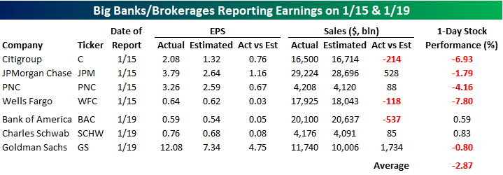
Banks: Where Good News is Bad
Earnings season is now in full swing, and we’ve already seen reports from seven of the largest and most significant banks and brokerage firms. While the results have been good, investors have been reacting with a sell the news attitude. As shown in the table below, all seven of the major banks and brokerage firms reporting so far have topped EPS forecasts. Revenues, on the other hand, haven’t been as positive relative to expectations with four beats and three misses. Where the real weakness has been, however, is in stock price reactions. Of the seven names reporting, five have either had or are on pace to have a negative one-day reaction to their earnings report, while just two – Bank of America (BAC) and Charles Schwab (SCHW) – are just marginally higher today in reaction to their reports. While these two stocks are higher, we would note that BAC was down 3% in sympathy with the other banks on Friday, so the only one of the seven listed that is at the same levels or higher now than it was at last Thursday’s close is SCHW.
With the seven stocks listed below all beating EPS expectations but averaging a decline of close to 3% in reaction to their earnings reports, we wondered how common it is for EPS relative to expectations to come in so strong in an earnings season but the stocks reacting so poorly. Using our Earnings Database and running some filters, we found just five other quarters in the last ten years where all seven stocks reported better than expected EPS. Interestingly enough, of those five periods, the average one-day reaction of the seven stocks in that earnings season was negative four times. The only earnings season where the seven stocks averaged a gain on their earnings reaction day was the Q4 2018 reporting period in January 2019. The worst reaction of these seven stocks in an earnings season when they all topped EPS forecasts was last earnings season in October when they averaged a decline of 2.95% with five of the seven names declining. It was only three months ago, but already last October seems like so long ago. Not a client? Click here to view Bespoke’s premium membership options including Bespoke Institutional, which provides full access to our Earnings Explorer tool.
Semi Seasonals
One of our Interactive Tools that subscribers have access to provides historical seasonality trends for the S&P 500. Our Seasonality Tool allows users to track historical trends of the broader market, ETFs, and individual stocks over pre-defined and custom time periods over the last ten years. Subscribers who have created custom portfolios can also track the names in these various baskets in order to see which ones have historically performed the best and worst over different time periods.
The gauges below are from the Seasonality Tool, and they show the S&P 500’s median performance over the last ten years for the upcoming week, month, and three months. For each time period, we show the S&P 500’s median change during that span as well as how that performance ranks relative to all other periods throughout the year. Using the one-week time period as an example, the S&P 500’s median performance over the upcoming trading week has been +1.15% over the last ten years. Relative to all other one-week periods throughout the year, it ranks better than 89% of them. For the one-month period, the S&P 500’s 3.11% median performance has been even better relative to other periods, ranking better than 94% of them. Over the next three months, though, the S&P 500’s median gain of 3.17% is not quite as strong, ranking better than only 63% of other three-month periods.

One sector that has been strong during the upcoming one-month period is semiconductors. In our Seasonality Tool, you can track that sector’s performance by looking at the ETF SMH, but below we wanted to summarize the performance of the Philadelphia Semiconductor Index (SOX) in the upcoming one-month period, not just over the last ten years but also going back to 1996. As shown in the table, from the close on 1/18 (or the most recent close before that if 1/18 wasn’t a trading day) through the close on 2/18, the SOX has seen an average gain of 3.53% (median: 4.35%) with gains just over two-thirds of the time. That’s more than twice as strong as the average gain of 1.3% for the SOX over all one-month periods since 1996. Over just the last ten years, the performance of the SOX over the next month has been even stronger with a median gain of 4.85% and gains in every year except 2018.
With a rally of 7% already YTD, the semiconductor group has had a strong run to start the year and heads into this week at overbought levels. It’s going to be hard to keep up at this pace, but at least one factor working in its favor is a seasonal tailwind. Click here to view Bespoke’s premium membership options for our best research available.
