Credit Market Reversals
We’ve noted in detail the massive reversals seen in global equities over the last three months, but outside of equities, we’ve also seen some other massive moves. One example is credit spreads between the yields of corporate and high yield bonds relative to Treasuries.
The top chart below shows the spread in yields between the B of A Corporate Index relative to Treasuries going back to 1997, and below that, we show the 50-day rate of change in the spread. Heading into the COVID-crash, spreads on corporate bonds were less than 100 basis points (bps), meaning the corporate bond index was yielding only 1 percentage point more than comparable Treasury yields. In the span of less than two months, though, spreads surged by more than 300 bps to over 400 bps. Not since the depths of the credit crisis in 2009 had we seen spreads widen out more than they did in March. Just as notable as the level is the fact that the speed with which spreads widened during the COVID-crash was similar to the pace during the credit crisis.
While spreads were quick to spike during both crises, they narrowed nearly as fast both times. Going back to 1997, the most corporate spreads have ever narrowed over a 50-day period was in June 2009. Coming in at a close second place, though, the 50-day period ending in early June was nearly as extreme.

Similar to spreads on corporate bonds, the movement in spreads on high yield (junk) credit has been nearly as extreme. While spreads on the B of A High Yield Master Index widened out by only half as much during the COVID-crash as they did during the Financial Crisis, the 50-day move ending in late March was easily more extreme than any other period outside of the credit crisis.

A shown in both charts above, the only time both corporate and high yield spreads narrowed by an amount anywhere close to the amount they narrowed from late March through early June was back in early June of 2009. The chart below of the S&P 500 shows that point from the perspective of the S&P 500. That period in June 2009 was right in the early stages of what turned out to be a multi-year bull market. Given the similar tightening in the credit market now versus back then, should we assume a similar move for equities going forward?
After the last five months, we’ll be the first to say that anything is possible. However, while there are plenty of similarities between the moves in credit markets over the last three months versus the first half of 2009, there are also important distinctions. The most important of these has to do with where the S&P 500 is trading right now. The second chart below shows the historical levels the S&P 500 has traded at relative to its all-time high. Even after the initial narrowing of credit spreads from March through early June 2009, the S&P 500 was still more than 40% off its all-time highs, and therefore still had a lot of climbing to do to get out of the hole. Back in June 2009, to get back to its all-time high from October 2007, the S&P 500 still had to rally another 75%. Today, it’s a much different picture as the S&P 500 is already within 10% of its February 2020 all-time high. Could we be in the earlier stages of what turns out to be another long-term bull market? Sure. Will the magnitude of the gains be anything like the gains early on in the bull market that began in 2009? It’s unlikely. Click here to view Bespoke’s premium membership options for our best research available.

Phenomenal Philly Fed
This morning, the Philadelphia Federal Reserve Bank updated its manufacturing index for the month of June. The past few months have seen some of the lowest readings in the index’s history dating back to 1968. But this month the index rose from -43.1 in May to 27.5 in June. That 70.6 point increase in the index was the largest single-month gain on record. The turn into positive territory also indicates that overall manufacturing conditions for the region improved in June, although we’re still far from fully recovered from the impacts of COVID-19. In the special questions section of this month’s survey, 77.8% of businesses reported total production is down in Q2 versus Q1. Of the responding firms, 46% reported conditions improved in June compared to 19% reporting decreases. Last month over half of the respondents reported worse conditions.
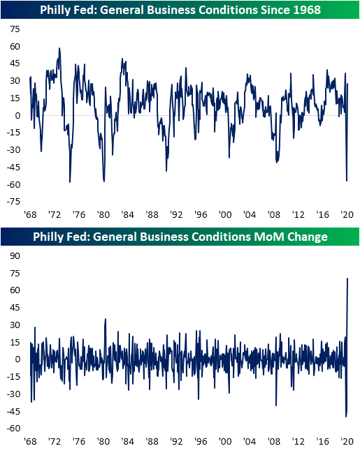
While the return to positive territory only leaves the headline index at its highest level since February, the index for conditions six months in the future is much higher as firms have an optimistic outlook. That index rose from 49.7 in May to 66.3 in June; its highest level since June of 1992.

Like the gain in the headline number which was the largest since month over month increase on record, the same can also be said for Shipments while several other categories, especially those for future expectations, experienced increases in the 90th percentile or better of all prior periods. In addition to the headline index, several categories also showed expansionary readings (above 0) compared to only two last month. For the six month outlook, every index is now positive.

Indicators of demand like new orders and shipments have both picked up substantially. As previously mentioned, the index for Shipments saw its largest monthly gain on record while New Orders saw its second-largest gain on record behind last month’s even larger gain of 45.2 points.

Broad activity for the region appeared to rebound in June, but employment remains weak. The indices for Number of Employees and Average Workweek both remain in negative territory (indicating a decrease in the level of employment) at -4.3 and -6.5, respectively, though they too have at least improved for two months in a row. Another reason for optimism regarding these indices is the six-month outlooks indices for these categories came in much stronger. In other words, while companies may not currently hiring, they expect to start doing so before year end. Click here to view Bespoke’s premium membership options for our best research available.
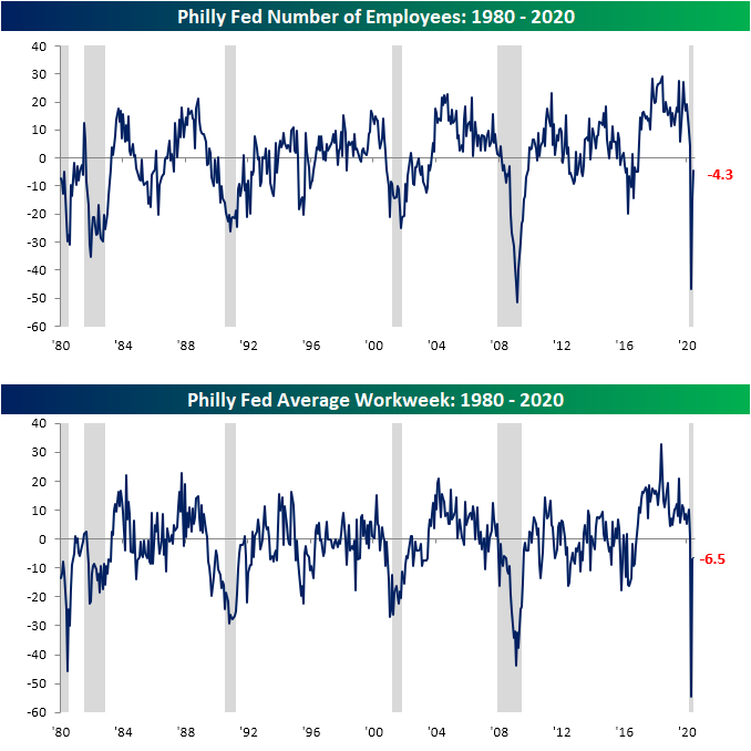
Chart of the Day: Biggest Gainers Of The Past Decade
Sentiment Turnaround
The S&P 500 has faced its share of downward pressure in the past week including a 5.76% drop last Thursday and multiple days with declines intraday. That has slammed investor sentiment as AAII’s bullish reading fell 9.91 percentage points to 24.37% this week. That is the largest single weekly decline in bullish sentiment since the final week of February when it fell 10.17 percentage points from 40.6% to 30.43%. This week also marked the largest move in absolute terms since then. That leaves bullish sentiment at its lowest level since the May 14th low of 23.31%.

The loss in bullish sentiment has almost entirely been picked up by the bearish camp. Bearish sentiment rose 9.73 percentage points this week to 47.78%; the highest reading of the past month. This was the first time bearish sentiment has risen in six weeks. As shown in the second chart below, the five-week streak of consecutive declines in bullish sentiment came to an end tied with six other identically long streaks for the longest in the history of the survey dating back to 1987.


The large inverse moves of bullish and bearish sentiment this week has caused the bull-bear spread to decline. The spread now stands at -23.41 compared to -3.77 last week. That 19.64 point decline was the largest drop in the spread and largest absolute move since a 20.49-point drop on March 12th. That also snapped a streak of five weeks in which the spread was moving in the direction of favoring bulls.
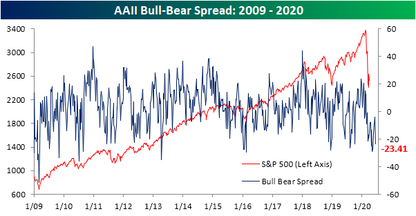
Not all the losses in bullish sentiment turned pessimistic though. Neutral sentiment experienced a small increase of 0.18 percentage points to 27.85%. Click here to view Bespoke’s premium membership options for our best research available.

The Dash for Trash
We’ve seen a number of claims recently that the huge surge in the share prices of formerly “trash” companies is a sign that markets are getting carried away. In reality, this is very normal behavior coming out of an extreme market movement like the February-March selloff. Across the 26 Russell 3,000 companies that had CDS spreads greater than 1000 bps (the traditional indication of “distressed” credit territory) at the equity market lows on March 23rd, the average spread was over 57%. As shown below, in 2009, there were three times as many distressed companies, but they traded at a lower average spread (26%).


Average performance afterwards, though, looks almost identical in the two cases. As shown below, in the 60 trading days that started the last bull market in 2009, these distressed companies rallied 209.8% on average. In the current situation, the average gains have been 208.2%.
Given the fact that equity is a call on the value of assets (retaining whatever is left after liabilities), large shifts like major bear market lows by definition should lead to huge gains for the most distressed companies. In other words, the theory (first put forward by Robert C. Merton in 1974, link) is perfectly consistent with what we see in practice both now and historically. The most stressed companies by definition should rally the most, by virtue of their distress in the first place; this “dash for trash” phenomenon is a function of the capital structure of distressed firms, not any sort of sentimental excess in the behavior of investors. This analysis was included in last night’s Closer report — Bespoke’s post-market macro note that goes out to clients at 6 PM ET each weekday. If you’d like to receive Bespoke’s Closer free for the next two weeks, sign up for a 14-day trial to Bespoke Institutional by clicking here.

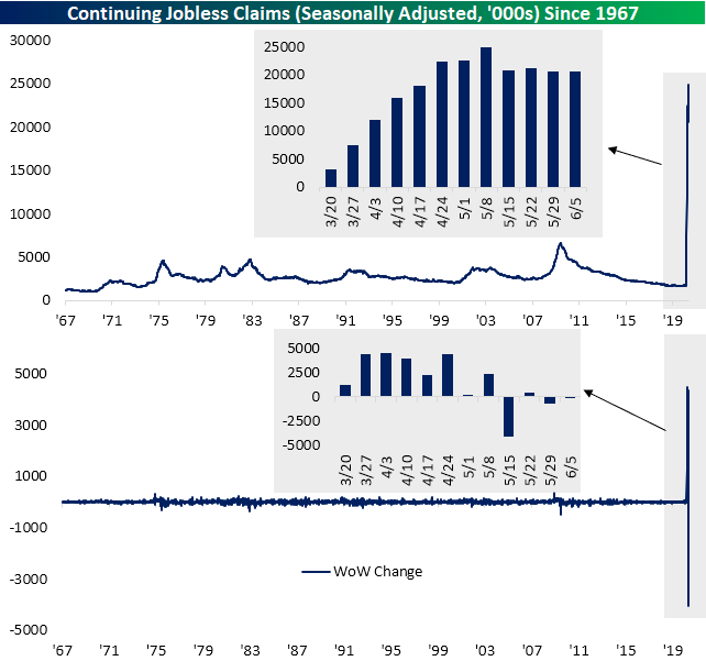
Diminishing Improvements For Claims
Last week, initial jobless claims beat estimates for the first time in six weeks. That better than expected trend didn’t continue this week, though, as seasonally adjusted claims came in at 1.508 compared to forecasts of 1.290. With claims 218K above expectations, that was the largest miss relative to forecasts since the week ending May 8th (481K above estimates). Even though claims were higher than expected this week, they still declined…again. Claims were lower week over week for an eleventh consecutive week; the longest such streak on record. Granted, this week’s decline was the smallest of the eleven weeks at just 58K. On an absolute basis, that was actually the smallest change (either positive or negative) since the first week of March (6K decline) when claims were printing in the sub-millions. Overall, a massive number of Americans continue to apply for unemployment insurance, and while there have been fewer doing so, the rate of those improvements has also slowed
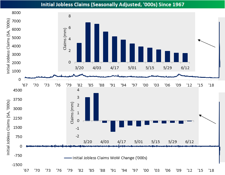
On a non-seasonally adjusted basis, claims also fell and by a larger degree than the seasonally adjusted number. Non-seasonally adjusted claims totaled 1.433 million this week; down 128K from last week. Unlike the seasonally adjusted data, that was not the smallest change of the past several weeks, but this reading has also generally seen lesser improvements recently.

It is a similar story for continuing jobless claims which fell by just 62K to 20.544 million this week; the smallest absolute WoW change since March 6th. With people returning to work as the economy slowly reopens and additional initial claims still in the millions, the in and out-flows have seemed to more or less balance out as continuing claims have been fairly flat over the past month, especially relative to much larger moves in March, April, and the first half of May. Since May 17th, continuing claims have hovered between roughly 20.5 million and 21.25 million with this week’s reading at the lower end of that small range. Click here to view Bespoke’s premium membership options for our best research available.
The Very Slow Recovery In Economic Activity Is Continuing
As economies around the country slowly recover from COVID-19 and reopenings proceed, economic activity is slowly recovering. For the hardest-hit sectors, though, the recovery is only inching forward. Security checkpoint volumes at US airports are still down 80% YoY, and the trend of improvement is only set to return travel activity to 50% of 2019 levels in September.
For restaurants, OpenTable data shows covers down by two-thirds from last year, though some of that is because many restaurants remain closed. Among reopened establishments, the number of seated customers are still down almost 40% YoY. About half of restaurants remain closed per the OpenTable data. We discussed this chart and other retail enthusiasm indicators in last night’s Closer report, which is available to Bespoke Institutional members. Click here to start a two-week free trial.

Chart of the Day: Smart Money Indicator
Global Valuations Stretching
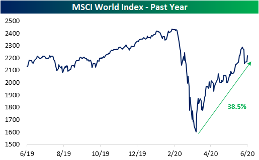
Generally speaking, stock markets around the globe have recovered a solid portion of their losses from earlier in the year. The MSCI World index is now just 8.86% below its February 12th all-time closing high after rallying 38.5% off of its March 23rd low.
With equities running higher around the globe, valuations have risen as well. The median price to earnings ratio of the 23 countries in our Global Macro Dashboard is now 19.89. That is actually down from some of the higher readings of the past couple of weeks when the P/E ratio was north of 20. As shown in the chart below, only about 10% of days over the past decade have seen the median P/E ratio at 20 or more. Most of those days came in January and February of this year and in parts of 2015 and 2016.

As shown in the table below, the median stock market’s P/E ratio is now in the 88th percentile of the past decade’s range. As for the 23 Global Macro Dashboard countries comprising that median reading, several including the US, Germany, Japan, and Norway are in the 90th percentile or better of the past decade’s range. Of all 23 countries, Norway has the highest overall P/E ratio of 41.22. Many of the other countries with the highest valuations like Brazil, Spain, and Japan all are also in the upper end of the past few years’ range. Meanwhile, China actually has one of the lowest valuations when compared to other countries, albeit that is at the highest level of the past couple of years. Other countries like South Africa, Mexico, and Canada are similarly at the lower end of the range of current country P/E ratios while also being at the upper end of their own range of the past few years. Click here to view Bespoke’s premium membership options for our best research available.

Job Losses Around the Globe
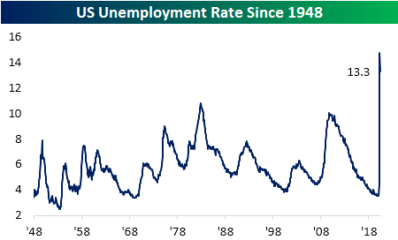
Every Wednesday we release our Global Macro Dashboard which covers major macroeconomic and stock market indicators across 23 of the world’s largest economies. One of the stats tracked is each country’s unemployment rate. Labor market data has been a major focus in the US as jobless claims have printed in the millions for multiple months now and the U-3 unemployment rate sits at 13.3%, off its April high of 14.7% but still at some of the highest levels since the Great Depression. High unemployment is not just a US phenomenon though. While it isn’t as extreme as the US, the world average across the 23 countries in our Global Macro Dashboard has soared and currently sits at 7.6%; the highest level in a decade.

In the charts below, we show eight countries that are experiencing some of the most dramatic upswings in unemployment. Our neighbor to the North, Canada, has a similar unemployment rate to the US both in terms of the rate itself and the sharp upswing over the past few months. Of the other countries in our Global Macro Dashboard, Brazil, South Africa, and Spain are the only other countries with double-digit unemployment rates at the moment. Like Canada and the US, the unemployment rates of Hong Kong, Malaysia, and South Korea have also all spiked to the highest levels of the past decade. Sweden, Australia, Germany, and Switzerland also all have seen large moves higher. Of these, only Germany has seen any respite as the US has in the most recent readings. Click here to view Bespoke’s premium membership options for our best research available.
