Heavy Hitters on Deck for Earnings
Earnings season is now off to the races and the week ahead is one of the busiest of the season. Of the S&P 1500 index members, 472 are scheduled to report over the coming week, and another 557 are scheduled to report the following week. In terms of market cap, that is more than $20 trillion this week and $7 trillion the next. Obviously, there is a huge divergence in the number of companies reporting and the size of those companies over the next couple of weeks. As we noted in today’s Chart of the Day and as shown in the chart below, one big reason for that is the fact that the FAAMG cohort is reporting this week. Today, Facebook (FB) is the first of those stocks with its $900+ billion market cap. Similarly, Tuesday will see Alphabet (GOOG) and Microsoft (MSFT) report, and their combined market cap is over a trillion dollars more than the 86 other S&P 1500 members reporting that day. Even more impressive, on Thursday, Amazon (AMZN) and Apple’s (AAPL) combined $4 trillion market cap outweighs the entire market cap of every other S&P 1500 stock reporting that day. In other words, this week has a huge number of stocks reporting, but the overall market’s direction will likely be dictated by the results of a small handful of names. Click here to view Bespoke’s premium membership options.

Bespoke’s Morning Lineup – 10/25/21- Modestly Positive Start to the Week
See what’s driving market performance around the world in today’s Morning Lineup. Bespoke’s Morning Lineup is the best way to start your trading day. Read it now by starting a two-week trial to Bespoke Premium. CLICK HERE to learn more and start your trial.
“We can guarantee cash benefits as far out and at whatever size you like, but we cannot guarantee their purchasing power.” – Alan Greenspan
US equities are on pace to kick off the week with a modestly positive open, while WTI crude oil nears $85, treasury yields rise, and bitcoin has rebounded from a weekend decline. It’s a quiet day for economic data today, but the pace of earnings will really ramp up after the close with Facebook (FB) and continue that way for the rest of the week.
Read today’s Morning Lineup for a recap of all the major market news and events from around the world, including the latest US and international COVID trends.
Equity futures remain subdued to kick off the week, but October has already been an extremely positive month. Through Friday’s close, the S&P 500 was up over 5.5% this month. Heading into the final week of October, that represents the best MTD performance for the index since 2015 (+8.08%) and just the 10th time in the post-WWII period that it has been up 5%+ heading into the final week of the month.
In the table below, we list each of the prior years where the S&P 500 was up 5%+ heading into the last week of October and show how it performed in the final week of the month. Of the nine prior occurrences, the index was up four times and down five times for a median decline of 0.07%. For comparison, in all other Octobers where the S&P 500 was up less than 5% heading into the last week of the month, the median performance was a gain of 0.64% with gains 62.7% of the time.

Start a two-week trial to Bespoke Premium to read today’s full Morning Lineup.
Bespoke Brunch Reads: 10/24/21
Welcome to Bespoke Brunch Reads — a linkfest of the favorite things we read over the past week. The links are mostly market related, but there are some other interesting subjects covered as well. We hope you enjoy the food for thought as a supplement to the research we provide you during the week.
While you’re here, join Bespoke Premium with a 30-day free trial!
Supply Chains
How to fix the port traffic jam by Ryan Petersen (ThreadReader App)
A detailed plan that will help alleviate the traffic jam at the ports in Southern California which is creating huge feedback loops through the entire trans-Pacific trade network and the rest of the global economy. [Link]
Biden Races Clock and Holds Few Tools in Supply-Chain Crisis by Josh Wingrove, Jill R Shah, and Brendan Case (Bloomberg)
Most of the problems that led to the supply chain snarl up are rooted in years of underinvestment and there are no quick fixes that can be quickly pushed by the White House or anybody else. [Link; soft paywall]
New Business Models
Selling Cars in the Era of the Chip Shortage: Online Chats and No More Haggling by Patrick Thomas (WSJ)
With inventories extremely tight, automakers are trying to match production to demand as closely as possible. That’s led to a much different buying experience than the traditional model of purchase out of dealer inventory. [Link; paywall]
Net Promoter 3.0 by Fred Reichheld, Darci Darnell, and Maureen Burns (Harvard Business Review)
An explanation of how net promoter scores (“How likely are you to recommend this product to a friend?”) have a complementary accounting concept, and how they tie together. [Link]
Business Travel’s Demise Could Have Far-Reaching Consequences by Alana Semuels (Time)
The demise of business travel is likely to be long-lasting, and that has major consequences for the way the travel industry functions as a whole given the premiums historically paid by people moving around the country on business. [Link]
Renewables
Bechtel, Hatch Win Leads on Australia-Singapore Power Megaproject by Mary B. Powers and Debra K. Rubin (ENR)
A massive solar-battery combined project in rural northern Australia will send power overland to Darwin, a port on Australia’s northern coast, via a 500 mile transmission line. From there, it will run all the way to Singapore via underwater cables (a total of 2600 miles). The massive storage project will be able to store 36-42 GWh of electricity and supply one-fifth of Singapore’s total power needs. [Link]
History
Viking Artifacts Give Precise Date for Europeans’ Earliest Presence in North America by Robert Lee Hotz (WSJ)
Wooden artifacts discovered in Newfoundland date back 1,000 years, almost half a millennium before Columbus is credited with “discovering” the Americas. The technique used is fascinating, relying on solar storms, tree rings, and radio carbon dating to arrive at an exact date that was much earlier than previous estimates. [Link; paywall]
Exotic Animal Japes
Officials hope to capture loose zebras with new plan involving even more zebras by Alanea Cremen (WUSA9)
A Maryland county is planning to lure zebras that escaped from a farm with the rest of the herd those exotic mammals escaped from. [Link]
Foreign Affairs
KGB archives show how Chrystia Freeland drew the ire (and respect) of Soviet intelligence services by Simon Miles (Globe & Mail)
During her time studying abroad in the Ukraine, current Canadian Foreign Minister Chrystia Freeland was surveilled by the Soviet Union’s secret police for her activity as a pro-democracy activist. [Link]
Real Estate
Will 4% Mortgage Rates “Halt the Housing Market”? by Bill McBride (Calculated Risk)
Some context on a prediction that the US is building too much housing relative to its population and that a move higher in interest rates will destroy home prices. [Link]
Flu Season
Walgreens Flu Index Shows Flu Activity Is Up 23 Percent Compared to Last Flu Season as People Return to More In-Person Activities (Yahoo!/BusinessWire)
The pharmacy chain is tracking a significant uptick in flu virus prevalence across the southern tier of the country after a year with record low flu activity thanks to masking and social distancing measures that helped prevent the spread of the more endemic virus as well as COVID. [Link]
Read Bespoke’s most actionable market research by joining Bespoke Premium today! Get started here.
Have a great weekend!
The Bespoke Report — Equity Market Pros and Cons (and everything in between)
This week’s Bespoke Report is an updated version of our “Pros and Cons” edition for Q4 2021.
With this report, you’re able to get a complete picture of the bull and bear case for US stocks right now. It’s heavy on graphics and light on text, but we let the charts and tables do the talking!
On page two of the report, you’ll see a full list of the pros and cons that we lay out. We then provide slides for each “pro” or “con” that we’ve highlighted.
To read this report and access everything else Bespoke’s research platform has to offer, start a two-week trial to Bespoke Premium.


Bespoke’s Morning Lineup – 10/22/21 – Stairs Down, Elevator Up
See what’s driving market performance around the world in today’s Morning Lineup. Bespoke’s Morning Lineup is the best way to start your trading day. Read it now by starting a two-week trial to Bespoke Premium. CLICK HERE to learn more and start your trial.
“If you wish to increase your success rate, double your failure rate.” – Thomas Watson
Futures are mixed this morning following some weak earnings in the technology space. Both the S&P 500 and Dow futures are in the green, while the Nasdaq is indicated to open lower following disappointing earnings from Intel (INTC) and Snap (SNAP) after the close yesterday. If the S&P 500 manages to close out the day in positive territory it will mark the eighth straight day of gains for that index. The only economic data on the calendar this morning are preliminary Markit Manufacturing and Services PMI readings for October.
Read today’s Morning Lineup for a recap of all the major market news and events from around the world, including the latest US and international COVID trends.
You read the title of this post correctly. Traditionally, investors are used to seeing steady moves higher in the market followed by sharp and swift pullbacks. Since the S&P 500’s peak in early September, though, we have seen the opposite pattern play out. In the most recent 5% pullback, the period from the peak to trough on 10/4 covered 21 trading days. Since the recent low on 10/4, though, it only took 13 trading days to erase all of the prior losses from the 9/2 peak. Talk about a quick rebound!

Start a two-week trial to Bespoke Premium to read today’s full Morning Lineup.
An Impressive 2021 So Far, But Flows Are Slowing
Yesterday the Investment Company Institute updated weekly fund flow numbers for the US mutual fund and ETF industry. As shown in the chart below, total mutual fund flows were positive this year but compared to the performance of ETFs, the inflows have been only modest at best. ETFs have logged more than $700bn in inflows, and while mutual funds avoided a fourth straight net outflow, their $66bn in inflows wasn’t that impressive. Across mutual funds and ETFs, bonds have been the massive winner this year, with more than $500bn in inflows. Equity funds record outflows over time as a mechanical result of equity retirements, but this year inflows have been the largest since 2014 with more than $210bn in buying across mutual funds and ETFs. About a quarter of total equity fund inflows so far this year have been dedicated to funds buying the domestic stock market. That’s the best year for domestic equity fund flows since 2014, and breaks a string of five consecutive years of outflows, though net flows have been stable for months now.
This analysis was first published last night in The Closer, Bespoke’s end-of-day macro note. To receive The Closer and all of Bespoke’s other reports covering sentiment and positioning, sign up for a two-week trial today if you’re not yet a member.

Philly Fed Fails
Last Friday the first regional Fed manufacturing report for the month of October rolled in with a larger than anticipated decline in the Empire Fed index. The Philly Fed’s index released this morning saw a similar result. The General Business Conditions index fell from 30.7 to 23.8 versus an expected decline to 25. That reading indicates the region’s manufacturing economy is still growing at a historically solid rate, but there was a significant deceleration in the month of October.

Taking a look under the hood of the report, overall the results were not as bad as the headline reading might imply. Most categories of the report were higher and General Business Conditions was the only index that was not in the top 10% of readings going back to the beginning of the survey in 1968. Inventories, Prices Received, and Average Workweek were the only current condition indices to fall month over month. Indices for future expectations are generally more pessimistic with only a small handful in the top decile.

The index to see the largest month over month increase in October was for New Orders as the index nearly doubled to 30.8. That is the strongest reading since May and it remains one of the strongest readings throughout the history of the survey. Shipments and Unfilled Orders rose less dramatically but likewise came in at historically strong levels. Inventories are also rising at a historically solid clip in spite of pulling back slightly this month. Of these indices, the most notable move was in future expectations for Unfilled Orders. After hitting a high of 19.2 back in June, the index has been in absolute free fall, shedding another 8.1 points this month. That is the weakest reading since 1998. In other words, even though backlogs are continuing to build on continued strong demand, businesses expect to rapidly work those off in the near future. Ironically, firms also reported that they expect shipments to decelerate down the road as well.

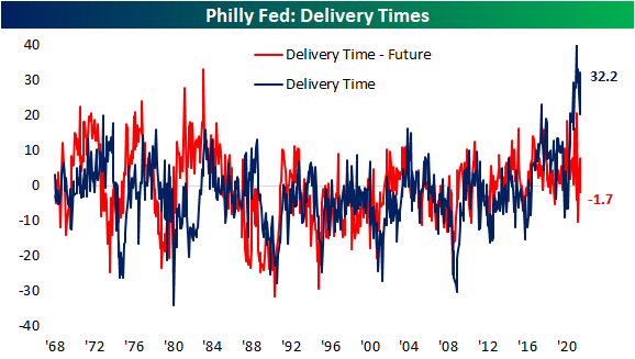
As for the reading on supply chains, delivery times remain historically high and deteriorating in October with the index rising 11.8 points to 32.2. That is the third-highest reading on record behind this past May (41.5) and June (33.3). But firms also do not appear to think things can get much worse. Expectations for Delivery Times fell into negative territory this month for the first time since July. That negative reading indicates reporting firms expect delivery times to be lower rather than higher in the future. Click here to view Bespoke’s premium membership options.
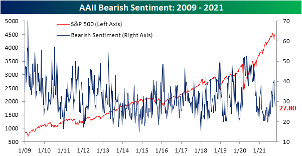
Sentiment Surge
Over the past couple of weeks, the S&P 500 has reversed higher, and the index is now only a few basis points away from the September 2nd closing high. With the rally, sentiment has taken a sharp turn towards optimism. The AAII reading on bullish sentiment rose for a second week in a row, climbing 9 percentage points to 46.9%. That is the highest reading on bullish sentiment since the week of July 1.

While this week’s increase was large, it comes on top of a double-digit rise last week. In total, bullish sentiment has climbed 21.4 percentage points in the past two weeks alone. That is the first time since November of last year that bullish sentiment has risen by at least 20 percentage points in two weeks. Going through the history of the survey, there have only been 17 other periods in which there were similar moves without another occurrence in at least six months. Overall, these instances have consistently seen the S&P 500 move higher in the following weeks and months with larger than normal average and median gains. That is except for one year out in which performance has been slightly worse than the norm.

With the big jump in bullish sentiment recently, bearish sentiment has pulled back to 27.8%. That is the lowest reading since September 9th and the third week in a row in which bearish sentiment has moved lower.
With inverse moves to bullish and bearish sentiment, the bull-bear spread stayed in positive territory for the second week in a row as bulls outnumber bears by the widest margin since the first week of July.
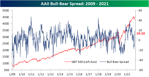
Big gains to bulls also borrowed heavily from neutral sentiment as that reading fell from 30.3% to 25.4%. Similar to bearish sentiment, that is the lowest reading since early last month.

As for some other readings on sentiment, the NAAIM Exposure index measuring investment managers’ exposure to US equities has also made a significant move higher this week. Readings in this index range from -200 to 200 where (-)200 would indicate responding managers are leveraged long (short), (-)100 would be fully invested long (short), and a reading of zero would be market neutral. At the end of last month, the reading fell to a low of 55 which was the weakest level since May. While the past two weeks only saw modest improvements, this week there was a surge all the way up to 98. The 33.6 point increase ranks as the fifth-largest week over week moves on record in the index dating back to 2006. Click here to view Bespoke’s premium membership options.

PUA Claims Negligible
Initial jobless claims made another move lower this week with the seasonally adjusted number falling by more than expected to 290K from an upwardly revised reading of 296K last week. That sets another record low for the pandemic era with claims now 34K above levels from March 14th of last year (the last reading before claims began to print in the millions).

On a non-seasonally adjusted basis, claims were again lower as is normal for the current week of the year. Historically, this point of the year is when claims tend to rise into year’s end, but the current week of the year provides a brief period of respite. Since 1967, the current week of the year has only seen claims rise week over week under a quarter of the time. While this week saw some seasonal tailwinds, PUA claims are increasingly a negligible factor as any backlogs are essentially worked off. Initial PUA claims came in at just 2K this week.


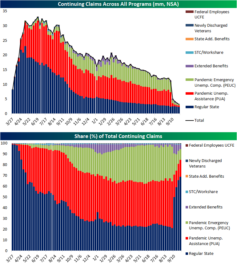
Continuing claims also set another pandemic low falling below 2.5 million.

The most recent data including all programs is through the week of October 1, and again there has been a substantial drop off in total claims thanks to the end of pandemic era programs. Total unadjusted continuing claims fell to 3.29 million down from 3.66 million the prior week. As could be expected, PUA, PEUC, and Extended Benefits programs were the main contributors to those declines leading regular state claims to once again account for a dominant share of total claims. Click here to view Bespoke’s premium membership options.
Bespoke’s Morning Lineup – 10/21/21 – Claims on Deck
See what’s driving market performance around the world in today’s Morning Lineup. Bespoke’s Morning Lineup is the best way to start your trading day. Read it now by starting a two-week trial to Bespoke Premium. CLICK HERE to learn more and start your trial.
“The problem is that a lot of big companies, process becomes a substitute for thinking. You’re encouraged to behave like a little gear in a complex machine. Frankly, it allows you to keep people who aren’t that smart, who aren’t that creative.” – Elon Musk
After a six-day rally of over 4%, the S&P 500 is indicated to open lower this morning along with the other major averages. The big drag on sentiment this morning is the 10-year yield which has spiked by about 4 bps in the last two hours taking yields to the highest level since May. Along with a busy slate of earnings, there are a number of economic indicators on the calendar that have the potential to swing things in the hours ahead. Jobless claims and the Philly Fed will be released at 8:30 AM while Leading Indicators and Existing Home Sales will hit the tape at 10 AM.
Read today’s Morning Lineup for a recap of all the major market news and events from around the world, including the latest US and international COVID trends.
With bitcoin hitting a new high this week, we wanted to update the comparison between ‘digital gold’ (bitcoin) and physical gold over the last year. Like bitcoin’s actual price, the ratio of bitcoin to gold also hit a new high this week topping the prior record high of 36.2 from April and finishing off yesterday at 37 ounces of gold to one bitcoin. That represents more than a six-fold increase in just the last year!

While bitcoin has been on a tear relative to gold, priced in terms of ether, it has underperformed over the last year. Last October, one bitcoin was worth more than 30 ether, but over the next six months that ratio rapidly compressed falling to as low as 12.3 this May. Ever since then, bitcoin and ether have been moving closer in tandem with each other as the ratio has been contained to a range between 12 and 18.

Start a two-week trial to Bespoke Premium to read today’s full Morning Lineup.