Bespoke Brunch Reads: 8/14/22
Welcome to Bespoke Brunch Reads — a linkfest of the favorite things we read over the past week. The links are mostly market related, but there are some other interesting subjects covered as well. We hope you enjoy the food for thought as a supplement to the research we provide you during the week.
While you’re here, join Bespoke Premium with a 30-day free trial!
Lawmaking
Congress Just Passed a Big Climate Bill. No, Not That One. by Robinson Meyer (The Atlantic)
In addition to the passage of the Inflation Reduction Act this week, Congress passed the CHIPS Act earlier this summer, with as much as one quarter of its $280bn in outlays aimed at accelerating zero-carbon and climate-relevant industries. [Link; soft paywall]
The Sinema-Manchin split that shaped Dems’ deal by Burgess Everett and Marianne Levine (Politico)
A tick-tock recap of the furious dealmaking which allowed Democrats to move their climate and taxation bill through the Senate and in to law with no margin for error. [Link]
Energy
Oil is back on the menu as energy majors return to exploration by Robin Millls (The National News)
While the oil industry capex response to higher prices has been at best tepid so far, there are signs of rising interest in new large-scale projects, including deep offshore exploration. [Link]
The Place With the Most Lithium Is Blowing the Electric-Car Revolution by Ryan Dube (WSJ)
Left wing politics, a history of environmental exploitation, vocal indigenous communities, and booming demand for lithium make the process of extracting it in South America fraught at best as electric vehicle production explodes. [Link; paywall]
China
China Graft Probes Stem From Anger Over Failed Chip Plans (Bloomberg)
An effort to build domestic capacity in semiconductors manufacturing and development has been relatively unsuccessful in China, which has so far failed to keep up with American intellectual property that underpins global chip use. [Link; soft paywall, auto-playing video]
China’s Current Account: A Very Nerdy Investigative Thread by Adam Wolfe (Thread Reader/Twitter)
A detailed dive into why the huge increase in the Chinese goods trade surplus hasn’t led to a similar increase in the country’s current account surplus. [Link]
Investing
RIP Big Bull Market (1982-2022) by Andy Kessler (WSJ)
A history of the massive trend towards capital appreciation dating from the early 1980s which may finally be coming to a close with the end of ever-lower interest rates. [Link; paywall]
Hedge Funds Face SEC Demand To Share More About Their Strategies by Lydia Beyoud (FA Mag)
A new SEC proposal would see a requirement that hedge funds provide regulators with more details about their strategies, which would allow the SEC to better understand risks in the financial system. [Link]
Inflation
The Snowballing US Rental Crisis Is Sparing Nowhere and No One by Maria Paula Mijares Torres and Jonnelle Marte (Bloomberg)
Across the country, rents are soaring far above incomes thanks to low vacancy rates and a dearth of new buildings as well as pandemic-era high demand for housing that hasn’t faded much yet. [Link; soft paywall]
Richer people are eating more at Applebee’s and IHOP by Danielle Winer-Bronner (CNN)
Down-market but still full-service restaurants are seeing improving foot traffic and consumer spend as higher-income consumers trade the steakhouse for a more humble meal. [Link]
Labor Markets
Business Is Booming for Layoff Specialists: ‘Never Seen Anything Like This’ by Maxwell Strachan (Vice)
Tech companies used to ramping up hiring rather than reducing headcount are scrambling for expertise as they look to fire staff that were added as part of over-optimistic expansion plans pre-dating the recent collapse in valuations. [Link]
Iranian charged in alleged plot to kill ex-Trump adviser John Bolton by Ellen Nakashima and Perry Stein (WaPo)
A Justice Department investigation uncovered an Iranian IRGC member attempted to book a $300k hit on Bolton; the suspect is presumed to have fled back to Iran. [Link; soft paywall]
Social Media
Teens, Social Media and Technology 2022 by Emily A. Vogels, Risa Gelles-Watnick, and Navid Massarat (Pew)
Use of Facebook among teens has plunged, with Twitter also down. Instagram and Snapchat are more popular while TikTok is second-place to YouTube; 95% of teens say they’ve used Google’s video site. [Link]
Vaccination
A vaccine for Lyme disease is in its final clinical trial by Bill Chappell (NPR)
As Lyme disease spreads across a greater territory of the US, a vaccine designed to prevent it has entered Phase 3 trials and could be available as soon as 2025. [Link]
Read Bespoke’s most actionable market research by joining Bespoke Premium today! Get started here.
Have a great weekend!
The Bespoke Report – 8/12/22 – Inflation Superfecta
This week’s Bespoke Report newsletter is now available for members.
After a strong jobs report last Friday reignited fears of an overheating economy, markets were edgy heading into a busy week for inflation data. It doesn’t happen that often, but bulls hit the inflation superfecta. It started with Monday’s release of the July Survey of Consumer Expectations which showed a continued decline in inflation expectations. On Wednesday, the big bad CPI report for July was released and that came in lower than expected for a change. The weaker-than-expected CPI was followed by a weaker PPI Thursday and then a weaker-than-expected report on Import Prices Friday. After months where it seemed as though every inflation report was coming in hot, this week’s data on prices was cold, cold, cold, and cold. The heatwave has been broken!
Well, we don’t know if the inflation heatwave has actually been broken or not, but we discuss all of this week’s inflation news and other major issues impacting the market in this week’s Bespoke Report.
To read this week’s full Bespoke Report newsletter and access everything else Bespoke’s research platform has to offer, start a two-week trial to one of our three membership levels.


Bespoke’s Best Charts of the Week
After another busy week for the markets, we wanted to highlight some of our favorite charts that we published for paying subscribers. Enjoy! Click here to start a two-week trial to Bespoke Premium and receive our paid content in real time.
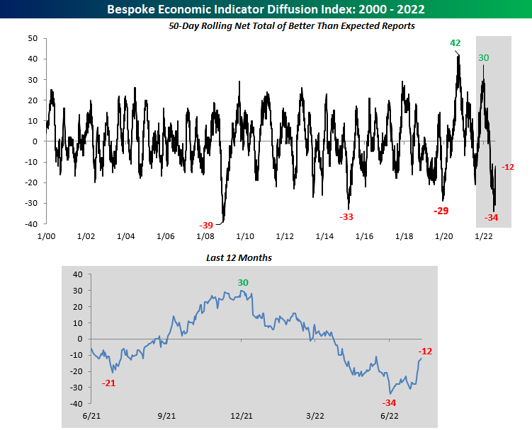
We started off the week by looking at our economic indicator diffusion index, which measures the pace at which economic indicators are coming in ahead (or below) consensus economist estimates over a 50-day period. In late June, this index hit a low that had not been seen since the great financial crisis, but it’s now 22 points above this level. It seems as if economists are struggling to predict economic data points, as the index has seen extremes in both directions since the onslaught of the pandemic.
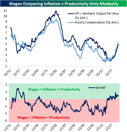
On Tuesday, we noted that, in the short-term, wages are rising far faster than output can justify, which means that either output needs to ramp up or wages need to decelerate. Over the long-term, though, nominal wages are basically moving at a similar pace to consumer prices plus productivity. In other words, on a trend basis, workers are earning slightly more than inflation plus productivity over the past five years. This tells us that the wage growth experienced over the last five years is likely sustainable, and further wage growth over the medium-term would not be surprising.
Following Wednesday’s inflation print, we took a look at the S&P 500’s performance when CPI is decelerating versus accelerating. As you can see from the chart below, decelerating inflation leads to better market performance across the board.

As of Wednesday, the Nasdaq Composite officially entered a new bull market based on the traditional 20%+ rally/decline threshold. All-in-all, the bear market experienced between November 19th, 2021 and June 16th was extraordinarily average, with the duration being just eight days above the average and the drawdown being 1.4 percentage points below that of the average. Let’s hope that this bull market is average as well, as this would imply gains of 135% over 841 days relative to the 6/16 low.
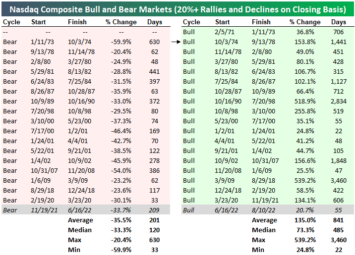
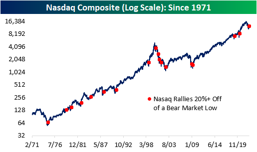
Below are all of the 20%+ rallies off of bear market lows since the Nasdaq’s inception. Apart from the dot-com era which experienced a massive bust, the forward performance has been quite positive.
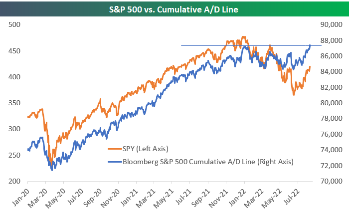
As of Thursday’s close, Bloomberg’s tracking of the S&P 500’s cumulative advance/decline line made a new all-time high. That represents significant divergence from the index’s price, which is still 12% below all-time highs. This kind of divergence is typically viewed as bullish, but you can read our B.I.G. Tips report on the topic to see if that’s really the case based on historical trends.
Americans across the country are breathing a sigh of relief as the AAA National Average price of gas per barrel broke below $4.00. Although the level is still elevated, the price of gas has been continuously declining.

This week was equally busy in the political sphere. Donald Trump’s residence was raided by the FBI, Biden signed the CHIPS Act, and the Inflation Reduction Act appears likely to be signed into law. All of this has come as we’ve seen a big shift in the betting market odds for Democrats and Republicans to take control of the Senate later this year.

If you would like to receive content like this daily, click here to start your trial today!
Risk of Default Declining
We like to use credit default swaps (a product that pays out investors if a reference company defaults) to track risk premiums in the corporate bond market. When risk premiums rise, credit default swaps get more expensive, and the spread implied between risk free rates and CDS rises. Click here to learn more about Bespoke’s premium stock market research service.
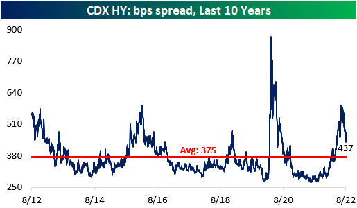
As recession fears intensified throughout the first half of 2022, both the investment grade and high yield credit default swap indices skyrocketed, gaining 106.7% and 110.5% between the start of the year and the highs, respectively. However, earnings were not as bad as feared, economic data is starting to come in better than expected, gas prices have fallen, and CPI seems to have peaked in June. All of this has caused substantial declines in CDS index spreads, with the risk premium associated with each falling by about a quarter since their summer peak.


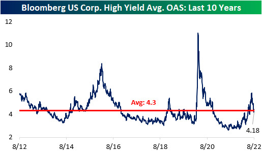
Although CDX High Yield’s spread is well off of its highs, it is still above the average over the last ten years, implying a still elevated risk related to recession and potential defaults. We can also tie CDS indices to the performance of actual corporate bonds. The option-adjusted spread (a proxy for the credit risk over risk-free rates for a given investment) for high yield bonds in the “cash” market has a 0.88 correlation to CDS over the past decade. Notably, the CDX HY spread remains above its long-term average, while that High Yield Average OAS is below its average, implying investors may be getting under-compensated for the risk they are taking in the high yield debt market. Click here to learn more about Bespoke’s premium stock market research service.
Bespoke’s Morning Lineup – 8/12/22 – Four in a Row?
See what’s driving market performance around the world in today’s Morning Lineup. Bespoke’s Morning Lineup is the best way to start your trading day. Read it now by starting a two-week trial to Bespoke Premium. CLICK HERE to learn more and start your trial.
“Pressure is what you live for… if you are going to be successful in life, you’re going to have pressure.” – Jack Nicklaus

Below is a snippet of content from today’s Morning Lineup for Bespoke Premium members. Start a two-week trial to Bespoke Premium now to access the full report.
The S&P 500 has been down on three of the four trading days this week, but it is still up over 1%. Barring a sharp reversal from the current level in the futures market, this would be the fourth positive week in a row. That would be the longest winning streak since early November of last year. Today’s only economic data is Import Prices at 8:30 Eastern (weaker than expected: -1.4% vs -1.0%) and then Michigan Confidence at 10 AM. As has been the case in the last couple of months, traders will be watching the level of inflation expectations in the Michigan report closely. Barring any major surprises in the data, and given the fact that it’s a Friday in August, activity in the afternoon is likely to slow down.
As mentioned above, futures are moderately higher while European equities are trading close to either side of the flat line, but drought conditions in the region continue to raise concerns over transportation and the region’s energy needs heading into winter. While inflation data here in the US was positive this week, both France and Spain reported their highest y/y increases in over 30 years.
Turning to China, five state-owned companies announced this morning that they will voluntarily delist from the NYSE. While none of these companies are particularly active on the NYSE, the symbolic nature of the delisting should not be understated and only further exacerbates the rising tensions between the two countries.
Today’s Morning Lineup discusses earnings and market news out of Europe and the Americas, overnight economic data, and much more.
Falling commodity prices have been one reason for optimism that inflation pressures may have peaked, but over the last five trading days, commodity ETFs in our Trend Analyzer tool have seen some strong moves. Energy-related ETFs have surged more than 6%, while base metals and the broader commodity space in general, have rallied 5% or more. Ag-related ETFs haven’t been as strong relatively speaking, but they’ve still managed to rally over 2%. The only area of weakness in the space has been in precious metals, which have been led lower by gold.

Start a two-week trial to Bespoke Premium to read today’s full Morning Lineup.
The Bespoke 50 Growth Stocks — 8/11/22
The “Bespoke 50” is a basket of noteworthy growth stocks in the Russell 3,000. To make the list, a stock must have strong earnings growth prospects along with an attractive price chart based on Bespoke’s analysis. The Bespoke 50 is updated weekly on Thursday unless otherwise noted. There were no changes to the list this week.
The Bespoke 50 is available with a Bespoke Premium subscription or a Bespoke Institutional subscription. You can learn more about our subscription offerings at our Membership Options page, or simply start a two-week trial at our sign-up page.

The Bespoke 50 performance chart shown does not represent actual investment results. The Bespoke 50 is updated weekly on Thursday. Performance is based on equally weighting each of the 50 stocks (2% each) and is calculated using each stock’s opening price as of Friday morning each week. Entry prices and exit prices used for stocks that are added or removed from the Bespoke 50 are based on Friday’s opening price. Any potential commissions, brokerage fees, or dividends are not included in the Bespoke 50 performance calculation, but the performance shown is net of a hypothetical annual advisory fee of 0.85%. Performance tracking for the Bespoke 50 and the Russell 3,000 total return index begins on March 5th, 2012 when the Bespoke 50 was first published. Past performance is not a guarantee of future results. The Bespoke 50 is meant to be an idea generator for investors and not a recommendation to buy or sell any specific securities. It is not personalized advice because it in no way takes into account an investor’s individual needs. As always, investors should conduct their own research when buying or selling individual securities. Click here to read our full disclosure on hypothetical performance tracking. Bespoke representatives or wealth management clients may have positions in securities discussed or mentioned in its published content.
Normalizing Sentiment
Sentiment has continued to head back towards more normal levels as equities press higher. The latest reading from the AAII on the percentage of investors that are bullish on the S&P 500 over the next six months reached the highest level since March. At 32.2%, bullish sentiment is now only 5.5% below the historical average.

The reading on bearish sentiment meanwhile has dropped to 36.7% which is also the lowest reading since the end of March; the last time this reading was below 30%.

Although both bullish and bearish sentiment are closing in on one another, bears continue to outnumber bulls. The bull-bear spread rose to -4.5 this week extending the streak of negative readings to 19 weeks long. At the moment, that is the third longest streak on record and would need to continue for at least three weeks more to tie the second-longest streak on record of 22 weeks ending in December 1990.
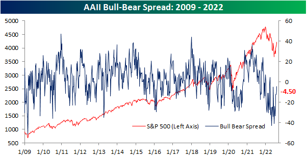
While the bull-bear spread remains negative for the AAII survey, other sentiment surveys have been showing more bullish sentiment. The Investors Intelligence survey has had a positive bull-bear spread for three weeks in a row now, and the NAAIM exposure index has shown investment managers have been quick to add exposure to equities in recent weeks. Standardizing these three survey results (measuring each one in how many standard deviations from the long-term average they are), the NAAIM and Investors Intelligence surveys are now back into positive territory. In other words, these two surveys are actually showing sentiment as having moved slightly above what has been the historical norm. Meanwhile, the AAII reading is far more negative even if it is trending higher.

Additionally, those are the first positive readings in some time. For the NAAIM index, the z-score has not seen a positive reading in 15 weeks. That is the longest stretch without a positive reading since the first quarter of 2016 and prior to that, there have only been a handful of other streaks that have gone on as long. For the Investors Intelligence survey, it was an even rarer streak ending at 29 weeks long. That was the longest since one that went on for roughly a year and ended in May 2009. Prior to that, you would have to go all the way back to 1995 to find a longer streak.
Then there are the AAII results. Still going at 32 weeks long, the z-score has only been negative for as many consecutive weeks once in the survey’s history, and that was during 2020. All of this is to say that the AAII survey has been leaning more pessimistically than other surveys even as overall sentiment has largely made its way back to historically normal levels. Click here to learn more about Bespoke’s premium stock market research service.

Another Week, Another New High In Claims
Prior to revisions, last week’s reading on jobless claims rose back up to 260K which was only 1K below the post-pandemic high from two weeks prior. Although that number was revised lower by 12K this week, the latest week’s reading rose up to 262K. That marks the highest level for initial claims since mid-November and a level that would have been the highest since September 2017 excluding pandemic readings.

This time of the year is usually when initial claims tend to head lower from a seasonal perspective, however, in the current week that has less often been the case. That was also true this year as unadjusted claims rose back above 200K. At 203.6K, claims are above the comparable weeks of 2017 through 2019. Looking forward to next week, it has historically been one of the best weeks of the year for claims. The only year on record in which NSA claims have risen week over week for this specific week of the year was in 2020.

In last Thursday’s Closer, we highlighted just how large of a disconnect there has been between initial and continuing claims as the ratio of the two has surged to levels rarely seen in the history of the data. Continuing claims continue to run at far healthier levels than initial claims with this week’s reading well below the lows of the several decades before the pandemic. That being said, this week did see a modest increase to a new high of 1.428 million; the most elevated reading since the first week of April. Click here to learn more about Bespoke’s premium stock market research service.

Bespoke’s Morning Lineup – 8/11/22 – Inflation Encore
See what’s driving market performance around the world in today’s Morning Lineup. Bespoke’s Morning Lineup is the best way to start your trading day. Read it now by starting a two-week trial to Bespoke Premium. CLICK HERE to learn more and start your trial.
“My fellow Americans, I am pleased to tell you today that I’ve signed legislation that will outlaw Russia forever. We begin bombing in five minutes.” – Ronald Reagan, 8/11/1984
Below is a snippet of content from today’s Morning Lineup for Bespoke Premium members. Start a two-week trial to Bespoke Premium now to access the full report.
Politicians are always getting themselves into trouble with hot mics, and with US Presidents, it has happened more than once with respect to Russia. Besides the Reagan comment above, remember ten years ago when President Obama was caught telling Russian President Medvedev that he would have more ‘flexibility’ after the election? Outside of Russia, President GW Bush was once caught on audio at a rally telling VP Cheney that a certain New York Times reporter was a “major league ___-hole”? And then there’s President Biden. Who can forget the ceremony for the signing of the Affordable Care Act into law when Biden as VP grabbed the President and told him that “This is a big f___-ing deal!”
Politicians live their lives under the camera, so it’s only natural that they get caught making these embarrassing comments from time to time, but in a society where everything is recorded, a parent’s advice that you should never say or do anything that you would be embarrassed for your parents to see or hear is more fitting than ever.
In markets today, futures suggest that yesterday’s rally will have additional legs, but PPI and Initial Jobless Claims will have a say over whether these gains can continue throughout the trading day. PPI was much weaker than expected at both the headline and core level and jobless claims were right about in line with expectations. Treasury yields are lower at the long end of the curve, bitcoin is higher and crude oil prices are back above $90 even as OPEC says it sees the market moving into a surplus at some point this quarter.
Today’s Morning Lineup discusses earnings and market news out of Europe and the Americas, overnight economic data, and much more.
Usually, when the market rallies, the VIX declines, and after yesterday’s rally, the VIX closed below 20 for the first time since April 4th after a run into the low 30s during the worst of the market declines earlier this year. One notable aspect of the sell-off during the first half of 2022 was the fact that the VIX didn’t reach extremely high levels that have been typical of prior sell-offs. Therefore it had less distance to fall in order to get back below 20. You’ll notice in the chart below that during the rally in late Q1, the VIX also managed to briefly close below 20 before bouncing back into the 30s, so it will be important to watch and see whether it can stay around these levels in the future.

The streak of VIX closes above 20 lasted 90 trading days, the longest since the 246 trading day streak that ended in March 2021 coming out of the COVID crash. That was the second longest streak of closes above 20 on record trailing only the 331 trading day streak that ended in December 2009. Before the COVID crash, in order to find another streak of 90 or more closes above 20 in the VIX or even 30 for that matter, you have to go all the way back to 2012.

Start a two-week trial to Bespoke Premium to read today’s full Morning Lineup.
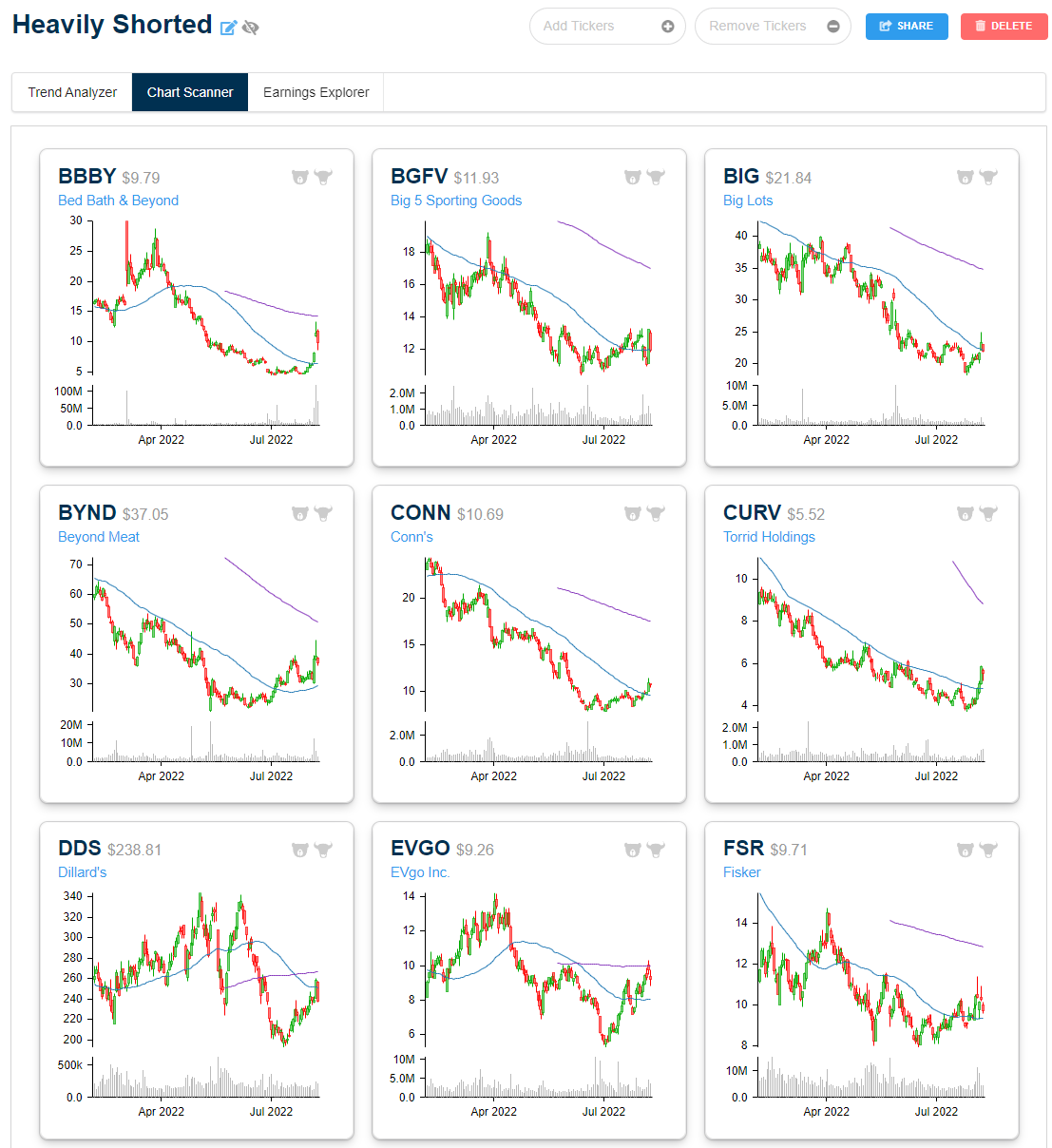
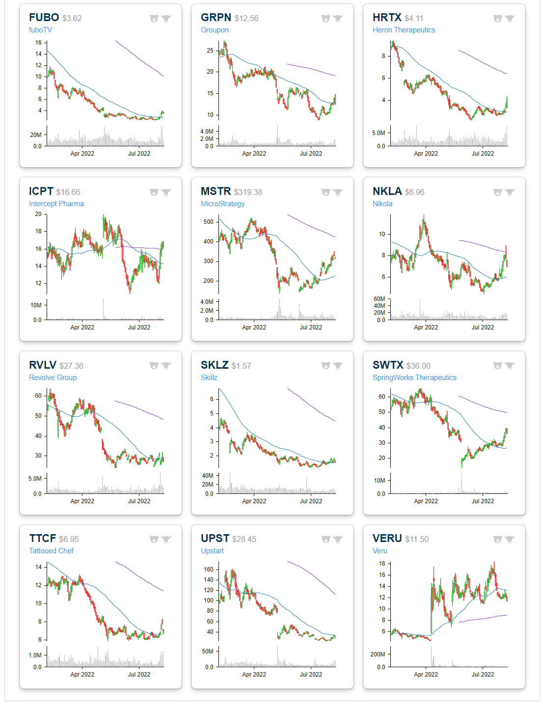
High Short Interest Revival
As we detailed in last night’s Closer, whatever name that it might be given—meme stocks, yolo trades, or “stonks”—there has been a trend recently in which there has been strong performance of highly volatile names loved by the most risk tolerant retail investor. That is roughly a year and a half to the day of the meme stock mania where highly shorted names saw massive short squeezes driven by the retail community.
Since the mid-June lows, highly shorted names have again been outperforming. Below we show the chart of an index covering the 100 most highly shorted stocks going back to early 2020. The vast majority of 2020 gains have been erased, however, this index has also risen 46% since its June 16th low (the same date as the broader market’s low). On a relative basis, the most heavily shorted stocks have been outperforming the Russell 3,000 in that time resulting in the relative strength line to break out of the downtrend that has been in place since the peak of the meme stock mania in late January of last year. That being said, the index itself has much further to go in order to break out of its downtrend off of that high in price.

Below we show the stocks within the Russell 3,000 that currently have the highest levels of short interest as of the end of July. The only stock with more than 50% of its float sold short is Torrid Holdings (CURV). The next highest is a company that frequently finds itself high up on the list of highly shorted stocks: Dillard’s (DDS). While those readings are elevated, they are well below what had been the most heavily shorted stock a month and a half ago. As of the mid-June update, Redbox (RDBX) had an extremely elevated reading on short interest that was closing in on 100%. Today that reading has collapsed back down to a still elevated but less extreme 41.5%. We would also note, however, that RDBX is a messy story at the moment in the midst of an acquisition (confirmed to go through in the past 24 hours) with the potential to save the company from bankruptcy.
Other notables on the list of most heavily shorted stocks include grill-maker Weber (WEBR), Bed Bath & Beyond (BBBY), Upstart (UPST), Big 5 Sporting Goods (BGFV), Beyond Meat (BYND), Groupon (GRPN), and Nikola (NKLA). Click here to learn more about Bespoke’s premium stock market research service.

Below is a look at price charts for most of the heavily shorted stocks listed in the table above. While many of these names are up huge since mid-June, the gains hardly register on six-month charts because they got hit so hard in the first half of the year. Bespoke subscribers can create Custom Portfolios on our website like the one below to easily monitor baskets of stocks and ETFs. Start a two-week trial to test out the service today!