S&P 500 Stocks: Worlds Apart
If you’ve been paying attention this year, you know that the S&P 500 has been carried by the performance of the index’s largest components, and the chart below illustrates just how wide the disparity has been. It shows the YTD performance of each of the S&P 500’s members sorted by their market cap heading into 2020 with the largest stocks on the left side and the smallest stocks on the right. So far this year, the 50 largest stocks in the S&P 500 are up an average of 11.3% YTD, and if we were to take an even narrower look at just the ten largest stocks heading into the year, the average YTD gain is over 27%!
While the largest stocks are up a lot this year, the next 400 stocks in terms of market cap haven’t fared nearly as well, averaging a decline of 2.0%. That’s not great, but considering the pandemic this year, even a 2% decline isn’t such a bad thing. The same can’t be said for the smallest stocks in the S&P, however. As shown below, the 50 smallest stocks are down an average of 15.3% YTD, and more than two-thirds of them are down!
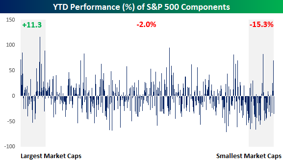
Another way to illustrate the declining fortunes of stocks this year based on their size is by looking at a moving average of YTD stock performance across the market cap spectrum, In the chart below, the first point on the chart represents the performance of the 50 largest stocks in the S&P 500 which have gained an average of 11.3% YTD. The next point to the right represents the average YTD change of the stocks that ranked between number 2 and 51 in terms of market cap at the start of 2020, and we continue that process down the entire list of components to the point where the last point in the series on the right side of the chart represents the average performance of the 50 smallest stocks in the S&P 500 heading into the year. As mentioned above, that group of stocks has averaged a decline of 15.3% YTD. The performance of the 50 largest stocks in the S&P 500 ranks as the fourth-best of 451 different points on the chart, while the basket of the 50 smallest stocks ranks as the 29th worst performing basket. In 2020, the bigger the stock, the better the returns. Click here to view Bespoke’s premium membership options for our best research available.

Chart of the Day: Calling All Calls
Claims Still Hovering Around 1 Million
Seasonally adjusted jobless claims continue to hover right around 1 million as forecasts were predicting. This week’s reading of 1.006 million was down 98K from 1.104 million last week and remains around some of the lowest levels of the pandemic. But as we have frequently mentioned, that is still very elevated relative to the rest of history.

On a non-seasonally adjusted basis, claims have likewise continued to fall as is the seasonal norm for this time of year. NSA jobless claims came in at a pandemic low of 821.59K this week, down from 889.55K last week. Again, although NSA claims have been lower, there are seasonal headwinds. Headed into the fall, claims tend to experience a seasonal bottom by mid-September, so NSA claims could begin to tick higher in the coming weeks.

As for seasonally adjusted continuing claims, there was also a small improvement falling from 14.76 million to 14.54 million. That is a fourth consecutive week in which continuing claims have declined.
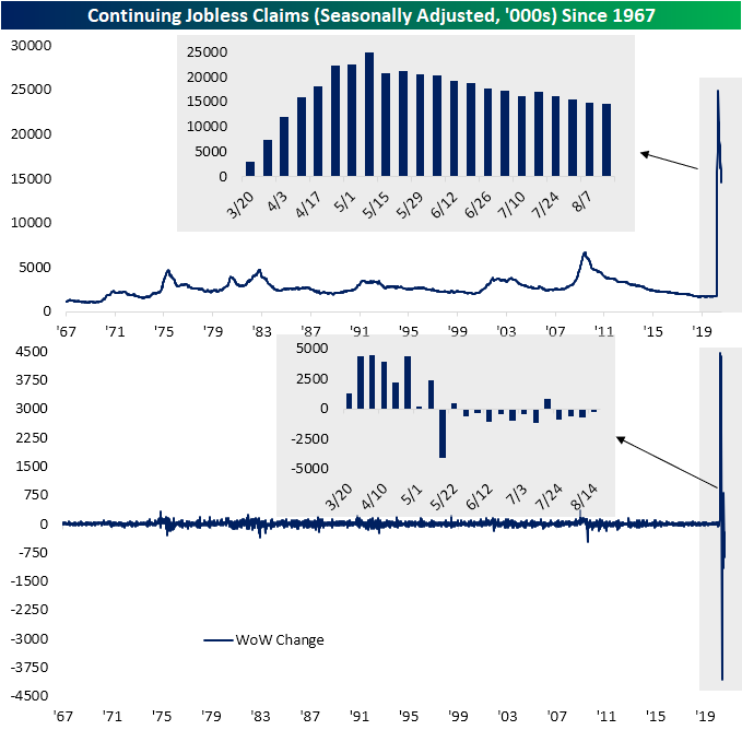
Factoring in Pandemic Unemployment Assistance (PUA), total NSA claims actually rose. Initial PUA claims rose from 0.53 million to 0.61 million for the second straight weekly increase. As for continuing claims (non-seasonally adjusted and lagged an additional week), total claims continued to fall in the first week of August reaching 25.2 million. That’s around the same levels as late April, but unlike back then, a much larger share of those claims are comprised of PUA claims.

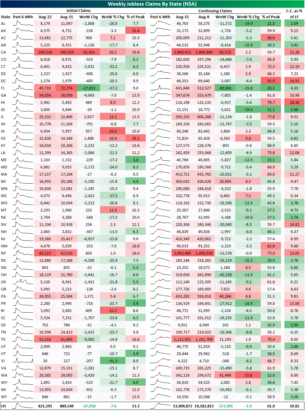
Finally, in the table below we show a breakdown of initial and continuing claims (both NSA) by state. As depicted, California, Illinois, Iowa, Kansas, and Montana all saw the largest percentage increases in initial claims this week, but not all of those are that elevated relative to where they have been in recent months. Kansas and Alaska are reporting claims that are the least improved from their pandemic peak. Additionally, the bulk of states have reported an improvement this week. Of the 53 states and territories, 41 reported lower claims this week. While not quite as strong, the same can be said for continuing claims. 39 states reported a decline in continuing claims while 14 reported an increase. Based on continuing claims, California, DC, Hawaii, Nevada, and New York currently have the highest unemployment rates each in the teens (continuing claims as a percent of the state’s labor force). Click here to view Bespoke’s premium membership options for our best research available.
Bullish Sentiment Slowly But Surely Rising
Additional all-time highs this week helped to further boost sentiment as the percentage of investors reporting as bullish in AAII‘s weekly sentiment survey rose to 32.08% from 30.39% last week. That is the highest level of bullish sentiment since mid-June when it spent two weeks above 34%. Think about that for a minute. While the S&P 500 makes new record highs, still less than a third of these investors consider themselves bullish.
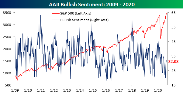
The gain in optimism took share from the bear camp as the percentage of bearish investors fell 2.78 percentage points to 39.62%. Although it remains the predominant sentiment reading, that is the lowest level since June 11th’s 38.05% reading. This week in addition to that June 11th reading and the prior week to that (June 4th) marks just the third time since the bear market low that bearish sentiment was below 40%. Before those June readings below 40%, you would need to go back to the first week of March to find the last time bearish sentiment was below 40%.

Given the opposing moves in bullish and bearish readings, the bull-bear spread is still negative as the record streak of negative readings grows to 27 weeks long. The spread is now the closest it has been to zero since June 11th.

Not all of the losses to bearish sentiment went to the bulls. Neutral sentiment is still in the same range it has been in all of August, rising to 28.3% this week. Click here to view Bespoke’s premium membership options for our best research available.

COVID Concerns and Case Counts
In Monday’s Closer, we took a look at data from YouGov’s COVID-19 Public Monitor which surveys people from countries around the globe on various COVID related topics such as if they were worried about contracting COVID-19, do they wear a mask when out in public, and do they avoid crowds.
In the charts below, we show the average readings of these survey results (blue line, left axis) across the countries of each region that have data available compared to the seven day average of total new case counts for those same countries in each region (red line, right axis). Broadly speaking and as could be intuitively expected, as case counts rise, higher shares of people report being more concerned about contracting the virus. European countries (Denmark, Finland, France, Germany, Italy, Norway, Spain, Sweden, and the UK) perhaps show this relationship the most cleanly as cases fell through the spring alongside concerns of contraction, but from June through the most recent readings earlier this month, concerns and case counts have steadily risen. Since July, APAC countries (Australia, China, Hong Kong, India, Indonesia, Japan, Malaysia, Philippines, Singapore, Taiwan, Thailand, and Vietnam) have similarly seen worries over catching COVID climb as the averages for daily new cases for those countries have also risen. Granted, worries were on the decline up through July despite rising cases. Meanwhile, US worries about catching the virus were at their highest levels yet as of early August, and that is even though case counts have been on the decline since the second half of July.
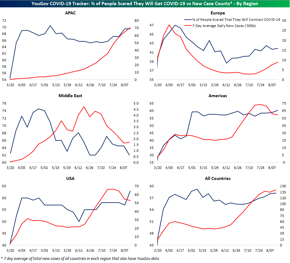
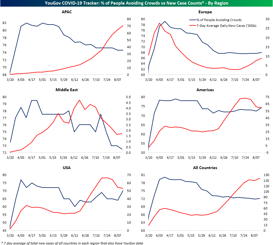
Fortunately, Americans seem to be proactive. As shown below, as those concerns have risen, a higher share of Americans have reported that they wear a mask when they go out in public. That potentially could be one of many factors in the recent decline in case counts. Granted, there has been a growing trend around the globe of more people wearing face masks, and that inverse relationship between masks and new cases is not necessarily shared in regions like Europe. As shown in the top-right chart, despite a record number of Europeans who say they wear a mask in public, COVID cases are back on the rise.

As for another spread mitigation measure, avoiding crowds, the same can be said for the US. As case counts have declined more people have been avoiding crowds. In Asia and Europe, though, fewer people have been avoiding crowds compared to earlier in the pandemic which may help to explain why case counts are rising. Click here to view Bespoke’s premium membership options for our best research available.
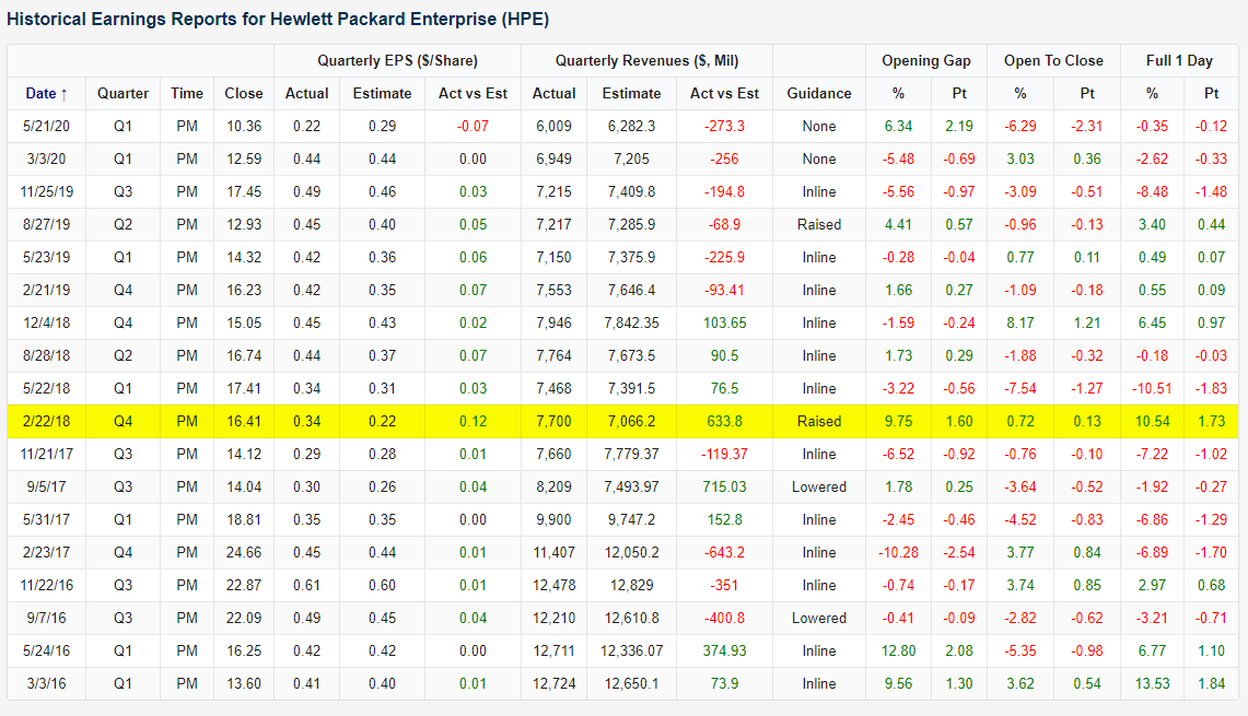
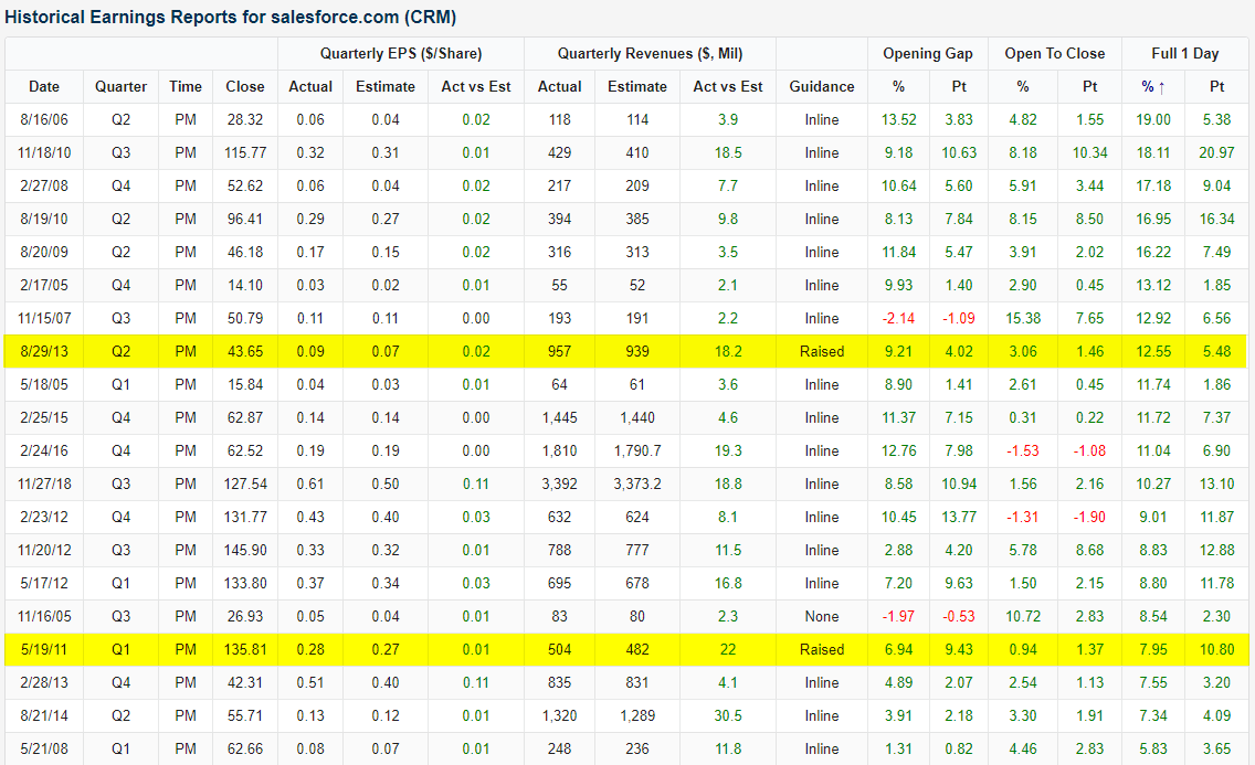
Biggest Beats Provide Big Bumps for HPE, CRM, and PLAN
With earnings season now in the rearview, the earnings front has been fairly quiet with retailers along with a handful of other big companies like salesforce.com (CRM) taking up the bulk of the calendar. While the new addition to the Dow reported a strong quarter last night with EPS exceeding estimates by $0.77 and sales coming in at $5.151 billion versus estimates of $4.9 billion, another former Dow component, Hewlett Packard Enterprise (HPE), reported a triple play. A triple play is considered the gold standard on earnings and is when a company beats estimates on the top and bottom line as well as raises guidance. For HPE, this was the first triple play since Q4 2018 (as shown in the snapshot of our Earnings Explorer below) as EPS was 9 cents above estimates and sales were $6.8 billion compared to estimates of $6.06 billion. The stock is up over 6.5% in response today. That is the best response to earnings since that last triple play.
As for CRM, the stock is rallying by much more with a gain of over 25% today in response to these strong earnings. As shown below, those gains put the stock on pace for its best response to earnings on record, exceeding the prior record of a 19% rally back in Q2 of 2006. Of the 20 other top reactions to earnings, only two were triple plays.
A frequent flier in the triple play club, Anaplan (PLAN), also reported in the past 24 hours and the results are basically a combination of HPE and CRM’s earnings. Like HPE, PLAN reported a triple play with a loss of 4 cents per share versus estimates for a loss of 12 cents. Revenues were up 26% YoY to $106.5 million; roughly $3 million better than expected. But unlike HPE, and more similar to CRM, the stock is getting a massive upwards boost from these results with the stock higher by over 25%. Just like CRM, that is on pace for the best earnings day reaction to date.

As for where those moves leave these stocks from a technical perspective, HPE is breaking out of the past year’s downtrend thanks to this boost on earnings and is now at the upper end of the range that it has traded in for most of 2020. Meanwhile, CRM is much more elevated as it has been in a long term uptrend, and today’s gains bring it well into new all-time high territory. PLAN’s big gains, on the other hand, have not even resulted in a 52-week high but is now sandwiched between the post IPO highs from the summer of last year and February of this year. Click here to view Bespoke’s premium membership options for our best research available.

Chart of the Day: No Selling in salesforce.com
Fifth District Flies While Future Outlook Falls
This morning, the Richmond Fed released the results of their monthly manufacturing survey for the month of August. The report showed a solid expansion of activity in August albeit on waning optimism for the future. General manufacturing activity in the Fifth District continued to expand in August with the index rising 8 points to 18. That is the highest level since an equivalent reading in October of 2018. That eight-point increase is still fairly large relative to the rest of history (in the 80th percentile of all month over month changes), but it was actually the least volatile move in the index since March.

In the tables below we show the results of this month’s survey for each of the sub-indices of the report for both current conditions and future expectations. While the indices for current conditions broadly improved—as evident through the headline number’s rise—expectations have declined dramatically. As shown in the second table, last month saw most readings in the top percentiles of all historical readings for the indices for future conditions, but this month every index with the exception of Capital Expenditures has fallen with those declines in the bottom 2.5% or worse of all monthly moves. This was the first time since October of 2015 that all but one of the 17 indices for future expectations fell in the same month. Sentiment towards the future saw a pretty significant turnaround in the span of a month.


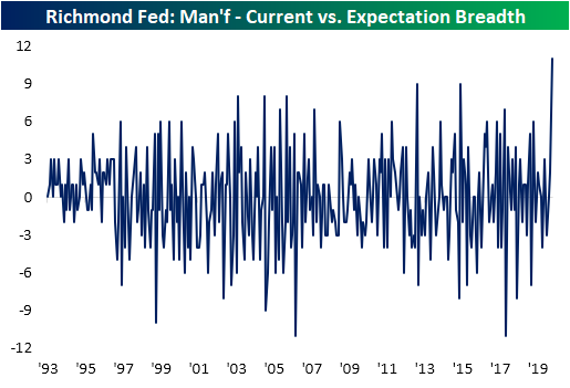
The big divergence between the moves in the indices for future expectations and current conditions can be illustrated in the chart below. In it, we show the spread between the counts of indices for current conditions rising less the number for future expectations that are rising MoM. With 12 current conditions higher compared to only 1 for future expectations, this spread was at its highest level on record.
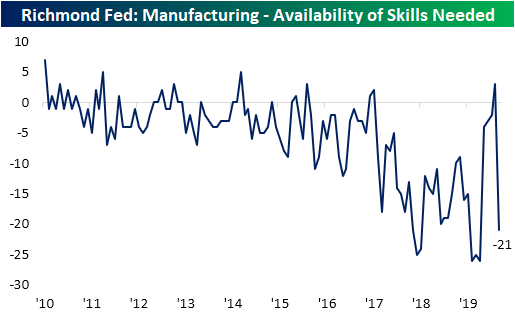
Future indices were not alone in experiencing historically big moves though. As shown below, the index for the Current Number of Employees climbed to its highest level since March of last year thanks to a 20 point jump in August. That is the most this index has gained in a single month ever. Additionally, that marked the first expansion in employment since February. But on the other hand, the index for Availability of Skills Needed plummeted by 24 points to a contractionary reading of -21. That marks a return to contractionary readings after a one month break in July and the lowest level for this index since March. In other words, businesses are beginning to ramp up hiring, but they are struggling to find workers with the right skills.

Alongside labor, capital is also on the up and up with the indices for Equipment and Software Expenditure and Capital Expenditure both moving into expansionary territory for the first time since March. For Capital Expenditures, this month’s increase was in the top decile of historical moves as well. Meanwhile, Business Services Expenditure remains weak but likewise improved in August rising from -23 to -18.

In addition to the manufacturing indices, the Richmond Fed also released service counterpart indices. These have fared far worse throughout the pandemic with most readings continuing to sit in contraction territory, but there has continued to be some improvement. August saw all but one of these indices for current conditions increase. This brought the indices for Revenues, Employees, and Wages all out of contraction. But, like the manufacturing report, future expectations hit the brakes. Start a two-week free trial to Bespoke Institutional to access our interactive economic indicators monitor and much more.


Chart of the Day: Big Changes for the DJIA
Weak Breadth in Strong Months
Yesterday’s 1% rally for the S&P 500 was also accompanied by positive breadth (for a change) as 412 stocks in the index finished in positive territory on the day. On a net basis, subtracting the number of decliners from the number of advancers, yesterday’s A/D reading of +322 was the strongest breadth reading since late July. Prior to yesterday’s rally, the strongest daily breadth reading for the month of August was +214 on August 7th. For a month where the index was already up 4% heading into the day, that’s pretty weak.
Breadth in August has been so weak in fact that Monday’s rally was only the 8th day out of 16 trading days in August where the S&P 500 had positive breadth. There’s still another five trading days left in the month, so breadth still has plenty of room to improve, but at the current rate, this month would go down as just the 12th month since 1990 where the S&P 500 was up over 4% but saw negative daily breadth on at least half of all trading days. The last time that happened was in July…of this year. And before that, May. We’ve already had two months in 2020 where the S&P 500 was up at least 4% and half of all trading days had negative breadth readings, and we’re now on pace for the third.
The chart below shows each of the prior times since 1990 where we saw similarly strong months with lackluster breadth. Before the two prior occurrences this year, the most recent was March 2009. Looking at the chart, that occurrence preceded a great time to be long the market. Before that, though, returns following similar breadth divergences were mixed as there were occurrences right in the middle of the bear markets from 2007-2009 as well as 2000-2002, and before that there were six occurrences in the 18 months leading up to the March 2000 peak. Click here to view Bespoke’s premium membership options, including the must-have Morning Lineup report.
