Chart of the Day: Oil Majors & The Renewables Shift
Continuing Claims Streak Of Declines Back On The Ropes
Over the past few weeks, initial jobless claims have seen a significant improvement falling to pandemic lows in the 500K range. Even with last week’s reading getting revised up by 19K to 566K and this week’s print missing expectations coming in 3K above estimates of 550K, the picture of the US labor market broadly remains positive. This week marked the first streak of three sequential weekly declines since November. At 553K, claims are also at the lowest level since the first half of March of last year and are below the peaks of past recessions.

Including the other major unemployment insurance program, the Pandemic Unemployment Assistance Program (PUA), the picture is the same. Non-seasonally adjusted claims between the regular state programs and PUA claims are at a new low on a combined basis dropping below 700K for the first time. Regular state claims have consistently accounted for a majority of initial claims and that has increasingly been the case over the past few months. PUA claims dropped 11.6K week over week to a new low of 121.75K which only accounts for roughly 17.5% of all initial claims. That compares to an average of 32.23% since the program first began to be tracked last year.

In spite of the pace of new claims entering the system having slowed recently, continuing jobless claims data has plateaued. Last week, we noted how a revision had brought back to life a record streak of consecutive sequential declines in continuing jobless. This week that streak once again looks like it has come to an end as continuing claims rose 9K to 3.66 million. Although that streak is over (barring any revisions down the road), it is in the context of a massive and rapid improvement in claims in a relatively short span of time. For starters, in the 50 weeks since the high in claims last May, there have only been seven weeks including the current one in which claims did not experience an improvement. Additionally, since falling below the 6.635 million level that had marked the pre-pandemic record high in claims from the Global Financial Crisis, claims have dropped another nearly 3 million in just under 6 months. By comparison, after the GFC peak, it took 128 months or over two and a half years for claims to move from that peak to a similar level as to now.

Including all programs adds some lag to the data meaning the most recent data is for the week of April 9th. Continuing claims across all programs fell 846K to 16.587 million. That is the second-lowest reading of the pandemic behind the first week of the year’s 16.05 million reading, although that week comes with the caveat of some irregularities on account of the timing of the signing of the spending bill. Essentially every program saw lower claims counts with the biggest drop coming from Pandemic Emergency Unemployment Compensation (PEUC) which fell by over 400K. Since the fall, this program as well as others that extend benefits beyond normal expiration have accounted for an increased share of total claims meaning a growing number of the unemployed have been facing long-term unemployment. Over the past several weeks, though, this reading has also been improving. Click here to view Bespoke’s premium membership options for our best research available.


Bespoke’s Morning Lineup – 4/29/21 – Facing the Music
See what’s driving market performance around the world in today’s Morning Lineup. Bespoke’s Morning Lineup is the best way to start your trading day. Read it now by starting a two-week free trial to Bespoke Premium. CLICK HERE to learn more and start your free trial.
“I didn’t know what Facebook was, and now that I do know what it is, I have to say, it sounds like a huge waste of time.” – Betty White
“Toxic” “Divisive” “Waste of Time” “Useless” These are just some of the adjectives we’ve heard to describe the Facebook (FB) platform over the last 24 hours, and they’ve come from analysts and investors who have nothing but positive things to say about the company’s profitability and business model. Facebook proved that last night with a blowout earnings report that surpassed even the most optimistic of forecasts. While people may say they use Facebook’s services less and less, the numbers tell an entirely different story. People hate Facebook so much that they can’t get enough of it.
In economic news this morning, Jobless Claims were roughly inline with forecasts, GDP came in modestly weaker than expected, but data on prices surged 4.1% compared to forecasts for an increase of just 2.6%.
Read today’s Morning Lineup for a recap of all the major market news and events including the biggest overnight events, some key earnings reports, economic data from around the world, as well as the latest US and international COVID trends including our vaccination trackers, and much more.

Facebook is on pace to gap up over 7.5% this morning, and based on our Earnings Explorer that would rank as the 10th largest upside gap in the stock in reaction to earnings since its IPO in 2012 and the 14th upside gap of 5%+ in reaction to earnings. Two of those 5%+ gaps have actually occurred in the last year (4/29/20 and 7/30/20). Of the prior 13 5%+ upside gaps, FB has continued higher from the open to close just four times with the largest gain coming in July 2013 when it tacked on an additional 2.4% finishing the day up just under 30%! Of the days where FB gave up ground during the trading session, declines were typically modest with the largest giveback being 3.7% in October 2012.

Mega Cap Earnings Coming Up
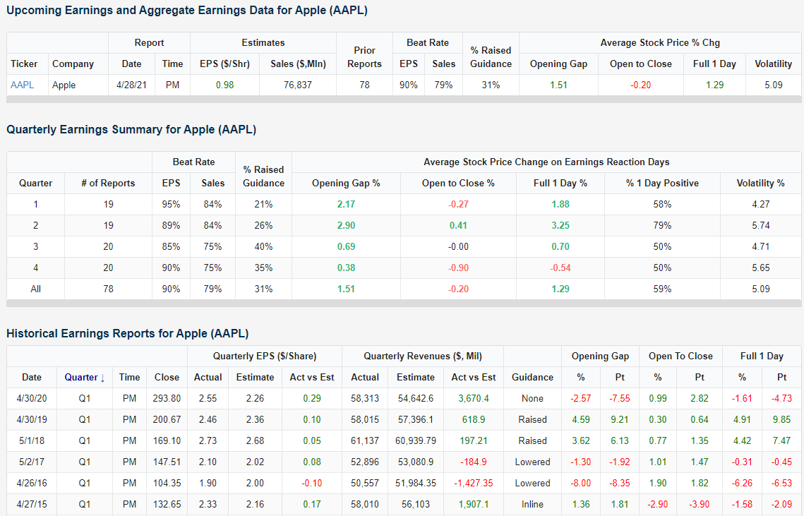
Among a large number of earnings reports over the next day and a half are some of the S&P 500’s largest companies. After the bell tonight, Apple (AAPL) and Facebook (FB) are set to report and Amazon (AMZN) will release earnings tomorrow night. For all three of these names, Q1 earnings have tended to be a solid quarter.
Starting with a look at Apple (AAPL), as shown in the snapshot from our Earnings Explorer below, Q1 has been the quarter with the highest EPS beat rate and is tied with Q2 for the strongest sales beat rate. While it is also the quarter where the company has raised guidance the lowest percentage of the time, the stock price reaction in Q1 has tended to be pretty strong. AAPL has risen in reaction to Q1 earnings 58% of the time with an average full-day gain of 1.88%. That ranks as the second-best quarter in both respects. It is also the least volatile quarter with an average move of 4.27%. While those results are fairly positive, taking a look at the past few years, the stock has only seen positive reactions when it has reported a triple play.
Facebook (FB) is entirely different. Q1 is actually the quarter with the worst beat rates for EPS and sales. In spite of this, it has been less volatile than other quarters and has also averaged the second strongest full-day performance with a gain of 3.64%. Most of that move comes from the opening gap of 4.6%; the best of any quarter. Also, no other quarter has been as consistent to the upside in terms of stock performance with a full day move higher 63% of the time. In fact, FB has not fallen in reaction to Q1 earnings since 2017.

Amazon (AMZN) is perhaps the best of these companies on first-quarter earnings. The stock has risen the day after reporting 63% of the time averaging a 4.21% move higher; the strongest performance for the stock of any quarter. Q3 and Q4 have typically seen AMZN trade lower despite guidance having been raised more often. Last year, the stock was hit hard after reporting Q1 results with a 7.6% decline, but prior to that, the stock was on a five-year streak of positive reactions for the comparable quarter. Click here to view Bespoke’s premium membership options for our best research available.

Flat Fed Day
In spite of a busy earnings slate, it has so far been a boring session with the S&P 500 fairly flat up only a few basis points on the day ahead of the FOMC’s rate decision. Performance today is more or less going along with the historical performance on Fed days. In the first chart below we show the median intraday performance of the S&P 500 on Fed days going back to the mid-1990s. Times in which rates have been held steady, as is expected today, have happened the most often. Similar to today, these days normally see the S&P 500 up just a few bps throughout the morning before ramping up headed into the FOMC decision around 2 PM ET. Some of those gains then get erased in the final hour of trading.

As for during Powell’s tenure, it has been another story. Again on a median basis the S&P 500 trades slightly higher during the morning although in the early afternoon there is a drift lower. While there has been a pop on the immediate release of the decision, usually around the time of the presser through the end of the session, the S&P 500 has tended to decline. In fact, the median decline in the S&P 500 by the end of the day has been 14 bps during Powell’s tenure. Over just the past year, we’ve still seen late-day weakness but the market has still managed to close in the green. Click here to view Bespoke’s premium membership options for our best research available.

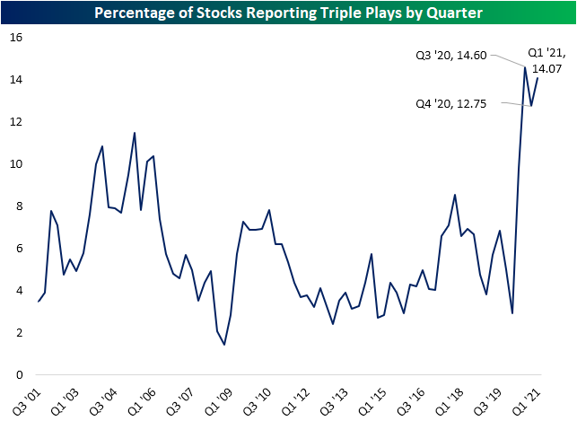
Triple Plays Waking Up With Good Breadth
Since March 1st, three-quarters of companies have beaten consensus analyst estimates on the top and bottom line, while 16% have raised guidance. Given this, the number of stocks reporting a triple play—EPS and sales beat alongside raised guidance—has been back on the rise. In the chart below we show the percentage of stocks reporting triple plays by quarter throughout the history of our earnings database dating back to 2001. With strong beat rates over the past year, the rate of triple plays has ripped higher to unprecedented levels. After a slight dip during the Q4 2020 reporting period, 14.1% of all earnings reports have been triple plays since March 1st. That’s almost as high as the record reading of 14.6% seen during the Q3 2020 period.
One interesting aspect of earnings over the past year has been stock price reactions. Perhaps due to a higher number of companies doing so, a company exceeding sales or EPS estimates or reporting a triple play has lost some of its luster. Particularly for triple plays, historically these stocks have averaged a 5.22% rally on their first full trading day after earnings. (For stocks that report after the close, we’re referencing its change on the next trading day. For stocks that report before the open, we’re referencing its change on that trading day.) In the two earnings seasons prior to the current one, the average full-day stock price reaction was not even half of that. So far this earnings season, average reactions for triple plays remain well below the historic average, but they are improving. Triple plays have averaged a 4.68% gain on Q1 earnings this year. Reactions to earnings more broadly have seen the same dynamic play out. Reactions in aggregate have been on the weak side but are recovering.

Not only have there been a higher number of triple plays with improving stock price reactions to boot, but the composition of the stocks reporting triple plays has also been changing. In the charts below we show the percentage of stocks reporting triple plays by sector going back to 2001. Historically, the Tech sector has dominated triple plays. Going back to 2001, the average quarter would see 11.63% of the sector’s stocks report a triple play. No other sector even touches double digits with the runner-up being Health Care with 7.33%.
While there are still plenty of earnings reports left on the docket this season, the reading at the moment for the Tech sector is at 23.93%. Although that is still extremely strong, more than double the historical average, it is lower for the second quarter in a row. Meanwhile, other sectors are seeing their shares of stocks reporting triple plays surge. For example, Industrials, Consumer Discretionary, and Materials currently all have a record percentage of stocks reporting triple plays. Though not at records, Communication Services and Real Estate also have very high readings. When it comes to triple plays, the numbers are really expanding to sectors outside of Tech. Click here to view Bespoke’s premium membership options for our best research available.

Chart of the Day – Biden Nears the Top of List
Bespoke’s Morning Lineup – 4/28/21 – Yields Creeping Higher
See what’s driving market performance around the world in today’s Morning Lineup. Bespoke’s Morning Lineup is the best way to start your trading day. Read it now by starting a two-week free trial to Bespoke Premium. CLICK HERE to learn more and start your free trial.
“I believe that if you show people the problems and you show them the solutions they will be moved to act.” – Bill Gates
Despite another round of blowout earnings since yesterday’s close, futures are flat to modestly lower. The economic calendar is light again today, but the pace of earnings will continue to be busy, and this afternoon, all eyes will be on the FOMC with its latest views on rates and the economy.
Read today’s Morning Lineup for a recap of all the major market news and events including the biggest overnight events, some key earnings reports, economic data from around the world, as well as the latest US and international COVID trends including our vaccination trackers, and much more.
Concerns over interest rates have taken a back seat lately, mostly because yields have been moving lower for the last several weeks. In recent days, though, we have started to see a modest reversal of that trend. Just as the yield on the 10-year US Treasury tested its 50-DMA, yields have started to move higher in recent days. This morning, yields are ticking slightly higher, and that has resulted in an upside break of the short-term downtrend from the peak yield in March. With an FOMC announcement and press conference coming up later today, it’s pretty safe to assume that yields are going to start getting a bit more attention.

Chart of the Day: 20-Year Rolling Performance
Soaring Home Prices
We got yet another data point on surging home prices today with the monthly release of Case Shiller indices. These numbers are lagged by two months so they don’t exactly provide a real-time look, but at least through February, home prices continue to soar. The table below shows month-over-month and year-over-year home price moves across the 20 cities tracked by the Case Shiller indices. The west has seen a big jump lately with San Diego, Seattle, San Francisco, and Phoenix all rising more than 2% month-over-month. Chicago and New York saw prices rise the least MoM at just 0.30% and 0.55%, respectively.
Nearly every city is up double-digit percentage points year-over-year. Phoenix and San Diego are up the most YoY with gains of ~17%, while Chicago is up the least with a gain of 8.71%. Click here to view Bespoke’s premium membership options for our best research available.

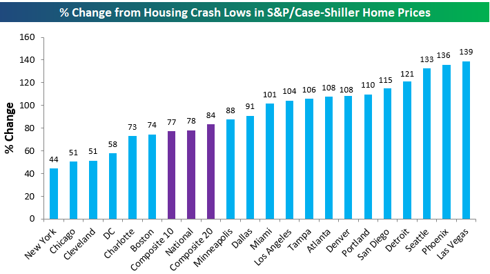
We like to look at home price trends relative to where they stood at various points during the mid-2000s housing bubble and subsequent crash. The chart below looks at where home prices stand now versus the lows that were made in the early 2010s after the bubble burst. As shown, the national index is now up 78% from its housing crash low, and eleven of twenty cities are up more than 100% from their lows. Las Vegas, Phoenix, and Seattle are up the most with gains of more than 130%, while New York is up the least and the only city that’s not up more than 50%.
The better chart is the one that looks at where home prices are now relative to their high points at the peak of the prior housing bubble. We’re now more than fifteen years removed from the prior peak for home prices in 2005/2006, and at this point only three of the twenty cities tracked have not made new all-time highs. Those three cities are are Las Vegas, Chicago, and Miami. Miami is the one closest to making new highs at just 2%, while Las Vegas prices are still 9% below their highs made in August 2006. The composite indices and the seventeen other cities have all managed to take out their housing bubble highs. Denver, Dallas, and Seattle are all up more than 50% above their prior all-time highs.

Below are price charts for all of the cities and composite indices tracked by Case Shiller. Cities not highlighted in green are the ones still below their prior housing bubble highs.


