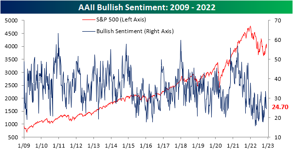
Sentiment Staves Off Lower Readings
Sentiment tipped over before the S&P 500’s rough start to December. Without the market giving investors any more reason to take a bullish stance, the latest sentiment data from the AAII showed that once again less than a quarter of respondents reported as bullish. This week’s reading was actually slightly higher rising 0.2 percentage points to 24.7%, a reading in the middle of this year’s range.
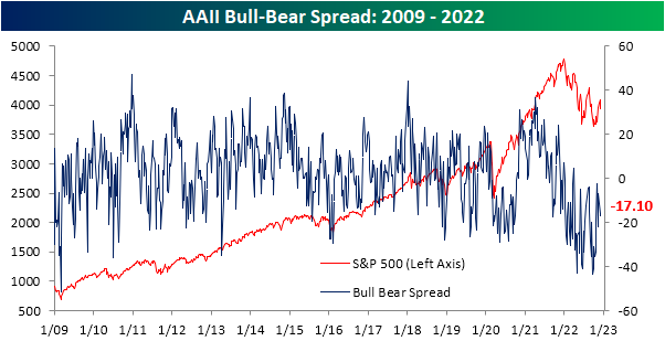
Although bullish sentiment was higher, bearish sentiment rose by more with the reading going from 40.4% to 41.8%. That is the highest level since November 10th. While bearish sentiment has remained in a relatively tight range just above 40% for the past four weeks, current readings are more muted than what had been observed throughout most of the past year when there have been plenty of readings above 50%.

Overall, sentiment continues to heavily favor bears with a 17.1 percentage point spread between bulls and bears. That extends the record streak of negative readings to 36 weeks.
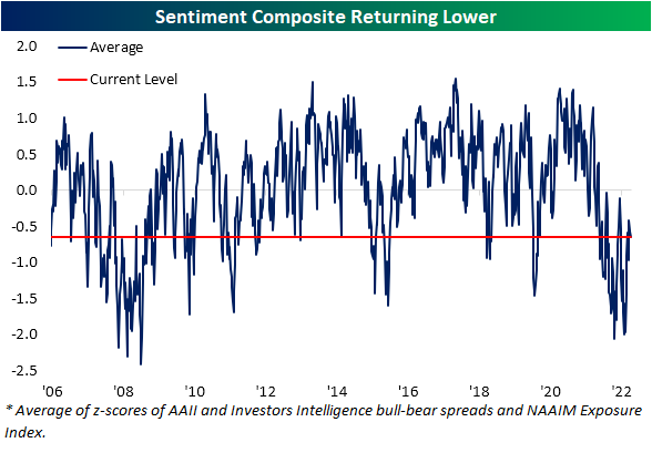
While the AAII survey was overall little changed, other sentiment readings were a bit mixed. The NAAIM Exposure index dropped to the lowest reading in a month. Conversely, the Investors Intelligence survey saw bulls surge to the highest level since late August combined with the lowest reading in the percentage of respondents expecting a correction since June. Aggregating all of these readings points to sentiment taking a bit more pessimistic of a stance this week than what has been observed over the past month. Click here to learn more about Bespoke’s premium stock market research service.
Muddled Continuing Claims Seasonality
At first glance, recent data on jobless claims have not painted a pretty picture of the labor market. For seasonally adjusted initial claims, things have not soured too dramatically although recent readings remain well off the lows from earlier this year. In the latest week’s data, claims rose another 4K to 230K compared to last week’s upward revision of 226K. Given the moves in claims have been somewhat choppy over the past couple of months, the four week moving average has also risen to 230K, the highest reading since the first week of September. In other words, claims are still below summer highs but modestly trending back up to those levels.

On a non-seasonally adjusted basis, the move in the latest week’s reading is right in line with what could have been expected given seasonality. Jobless claims have historically risen over 80% of the time for the current week of the year with an average increase of 85K week over week. The 87K increase this week was right in line with that average and brings the indicator up to similar levels as the comparable weeks of 2017 through 2021 (excluding 2020).

Continuing claims have been the much more worrisome side of jobless claims recently. The seasonally adjusted reading has rocketed higher over the past several weeks, rising to a new high of 1.671 million this week. That is the most elevated reading since the first week of February. Whereas continuing claims had spent a long time below the pre-pandemic range, this latest reading is right back into that range. As we have noted in the past couple of weeks as well (see here and here), the rapid uptick in seasonally-adjusted claims has been consistent with the rise in claims during past recessions, meaning that even if claims are well below where they have been in the past, the speed and direction they have headed are worth keeping an eye on.

While continuing claims are flashing recessionary warning signs after seasonal adjustment, with the latest week’s data (the last week of November) covering a holiday, there are always some difficulties with the seasonal adjustment. On a non-seasonally adjusted basis, claims are still lower than comparable weeks of the year over the past 20 years (top chart below) as claims experience their typical swing higher for this point of the year. As shown in the second chart below, the current week of the year has historically experienced a large uptick. In fact, the average w/w increase for the current week has been 328K, roughly in line with the 300.9K rise in the latest data. Similarly, the total increase off the early October low (+363.5K) has likewise been smaller than the historical median of 538K.

In spite of the tendency of the large swing higher week over week historically, seasonal factoring was not quite as pronounced. As shown below, the seasonal factor was much weaker for the latest week’s data than say the prior few weeks. That is not to say the seasonal adjustment is necessarily wrong or worries of recession as a result of recent moves in the adjusted number are not without merit, rather it is worth noting that the seasonally adjusted number could be sending the message of a more elevated reading on claims than in actuality. In other words, it is not perfectly clear how much of the increase in continuing claims has been the result of seasonality or the beginnings of recession. Click here to learn more about Bespoke’s premium stock market research service.

Bespoke Charts of the Week — 12/8/22


Not yet a member? Subscribe to one of Bespoke’s three membership levels below to receive more in-depth market research and analysis from Bespoke on a daily basis!

Bespoke believes all information contained in this report to be accurate, but we do not guarantee its accuracy. Bespoke’s Charts of the Week is for educational purposes only. None of the information in this report or any opinions expressed constitutes a solicitation of the purchase or sale of any securities or commodities. As always, past performance is no guarantee of future results.
Bespoke’s Morning Lineup – 12/8/22 – Imagine…An Up Day
See what’s driving market performance around the world in today’s Morning Lineup. Bespoke’s Morning Lineup is the best way to start your trading day. Read it now by starting a two-week trial to Bespoke Premium. CLICK HERE to learn more and start your trial.
“Happiness is just how you feel when you don’t feel miserable.” – John Lennon

Below is a snippet of content from today’s Morning Lineup for Bespoke Premium members. Start a two-week trial to Bespoke Premium now to access the full report.
Futures have been steadily improving as we head into the opening bell as the S&P 500 looks to end a streak of five straight declines. European equities have been basically flat trading in a range, while treasury yields and crude oil are higher. One notable asset class that hasn’t been moving at all is bitcoin. In the span of the last 24 hours, the world’s largest cryptocurrency has traded in a range of less than 1%. Looking ahead, the only economic reports on the calendar today are initial and continuing jobless claims. After that, all eyes will shift to Friday’s PPI…and then CPI and the Fed next week.
Happiness is not a feeling the bulls have after the first week of December. The Nasdaq just completed its worst first week to December since 1975. Think about that. Chances are you had no idea what the stock market even was the last time the Nasdaq started off December this bad. Weakness hasn’t just been isolated to the Nasdaq and growth stocks either. While some sectors have done worse than others, they’re all down over the last week as Powell’s speech last week at the Brookings Institution fades into the rearview mirror.
Leading the way lower, Energy has plunged over 6.5% as weaker oil and natural gas prices finally catch up to the sector. There’s no need to feel bad for Energy, though, as it’s still up over 58% YTD and is more than 57% percentage points ahead of the next closest sector (Utilities). Other sectors that have been under pressure since December started were Consumer Discretionary, Financials, Technology, and Communication Services. At the other end of the performance spectrum, Health Care and Utilities get the participation trophies as they’re both down less than 1% MTD.
As bad as December has been to start, one potential bright spot is that every sector except for Energy and Consumer Discretionary remains above its 50-day moving average, so if you want to take the optimistic approach, the last week can still be considered a digestion of the rally off the October lows.
One last side note. This year has been unique for a lot of reasons, but how often is it that you see Energy and Consumer Discretionary simultaneously leading the market to the downside?

Our Morning Lineup keeps readers on top of earnings data, economic news, global headlines, and market internals. We’re biased (of course!), but we think it’s the best and most helpful pre-market report in existence!
Start a two-week trial to Bespoke Premium to read today’s full Morning Lineup.
Losses Chase the JPMorgan Chase (JPM) Moving Average Crossover
Banking stocks had been outperforming the broader market throughout most of the fall, but that reversed in a big way in November and even more so this month. The largest stock in the S&P 500 Banking Industry, JPMorgan Chase (JPM), however has been a notable outperformer. As shown below, relative to other S&P 500 banks, JPM has seen its relative strength rip higher.

Although it has reverted lower more recently after trading well above its 50-DMA, the stock has experienced a notable moving average crossover as its 50-DMA has risen above the 200-DMA. That is the first time the 50-day has been higher than the 200-day since the start of the year. From a technical perspective, these types of patterns are considered positive, especially when both are rising (golden cross).

In spite of that bullish reputation, the actual performance following past moving average crossovers where the 50-DMA trades above the 200-DMA is not particularly noteworthy nor should it generate a massive amount of optimism. As shown below, on an average basis, JPM has fallen one week and one month after past occurrences that have happened without another instance in the prior three months. That compares to gains of 0.25% and 1.05%, respectively, for all other periods. Looking further out, average performance has only been notably better than normal three months later albeit that is paired with less consistency to the upside. In other words, moving average crossovers to the upside are not necessarily the positive technical pattern many chart watchers consider them to be. As always, past performance is no guarantee of future results. Click here to learn more about Bespoke’s premium stock market research service.

Chart of the Day: TLT Spikes
S&P 500 (SPY) December Drop
The S&P 500 (SPY) has struggled to pick a direction so far this morning but at least as of this writing, it is on pace to finish lower yet again. From a technical perspective, the index is at a cross roads having formed a wedge in the past couple of months. During the recent rally, SPY did manage to move back above its 200-DMA, but it couldn’t quite get above the past year’s downtrend line. After the streak of declines in the past week, it has returned to the bottom of the rough uptrend line that has been in place off the October lows.

Again price action has been choppy so far today, and while further declines could result in a break down, it would also mark an impressive, but not exactly unheard of, streak of declines. As shown below, it would be the fifth daily decline in a row. From a historical perspective, that is not particularly rare with 65 other streaks of 5 days or more since SPY began trading. As recently as October and September, there were two streaks that even extended to 6 days long.
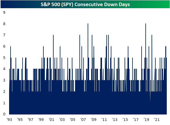
What is more rare is for these streaks to start at the beginning of a new month. In fact, this month’s 3.5% drop to start December is on pace to be the 20th worst start of a month for the S&P 500 ETF (SPY) since inception, and there have only been two other times in which all of the first five trading days of a month have seen declines: February 2002 and June 2011. As shown below, those streaks of declines actually came in what were the middle of periods of consolidation while the following few months went on to experience further downside. As for the actual size of the declines, both of those previous instances saw larger drops (roughly around 4.5%) than the 3.5% decline currently.


Bespoke’s Morning Lineup – 12/7/22 – Down-cember
See what’s driving market performance around the world in today’s Morning Lineup. Bespoke’s Morning Lineup is the best way to start your trading day. Read it now by starting a two-week trial to Bespoke Premium. CLICK HERE to learn more and start your trial.
“Theory is splendid but until put into practice, it is valueless.” – James Cash Penney
Below is a snippet of content from today’s Morning Lineup for Bespoke Premium members. Start a two-week trial to Bespoke Premium now to access the full report.
December just keeps getting lousier and lousier as futures are negative, putting the S&P 500 on pace for five straight losses to kick off what has historically been one of the more positive months of the year. The culprit for this morning’s weakness is negative trade data out of China, and the action in oil over the last couple of days has been signaling that weakness. The just released reports on Nonfarm Productivity and Unit Labor Costs came in better than expected providing a boost to futures but at this point, not enough to push them into positive territory.
It hasn’t been a healthy start to the month of December for the market, but the Health Care sector has held up better than a lot of others with its decline of less than 1.3%. The sector has had a strong run from its October lows, and technicians are salivating over the impending ‘golden cross’ for the sector. A golden cross occurs when a security’s short-term moving average crosses above a longer-term one as both are rising, and it’s considered a positive technical pattern. In the case of the Health Care sector, we’re looking at the 50 and 200-day moving averages and barring any major moves, that crossover will occur tomorrow.

With a lot of technical patterns, the theoretical doesn’t always translate to reality. The table below lists the thirteen prior golden crosses for the Health Care sector since the start of 1990, and for each one, we list the sector’s performance following that occurrence. As shown at the bottom of the table, while median returns over the following week and month were better than the average for all periods since 1990, median returns three and six months later were actually below the long-term average for all periods. One year later, the Health Care sector was positive 12 out of 13 times for a median gain of 9.2%, and while the consistency of positive returns was better than average, the median return of 9.2% was basically right in line with the historical average. Historically speaking, golden crosses for the Health Care sector haven’t been bad, but they haven’t necessarily been followed by better-than-average returns either.

Our Morning Lineup keeps readers on top of earnings data, economic news, global headlines, and market internals. We’re biased (of course!), but we think it’s the best and most helpful pre-market report in existence!
Start a two-week trial to Bespoke Premium to read today’s full Morning Lineup.
Bonds Catch a Bid as Stocks Sink
US equity markets have gotten off to a very weak start to December with four consecutive declines to start the month (and futures on Wednesday pointing to a fifth straight day). As shown below, SPY and most other major US index ETFs are already down more than 3% MTD, with growth underperforming value by a bit. Energy (XLE) is down most of the US sector ETFs followed by Consumer Discretionary (XLY) and Financials (XLF). Utilities (XLU) is down the least so far in December at just -0.50%.
International equity markets have held up a little better than the US. The All-World ex-US ETF (CWI) and the Emerging Markets ETF (EEM) are both down just 1.2% MTD, and the All-World ex-US ETF is now outperforming SPY on a YTD basis because of the recent divergence.
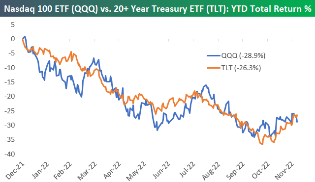
For most of the year heading into December, we saw the bond market fall in tandem with stocks, but recently as stocks have dropped, bonds have caught a bid. As shown in the bottom right corner of our ETF matrix below, Treasury ETFs of all durations are up on the month, with the 20+ Year Treasury (TLT) up the most at 4.35%.
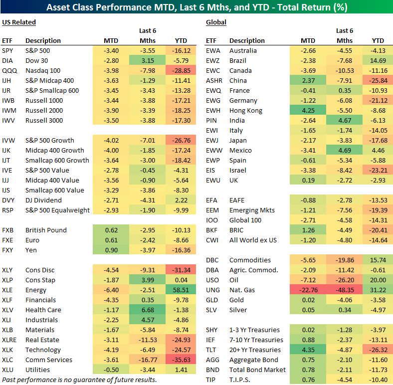
The chart below of the year-to-date percentage change (total return) of the Nasdaq 100 (QQQ) and the 20+ Year Treasury ETF (TLT) is a great way to highlight how closely stocks and bonds have tracked each other this year. So far this month, QQQ is down 3.98%, while TLT is up 4.35%, but this performance divergence over the last four days hardly shows up yet on the chart. Click here to learn more about Bespoke’s premium stock market research service.