Near Record Consistency for the US Dollar in April
The US dollar performed incredibly strong in the month of April, gaining a total of 4.7%. In addition, there were only three trading days in which the US Dollar Index traded lower, which constitutes a monthly positivity rate of 86%. Notably, this is the third-highest positivity rate on record (since 1971), falling short of just July 1975 and May of 2012. In this week’s Bespoke Report, we conducted a deep dive into the dollar’s recent strength. You can access this report by becoming a paid subscriber today. Click here to view Bespoke’s premium membership options.

The month where the Dollar Index experienced the highest consistency of positive returns was in May 2012 when it finished higher on just under 87% of the month’s trading days. During that month, the Dollar Index recovered after falling 175 basis points between the end of 2011 and the start of May. In May alone, it rallied 542 basis points, more than erasing the YTD losses heading into the month. Economic weakness in Europe and concerns over Greece being able to make its debt payments also caused a rotation into dollar-denominated assets.
In July of 1975, the Dollar Index traded higher on 86.4% of the month’s trading days. Back then, the US was emerging from a recession as the economy was beginning to show signs of strength. Inflation was running hot, which caused short-term interest rates to rise and attracted foreign investors, thus boosting demand for the dollar.
Last month, demand for the Dollar moved consistently higher as higher yields attracted foreign investors. In addition, weakness in the Yen attracted foreign capital as well. With just three down days during the month, the Dollar Index was up on 85.7% of the month’s trading days.
In November of 1978, the daily positivity rates for the US Dollar Index hit 80%. The dollar had experienced weakness leading up to November, shedding 13.9% of its value on a YTD basis. Rates continued to tick higher amidst a high inflationary environment.
As mentioned in our Conference Call Recaps, strength in the US dollar acts as a headwind to Corporate America, as constant selling prices in foreign countries leads to less favorable currency conversions. So, how have equity markets performed during and after strong months for the dollar? In May 2012, the S&P 500 lost 6.3% but gained 4.0% in the following month. Three and six months out, the index was up 7.3% and 8.1%, respectively. In July 1975, the S&P 500 traded down by 6.8% and proceeded to lose another 2.1% in the following month. Three months out, the S&P 500 was up just 33 basis points. However, six months out, the index had gained 13.6%. Lastly, in November 1978, the S&P 500 gained just 1.7% after trading down by 9.2% in the previous month. In the following month, the index gained 1.5%. Three and six months later, the index was up 1.7% and 4.6%, respectively. For the sake of comparison, in April of this year, the S&P 500 shed 8.8% of its value, so weakness in equities during months where the Dollar Index has been very consistent to the upside is not necessariliy out of the ordinary.
WTI Monthly Win Streak
It’s been a monster year for cruse oil and it continued in April. For the month, WTI rallied 4.4% and finished the month at $104.7 per barrel. This comes as Russian supply has been essentially cut off from Western markets, the Saudis hold back supply, and US drillers are in the process of ramping up capacity to meet demand, which is a process that takes several months to complete. Most notable about April’s rally was that it marked the fifth consecutive month in which WTI rallied, which is tied for the second-longest streak on record (since 1983). The only streak that was longer was in late 2010/early 2011 when WTI notched eight straight months of gains.

The chart below outlines the long-term price chart of WTI Crude. Two aspects stand out in the chart. First, crude oil tended to see additional gains in the short term following these five-month streaks. Secondly, it is also worth noting that three of these occurrences happened within two years (2009 – 2011), which was likely due to aggregate demand ticking higher as the economy emerged from the Global Financial Crisis. The current period is relatively similar, as the global reopening has put upward pressure on the demand curve after oil producers lowered output during COVID. That increased demand has also been exacerbated by supply constraints following the Russian invasion of Ukraine.
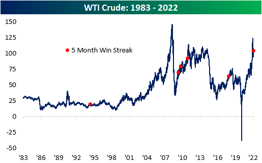
The table below outlines the performance of WTI after the fifth straight month of prior five-month win streaks. WTI tended to trade down over the following month but reversed course to book gains in the following three and six months. In the month following these streaks, WTI averaged a loss of 4.4% (median: -4.8%), booking gains just one time (20%). After three months, WTI averaged a gain of 5.1% (median: 5.5%), performing positively 80% of the time. Over the next six months, average performance and positivity rates declined to 1.9% and 60%, respectively.
Higher oil prices affect energy prices, shipping rates, and the cost of so many more secondary products. Therefore, higher oil prices tend to be inflationary and crimp corporate margins as well as consumer buying power. Historically speaking, though, the S&P 500 has averaged a gain of 8.3% (median: 12.1%) during these streaks, which is 420 basis points higher than the average performance for all five-month periods since 1983. In the month following these streaks, the S&P 500 has averaged a gain of 1.4% (median: 3.2%), which is higher than the historical average as well. In the next three months, the index has averaged a gain of 4.5% (median: 4.9%) with positivity rates higher than that of all periods. Similar to what we see in the six-month performance of WTI, positivity rates moderate for the S&P 500, with average six-month gains of 3.2% (median: 0.2%) versus around 5% for all six-month periods since 1983. Click here to view Bespoke’s premium membership options.

Berkshire’s Annual Conference
Warren Buffett’s Berkshire Hathaway (BRK/B) is hosting its annual investor conference this weekend, and investors who don’t make the pilgrimage to Omaha will tune in from around the world to hear Buffett and Munger provide their insights into the economy and the market. You can tune in here. We often hear that Berkshire’s stock gets a lift coming out of the annual meeting, but a look at the stock’s performance leading up to and after the annual meeting suggests otherwise.
Over the last 20 years, BRK/B stock has averaged a gain of 1.0% (median: 80 bps) in the week leading up to the meeting with gains 71% of the time. That average is higher than the average of all periods by a factor of just over four, with positivity rates 18 percentage points higher than that of all periods.
Immediately coming out of the conference, Berkshire has also tended to get a lift with the stock averaging a gain of 40 bps (median: 80 bps) the day after the conference, but that bounce didn’t tend to last long. As shown in the table, on both an average and median basis, returns over the following week were lower than the following day. Buffett would be the last person to advocate a strategy of short-term trading of Berkshire stock, so it’s only fitting that there isn’t a clear pattern of performance leading up to or immediately after his annual “Woodstock for Capitalists”. Click here to view Bespoke’s premium membership options.

Historic End to a Down Month
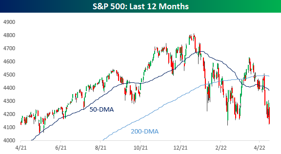
It was a rough finish to the month of April. Not only did the S&P 500 (SPY) finish the month with an 8.78% decline month to date, the biggest one-month decline since March 2020, but the last trading day of the month was one for the record books. Since SPY began trading in 1993, the only bigger drop on the final trading day of the month was in August 1998. Back then it was a much larger 7.13% decline.

In the table below, we show all months since 1993 that SPY declined at least 2% on the last trading day of a month. Behind April, the next worst final day of a month and the only other month with an over 3% decline was September 1998, but back then, SPY had still managed to finish up MTD. Finishing up MTD has been the exception rather than the rule of these occurrences, though, as November 1998 and October 2011 were the only other times that SPY fell over 2% on the last trading day of the month but still finished with a MTD gain.
As for where the S&P 500 has typically gone from there, the first trading day of the new month has only seen a move higher 46% of the time as the index has averaged a 30 bps decline. For the full month, though, performance is generally more positive with an average gain of 2.75% and positive returns almost 70% of the time. Click here to learn more about Bespoke’s premium stock market research service.

The Bespoke Report – 4/29/22 – Is That Blood in the Streets?
This week’s Bespoke Report newsletter is now available for members.
An appointment for a root canal has sounded better than having to watch this stock market lately. Just when you think things can’t get any worse in this market, they do, as every bounce has been quickly repudiated with stocks grinding down to new lows for the year.
It’s never a good feeling when equities close out the week at their lows, but we’ve now had that happen two weeks in a row. The S&P 500 has now declined at least 1% for four straight weeks while the Nasdaq has been down at least 2.5% for four straight weeks. Since 1971, there have only been four other times where the Nasdaq experienced a similar streak, so this kind of persistent weakness doesn’t occur very often.
When the markets start acting like this, it’s incredibly difficult to make any sense of the day-to-day moves, so for us or anyone to say anything about what to expect in the short-term would be foolish. Long-term investors have experienced worse and the market will eventually turn, but until it does, that root canal doesn’t look all that bad.
The snippet above is pulled from a page from this week’s Bespoke Report newsletter. If you’re not a Bespoke subscriber and you want to read this week’s full Bespoke Report (and access everything else Bespoke’s research platform has to offer), start a two-week trial to one of our three membership levels.


Amazon (AMZN) Shares Now Barely Up Post-COVID
Amazon (AMZN) was one of the primary beneficiaries of the pandemic as consumers were forced to engage in commerce digitally and corporations became increasingly willing to migrate to the cloud. In the first year or so after the March 2020 COVID Crash, AMZN shares soared from $2,000 up to $3,700. Since peaking in mid-2021, however, it has been a different story. Since AMZN reported earnings last night, shares have fallen another 15%. This leaves AMZN up just 13.5% from the level it was trading at right before the pandemic began on 2/19/20.
Although the stock is now barely higher versus pre-COVID levels, revenues continue to climb. Relative to pre-pandemic levels, trailing 12-month revenues have increased by 70.3% (CAGR of 27.2%). As implied, the price to sales multiple has compressed considerably relative to pre-pandemic levels. At the highs, AMZN was trading 3.8 times sales. The highest P/S multiple for the stock since the start of 2020 occurred in September of 2020, when the multiple hit 5.5. As it currently stands, the price to sales multiple is at new lows relative to the start of 2020 at just 2.7.

While AMZN revenues are up 70% from pre-COVID levels, margins have compressed considerably. In Q1 2020, AMZN posted operating margins of 9.5%. In Q1 2022, AMZN reported operating margins of 3.2%. These results can be attributed to inflationary pressures, labor challenges, supply chain constraints and foreign exchange headwinds. As you can see in the chart below, margin compression has hampered EPS, resulting in a decline in trailing 12-month EPS over the last three quarters. Relative to pre-pandemic levels, EPS have risen by 52.5% (CAGR: 21.1%), but they’ve declined by 38.8% over the last three quarters. Click here to become a Bespoke Institutional subscriber and gain access to our Conference Call Recaps.

The Bespoke 50 Growth Stocks — 4/28/22
The “Bespoke 50” is a basket of noteworthy growth stocks in the Russell 3,000. To make the list, a stock must have strong earnings growth prospects along with an attractive price chart based on Bespoke’s analysis. The Bespoke 50 is updated weekly on Thursday unless otherwise noted. There was one change to the list this week.
The Bespoke 50 is available with a Bespoke Premium subscription or a Bespoke Institutional subscription. You can learn more about our subscription offerings at our Membership Options page, or simply start a two-week trial at our sign-up page.

The Bespoke 50 performance chart shown does not represent actual investment results. The Bespoke 50 is updated weekly on Thursday. Performance is based on equally weighting each of the 50 stocks (2% each) and is calculated using each stock’s opening price as of Friday morning each week. Entry prices and exit prices used for stocks that are added or removed from the Bespoke 50 are based on Friday’s opening price. Any potential commissions, brokerage fees, or dividends are not included in the Bespoke 50 performance calculation, but the performance shown is net of a hypothetical annual advisory fee of 0.85%. Performance tracking for the Bespoke 50 and the Russell 3,000 total return index begins on March 5th, 2012 when the Bespoke 50 was first published. Past performance is not a guarantee of future results. The Bespoke 50 is meant to be an idea generator for investors and not a recommendation to buy or sell any specific securities. It is not personalized advice because it in no way takes into account an investor’s individual needs. As always, investors should conduct their own research when buying or selling individual securities. Click here to read our full disclosure on hypothetical performance tracking. Bespoke representatives or wealth management clients may have positions in securities discussed or mentioned in its published content.
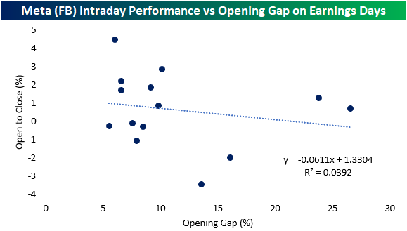
Meta (FB) Intraday Performance Following Strong Earnings
Yesterday, Meta Platforms (FB) reported earnings. In the report, the company noted a sequential rise in both daily and monthly active users in every region apart from Europe, which can be attributed to the effects of the war in Ukraine. This gave investors a sigh of relief, sending shares up over 14% in premarket trading.
FB has gapped higher by 5%+ in reaction to earnings fourteen times since its IPO. Historically, when this occurs, the stock’s performance from the open and close has been modestly positive, booking gains 57% of the time. The average performance was a gain of 64 basis points (median: 80 bps). The worst intraday performance came in 2014 when the stock traded down by 2.0% percentage points intraday after gapping up 16.05%. On the other hand, the best intraday performance in these time periods occurred in 2018, when the stock gained 4.5% after gapping up 6.0% at the open.
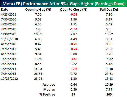
Today marks the fourth-best opening gap since FB went public. This is particularly interesting, as the y/y revenue growth rate in this quarter was the slowest seen since the company went public in 2012. Notably, the opening gap does not seem to be a determining factor for the opening to close performance. As you can see from the chart below, only 3.9% of the variation in the open to close performance can be explained by the size of the opening gap (for 5%+ opening gap gains on earnings). Click here to view Bespoke’s premium membership options.
Bespoke’s Morning Lineup – 4/27/22 – Happy Birthday Universe!
See what’s driving market performance around the world in today’s Morning Lineup. Bespoke’s Morning Lineup is the best way to start your trading day. Read it now by starting a two-week trial to Bespoke Premium. CLICK HERE to learn more and start your trial.
Bespoke’s Quote of the Day: “I much prefer the sharpest criticism of a single intelligent man to the thoughtless approval of the masses.” – Johannes Kepler

Below is a snippet of content from today’s Morning Lineup for Bespoke Premium members. Start a two-week trial to Bespoke Premium now to access the full report.
6,999 years ago today, the Universe was born. At least that’s according to German astronomer Johannes Kepler who came to that conclusion in the 1600s. Kepler’s work has been ‘revised’ in the centuries since, and it is now widely agreed that he was off by at least 10 billion years. What’s a few billion amongst friends, though? It just goes to show that facts that people take for granted in one environment can look foolish in another.
Futures are looking to recoup some of yesterday’s losses, but even at their best levels earlier this morning, we weren’t even on pace to recoup half of Tuesday’s losses. Let’s just call it the ‘two steps backward, one step forward market’. There’s been a ton of earnings news since the close yesterday, and the pace will only intensify over the next two days.
The only two economic reports on the economic calendar this morning are Wholesale Inventories which came in higher than expected (2.3% vs 1.5%), and at 10 AM we’ll get the latest read on Pending Home Sales which are expected to show a decline of 1.0%
In today’s Morning Lineup, we recap overnight events in Asia and Europe (pg 4), take a look at the rising levels of volatility in the Nasdaq 100 (pg 4), and then highlight the dollar’s rip higher in recent weeks (pg 5).
While equities are looking to gain today, the Nasdaq has declined 8.3% over just the last five trading days. Relative to history, this move hasn’t been extraordinary by any means, but it still hurts. Looking more recently at just the period since COVID first surfaced in early 2020, there have only been three other periods where the Nasdaq saw steeper declines in a five-day period.
The first two were during the COVID crash while the third occurred in September 2020 right when the Nasdaq experienced a short-term peak. What’s interesting to note about the current period is that ever since the start of 2022, we’ve started to see the intensity of five-day sell-offs start to increase.

Start a two-week trial to Bespoke Premium to read today’s full Morning Lineup.
Shipments Saving Richmond
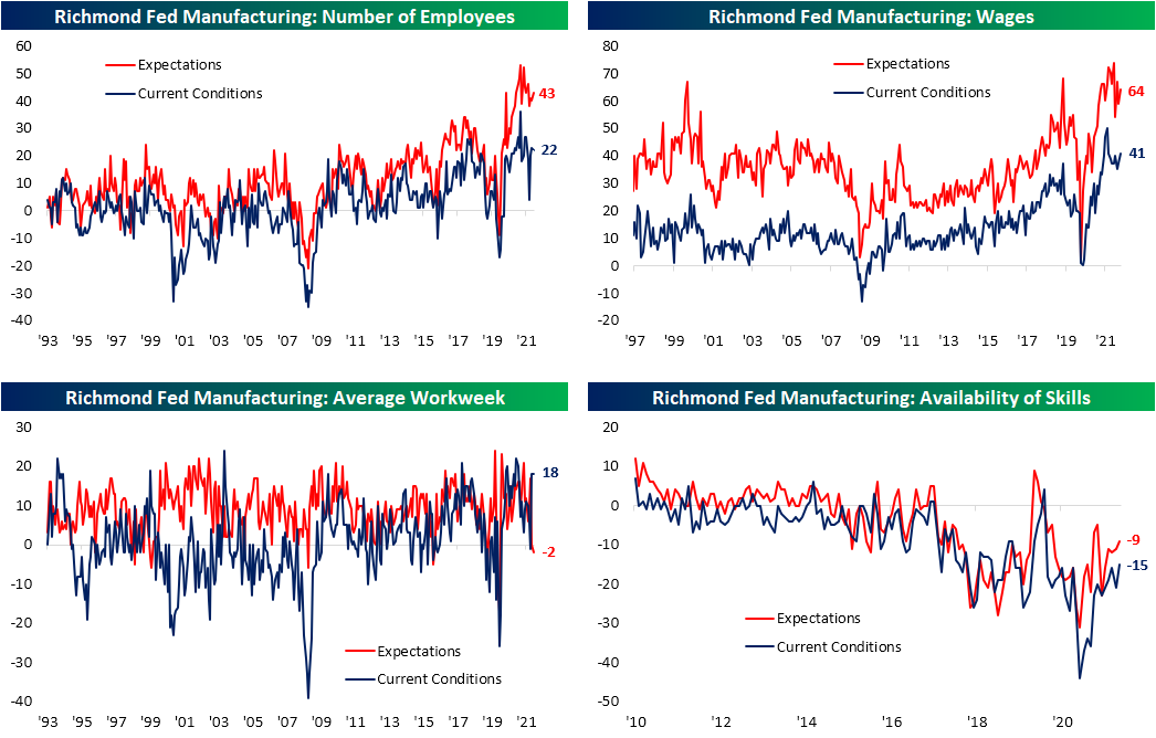
The Richmond Fed’s manufacturing survey was released this morning showing a modest improvement in conditions in the month of April. The headline number rose by a point to 14 which is still in the middle of the pandemic range of readings and the highest level since December.

In spite of the improvement in the composite index—a weighted average of shipments, new orders, and employment—the breadth of this month’s report was negative with over half of the categories declining month over month. Two of those declining categories were new orders and employment which are again inputs for the composite. That means the higher reading of the composite was entirely thanks to the 8-point increase in shipments.
Looking across other areas of the report, expenditures were weaker while inventories are recovering from historic lows. While business conditions are mixed to deteriorating, supply chains are showing signs of improvement as evidenced by the increase in shipments.
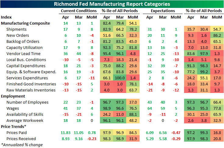
While shipments were an area of strength, another input to the composite, new orders, fell 4 points and is back near the middle of its historical range. Expectations, however, experienced a sizeable rebound with that index rising 9 points. While that increase bucks the trend of weak expectations readings relative to current conditions that we have seen in other regional Fed surveys (which we discussed in last night’s Closer), this index’s increase was the exception rather than the rule. As shown in the table above, only a handful of other expectations categories rose month over month with many declines ranking in the bottom decile of monthly moves.
The big increase to shipments left that index at the highest level since last July as backlog of orders are growing at a substantially more modest pace compared to earlier in the pandemic. One likely reason that both of these readings are improving is a coincident improvement in supply chain stress. The index for lead times saw an 8-point decline ranking in the bottom 5% of all monthly moves. That leaves the index one point above the December low of 35.

Employment metrics were mixed this month. The region’s firms are still hiring on a net basis, but hiring has peaked and declined again in April. That was in spite of firms also reporting better availability of workers with in-demand skills as that index rose to the highest level since July 2020. With that being said, the negative number indicates a still insufficient supply of quality talent. Wages, meanwhile, saw one of the larger increases in recent months rising to the highest level since September. The average workweek was unchanged at a healthy level in the top 5% of its historical range, but expectations are calling for declines in hours worked on the horizon. Click here to learn more about Bespoke’s premium stock market research service.