Bespoke’s Morning Lineup – 7/15/20 – Fading Hope
See what’s driving market performance around the world in today’s Morning Lineup. Bespoke’s Morning Lineup is the best way to start your trading day. Read it now by starting a two-week free trial to Bespoke Premium. CLICK HERE to learn more and start your free trial.
Futures are off to the races this morning with the S&P 500 indicated to open up over 1%. It started last night after the close with some positive trial results from Moderna (MRNA) related to its COVID vaccine. Then this morning, futures received another boost when Goldman (GS) reported much better than expected earnings driven by strength in its sales and trading unit. It looks like Robinhood traders aren’t the only ones stuck at home and coining money!
Be sure to check out today’s Morning Lineup for a rundown of the latest stock-specific news of note, the latest earnings reports, global economic data, trends related to the COVID-19 outbreak, and much more.

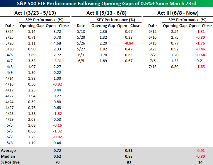
In last Friday’s Bespoke Report, we described the rally off the March lows as a series of three acts each represented by different market characteristics. With futures indicated higher this morning, we wanted to provide a snapshot of market performance following strong opens in each ‘act’ of the rally off the lows and how performance following these strong opens has differed in Act III relative to Acts I and II.
In both Acts I & II, strong opens were typically followed up with additional gains from the open to close. In Act I, the S&P 500 ETF (SPY) had 20 days where it gapped up at least 0.5%. On those days, SPY averaged an open to close gain of 0.72% (median: 0.52%) with gains 70% of the time. In Act II, performance was pretty much just as strong. In the six days where SPY gapped up more than 0.5%, SPY saw an average open to close gain of 0.31% (median: 0.55%) with gains five out of six times.
Act III, which includes the current period though (rightmost column), has been a completely different picture. On the seven prior days since June 8th where SPY gapped up over 0.5%, it has averaged an open to close decline of 0.91% (median: 0.80%) with gains only once. Whether the headlines related to COVID have been good or bad lately, investors have faded the initial market reaction.
Tax Day Cometh. Wait. What Month is This?
It may be July but due to the government shutdowns this Spring, the Federal deadline for filing taxes was delayed by three months. With that in mind, the table below summarizes the performance of the S&P 500 in the weeks leading up to and after the Federal tax deadline over the last twenty years. Obviously, the major caveat is that the performance numbers shown from prior years are for the month of April, while this year is the only time the deadline has been in July.
Historically speaking, the S&P 500’s performance in the weeks leading up to the Federal tax deadline have been positive but hardly anything worth writing home about. In the two weeks leading up to the tax deadline, the S&P 500 averaged a gain of 0.05% but with gains less than half of the time (9 out of 20). In the week leading up to the tax deadline, the results were nearly identical at +0.06% with gains exactly half of the time. With the backdrop of those historical results, the S&P 500’s performance leading up to tax day this year has been better than average with a gain of 1.87% over the last two weeks and 0.14% over the last week.
While returns leading up to the tax deadline haven’t been anything special, returns one and two weeks after the tax deadline have been much stronger than average. One week after the Federal tax deadline, the S&P 500 has averaged a gain of 0.87%, and two weeks later the average gain has been 1.50%. The market has also been pretty consistent to the upside in the days after tax day as the S&P 500 has been up three-quarters of the time. Americans were reportedly quick to put their stimulus checks into the market back in the Spring, so will they double-down with their refund checks? Like what you see? Click here to view Bespoke’s premium membership options for our best research available.

Daily Sector Snapshot — 7/14/20
A Dow in Nasdaq’s Clothing
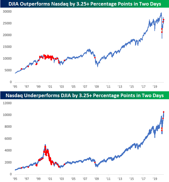
The last two trading days have certainly been out of the ordinary in terms of relative performance between the Nasdaq and the Dow. Since Friday’s close, the Nasdaq is down 1.2% while the Dow is up 2.2%. That performance spread of 3.4 percentage points in the last two trading days is the widest gap between the two indices (in the Dow’s favor) since May and then in March. While there have been two prior occurrences in the last three and a half months, if you take a longer view, this type of short-term outperformance by the Dow has been uncommon. Before the occurrences in March and May, you have to go all the way back to September 2008 to find the last occurrence and then before that July 2003.
Before 2002 and going back to the late 1990s, there were a number of occurrences on both the way up and even more so on the way down. Given the market’s performance following the last time we saw a high frequency of periods with similar performance gaps, let’s hope the performance disparity of the last two days doesn’t become a trend. Like what you see? Click here to view Bespoke’s premium membership options for our best research available.
Big Winners Driving The Market In 2020
So far this year, the US equity market has been a story of big winners…and then the other 99% of the market.
Seven S&P 500 stocks stand out in terms of contribution, with the “Big Five” tech or tech adjacent names (AAPL, AMZN, FB, GOOG, MSFT) and two others that get a bit less discussion (NFLX, NVDA) each accounting for at least a +0.3 percentage point impact on the overall index performance this year. On average, these top seven are up 45% YTD, versus an 11% decline for the rest of the index. That’s why the equal-weighted S&P 500 is underperforming so badly: the majority of stocks are way, way behind a furious rally in some of the biggest names.
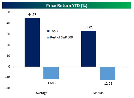
Currently, the top seven stocks by contribution have added 6.7% to the index in 2020, which itself is still down a bit over 1% on the year. That means that the rest of the stocks in the index have cost the S&P 500 over 8% in 2020. We went into further detail on contribution to total earnings as well as YTD gains in last night’s Closer report, which is available to Bespoke Institutional members. Click here to start a two-week free trial.

US Citi Surprise Index Continues to Surge
Just about a month ago, we noted how the Citi Economic Surprise Index for the United States reached a new record high as economic data broadly rebounded. In the time since then, the US surprise index has left that record in the dust. Since the first new record high on June 15th, the US index has not just continued to rise but has more than doubled with 19 of the past 22 days marking a fresh record high!
Likely helped by the US strength at least in part, the index for the entire globe has also entirely recovered. The global index is at its highest level since March of 2017 and in the 98th percentile of all readings since the start of the index in 2003. Meanwhile, that strength has not been echoed in the indices for the Eurozone and Emerging Markets. The Eurozone index fell sharply in the first half of the year. Although it has staged a rapid recovery since mid-June, it is still negative meaning reports are generally missing forecasts. Although it never fell as sharply as other areas of the globe, the index for emerging markets likewise remains in negative territory and in the bottom 13% of all readings. Click here to view Bespoke’s premium membership options for our best research available.

Bespoke Stock Scores — 7/14/20
Chart of the Day: Nasdaq Bearish Engulfings
Bespoke’s Morning Lineup – 7/14/20 – Turnaround of a Turnaround
See what’s driving market performance around the world in today’s Morning Lineup. Bespoke’s Morning Lineup is the best way to start your trading day. Read it now by starting a two-week free trial to Bespoke Premium. CLICK HERE to learn more and start your free trial.
If there’s a time that bulls are hoping for a turnaround Tuesday, it’s today. After a strong rally yesterday that took the S&P 500 into positive territory for the year and the Nasdaq to another record high, sellers stepped in during the afternoon erasing all of the gains and then some. The S&P 500 finished down almost a percent and the Nasdaq was down over 2%. It’s pretty crazy to think that on the same day that the Nasdaq hit an all-time high, that it also finished the day down 4% from that record!
Today, sentiment is looking a little bit better than it did at the close yesterday. Futures are higher following some positive earnings news from Citi and JP Morgan, and NFIB Small Business Sentiment also came in better than expected.
Be sure to check out today’s Morning Lineup for a rundown of the latest stock-specific news of note, the latest earnings reports, global economic data, trends related to the COVID-19 outbreak, and much more.
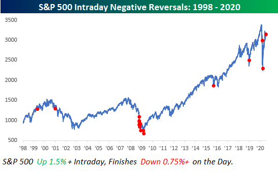
Yesterday’s reversal for the S&P 500 was the first time since March 20th that the index was up over 1.5% intraday but then finished the day down over 0.75% versus the prior day’s close. The chart below shows every similar occurrence going back to the late 1990s. The bulk of these prior occurrences all occurred during the late stages of the Financial crisis, but outside of that period, there were also a handful of occurrences leading up and after the dot-com peak.
More recently, occurrences in the last ten years have been more likely to occur in the later stages of a sell-off (August 2015 and December 2018) than near a peak. Overall, of the 17 prior occurrences since 1998, the S&P 500’s average next-day return was a gain of 1.24% (median: -1.13%) with positive returns just eight times. From a short-term perspective, the only takeaway is that volatility remains in place. On the day after all 17 prior occurrences, the S&P was up or down at least 1% each time. Buckle Up!