The Little Guy Eying Inflation
Looking across the range of issues surveyed by the NFIB, labor and inflation remain front and center of what most concerns small businesses. As shown below, the combined percentage of respondents reporting either cost or quality of labor as their most important problem continues to be the most prevalent topic with 33% of firms reporting as such. That is down slightly from 34% in January thanks to the decline in quality of labor. Most other categories fell to or remained at record lows. Such was the case for Poor Sales, Competition from Big Business, Government Requirements and Red Tape, and Financial & Interest Rates.
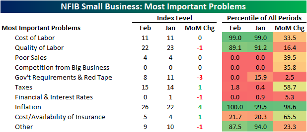
Last month the percentage of respondents reporting inflation as their biggest problem went unchanged from the December reading of 22%. This month that reading gained another 4 percentage points to cross above a quarter of all respondents for the first time on record going back to 1986. Behind labor concerns (the combined reading of cost and quality of labor), this is the most commonly reported problem, and based on the action in commodities prices over the last couple of weeks, this reading will almost certainly increase again next month.

That means what has usually been the second most important problem on a combined basis recently, government requirement and taxes, dropped in the ranking. In fact, the 3 percentage point decline in government requirements offset the one percentage point increase in taxes to tie the November 2005 reading for the lowest on record. As we have noted in the past, the past few presidential cycles have structurally seen lower readings in these indices when Republicans were in office and vice versa when Democrats have held the presidency. With Biden currently in office, the record low reading is somewhat unusual from this political perspective.

That is not the only category that has fallen to record lows. Poor sales and competition from big business have both fallen dramatically in the past couple of years. Click here to view Bespoke’s premium membership options.


Price Hikes Surge For Small Businesses
Sentiment on behalf of small businesses fell for the second month in a row in February. At 95.7, the NFIB’s Optimism Index has now dropped to the lowest level since January 2021 and continues to closer to its COVID low and further from its high.

The Optimism Index is now right around the bottom quartile of historical readings after the 1.4 point decline. Given the decline in the headline number, breadth across categories this month was weak with Job Openings Hard to Fill the only index to rise month over month. Despite the increase in Job Openings Hard to Fill, the index for Plans to Increase Employment saw the largest decline of any component.
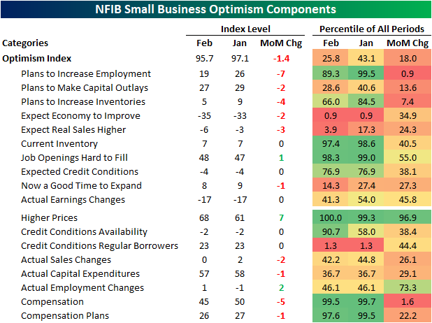
Employment indices in this month’s report are some of those that remain the most elevated relative to their historical ranges. That being said, they have cooled off recently as we noted earlier in today’s Morning Lineup. Indices like Job Openings Hard to Fill and Compensation and Compensation Plans are all in the top few percentiles of their historical ranges even after coming off their peaks and some even falling significantly month over month in February. Hiring Plans, however, experienced a 7 point decline—ranking in the bottom 1% of all monthly moves—bringing that index out of the top decile of historical readings.

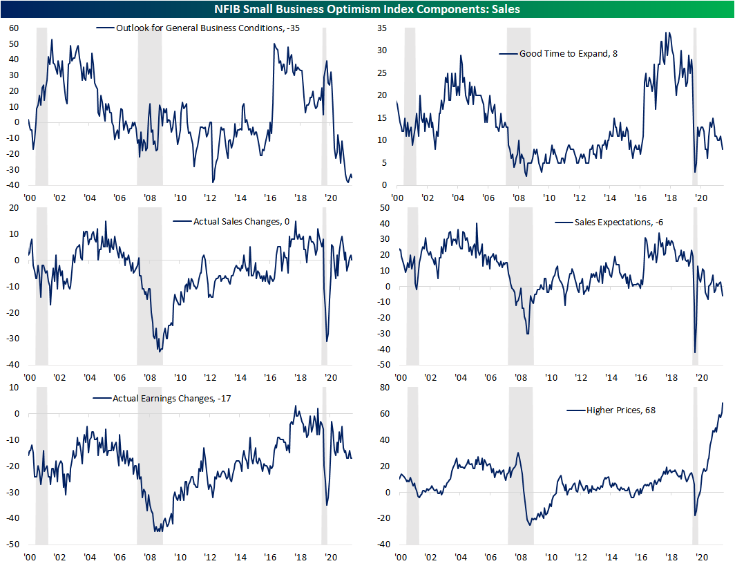
As for other areas of the report, General Business Conditions remain extremely weak falling another 2 points to remain in the bottom one percent of historical readings. Additionally this month, fewer respondents reported that it is a good time to expand, and more expect lower than higher sales on the horizon. While it is not an input to the optimism index, there was a new record high in the percentage of respondents reporting that they are raising prices. Click here to view Bespoke’s premium membership options.
Clean Energy Versus Oil
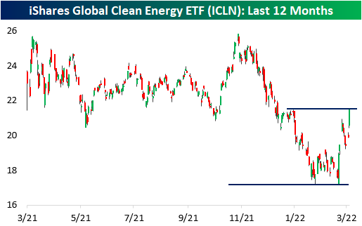
As the Russia-Ukraine conflict escalates and western nations apply economic pressure on Russia (one of the world’s largest producers of oil & natural gas), the market for energy-related commodities has become extremely tight. The current energy crisis has shown investors the downside of being reliant on other countries, especially ones they aren’t friendly with. In our current economic setup, For example, it would be nearly impossible to phase out Russian oil for the majority of western nations, but technological innovation and increased adoption of clean energy can change the balance which is why alternative energy stocks have caught a bid. For example, the iShares Global Clean Energy ETF (ICLN) has rallied 17.8% since Russia invaded Ukraine, thus wiping out the previous 17% YTD decline.
There are two ways to view the correlation between clean energy stocks and the price of energy. As the price of oil rises, the attractiveness of alternative energy sources increases for consumers, enterprises, and governments alike. Therefore, following this logic, one could expect a moderately positive correlation between the two. On the other hand, increased adoption of alternative energy decreases the demand for oil, which will suppress the value of energy commodities and lead to gains for clean energy stocks.
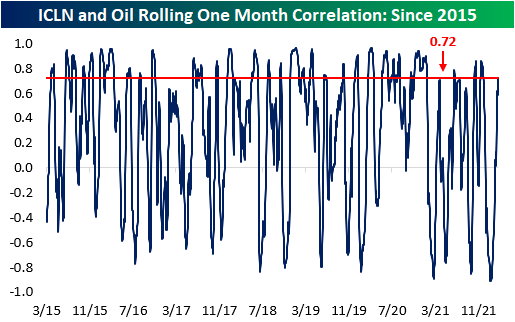
Since ICLN began trading in February of 2015, the ETF and the front-month WTI crude oil contract have had a correlation coefficient of 0.35, which signifies a moderately positive relationship. However, this correlation is far from constant. Granted, there are many other factors besides oil prices (like government legislation and valuations) that affect the stocks in the ICLN ETF, but currently, the one-month correlation between the two assets is relatively strong at 0.72, which is especially notable since this figure hit a record low of -0.91 on 1/26.
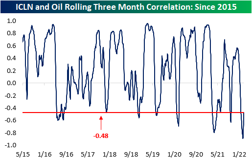
On a rolling three-month basis, the correlation coefficient between the two assets is still compressed compared to historical averages. Since the launch of the ETF, the average three-month correlation between ICLN and oil has been 0.24, but this figure hit an all-time low of -0.89 two weeks ago on 2/25. This measure has started to move higher in the last few sessions, but the current level is still low relative to history. In fact, the correlation coefficient on a three-month basis has only been lower than current levels 8.5% of the time since 2015..
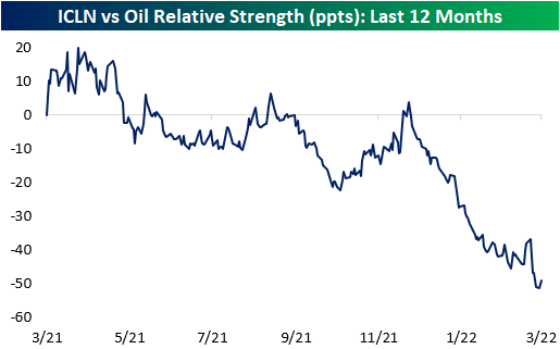
The chart below compares the relative strength of ICLN versus oil over the last year. In the chart, a rising line indicates that ICLN is outperforming oil and vice versa. As you can see, oil has been significantly outperforming ICLN over the last year. Additionally, excluding the COVID craziness when oil turned negative for a day in April 2020, the rolling one-year relative strength is near all-time lows (second chart). Click here to view Bespoke’s premium membership options.

Country ETFs Falling Below Pre-COVID Highs
Headed up to the two-year anniversary of the COVID crash low (3/23/20), equities around the globe have been experiencing some of the worst pullbacks since that period. In the table below, we show the country ETFs of the countries tracked in our Global Macro Dashboard as well as their year and month to date performance, performance since each respective 52-week high as of 2/19/20 (the S&P 500 and a handful of other global indices last high before entering bear markets during the COVID crash) and current 52-week high. We also show where they are currently trading with respect to their 50-DMAs.
Given the degree of declines recently, nearly everything is oversold with six countries’ readings now ‘off the chart’ as they trade well over three standard deviations below their 50-DMAs. The average country ETF is also down double digits on both a YTD basis and relative to their respective 52-week highs. Of the countries shown below, only Brazil (EWZ) and South Africa (EZA) are higher YTD with gains of 17.56% and 9.27%, respectively. Russia (RSX), meanwhile, is obviously down the most having been cut by over 75%.
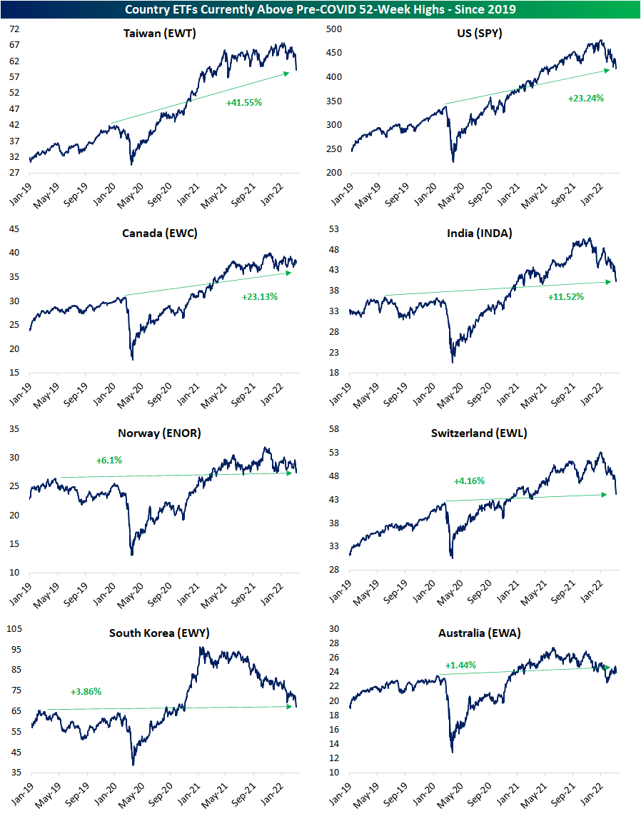
The average country ETF is now down over 20% from its 52-week high, and only four of those 52-week highs have come since the start of 2022 whereas most were set last spring. As for how the current drawdowns have eaten into the post-COVID rallies, below we also show the percent change of these ETFs relative to their 52-week highs as of 2/19/20. In other words, where each ETF is trading with respect to their pre-COVID highs. Currently, there are only 8 country ETFs that remain above their respective pre-COVID highs. Seven others, meanwhile, have now declined more than 20% below their pre-COVID highs. Of course, Russia is once again down the most dramatically from those levels falling more than 75%.

Below we show the charts of those eight countries that are currently still in the green relative to pre-COVID highs. The recent rough patch is not exactly identical for all countries though. Whereas the downtrends for some like Taiwan (EWT) or the US (SPY) are bringing these ETFs to multimonth lows, others like Canada (EWC) and Norway (ENOR) have more or less trended sideways. Since retaking pre-COVID highs, only Australia (EWA) has gone on to recently retest/fall back below those levels which it did in late January. While it would mean much further downside for the likes of EWT, SPY, and EWC, those prior highs could mark one area of tangible support for these other countries. Click here to view Bespoke’s premium membership options.
Bespoke’s Morning Lineup – 3/8/22 – Trying to Climb Out of the Hole
See what’s driving market performance around the world in today’s Morning Lineup. Bespoke’s Morning Lineup is the best way to start your trading day. Read it now by starting a two-week trial to Bespoke Premium. CLICK HERE to learn more and start your trial.
“No fact begins with if” – Nicholas II
With the entire world focused on the Russia-Ukraine war and possible scenarios under which President Putin can either ratchet up or dial back the tensions, it’s ironic that today marks the 105th anniversary of the start of the ‘February Revolution’ which essentially ended the reign of czarist rule in Russia when Nicholas II abdicated his throne. Historians cite a number of factors for the February Revolution including frustration with government corruption, a poor economy, and autocratic rule, but the Russian military’s poor performance in World War I was the primary catalyst for the Revolution. Russians came out in droves to protest the conditions and despite an attempted crackdown Russian police and ultimately the military, the protestors refused to back down. Within less than a week, Nicholas II abdicated the throne ending the era of czarist rule in the country.
Not long after Nicholas abdicated, Vladamir Lenin returned from exile in Switzerland to lead the Russian Revolution, and as he is often credited with saying, “There are decades where nothing happens, and there are weeks where decades happen.” During the February Revolution, it took less than a week for protests to lead to the abdication of the throne by Nicholas II and usher in the communist era. The current Russia-Ukraine war hasn’t even been two weeks yet, and several years from now, with the benefit of hindsight will we be looking back on this period as another one of those moments where ‘decades’ occurred within a matter of weeks?
Futures are looking pretty boring at current levels as we type this with little change in any of the major averages, but since the close yesterday, we have seen them trade down more than 1% and trade up by close to 1%. One thing we can pretty much bank on here is that equity indices will not finish the day where futures are currently trading.
In the commodity space, we’re still seeing some intense moves as nickel prices more than doubled to over $100,000 per metric ton resulting in a halt of trading for the remainder of the day. Given that move, the 2% rally in crude oil looks downright pedestrian.
Lastly, on the economic calendar, the NFIB Small Business Optimism Index came in lower than expected falling from 97.1 last month to 95.7.
Read today’s Morning Lineup for a recap of all the major market news and events from around the world, including the latest US and international COVID trends.
With all of the volatility we’ve seen so far this year, the average daily change of the S&P 500 and Nasdaq has been ticking higher, and over the last 50-trading days, both indices have seen average daily moves of at least 1%. For the S&P 500, the current rate of daily volatility is still below the highs from December 2020, but the Nasdaq’s average daily move of 1.51% is on the verge of eclipsing that peak from the same period. For some perspective, though, the current pace of volatility in stocks is nowhere near the levels experienced during the COVID crash when both indices were experiencing average daily moves of more than 3%.

Start a two-week trial to Bespoke Premium to read today’s full Morning Lineup.
B.I.G. Tips – Nasdaq Bear Markets
Nickel Skyrockets
Nickel futures surged 64% today as Russian supply concerns sparked a massive short squeeze in the commodity. There was a modest pullback into the close but remained extremely elevated nonetheless. Today’s move put nickel at an all-time high and it was also the largest single-day move in the history of the commodity. The skyrocketing price of nickel has implications for a variety of industries and countries, which we outline below.

The US is heavily reliant on Nickel imports, as only about one percent of the Nickel mined globally originates in the US. Indonesia, the Philippines, and Russia are the three largest producers of the commodity, and Australia, Indonesia, and Brazil have the largest share of global reserves (as per the United States Geographical Survey). Russia’s leadership in global nickel mining largely explains the recent price spike, but many countries are poised to benefit from the price appreciation. While it will take time to ramp up production, countries with the largest share of reserves are likely to increase their mining operations to capitalize on higher prices, especially given the fact that many of the countries with the highest amount of reserves are emerging economies that do not play a substantial role in global geopolitical conflicts.

Over the last few years, investors have focused on the electric-vehicle use case to justify nickel positions, but over 70% of first-use demand for Nickel originates from steel products. The spike in this commodity will increase construction costs, mitigate the impact of Biden’s infrastructure package, slow the EV transition, and make batteries, in general, more expensive for consumers and enterprises alike. Put simply, a lot of industries have exposure to the recent hike in nickel and related metals prices.
Although it is hard to view this as a positive for the US economy or global inflation, one country poised to benefit from the surge in nickel prices is Indonesia. Pre-pandemic, around five percent of Indonesia’s GDP came from Nickel exports which is not an insignificant amount. Not surprisingly, the MSCI Indonesia ETF (EIDO) has been one of the top-performing country ETFs on a YTD basis gaining 3.5% through Monday’s (3/7) close. Click here to view Bespoke’s premium membership options.

Daily Sector Snapshot — 3/7/22
Chart of the Day – Gold and US Dollar at 52-Week Highs
Gasoline National Average Above $4
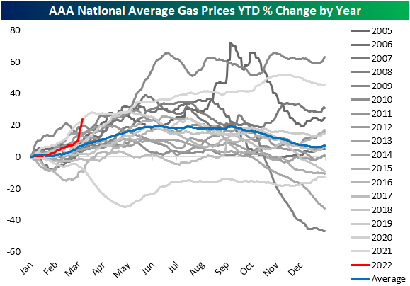
We have consistently been covering the surges in commodity prices over the past couple of weeks, and over the weekend there was yet another major development on this front. As shown below, for the first time since June/July 2008, the national average for a gallon of regular gasoline crossed above $4. As the post-pandemic period has progressed, gas prices have been rapidly on the rise but the move since the late December low of $2.83 has been outright parabolic.

With regards to seasonality, this point of the year tends to see gas prices rise up through the late spring where they then plateau through the summer and fall until year-end. Whereas prices had been following the usual seasonal pattern, albeit growing at a slightly above-average rate, the recent surge has brought the year-to-date gain up to 23% which puts it back on the pace with the historically large year-to-date gains last year.
AAA also provides a breakdown of prices by state. While the national average sits at $4.065, there are 22 states with an average price also above $4 compared to only two states (California and Hawaii) one month ago. Today, those two still have the highest price of the 50 states. In fact, California gas prices are now well above $5. The cheapest gas in the country can be found in Missouri, Oklahoma, Kansas, and Arkansas all with prices in the $3.60 range.
As for which states have seen prices rise the most dramatically, those East of the Mississippi have all seen prices rise by over $0.50 over the last month; Alabama (+$.75) and Rhode Island ($+0.74) marking the largest increases in dollar terms. On the West Coast, California and Nevada also have seen price increases over the past month that are larger than the average for the whole country ($0.60).

As prices surge and will likely weigh on the average American’s budget, consumers are understandably looking for a deal where possible. In the charts below, we show Google Trends data for the search terms “Gas Prices”, “GasBuddy”, “Cheap Gas”, and “Cheap Gas Near Me.” Google’s indices index the period which searches for a given term were the most popular to 100. Thus a reading of 75 would be when interest was three-quarters of the peak, 50 would be a time that searches were half of the peak, and so on. As shown, each of these terms has taken off this month and is at or approaching record highs. For the broadest search of “Gas Prices,” September 2005 was the only time search interest was more elevated. “Cheap gas” has also made a sharp move higher hitting levels last seen over a decade ago. A perhaps more actionable search of “Cheap gas near me” meanwhile is at the highest level ever by a massive margin. Searches for the app “GasBuddy” which helps to find the gas stations with the lowest prices around a user’s area has also made an explosive move higher. The only points in time with higher readings in the index were last May and September 2017. Click here to view Bespoke’s premium membership options.
