Slight Disconnect Between the VIX and Volatility
The CBOE Volatility Index (VIX) was invented to allow investors to speculate about volatility over the next 30 days. The VIX is commonly referred to as the fear index, and readings above 20 tend to occur in uncertain times filled with concern, while readings below 20 indicate a perceived relatively low-risk environment. As of late, the average intraday range of the S&P 500 has been quite high, with the last 30 trading days averaging a trading range of 2%, which is on the high side relative to history. In fact, the 30-day rolling average percentage spread between intraday highs and lows did not cross 2% throughout the entirety of 2021, but on the first day of February 2022, we broke a 440 trading day streak in which the reading was below 2% that had bene in place since the days coming out of the COVID crash.

As depicted below, the VIX tends to spike during times in which market volatility increases. However, the current elevated level of intraday volatility has not been matched with a proportional rise in the VIX. Based on historical data, the VIX should currently be closer to 26.5, but the current reading of 21.8 is 17.6% below the implied value we would derive from the last 30 days of intraday volatility alone. This suggests that although the market has been shaky as of late, investors expect an easing of that volatility in the near future. Click here to view Bespoke’s premium membership options.

Bespoke’s Morning Lineup – 3/25/22 – Semis Roll
See what’s driving market performance around the world in today’s Morning Lineup. Bespoke’s Morning Lineup is the best way to start your trading day. Read it now by starting a two-week trial to Bespoke Premium. CLICK HERE to learn more and start your trial.
“Your information sources should complement one another, and also be redundant because that gives you a way to verify what you’ve learned.” – Andrew S Grove
It almost took an entire quarter but the S&P 500 is on the cusp of its first back-to-back weekly gains in all of 2022. For the Nasdaq, a positive finish to this week would be the first back-to-back weekly gain since November. Futures are currently indicated higher, and the only economic reports on the calendar are Pending Home Sales and Michigan Confidence. Pending Home Sales are expected to bounce back modestly following January’s surprise decline of 5.7%. Michigan Confidence, meanwhile, has been one of the most disappointing economic series of the last several months as it’s well below its COVID lows and at levels last seen in late 2011 and before that the Financial Crisis.
Markets in Europe are modestly positive with the major benchmark indices up between 0.5% to 1.0%. despite weaker than expected sentiment readings in Germany and Italy, while UK Retail Sales unexpectedly declined. Treasury yields in the US are higher again today with the 10-year up to 2.36% while the 5-year is even higher at 2.40%. Crude oil is down another 2% sending WTI down to $110 per barrel, gold is modestly lower, and bitcoin is trading above $44,500.
Read today’s Morning Lineup for a recap of all the major market news and events from around the world, including the latest US and international COVID trends.
Yesterday was a good day for the equity market, but it was especially strong for semiconductors as the Philadelphia Semiconductor Index (SOX) rallied close to 5%, and every stock in the index was up at least 2%!. In the process of Thursday’s rally, the SOX finished the day above its 50 and 200-day moving average for the first time since January and also managed to close back above its highs from last Summer (red line).

We watch the relative strength of the SOX versus the S&P 500 as it has historically been a good leading indicator of the broader market. On the positive side, yesterday’s rally broke the most recent downtrend that has been in place since mid-January, but it came up just short of taking out the high end of last summer’s range.

One thing the SOX has been this year is volatile. Over the last 50 trading days, the index has seen an average daily move of more than 2.5%. That ranks as the highest average daily change since the COVID crash (when it went much higher), and before that, you’d have to go all the way back to the financial crisis to find the last time daily volatility in the SOX was as high as it is now. In the post-dot-com era, this kind of volatility for semiconductors has been extremely uncommon.

Start a two-week trial to Bespoke Premium to read today’s full Morning Lineup.
The Bespoke 50 Growth Stocks – 3/24/22
The “Bespoke 50” is a basket of noteworthy growth stocks in the Russell 3,000. To make the list, a stock must have strong earnings growth prospects along with an attractive price chart based on Bespoke’s analysis. The Bespoke 50 is updated weekly on Thursday unless otherwise noted. There were five changes to the list this week.
The Bespoke 50 is available with a Bespoke Premium subscription or a Bespoke Institutional subscription. You can learn more about our subscription offerings at our Membership Options page, or simply start a two-week trial at our sign-up page.
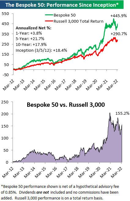
The Bespoke 50 performance chart shown does not represent actual investment results. The Bespoke 50 is updated weekly on Thursday. Performance is based on equally weighting each of the 50 stocks (2% each) and is calculated using each stock’s opening price as of Friday morning each week. Entry prices and exit prices used for stocks that are added or removed from the Bespoke 50 are based on Friday’s opening price. Any potential commissions, brokerage fees, or dividends are not included in the Bespoke 50 performance calculation, but the performance shown is net of a hypothetical annual advisory fee of 0.85%. Performance tracking for the Bespoke 50 and the Russell 3,000 total return index begins on March 5th, 2012 when the Bespoke 50 was first published. Past performance is not a guarantee of future results. The Bespoke 50 is meant to be an idea generator for investors and not a recommendation to buy or sell any specific securities. It is not personalized advice because it in no way takes into account an investor’s individual needs. As always, investors should conduct their own research when buying or selling individual securities. Click here to read our full disclosure on hypothetical performance tracking. Bespoke representatives or wealth management clients may have positions in securities discussed or mentioned in its published content.
The Closer – Peso Push, Distributional Discussion, Roaring Capex – 3/24/22
Log-in here if you’re a member with access to the Closer.
Looking for deeper insight into markets? In tonight’s Closer sent to Bespoke Institutional clients, we begin tonight with a look at EMFX performance followed by a rundown of the Federal Reserve’s quarterly update of Distributional Financial Accounts data. We also show the differing performance of investors by generation. We then take a look at quarterly equity market issuance and retirement data, preliminary durable goods figures, and the 10 year TIPS reopening.

See today’s post-market Closer and everything else Bespoke publishes by starting a 14-day trial to Bespoke Institutional today!
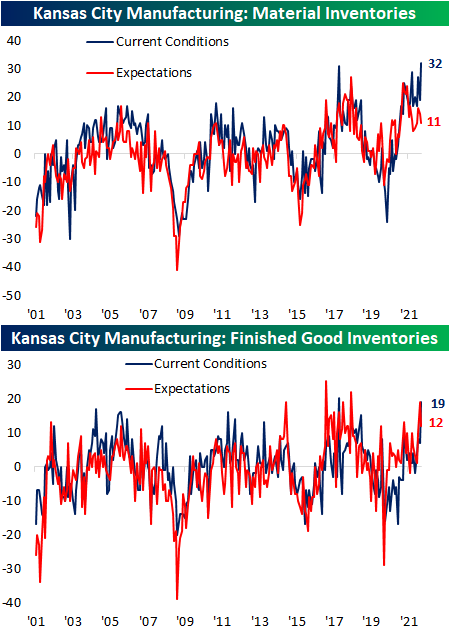
Record Readings From The KC Fed
The fourth of five regional Fed manufacturing indices was released this morning from the Kansas City Fed. The 10th district’s Manufacturing Composite hit a new record high in March rising 8 points to 37. Expectations also set a new record climbing 3 points to 41. Those readings indicate the region’s manufacturers have seen a historic rate of growth and expect that to continue over the next six months.

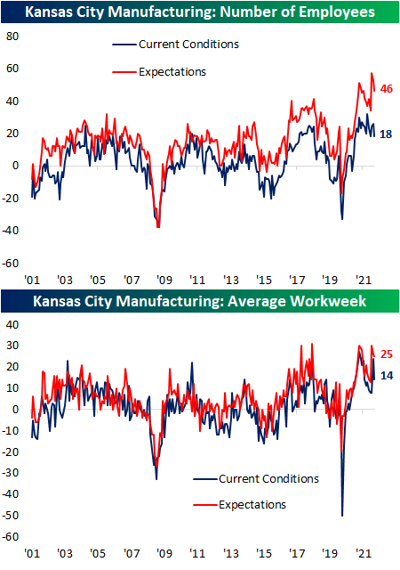
Given the record reading in the headline index, most categories of this month’s report came in at historically elevated readings. Breadth was also impressive with only three categories declining month over month: Number of Employees, Average Workweek, and New Orders for Exports. In spite of those declines, the levels are consistent with healthy growth. Breadth for expectations was more mixed with an equal number of categories rising and falling versus the February report.

Growth in demand only accelerated modestly as the new orders index rose a single point to 33, and order backlogs rose by a more significant 7 points. The ability of the region’s manufacturers to fulfill those orders, meanwhile, was much stronger in March as both shipments and production set new record highs rising 22 and 15 points, respectively. Production expectations also set a new record high.

That higher production also came in spite of supply chain slowdowns. The delivery times index rose back up to the November record high of 55, erasing any of the past few months’ improvements. The expectations index saw the same results in which any recent reversal lower has now been erased as it set another record high.

Similar to delivery times, a huge month-over-month increase in prices paid this month led the index to reverse much of the past year’s decline, though, that was preceded by a large increase in expectations last month. The prices received index has been more rangebound recently but it too ticked higher in March. That is while expectations are rising at a much more rapid rate, setting more all-time highs.

In spite of higher prices paid and supply chain delays, material inventories experienced record builds in March as that index took out the former record from October 2017. Finished good inventories, meanwhile, came up one point shy of its October 2017 record.
The only notably weak area of the report was employment metrics. Both number of employees and average workweek remain in expansionary territory but pulled back in March for both current conditions and expectations. Click here to view Bespoke’s premium membership options.
Bespoke’s Weekly Sector Snapshot — 3/24/22
Bulls and Bears Swing Double Digits
There’s nothing like higher prices to cure investor blues, and the last week has been a perfect example of that. AAII’s weekly sentiment survey saw a double-digit increase in the percentage of respondents reporting as bullish this week with that reading rising from 22.5% up to 32.8% and matching the highest level of optimism in 2022.

Those gains to bullish sentiment borrowed entirely from bears as the percentage of respondents reporting as pessimistic fell from nearly 50% of respondents down to 35.4%. The 14.4 percentage point decline marked the largest weekly decline in bearish sentiment since July 2010 when the reading had fallen by 19.27 percentage points. More recently, however, there have been a couple of other double-digit drops in bearish sentiment including a 12.3 percentage point decline in the first week of March and an 11.9 percentage point drop in December.

Bears continue to outnumber bulls, but the margin has narrowed to the smallest degree since the first week of the year. The bull-bear spread has risen to -2.6 after leaping higher by 24.7 points week over week; the largest one-week increase in the number since October 2019.

Looking at it another way, this week marked the first time since October 2019 that bullish sentiment rose by at least 10 percentage points while bearish sentiment fell by at least 10 percentage points in the same week. In the table below, we show each prior instance of simultaneous double-digit swings in bullish and bearish sentiment without another occurrence in the previous six months. As for how price action has responded to such swings in sentiment, the S&P 500 has generally seen consistently positive performance in the months ahead, but only one week and one-month performance has been significantly stronger on an average or median basis than what has been the norm. Click here to view Bespoke’s premium membership options.

More 52-Week Lows for Homebuilders
Homebuilder stocks are under pressure again today following a weak earnings report from KB Home (KBH) which has the stock trading down over 3%. The weakness in KBH has also shown up in the iShares Home Construction ETF (ITB) which is down 1.6% and on pace for its lowest close in more than a year.

Rising rates have been cited as a major cause behind the weakness in homebuilder stocks, but they aren’t the only factor. As mentioned in the KBH call this morning, constraints in the supply of both labor and materials has also slowed down business for homebuilders. They literally can’t build houses fast enough to meet demand. The chart below compares the performance of ITB versus Bankrate.com’s 30-year mortgage rate (shown on an inverted basis in the chart). Over time, there has been a positive correlation between homebuilder stocks and rates, but there have also been periods where the two have diverged as well, and if you’re long homebuilder stocks, you should be happy that mortgage rates aren’t the only factor driving performance of homebuilder stocks. If that were the case, the recent surge in rates (shown by a falling red line in the chart) would have resulted in a crash in homebuilder stocks.

While homebuilder stocks trade near 52-week lows today and have underperformed the broader market, the current level of underperformance is hardly extreme relative to recent history. The chart below shows the rolling 50-trading day performance spread between ITB and the S&P 500 going back to the start of 2010. At the current level of 11.4 percentage points, the current level of underperformance by the homebuilders has been seen at three other periods since the start of the pandemic in 2020. Click here to view Bespoke’s premium membership options.
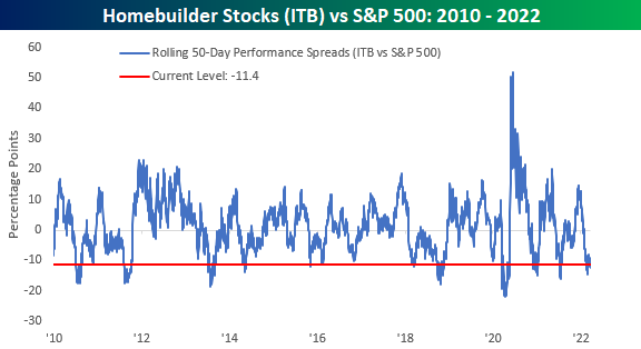
Chart of the Day: Bonds Wrecked Into Quarter End
Jobless Claims at Lowest Level in Over 50 Years
Since early December, initial jobless claims have risen and remained above multi-decade lows. That is until this week. Seasonally adjusted claims fell for a second week in a row down to 187K this week. That is the lowest reading since claims came in at 182K all the way back in September 1969.

While not to take away from the historically strong reading as NSA claims also hit a new low for the pandemic of 181.1K, before seasonal adjustment, jobless claims have not exactly fallen to as significant of a low as the adjusted number. Although that is the lowest level for the current week of the year since 1969, there have been recent periods like the fall of 2018 and 2019 in which claims were even lower. Declines in initial claims have historically been common for the current week of the year, but the next couple of weeks have typically seen claims experience a brief bump before resuming a seasonal downtrend roughly through mid-spring.

Continuing claims have fallen even more consistently with week-over-week improvements in 7 of the past 10 weeks. Now at 1.35 million, continuing claims are down to the lowest level since the first week of 1970. Click here to view Bespoke’s premium membership options.
