More Lows Than Highs
With more than half of the S&P 500 lower today, the index is once again looking to end the week in the red and with weak breadth. As a result of the consistent declines lately across the index, the net reading of the percentage of stocks at new 52-week highs versus lows is on pace to see the first negative reading since December 2nd.
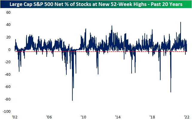
Moving down through the spectrum of market caps, the readings on net new highs only get worse. The S&P 400 which is comprised of mid-cap names has an even lower reading of -6.23% of net new highs today. That is the lowest since November 30th, and prior to that, you would have to go back to the record low readings of March 2020 to find the last time that there were as wide of a margin between the number of stocks hitting new lows versus new highs.

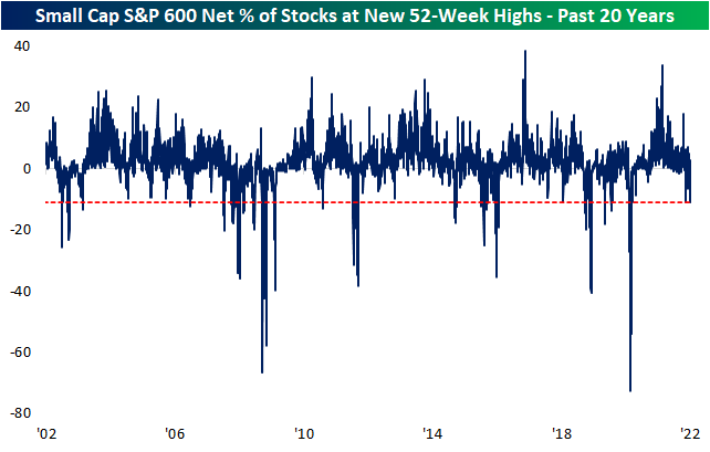
Moving down again to the small cap S&P 600, once again the reading only gets worse. This index is seeing a double-digit negative reading. With a net 11.13% at new 52-week lows, it is the weakest reading since March 23, 2020 and is in the 5th percentile of readings going back to the start of the data in 1995. Click here to view Bespoke’s premium membership options.
Tech Sheds a Trillion
Earlier this week in our Sector Weightings report, we highlighted how the weight of the Technology sector remains well above that of any other sector, though, it did come off recent highs. In terms of market cap, the Tech sector is still valued at nearly $11 trillion. The next largest sectors are Health Care and Consumer Discretionary at a little over $5 trillion. Utilities is currently the only sector with a market cap under $1 trillion. Remember, back in April 2020, the S&P 1500 Energy sector’s market cap got down to just $701 billion!
Taking a look at the changes three weeks into the new year, Tech has already shed over a trillion dollars in market cap. Combined, Consumer Discretionary, Health Care, and Communication Services have also fallen by over a trillion dollars. Meanwhile, only Energy has seen its market cap increase.

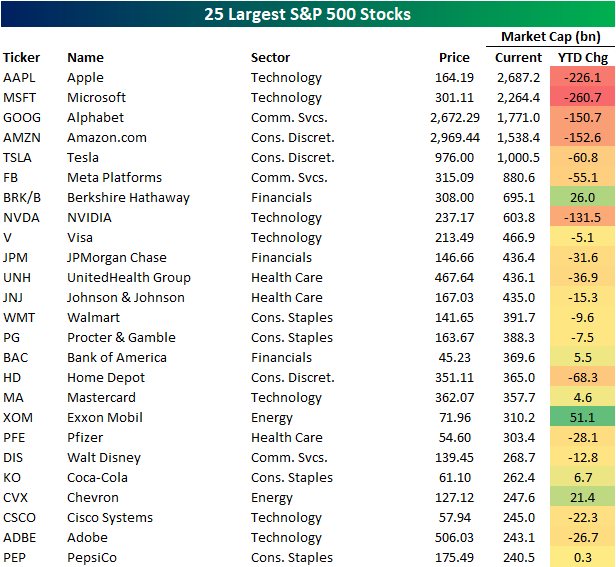
As for the individual stocks of the S&P 500, there are currently five members with market caps above $1 trillion, and those five stocks have seen a combined drop in market cap of roughly $850 billion year to date. Apple (AAPL) and Microsoft (MSFT) are the biggest of these with market caps of $2.69 trillion and $2.65 trillion respectively, and as such, their declines year to date are the largest of any S&P 500 stock. Of the 25 largest S&P 500 members, only a handful have seen their market caps rise so far in 2022. Exxon Mobil (XOM) has seen the largest increase followed by Berkshire Hathaway (BRK/B) and Chevron (CVX).
In the table below, we show the 25 S&P 500 stocks that have seen their market caps rise the most this year. Not only does an Energy stock top the list, but across these 25 names, Energy stocks have the most representation. Financials also have a decent number making the list while not a single Consumer Discretionary or Tech name is to be found. Click here to view Bespoke’s premium membership options.
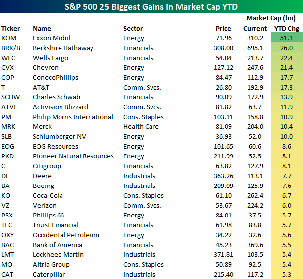
Chart of the Day: Weak Final Hour In 2022
Philly Fed Redeems Empire Fed
Unlike the horrendous Empire Fed’s Manufacturing Report released on Monday, the neighboring Philly Fed’s survey saw somewhat more promising results. Rather than a dramatic drop, the headline number in the January report rose 7.8 points to 23.2. That is just barely in the upper quartile of readings historically and in the middle of the post-pandemic range.

While the main index was higher, breadth was fairly mixed. Again unlike the NY regional Fed survey that was released earlier this week, demand readings were broadly positive with New Orders, Shipments, and Unfilled Orders all higher. Employment, meanwhile, saw a substantial slowdown likely as a result of the Omicron wave.
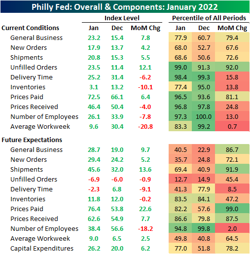
Again, one of the main areas to have seen improvement was demand. While only in the 68th percentile of readings and well off the highs from just a couple of months ago, New Orders and Shipments were both higher. Unfilled Orders saw a much larger increase of 12.1 points to reach a 99th percentile reading. Inventories conversely saw a sharp decline of 10.1 points leaving that index at the lowest level since the negative readings in August.

The surge in unfilled orders and the big drop in inventories amidst only modest rises in shipments and new orders likely means that production took a step back in January, and a likely reason for that is a lack of a workforce due to COVID absentees. That is illustrated through Average Workweek which saw the fifth-largest decline on record as the index hit the lowest level since September 2020. Hiring also pulled back, though more modestly and it is coming off of a record high in December.

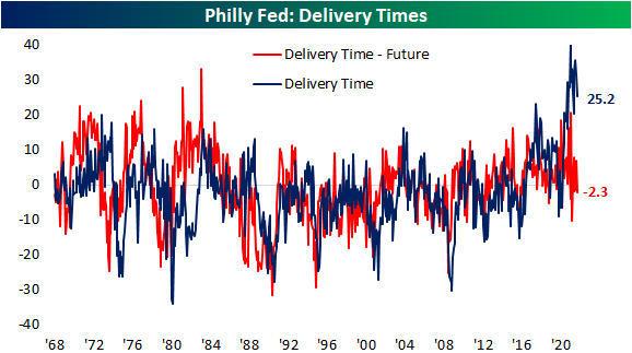
Although workers may not have been spending as much time at work, Delivery Times did manage to improve. That index remains well above any pre-pandemic reading meaning supply chains are still stressed, but the index did fall indicating some easing of the pressures. The expectations index even fell into negative territory indicating responding firms expect delivery times to begin to shorten in the future. Click here to view Bespoke’s premium membership options.
Sentiment Slammed
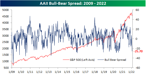
As could be expected with the NASDAQ meeting the technical definition of a correction and the S&P 500 continuing to pull back, sentiment has continued to take a dive with only 21% of respondents to the AAII sentiment survey reporting as bullish this week. That is the second week in a row in which less than a quarter of respondents reported as bullish. It is now also the lowest level since July 2020.
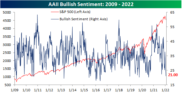
With such a large drop in bullish sentiment, there was a surge in bearish sentiment. Pessimism rose 8.4 percentage points week over week to 46.7%. That is the highest reading since September 2020.

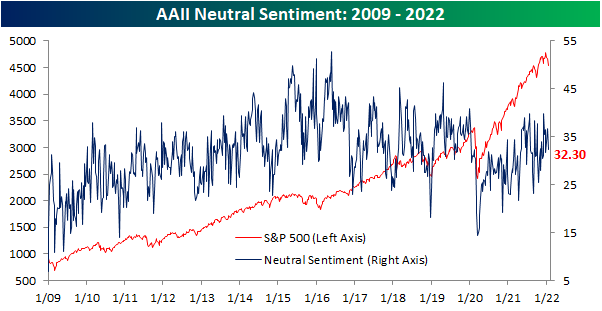
While the decline was more modest, the increase in bearish sentiment also borrowed from those formerly reporting as neutral which fell from 36.8% to 32.3%. Unlike the other two readings, that does not set any sort of significant longer-term high or low, and the one-week change is also only the largest in three weeks.
Given bullish and bearish sentiment were the biggest movers and in opposite directions, the bull-bear spread has moved to a deeply negative reading. In the past two weeks, the bull-bear spread has dropped 25.2 points to -25.7 which is the lowest level—meaning bears outweigh bulls by the widest margin—since July 2020. Click here to view Bespoke’s premium membership options.
Seasonal Strength Didn’t Help Claims
On a seasonally adjusted basis, initial jobless claims were a bit of a dud this week rising all the way up to 286K compared to expectations of a decline from 230K to 225K. That is now nearly 100K above the multi-decade low set at the start of December albeit still at the low end of claims’ historical range of the past several decades.

Part of the reason for the uptick in claims is likely thanks to the rise in COVID cases in recent weeks but there are also some interesting points regarding seasonality for the current week of the year. As shown in the charts below, going back to 1967 when claims data begins, there has actually not been a single time that the third week of the year has seen unadjusted claims up week over week! So seasonal tailwinds for the current week of the year have pretty much been a surefire bet, and as such, unadjusted claims fell from 420.8K down to 337.4K. Although lower, the size of the decline was not nearly as large as could have been expected. At 83.4K, the decline week over week is actually on the small side when compared to the averaged decline of 146.7K for the current week of the year. Overall, claims remain at relatively healthy levels in spite of recent weeks’ deterioration.

Continuing claims are lagged an additional week to the initial claims number making the most recent print through the first week of the year. Seasonally adjusted continuing claims rose to 1.635 million that week. Albeit higher, that is still over 100K below levels from before Christmas and around one of the lowest levels of claims since the 1970s. Given the most recent week’s increase in initial claims, continuing claims are likely to continue to rise next week. Click here to view Bespoke’s premium membership options.

Biden: An Above Average President?
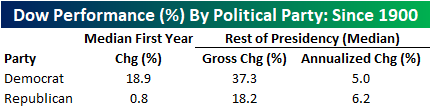
As President Biden concludes his first year in office, we took a look at the performance of the Dow Jones Industrial Average during his presidency thus far. Compared to previous administrations since 1900, performance during Biden’s first year in office has exceeded the historical average by just under two percentage points (12.3% vs 10.4%). In the chart below, it would appear as if Biden’s first year in office was more volatile than it was under previous administrations, but that’s because we’re comparing a single year to an average. In looking at the median absolute daily change under Biden, it was actually quite similar to prior administrations (46 bps vs 47 bps). Even though the Biden administration had a tough start, the Dow was able to recoup all of its initial losses rather quickly and booked a solid first-year return when all was said and done.

Although a strong historical reading, the Dow’s performance during Biden’s first year in office underperformed the first year of the previous two administrations, and Biden ranks ninth versus all other Presidents in first-year performance since 1900. On a median basis, the Dow has outperformed by seven percentage points. Historic first-year returns vary greatly, and the standard deviation for this data set is astoundingly high at 24.7 percentage points. Historically, when the Dow appreciates by over 10% during a President’s first year in office, the average annualized return for the remainder of the Presidency is 5.0% (median: 5.7%), which is about 40 basis points above the average of all periods but below the median.

In addition to the Dow underperforming the last two administrations under Biden, the index has underperformed relative to the median for all Democratic Presidents since 1900 by 6.6 percentage points. Historically, the first-year performance under Democratic leadership tends to be significantly higher than first years under Republican leadership (18.9% vs 0.8%). However, Republican Presidents tend to have higher annualized returns for the remainder of their Presidencies when looking at the median (6.2% vs 5.0%). Stay on top of market trends by becoming a Bespoke subscriber today. Click here to view Bespoke’s premium membership options.
Bespoke Baskets Update — January 2022
Sovereigns Soar
All around the world, government bond yields are on the rise and hitting some significant levels. In many cases, the rapid increase in yields over the past month has resulted in multi-month, if not multi-year, highs. For Spain and Italy, today’s level of yields are the highest since May and June 2020, respectively. The 10 year US Treasury yield has reached the highest level since January 2020 as Canada, France, the UK, and Germany meanwhile have the highest yields since the spring of 2019. In the case of Germany, the bund yield even moved back into positive territory for the first time since 2019. As the 10-year yield on Swiss bonds has reached the highest level since the fall of 2018, it too has moved back into positive territory in recent weeks. While it has also seen a big rise in yields, Brazilian bond yields remain further off of prior highs.
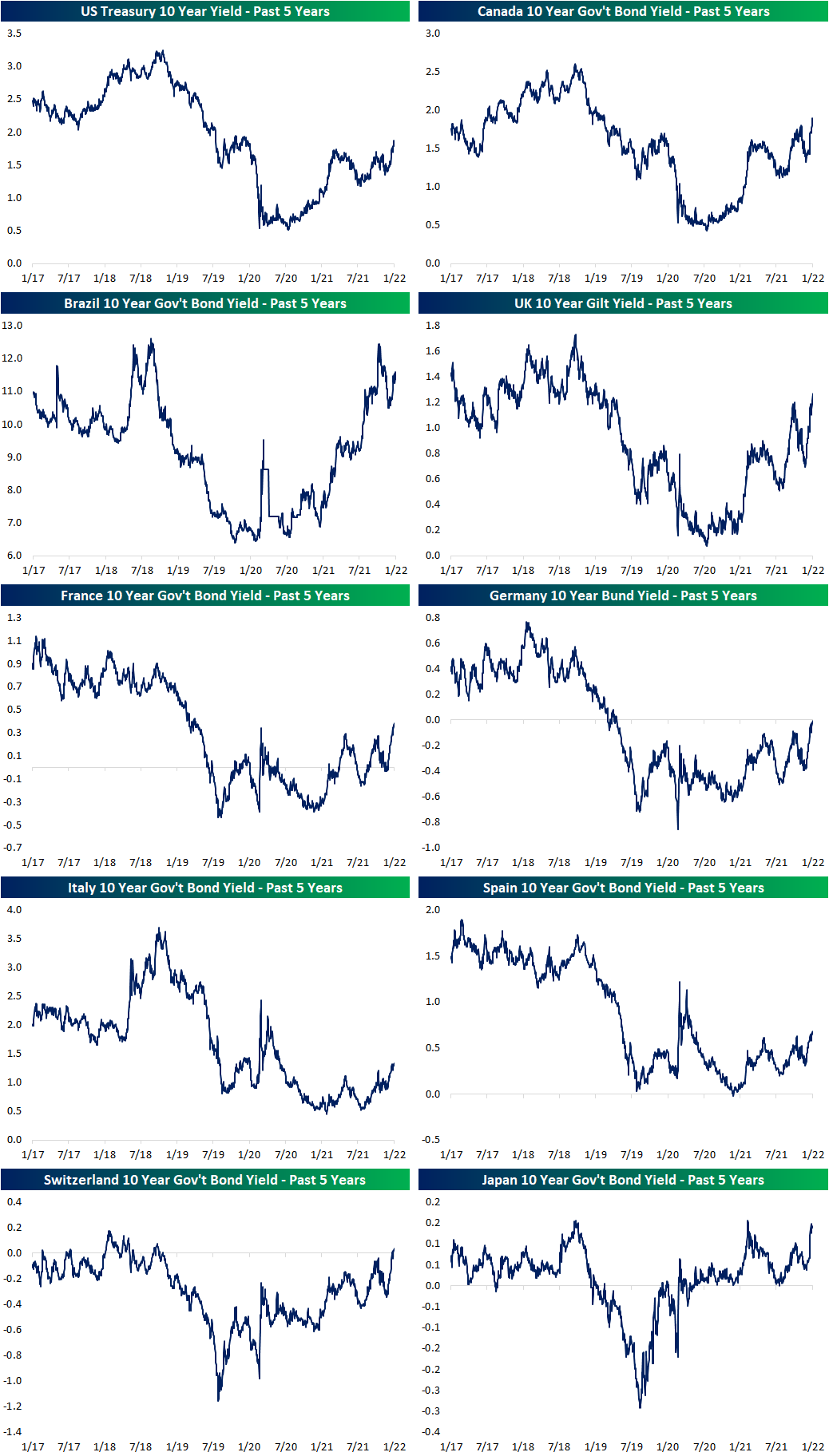
As previously mentioned, the broad move in yields in the past month has been rapid. In the charts below, we show the one-month change in the 10-year yields for these countries’ bonds going back over the past five years. In most cases, the current run has been the sharpest increase since around the time of the COVID crash. For each country shown, those one-month changes also rank in the top few percent of all monthly changes over the past two decades. In fact, for Canadian bonds and UK Gilts, the moves rank in the top 1% of all monthly moves over the past twenty years. In today’s Fixed Income Weekly, we take a closer look at the moves in yields for a range of countries, and the implications for foreign exchange. Click here to view Bespoke’s premium membership options.
