A Blowout Year For Treasuries
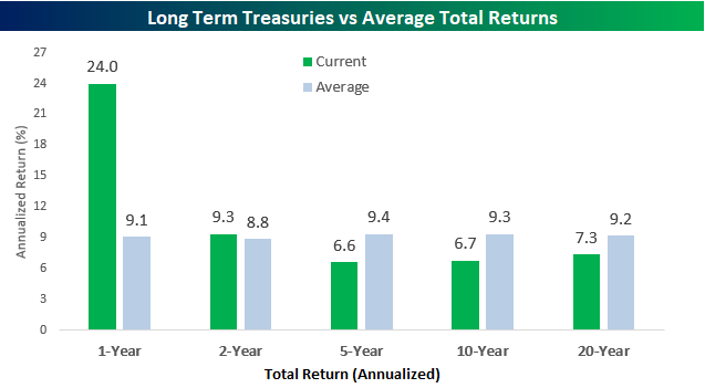
As noted in a post yesterday, the last 12 months haven’t been great for the S&P 500 with the index posting a total return of 4.3% compared to an average one year gain of 11.7%. For long-term treasuries, though, it has been the complete opposite. Based on returns of the Merrill Lynch 10+ Year US Treasury index, long term treasuries have had a total return over the last year of 24%, which is more than two and a half times the historical average of 9.1%. While one-year returns for long-term treasuries have been much better than average, relative to other time frames, historical returns of treasuries have been much more inline or even below their historical averages. Two-year returns are only slightly above their historical average, while five, ten, and twenty-year returns are all below their historical averages.
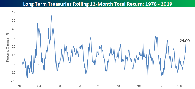
The chart below shows the rolling 12-month total return of long-term US treasuries going back to 1978. The recent surge in performance of Treasuries has taken returns to their highest levels since late 2015 and before that 2012. In fact, compared to all other 12-month rolling returns, the current gain of 24% ranks in the 90th percentile. Not a bad year at all! Start a two-week free trial to Bespoke Institutional for full access to our research and market analysis.
Bespoke’s Global Macro Dashboard — 10/2/19
Bespoke’s Global Macro Dashboard is a high-level summary of 22 major economies from around the world. For each country, we provide charts of local equity market prices, relative performance versus global equities, price to earnings ratios, dividend yields, economic growth, unemployment, retail sales and industrial production growth, inflation, money supply, spot FX performance versus the dollar, policy rate, and ten year local government bond yield interest rates. The report is intended as a tool for both reference and idea generation. It’s clients’ first stop for basic background info on how a given economy is performing, and what issues are driving the narrative for that economy. The dashboard helps you get up to speed on and keep track of the basics for the most important economies around the world, informing starting points for further research and risk management. It’s published weekly every Wednesday at the Bespoke Institutional membership level.
You can access our Global Macro Dashboard by starting a 14-day free trial to Bespoke Institutional now!

Bespoke’s Morning Lineup – 10/2/19
See what’s driving market performance around the world in today’s Morning Lineup. Bespoke’s Morning Lineup is the best way to start your trading day. Read it now by starting a two-week free trial to Bespoke Premium. CLICK HERE to learn more and start your free trial.

The Closer – Incorrect Signal for Markets – 10/1/19
Log-in here if you’re a member with access to the Closer.
Looking for deeper insight on markets? In tonight’s Closer sent to Bespoke Institutional clients, we first take a look at stocks’ triple top and the dollar’s double top. We then turn to macro data including the small miss in construction spending and weak ISM data, which has negative implications for the economy. Finishing on a more positive note, we show performance after similarly bad starts to Q4.

See today’s post-market Closer and everything else Bespoke publishes by starting a 14-day free trial to Bespoke Institutional today!
You Call This A Bull Market?
By just about all accounts, investors have been spoiled over the last ten years as the S&P 500 has rallied more than 13% on an annualized basis. However, when you compare returns for the market over the last one, two, five, ten, and twenty years, current returns are hardly at any sort of historical extreme. The chart below compares the S&P 500’s annualized performance on a total return basis to the average annualized return for all similar time frames. Looking just at the last year (through 9/30), the S&P 500’s total return is 4.3%, which is less than half of the historical average one year total return of 11.7%. Looking at two and five-year annualized performance figures, current returns are just modestly above their historical average. While the ten-year annualized return is almost three percentage points above the historical average, the current 20-year annualized gain of 6.3% is well below the S&P 500’s historical average of 11.0%.
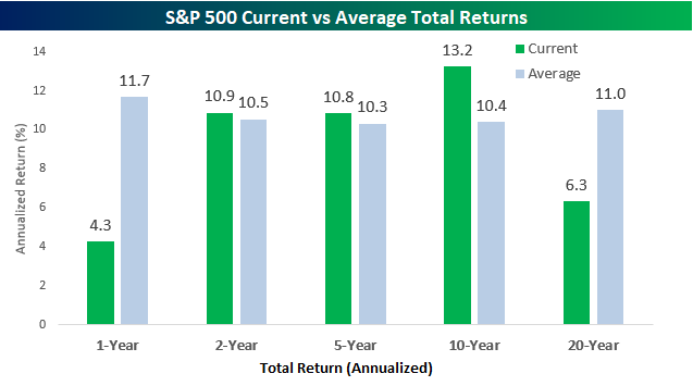
When we compare current returns to all other periods in terms of the percentile rank, they’re even less impressive. Over the last year, the S&P 500’s current one-year gain only ranks in the 31st percentile compared to all other periods. Over the two and five year periods, current returns are just under the 50th percentile compared to all other two and five year periods, and for the ten-year time period, which is the best relative to average of the five time frames shown, current returns are only in the 61st percentile. Where performance really looks pathetic, though, is the 20-year window. The S&P 500’s current annualized return of 6.3% only ranks in the 5th percentile, meaning that 95% of all other 20-year periods have been better than the current 20-year window. Start a two-week free trial to Bespoke Institutional for full access to our research and market analysis.
![]()
Updated Case Shiller Home Price Trends
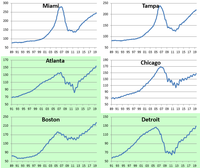
Below is an updated look at recent home price changes for cities across the US based on the monthly S&P/Case-Shiller readings. As shown, a large majority of cities posted month-over-month gains in July, but it was the big three cities of New York, DC, and Los Angeles that saw home prices decline. Cleveland was the biggest MoM gainer at +1.11%, followed by Minneapolis, Phoenix, San Diego, Portland, and Las Vegas.
On a year-over-year basis, Seattle is the only city that posted a decline at -0.64%, while San Francisco was up just barely at +0.15%. These are two mega-cap Tech cities that saw prices boom over the last half dozen years, but they’ve cooled off recently as prices just got too absurd.

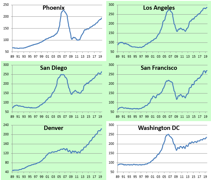
Below we show how much home prices are up or down versus their prior bubble highs seen in the mid-2000s. As shown, all of the composite indices are now at new highs, but there are still seven cities that have yet to get back their prior highs. These include Las Vegas, Phoenix, Miami, San Diego, Tampa, New York, and DC.

San Francisco, Las Vegas, and Detroit are now up 100% or more from their lows following the bursting of the housing bubble in the late 2000s. (Most lows were made in 2011 and 2012.) The composite indices are up roughly 60% from their lows, while home prices in New York are up just 27% since they bottomed out in 2012.

Below we show actual index price levels for the 20 cities tracked by S&P/Case-Shiller. This lets you see the long-term trend in home prices for each city. Cities highlighted in green are ones where home prices have taken out their prior highs during the current economic expansion. Start a two-week free trial to Bespoke Institutional for full access to our research and market analysis.
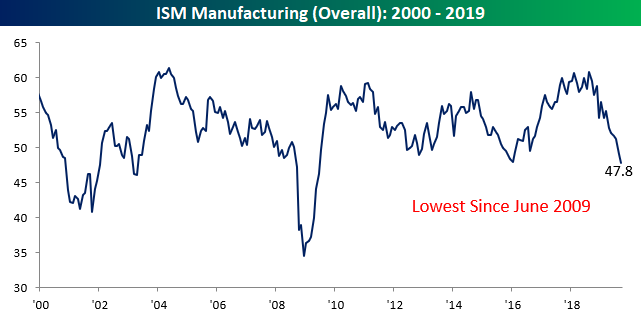
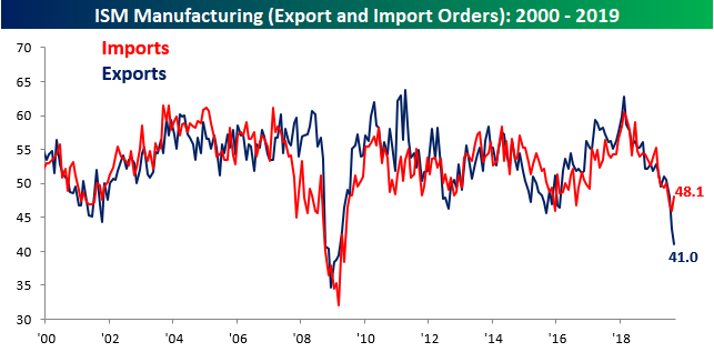
ISM Back to 2009 Levels
Talk about a disappointing start to the quarter. In the first economic report of the new quarter, ISM Manufacturing came in weaker than expected falling from 49.1 down to 47.8 compared to expectations for a reading of 50.0. While a miss of fewer than 1.5 points versus consensus expectations isn’t huge, investors treated it that way as the Dow has reversed more than 400 points from its earlier highs. What really spooked investors was the fact that the headline reading dropped to its lowest level since June 2009.
Breadth in this month’s report was also poor as six categories showed m/m declines while just four showed increases. On a year/year basis, things were even worse as Customer Inventories were the only category up versus this time last year. Some of the more notable decliners were Production (first chart below), which fell to its lowest level since April 2009, and Export Orders which is at its lowest level since March 2009.


In the case of Export and Import Orders, this month we saw a really wide disparity between the two. While Export Orders fell to its lowest level since March 2009, Imports actually increased. Normally these two indices move in unison with each other, but this month saw a wide divergence suggesting that the US economy is still on a better footing than international economies. In fact, the current spread between Exports and Imports hasn’t been this negative since September 2007. Start a two-week free trial to Bespoke Institutional for full access to our research and market analysis.
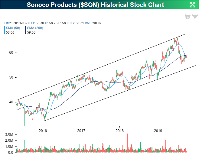
Dividend Stock Spotlight: Sonoco (SON)
One of the world’s largest packing product companies, Sonoco (SON)—not to be confused with major gas station brand Sunoco (SUN)—had a bit of a rough third quarter. Declining just over 10% in this time, the stock fell to the lower end of the past few years’ uptrend channel; taking out both the 50 and 200-DMAs in the process. Since mid-August, though, the stock has rounded out a bottom and has moved back above the 50-DMA. This also coincided with a support level that shares with the highs from around this time of year in 2018. In other words, while the shorter-term trend has been somewhat weak, the longer-term technicals have held up just fine.
SON’s dividend also helps its attractiveness. SON currently pays 2.94%, which is 50 bps more than the average for other Materials sector stocks in the S&P 1500. While somewhat high, the payout ratio is at 55.15%, meaning there is some security in the dividend by that metric. But that is not taking into account the fact that the company has been paying, and growing, its dividend consistently since the mid-80’s. Back in the spring, SON raised its quarterly dividend again from $0.41 per share to $0.43. That means for every 100 shares ($5,818), you’ll get $172 in dividend income per year from SON. That’s nearly twice the $96 you’d get per year from the same $ investment in the 10-Year Treasury.
Bespokecast Episode 31 — Alexandra Scaggs — Now Available on iTunes, GooglePlay, Stitcher and More
We’re happy to announce that the newest episode of Bespokecast is now available to the general public both here and via the various podcast platforms. Be sure to subscribe to Bespokecast on your preferred podcast app to gain access to our full collection of episodes. We’d also love for you to provide a review as well!
In this new episode of Bespokecast we sit down with Alexandra Scaggs of Barron’s. Alexandra joins us to discuss the plumbing of fixed income markets and the evolution of Federal Reserve policy. In recent weeks, the New York Fed has had to intervene in repo markets, driven by a sudden scarcity of liquidity that didn’t exist in recent years. We dive into why that scarcity has suddenly cropped up, why it matters for markets, and what the Fed can do about it in addition to recent steps it has already undertaken. Our guest previously wrote for Bloomberg and the Financial Times, and currently covers fixed income markets for Barron’s. You can follow her on Twitter here.

To listen to our newest episode or subscribe to the podcast via iTunes, GooglePlay, OvercastFM, or Stitcher, please click the button or links below. Please note that third-party podcast feeds may update at a lag of a few hours to this blog post.

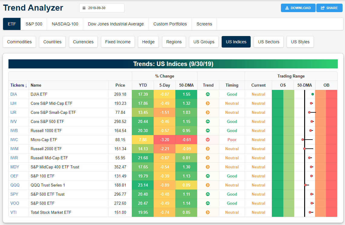
US Equity Markets Enter Q4 in Neutral Territory
Below is a snapshot of US equity index ETFs from our Trend Analyzer tool. The Trend Analyzer helps investors easily see where a large number of stocks or ETFs are trading relative to their normal ranges. When looking at the “Trading Range” section, the black, vertical line represents each ETF’s 50-day moving average, and the dot represents where the ETF’s price is currently trading. The tail end of the dot shows where the ETF was trading one week ago, so if the dot is to the left of the tail, the ETF’s price moved lower within its trading range over the last week.
Over the last week, every major US equity index ETF moved lower within its range with the exception of the Dow 30 (DIA). The small-cap Russell 2,000 (IWM) and the Micro-Cap ETF (IWC) both moved back below their 50-day moving averages, while the Nasdaq 100 (QQQ) is the next closest to testing its 50-DMA. Start a two-week free trial to Bespoke Institutional for full access to our research and market analysis.
Looking at US sector ETFs, we saw Communication Services (XLC), Energy (XLE), and Health Care (XLV) break below their 50-day moving averages over the last week, while Consumer Staples (XLP) moved from neutral to overbought. Along with Utilities (XLU) and Real Estate (XLRE), the only sectors that are overbought right now are defensive in nature.
