The Closer – Global Highs, Value vs Growth – 11/5/19
Log-in here if you’re a member with access to the Closer.
Looking for deeper insight on markets? In tonight’s Closer sent to Bespoke Institutional clients, we take a look around the globe to see how far equities are from their 52-week highs. We also show the outperformance of value relative to momentum and the Technology sector’s valuation. We then take a look at the price action of the Dow Transports and dollar. After that, we recap today’s trade data

See today’s post-market Closer and everything else Bespoke publishes by starting a 14-day free trial to Bespoke Institutional today!
Best and Worst Performing Russell 1,000 Stocks YTD
In the large-cap Russell 1,000, the average stock is up 24.5% YTD. Notably, there are more stocks in the index up 50%+ year-to-date (143) than there are stocks that are down on the year (136). Interestingly, though, there are only nine stocks in the index up more than 100% on the year. We expected to see quite a few more triple-digit gainers in this environment.
Below is a list of the 35 best performing stocks in the index so far in 2019 on a total return basis. As shown, streaming media device company Roku (ROKU) is at the top of the list with a gain of 351%. That’s more than twice as much as the 145% gain seen by Carvana (CVNA), which ranks second. B2B tax software company Avalara (AVLR) ranks third with a gain of 126.5%, and then Universal Display (OLED) and Tempur Sealy (TPX) round out the top five with gains of 114.4% and 106.8%, respectively. LRCX, SWCH, COUP, and TER are the remaining stocks up more than 100% on the year.
The three largest stocks on the list of 2019’s biggest winners are all semiconductors — Lam Research (LRCX), Advanced Micro (AMD), and Appliled Materials (AMAT). Other notables on the list include Xerox (XRX), Caesars Entertainment (CZR), LendingTree (TREE), Hess Corp (HES), and the Trade Desk (TTD).

While there are nine stocks in the Russell 1,000 up more than 100% YTD, there are five that are down more than 50%. Antero Resources (AR), PG&E (PCG), and Centennial Resource (CDEV) are down the most with declines of more than 60%, while 2U (TWOU) and GrubHub (GRUB) are both down more than 50%. Other notables on the list of losers include Lions Gate (LGF/A and LGF/B), Macy’s (M), Virtu Financials (VIRT), L Brands (LB), Gap (GPS), and US Steel (X). Sign up for Bespoke’s “2020” special and get our upcoming Bespoke Report 2020 Market Outlook and Investor Toolkit.

Stocks In The Year Ahead of Elections
Can you believe we still have another year to go before the next election? Even though the Iowa caucuses are still more than two months away, it seems like it has been campaign season forever now. With today being Election Day 2019, though, we wanted to take a quick look at market performance in the year leading up to Presidential elections. Since the 1930s, the 365 days ahead of elections have tended to see stocks rise, with only 1932, 1940, 1960, and 2008 seeing stocks drop as candidates contested the White House. The average return around 6.7% isn’t amazing but isn’t too bad either. Median returns of 7.9% are stronger.

Where things get interesting is the split between parties. At a surface level analysis, the average return for years ahead of Democrats winning the White House has been +3.6%, much weaker than the +10.3% for years ahead of Republicans’ retaking the White House. This would suggest that markets rally more in anticipation of a Republican victory. Taking a closer look, though, median returns are modestly stronger for Democrats in the year leading up to Presidential elections. The reason for the big difference in the average and median is that 1932 and 2008 both saw huge declines in the year leading up to a Democratic victory. The median return isn’t weighted as much towards those two massive declines.
In our view, these numbers suggest little in the way of a difference between market performance leading up to Presidential elections where Republicans or Democrats are victorious. Every election is different. Some are closer than others. In some cases, it is well known which party will win, while in others it is even more ‘well known’ and the other party wins! Besides that, there is also usually a big difference between what a candidate says they will do and what they are actually able to accomplish as President. Presidents Obama and Trump were both elected along with full control of Congress and even they had trouble getting through all of what they campaigned on. In many cases, not even the market knows which party will win, but even more importantly, how their terms in office will unfold. Sign up for Bespoke’s “2020” special and get our upcoming Bespoke Report 2020 Market Outlook and Investor Toolkit.
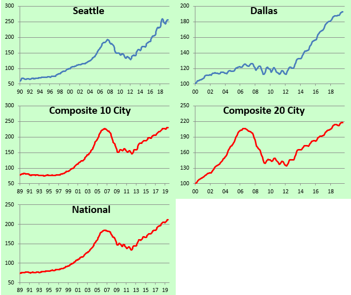
Home Price Changes Around the Country
Below is an updated look at home price changes around the country from the most recent S&P/Case Shiller numbers through August. As shown, 12 of 20 cities saw month-over-month gains, while 19 of 20 cities are up year-over-year. San Francisco is currently the weakest area of the country as it was down the most month-over-month, and it’s the only city down year-over-year. On the other hand, Phoenix is up the most on both a month-over-month and year-over-year basis.

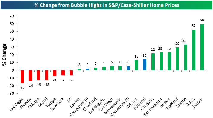
Below we show where home prices in each city stand relative to their prior all-time highs seen during the housing bubble of the mid-2000s. As shown, 13 of 20 cities have eclipsed their prior housing bubble highs, led by Denver and Dallas which are both more than 50% higher now than they were at their prior peaks. On the downside, Las Vegas home prices remain the farthest below their prior highs at -17%, while New York, Chicago, and DC have yet to eclipse prior highs as well.
In the chart below we show how much home prices have gained from their housing crash lows following the bursting of the bubble. While home prices peaked in 2005 during the housing bubble for most cities, they didn’t ultimately bottom until 2011/2012, which was more than two years after the stock market bottomed in early 2009.
The National indices are all up roughly 60% from their lows, and 14 of 20 cities are doing even better than that. San Francisco is up the most from its low at +128%, followed by Las Vegas (+116%), Detroit (+101%), and Seattle (+98%). At the bottom end of the spectrum, New York prices are up just 28% from their lows in the early part of this decade, and the elimination of the SALT deduction from Federal taxes isn’t helping matters for the region.

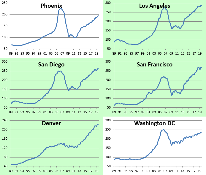
Our final charts show home price levels for each of the 20 cities tracked going back decades, and cities that have eclipsed their mid-2000s housing bubble highs are highlighted in green. Sign up for Bespoke’s “2020” special and get our upcoming Bespoke Report 2020 Market Outlook and Investor Toolkit.


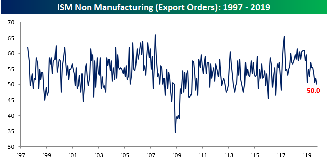
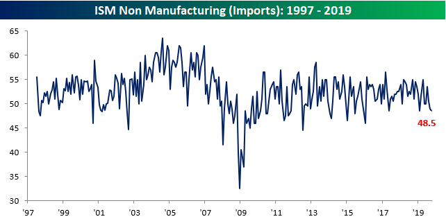
Sigh of Relief in ISM Services
After the Markit PMI reading for the Services sector came in weaker than expected, investors were on edge that the ISM Services report fifteen minutes later would also miss expectations. Thankfully, the report didn’t disappoint as it rose from 52.6 (the lowest level since August 2016) up to 54.7 versus expectations for an increase to 53.5. On a combined basis and accounting for each sector’s share of the overall economy, the October ISM increased from 52.1 (again, the lowest level since August 2016) up to 54.0.

Looking at the internals of the report, breadth was biased to the downside as six components declined on a m/m basis and just four increased. On a y/y basis, though, breadth was all in the same direction and that direction was down, as every component is lower now than it was at this same time last October. While breadth was negative and the overall level of growth is on the weak side, only three components shown below did not show growth (50 or below) in October.

Two of the categories showing no growth in October were Export and Import Orders as the trade war continues to depress cross-border activity. As shown in the charts below, the level of Export Orders is now at its lowest level since early 2017, while the level of Import Orders is at its joint lowest level since January 2016. Sign up for Bespoke’s “2020” special and get our upcoming Bespoke Report 2020 Market Outlook and Investor Toolkit.
Bespoke’s Morning Lineup – 11/5/16 – Even Small Caps Are Getting in on the Action
See what’s driving market performance around the world in today’s Morning Lineup. Bespoke’s Morning Lineup is the best way to start your trading day. Read it now by starting a two-week free trial to Bespoke Premium. CLICK HERE to learn more and start your free trial.

The Closer – Credit + Commodities = Cycle, Missing Pickup for Uber, Equal Weights – 11/4/19
Log-in here if you’re a member with access to the Closer.
Looking for deeper insight on markets? In tonight’s Closer sent to Bespoke Institutional clients, we begin with a note on where credit and commodities stand as equities reach new highs. We also recap Uber’s earnings before turning to an equal-weight breakdown of the S&P 500’s sectors. Turning to macroeconomic data, we review today’s September manufacturing data and the Federal Reserve’s quarterly survey of bank loan officers.
See today’s post-market Closer and everything else Bespoke publishes by starting a 14-day free trial to Bespoke Institutional today!
Dividend Stock Spotlight: Cisco (CSCO)
After declining alongside the rest of the market in the final quarter of 2018, Cisco (CSCO) experienced a sharp rebound in the first half of 2019. But that rally screeched to a halt in August after CSCO and competitor Arista Networks (ANET) lowered guidance citing the impact of trade issues. Whereas the stock was sitting on a 34% YTD gain at its highs in July, it is currently only up only 9.9% YTD. Without finding much relief since those declines this past summer, CSCO’s shorter-term chart has left much to be desired, but on a long-term basis, not all is lost as the stock finds itself at the bottom of the past few years’ uptrend.

Given these declines, CSCO’s valuation has become more attractive and is off the highs from earlier this year. The forward P/E ratio now sits at 14.1 which is below the average for both the Technology sector and Hardware and Equipment industry group. Likewise, the enterprise value is only 9.8x EBITDA which is also below the sector and industry group averages of 15 and 10.8, respectively.
CSCO’s dividend yield has also remained attractive at slightly less than 3%. That is not only higher than the broader S&P 500 and government bonds but is also double the average yield of other S&P 500 technology sector stocks. Cisco (CSCO) first began paying a dividend in 2011, and though that is not an exceptionally long track record, the quarterly payout has grown every year, from 6 to 35 cents per share. CSCO also looks likely to continue to be able to pay and grow this dividend seeing as the company has more cash than debt (Net debt to EBIDTA ratio is -0.5) and the payout ratio is still on the lower side at 67.5%. Start a two-week free trial to Bespoke Institutional to access our interactive Security Analysis tool, model portfolios, and more.

B.I.G. Tips – Year Like 2019: November Edition
After breaking out to new highs last week, the equity market has followed through on its rally to start this week. As of late morning Monday, the S&P 500 was up just under 23% YTD putting it on pace for the best year since 2013 and the 12th best year in the index’s history dating back to 1928. As we highlighted in last weekend’s Bespoke Report, the latest leg higher in equities has come as sentiment among both professional and individual investors remains negative to, at best, neutral.

So how might the stock market trade for the remainder of 2019 based on the pattern we’ve seen so far this year? As we regularly do throughout the year, we ran the correlation of the closing prices of the S&P 500 so far in 2019 to the closing prices for every other year through 11/4. In our newest BIG Tips report, we have highlighted the ten years where the correlation coefficient with 2019 was the highest. For each year, we also show the S&P 500’s YTD gain through 11/4 and then how the index performed for the remainder of the year, including the maximum gain and loss from the 11/4 close through year-end. Read the report to find out if these 10 prior years that look most similar to 2019 saw further gains or a downside reversal from now through year end.
For anyone with more than a passing interest in the market’s seasonal patterns, this report is a must-read. To see it, sign up for a monthly Bespoke Premium membership now!
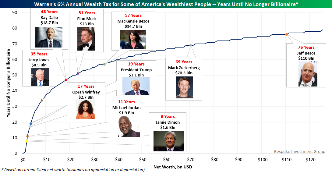
Warren’s Wealth Tax and America’s Wealthiest
Late last week, Democratic Presidential hopeful Elizabeth Warren quite literally doubled down on her proposed wealth tax, announcing that the annual tax rate on billionaire’s net worth would be 6% rather than the previously proposed 3%. Friday afternoon, we tweeted the chart below showing how many years it would take for some of America’s wealthiest people to lose their “billionaire” status given this tax’s erosion on their wealth. This is based on their current reported net worth (from a simple Google search) and doesn’t assume any appreciation or depreciation of assets from here.
Some of the most famous billionaires in the country like JP Morgan Chase CEO Jaime Dimon, Oprah, Michael Jordan, and even the President would no longer be billionaires less than 20 years down the road if taxed at Warren’s proposed 6% rate. For others like Bridgewater Associates’s (one of the world’s largest hedge funds) Ray Dalio, Dallas Cowboys owner Jerry Jones, or Tesla/SpaceX’s Elon Musk, it would take a bit longer to lose the billionaire status. As for the richest man in the world with a net worth of roughly $110 billion — Amazon’s founder Jeff Bezos — he has less to worry about as it would take just a couple years less than the average American’s lifespan to no longer be a billionaire. Granted, the first wealth tax check written to Uncle Sam would total $6.6 billion for Bezos, and that doesn’t even include other taxes (e.g., income, property, capital gains). Start a two-week free trial to Bespoke Premium to access our daily research and interactive tools.