Bespoke Brunch Reads: 9/27/20
Welcome to Bespoke Brunch Reads — a linkfest of the favorite things we read over the past week. The links are mostly market related, but there are some other interesting subjects covered as well. We hope you enjoy the food for thought as a supplement to the research we provide you during the week.
While you’re here, join Bespoke Premium with a 30-day free trial!
COVID
J&J offers PhI/IIa data showing its single-dose vaccine can stir up sufficient immune response by Amber Tong (Endpoints News)
The outlook for vaccine coverage got a shot in the arm this week as Johnson & Johnson’s early stage data revealed that a single dose gave 98% of participants neutralizing antibodies 29 days after administering just one dose of vaccine. [Link; soft paywall]
How Italy Snatched Health From the Jaws of Death by Elisabeth Braw (Foreign Policy)
After a horrifying first wave, Italians have avoided seeing a resurgence in COVID infections, unlike many of their European neighbors. [Link]
SARS-CoV-2 Transmission Dynamics Should Inform Policy by Muge Cevik, Julia Marcus, Caroline Buckee, and Tara Smith (SSRN)
A detailed review of possible mitigation strategies based on the results of contract-tracing studies. Lower income and high-occupant households are key to the strategy. [Link]
A Notorious COVID Troll Actually Works for Dr. Fauci’s Agency by Lachlan Markay (Daily Beast)
One of the National Institute of Allergy and Infectious Diseases’ PR team has been waging an online disinformation campaign designed to undermine NIAID communications related to COVID. [Link]
“Security”
Ring’s latest security camera is a drone that flies around inside your house by Dan Seifert (The Verge)
Home surveillance company Ring is rolling out an aerial drone designed to be used inside the home, allowing users to remotely activate and patrol when they’re away. [Link]
Texas Deployed SWAT, Bomb Robot, Small Army of Cops To Arrest A Woman And Her Dog by Seth Harp (The Intercept)
Police shut down an entire bridge because they thought a woman’s car decorations meant she was carrying a bomb. [Link]
Schools
Temperature Isn’t a Good Litmus Test for Coronavirus, Doctors Say by Sumathi Reddy (WSJ)
Schools and a variety of other institutions have been using temperature as a proxy for COVID infection, but the loose proxy for infections might be much less useful than widely hoped. [Link; paywall]
New York’s Online Class Sizes Could Reach Nearly 70 Students by Lee Hawkins (WSJ)
With NYC’s in-person reopening of classrooms pushed back, online learning programs may be overwhelmed by students who had planned for in-person learning. [Link; paywall]
Forgone Growth
Citi Pledges to Become Antiracist, Review Internal Policies by Jennifer Surane (Bloomberg)
A new Citigroup report estimates that economic discrimination against Black Americans has cost the US economy $16trn over the last 20 years via lost wages, less education, and less access to loans for business or homeownership. [Link; soft paywall]
Americans Want Homes, but There Have Rarely Been Fewer for Sale by Nicole Friedman (WSJ)
Thanks to both longer-term structural patterns including demographics and the shorter-term drive of lower interest rates and the COVID pandemic, there aren’t many houses available to buy these days. [Link; paywall]
Conservation
Botswana says toxins in water killed hundreds of elephants by Brian Benza (Reuters)
Bacterial blooms in drinking water that produce toxins that are toxic to animals are responsible for the deaths of hundreds of elephants, a devastating side-effect of climate change for an already stressed population. [Link]
Airbus has revealed three zero-emission plane designs that could become reality in just 15 years — take a look at the hydrogen-powered aircraft of the future by David Slotnick (Business Insider)
Hydrogen powered planes are being touted by Airbus as a potential climate solution, with three concept models in the works and potentially ready within 15 years. [Link]
Sustainability Timeline: Walmart’s Journey to a Better Future (Walmart)
This week Wal-Mart committed to zero emissions by 2040 and reserving 50 million acres of land and 1 million square miles of ocean by 2030. [Link]
Read Bespoke’s most actionable market research by joining Bespoke Premium today! Get started here.
Have a great weekend!
“Low Energy” Energy
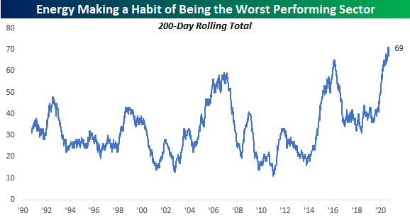
US stocks are looking to close out the week on a positive note with the S&P 500 up over 1%. One sector that hasn’t been participating in the rally, however, is Energy. While it just moved back into positive territory for the day, the sector remains at the back of the pack in terms of sector performance. If these levels hold for the remainder of the trading day, it will be the 69th time in the last 200 trading days that Energy has been the worst-performing sector. That works out to more than once every three trading days. Talk about a sector that’s in liquidation mode!
The chart below shows the rolling 200-day total number of days that Energy has been the worst-performing sector in the S&P 500. While the current level of 69 is extremely high, earlier this month the rolling 200-day total was even higher at 71. Over this same period of time, no other sector has even seen close to as many days of ranking at the bottom as Energy. The next closest is Utilities as it has been at the bottom of the pack in terms of performance on 36 of the last 200 trading days. It hasn’t just been the last 200 trading days that have been rough for the Energy sector. Over the last five years, the sector has been the worst-performing sector on just over 23% of all trading days. Is this what it felt like for the horse and buggy companies in the early 1900s or the ice-harvesting companies after the invention of electric refrigeration? Click here to view Bespoke’s premium membership options for our best research available.
Bespoke’s Morning Lineup – 9/25/20 – Tug of War Continues
See what’s driving market performance around the world in today’s Morning Lineup. Bespoke’s Morning Lineup is the best way to start your trading day. Read it now by starting a two-week free trial to Bespoke Premium. CLICK HERE to learn more and start your free trial.
“Short term volatility is greatest at turning points and diminishes as a trend becomes established.” – George Soros
It’s been a relatively volatile night in the markets as futures vacillate between modest and steeper losses. Currently, they are closer to the side of modest weakness, but that’s subject to change depending on the market’s latest whims. European markets are seeing even sharper declines as we close out another lousy September week for markets. Investor concerns about the election and an expansion of the COVID outbreak continue to keep a lid on any market upside. Despite the rising concerns over COVID, the cruise lines are a notable bright spot this morning as Barclays upgraded the group.
Be sure to check out today’s Morning Lineup for a rundown of the latest stock-specific news of note, market performance in the US and Europe, trends related to the COVID-19 outbreak, and much more.

September has certainly been a rough month for stocks, and the charts below show just how consistent the selling has been. The chart on the left shows a composite chart of the S&P 500’s performance this month, and the one on the right provides an hourly breakdown of performance. To sum things up, when the market has been open, investors have been selling. Besides some ever so modest gains in the opening half-hour, the rest of the day consists of investors hitting bids and unloading stocks. While the 10-11 hour has seen the steepest losses, every other hour of the day from 11 AM on has also seen losses on an average basis. Looking on the bright side, after today there are only three trading days left in the month.

Bullish Sentiment Slipping and Sliding
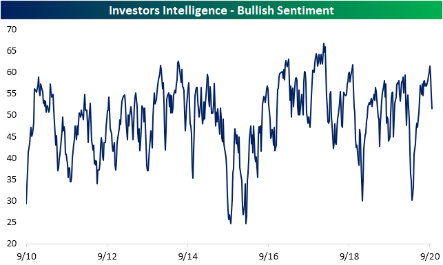
Last week, when the S&P 500 was appearing to hold up at support at its 50-DMA, bullish sentiment managed to significantly rise to 32.02%. But in the week since then, the S&P 500 has taken another leg lower, falling below its 50-DMA and is now 9% from the September 2nd high. Today the index even briefly met the technical definition of a correction (10% decline from a high) on an intraday basis. Given this, bullish sentiment, as seen in the American Association of Individual Investors‘ weekly survey, has likewise taken a sizeable turn lower. Just 24.89% of responding investors this week reported as bullish. While lthis is a low reading, this week’s reading is actually slightly higher than two weeks ago (23.71%) following the initial drop from the highs.

While the AAII survey has consistently held a bearish bias over the past few months despite the market rally, the Investors Intelligence survey of equity newsletter writers has been more optimistic. That is until the past few weeks. 51.5% of respondents to this survey are now reporting as bullish which is the lowest reading since the last week of May. Back at the September 2nd high, this survey showed 61.5% of respondents as bullish; the most since October of 2018. The 10 percentage point drop in that time was the largest decline in three weeks since March.
As a result of the losses in bullish sentiment, bearish sentiment in the AAII survey rose from 40.39% to 45.99%. Just as with bullish sentiment, there was a higher reading of 48.45% two weeks ago in the wake of the initial drop off the highs, but this week’s move returns bearish sentiment to levels seen throughout the spring and first half of summer.
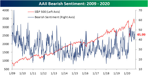
With the inverse moves in bullish and bearish sentiment, the bull-bear spread widened to the low end of the past several month’s range at -21.1. The record streak of negative bull-bear spread readings has also continued to grow, now extending to 31 weeks.

Neutral sentiment was also higher this week rising to 29.11%, bringing the reading up to the same level as July 23rd. Click here to view Bespoke’s premium membership options for our best research available.

“The Captain Has Turned on the Fasten Seat Belt Sign”
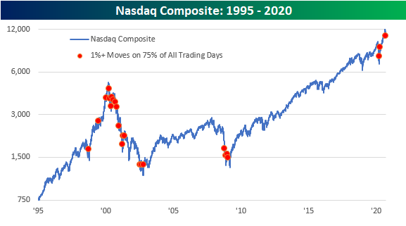
Since most of us haven’t been on planes in quite a while, it’s been some time since we last heard the above statement warning of turbulence ahead. If only we had one for the market. While there’s still another week left in the month, this September is on pace to be one of the most volatile in terms of the frequency of 1% daily moves (up or down) for the Nasdaq Composite. The table below on the left shows the daily percentage moves of the Nasdaq so far in September. Of the 17 trading days so far including today, all but three have seen one-day moves of at least 1%, and on one of those three days (9/2), the daily move was 0.98% or just shy of 1%. We would note that the Nasdaq has been fluctuating multiple times today between a move of above or below 1%, so depending on where things settle today, the percentage of 1% days this month will be either 82.4% or 76.5%.
If today’s move settles at 1% or more, this month will be on pace to rank as number eight in terms of the highest frequency of 1% daily moves (table on left). It is also on pace to be just the 24th month since 1970 where the Nasdaq moved 1% or more on at least three-quarters of all trading days. Looking through the table, the majority of other months were from the late 1990s through 2002, but there were also a handful of occurrences during the financial crisis and earlier this year.

The chart below of the Nasdaq since 1995 includes red dots indicating each month where the Nasdaq moved 1%+ on at least 75% of all trading days. During the run-up and crash from the dot-com boom, there were occurrences on both sides of the peak, but the vast majority of them came after the peak and then occurred periodically right up through the low in October 2002. During the Financial Crisis, there were four straight months of occurrences spanning October 2008 through January 2009. More recently, March of this year saw the fifth-highest percentage of 1% days at 86.4%, and then in April, just over 76% of all trading days saw 1% moves. With a number of indicators and trends in the market lately, the two periods that keep popping up are the late 1990s to early 2000s and the Financial Crisis, and in the case of a high frequency of 1% daily moves, the same can be said. Keep those air sickness bags handy! Click here to view Bespoke’s premium membership options for our best research available.
Is Seasonality Driving Claims?
Seasonally adjusted initial jobless claims have stubbornly remained in the elevated upper 800K range with this morning’s release rising by 4K to 870K. That was worse than expectations of a reading of 840K which would have marked a 26K improvement from last week. While it was not an improvement, claims have been fairly stable with this week’s increase not being particularly large as it only leaves initial claims at their highest levels since the first week of September when they were at 893K. In fact, although comparisons to pre-September readings are not perfectly like for like on account of the recent changes to the seasonal adjustment methodology, since the pandemic began the only smaller weekly move was a 2K decline in mid-July.

On a non-seasonally adjusted basis, claims were also higher rising to 824.5K from a pandemic low of 796K last week. But just as with the seasonally adjusted number, that only brings claims to the highest level since two weeks ago. As shown in the second chart below, assuming this year follows the seasonal patterns that have been observed in the past, the 37th week of the year (last week) has, on an average basis, been the seasonal low for jobless claims with a steady rise in claims through New Year’s. That means that this week’s increase in non-seasonally adjusted claims could just as well be a factor of seasonality as a material worsening in the data.


Meanwhile, seasonally adjusted continuing claims also missed expectations of 12.275 million with a reading of 12.58 million. While higher than expected, that was lower from last week’s upwardly revised 12.747 million. Again, the caveat applies of comparisons not being perfectly like for like due to changes in seasonal adjustment, but that would mark the lowest continuing claims reading since the first week of April.

Although the headline number for initial jobless claims was higher this week, including Pandemic Unemployment Assistance (PUA) total claims were actually lower. Initial PUA claims fell from 675K to 630K marking the lowest level of PUA claims (as well as total claims) in a month. While that is still a massive number of people filing for unemployment, it is an improvement and puts this week’s print right inline with the average of what has been observed since the beginning of August.
As for continuing claims, there was a steep drop in PUA claims for the most recent week (the first week of September). Claims dropped from 14.5 million to 11.5 million. That is the fewest continuing PUA claims since the first week of August. Combined with the standard unadjusted continuing claims, there were 24 million total claims which, while still a massive number, is the lowest reading since April. Click here to view Bespoke’s premium membership options for our best research available.

Bespoke’s Morning Lineup – 9/24/20 – It Could Be Worse
See what’s driving market performance around the world in today’s Morning Lineup. Bespoke’s Morning Lineup is the best way to start your trading day. Read it now by starting a two-week free trial to Bespoke Premium. CLICK HERE to learn more and start your free trial.
“For September so far this year the spending by $BAC customers both on debit and credit cards is up–spending overall is up.” – Brian Moynihan, CEO Bank of America
Futures have been modestly lower for most of the morning, but we have a busy day of Fed speakers on the schedule, and jobless claims were just released. Both reports came in higher than expected. Initial claims came in at 870K versus expectations of 840K while continuing claims were more than 300K above consensus forecasts (12.58 million versus 12.275 million). The only other economic data on the calendar is New Home Sales at 10 AM (estimate – 890K) and KC Fed Manufacturing (estimate – 14).
While the labor market appears to be slowing, or even weakening a bit, it was somewhat encouraging to hear Bank of America CEO Brian Moynihan say in an interview on CNBC this morning that both spending and checking account balances in its customer accounts is higher this September than it was last September.
Be sure to check out today’s Morning Lineup for a rundown of the latest stock-specific news of note, market performance in the US and Europe, economic data in Europe, trends related to the COVID-19 outbreak, and much more.
Yesterday was a lousy day for bulls capping off what has been a lousy month. It could be worse. It has now been three weeks (14 trading days) since the S&P 500’s high on September 2nd, and during that span, the index has declined nearly 9.6%, which is just shy of the technical definition of a correction.
Now, rewind six months. Half a year ago this morning, we were all coming in to our desks (or more accurately, at our kitchen counters, a corner of the bedroom, or maybe down at a table in the basement) and looking at a market that had just lost more than a quarter of its value in the same span (14 trading days). By just about all accounts, things were looking bleak. In the six months that followed, though, the S&P 500 has rallied more than 40% in what, even after the declines of the last three weeks, has been one of the strongest six-month rallies in the history of the stock market.
In a B.I.G. Tips report yesterday, we looked at prior periods where the S&P 500 saw similar moves over a six-month stretch to see how the S&P 500 performed going forward. If you haven’t already, make sure to read it over.

Restaurant Stocks Getting Burnt
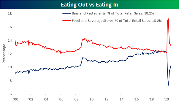
In our recap of last week’s retail sales report, we noted how there is evidence of a trend of Americans returning to spending habits prior to the pandemic. Namely, that can be seen through spending at bars and restaurants which was the strongest category in August having grown 4.71% month over month. The past decade has seen spending at bars and restaurants as a percentage of total retail sales gaining share and eventually overtaking spending at food and beverage stores. In other words, Americans began to spend more eating out than eating in; that is up until the pandemic. COVID’s reversal of this trend reached an apex in April, but more than half of that move has since been erased. Now bars and restaurants account for 10.2% of total retail sales versus 13.2% for food and beverage stores. So while bars and restaurants have taken a big hit and are far from out of the woods, recent months have seen improvements.
While aggregate spending data for bars and restaurants is not yet back to pre-pandemic levels, the Russell 3000 Restaurants and Bars group has managed to recover all of its COVID-Crash declines. Since its low in mid-March, the index has been trending higher having rallied 63.8%.
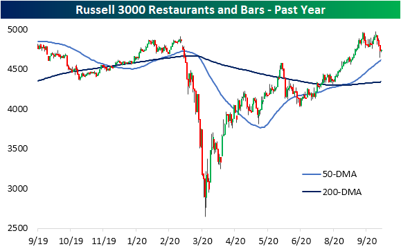
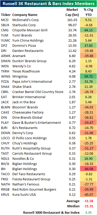
This index includes 35 stocks with a variety of niches ranging from fast food like McDonald’s (MCD) to coffee chains like Starbucks (SBUX) and Dunkin (DNKN) to less grab-and-go oriented chains like Dave and Buster’s (PLAY). Although the index may look like it has held up well at face value and is currently positive on a year to date basis, under the hood the individual stocks of the index are painting a weaker picture. Whereas the cap-weighted index is up 3.35% YTD, the average stock in the index is down 11.31%. In other words, the strength of the index is not so much a factor of broad strength of restaurant stocks, but instead is a result of solid performance of some key large-cap players like Chipotle (CMG), McDonald’s (MCD), and Domino’s (DPZ) to name a few. Click here to view Bespoke’s premium membership options for our best research available.
Bespoke CNBC Appearance (9/22)
Bespoke co-founder Paul Hickey appeared on CNBC’s The Exchange yesterday (9/22) to discuss the current setup of Apple (AAPL) and the broader market in general. To view the segment, please click on the image below. Click here to view Bespoke’s premium membership options for our best research available.

Mean Reversion Seen Around the Globe
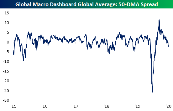
Each Wednesday, we publish our Global Macro Dashboard which provides a high-level summary of economic and market indicators of 23 of the world’s largest economies. Included in this report we show the charts of each of these countries’ stock markets and glancing across these charts, the US has not been alone in falling back below its 50-DMA. In the chart below, we show the average distance to the 50-DMA of these 23 countries. At the start of the summer, the global average 50-DMA spread was at the highest levels of the past five years after hitting multi-year lows just months earlier, but through the summer that reading gradually moderated. With weakness in equities around the globe since the start of the month, the average global stock market was 2.43% below its 50-DMA as of yesterday’s close. That is the lowest reading since April. In other words, equity markets around the globe have mean reverted just like the US.
In fact, there are only a small handful of these countries that are currently sitting above their 50-DMAs. Of these Switzerland, Sweden, and Japan are further above at over 1% while Russia and South Korea are a more modest 0.1% and 0.3% above their 50-DMAs, respectively. For the US, this month’s declines only leave the S&P 500 roughly 1% below its 50-DMA which is actually one of the stronger readings (third highest) among countries that are trading below their averages. Currently, nine of these countries are more than 2% below their moving averages.

Although major global equity markets are generally together in sitting below their 50-DMAs, the US is coming from a much different place than most other counties. For starters, other than the US, only South Korea and Taiwan reached new 52-week highs in September while South Africa is the only other country to have seen a 52 week high since the beginning of August.
As shown in the table below, prior to the recent mean reversion (at the last high for the S&P on September 2nd), US equities were 9% above their 50-DMA. That compares to the global average of just 1.4% at the same time. The country that was the next most extended besides the US was South Korea at +4.8%. Since then, US equities have dropped 7.41%, with the month to date decline at 5.3% which is second only to Hong Kong’s 5.7% drop. In other words, equities around the globe have experienced mean reversion, but price action in the US has been some of the most dramatic and perhaps most justified. Click here to view Bespoke’s premium membership options for our best research available.
