University of Michigan Mixed Again
The University of Michigan reported preliminary consumer sentiment numbers for October. University of Michigan data has shown a much smaller bounce than other sentiment surveys, but the preliminary numbers for October did increase versus September. The strongest part of the survey was expectations, which has risen three months in a row to the highest levels since March. Consumers’ current assessment of the economy fell sequentially and is sitting at about the same place it was back in early 2012.

One feature of the University of Michigan poll with incomplete data prior to 2016 but more complete data since is a breakout of economic sentiment by political party affiliation. As shown below, their data shows Republicans getting a massive sentiment boost in the wake of the 2016 election. The key here though, is that the boost to the sentiment of Republicans and the decline for Democrats came after the election as this data is definitely lagging to political outcomes rather than leading. Click here to view Bespoke’s premium membership options for our best research available.

2020 Elections: Strong Turnout Ahead
Betting markets sites like Election Betting Odds and poll aggregators like FiveThirtyEight or The Economist are all diligently predicting who wins the 2020 election, but almost as interesting to watch is voter participation. We won’t be doing any forecasting on election outcomes in this post; there are lots of arguments both ways about which candidate or party might benefit from changes in overall voter turnout, and we’re not equipped to answer them. But we do feel like 2020 being a very strong turnout year is a safe bet.
So far, over 17 million voters have already cast their ballots among the 36 states reporting early vote and/or mail-in ballot tallies per U.S. Elections Project. Patterns of early voting activity vary widely across states thanks to different rules and timelines for mail-in or early voting. Of the 36 states for which data exists, four have ballots cast at less than 5% of 2016 levels. In contrast, Vermont has already seen more than a third of 2016 votes cast submitted early. Texas, which has limited mail voting and is just two days into early voting, has already seen nearly 20% of 2016 votes cast. California’s mail-heavy system is above 10%.

So is that an unusual number of pre-election votes cast? In a word, yes. Data from TargetSmart, a Democratic Party-aligned analytics firm, shows total early voting is running at a pace roughly six times what it did in recent Presidential years. Of course, the COVID-19 pandemic is driving more folks to mail their votes in, so maybe the huge numbers of early and mail-in voters aren’t showing an actual turnout surge. But other leading indicators do support the idea that 2020 will see strong participation.
One example is midterm participation from 2018. The last midterm election saw the highest voter turnout since 1970 per the U.S. Elections Project. Historically, prior midterm turnout isn’t a great indicator for Presidential year turnout, but there is some co-movement.

A better example is Gallup surveys asking people how enthusiastic they feel about upcoming elections versus past elections. As shown in the chart below, the spread between the two tends to be a pretty good predictor of overall turnout in Presidential elections since 1996; the only major departure was 2016, when the Gallup measure substantially undershot overall turnout. This makes a very compelling case that Americans are set to vote in relatively large numbers.

If the Gallup numbers are correct, and the early vote numbers are certainly consistent with them, then this would be the highest turnout year since 60.7% of Americans voted in the 1968 election of Richard Nixon (Republican), higher even than the 2008 election of Barack Obama (Democrat). Stay on top of major election trends and their impact on the financial markets with a Bespoke. Click here to view Bespoke’s premium membership options for our best research available.

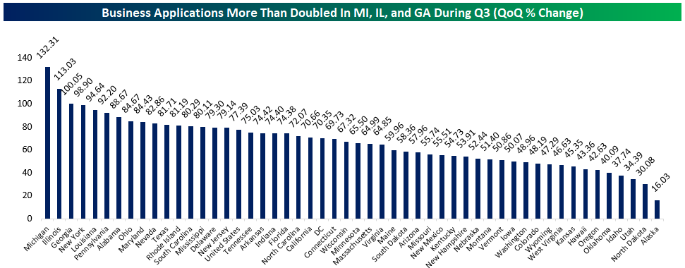
Record Surge In Business Formations As Economy Recovers From COVID
Yesterday the Census updated business formation stats for Q3, and as indicated by high-frequency data from the Atlanta Fed, business formation exploded in Q3. As shown in the first chart below, total business applications rocketed upwards by 1.57 million, a record increase. Stripping out businesses that are unlikely to result in hiring, the numbers are much smaller in absolute terms but still rose 79% to a record pace. Finally, applications for businesses with planned wages surged 70% from a record low in Q2, to the highest levels since 2008.

In all three instances, the recent behavior is a complete reversal of the post-Financial Crisis period, when the prolonged recession led to a huge decline in business starts. That’s a good sign for the breadth of the economic rebound, as business formation tends to lead to higher productivity thanks to more innovation and investment. Below we show changes in total business applications by state; Michigan, Illinois, and Georgia are the biggest winners, with applications more than doubling. This analysis was originally published in our evening report — The Closer — on 10/14/20. Click here to start a free trial to Bespoke Institutional and receive our daily Closer for the next two weeks, featuring more commentary and data on macro markets.
Second District Sagging
Whereas the Philadelphia Fed’s October reading on the manufacturing sector blew expectations out of the water, the New York Fed’s reading also released this morning was more of a dud on the headline level. Unlike the Philly Fed which surged this month to the upper 5% of all readings, the New York Fed’s index fell more than expected and is much more modestly in the upper half of its historical range. The headline index was expected to fall to a reading of 14 from 17 last month, instead, it fell further down to 10.5. Meanwhile, optimism has waned as the index for expectations six months out also declined and has now fallen in three of the last four months since its peak. That is not to say businesses are pessimistic and activity has not continued to improve though. These readings are still indicative of further improvements to business conditions but just at a slower pace than September, and expectations are still higher than they have been for much of the past couple of years.

Looking under the hood at the individual categories of the report, the picture is a bit better. New orders and shipments have continued to rise while lead times have fallen. Employment is also higher with a significant uptick in the average workweek. Expectations are more negative as the outlook for demand and expenditures has weakened. These readings are also generally lower within their respective historical ranges.

As mentioned above, demand remains solid with expansionary readings for New Orders and Shipments. Both indices rose in October meaning New York area businesses are seeing an acceleration in demand. Granted, the indices for expectations are moving inversely indicating that businesses are less optimistic for new orders and shipments in six months’ time even though current levels are growing.


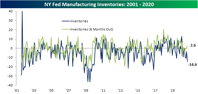
Even though demand has not accelerated at any sort of historic pace as was the case for the Philly Fed, the continued improvement has meant inventories are quickly unwinding. The index for Inventories has fallen to a fresh low of -14.6. That is the lowest level since November of 2016. Despite this, expectations are pointing to higher inventories six months into the future.
One of the strongest readings in this month’s report was the employment figures. The index for Number of Employees has continued to climb with October marking a six straight month of gains. Rising to 7.2, the index is at its highest level since January. There are also high expectations of future gains to employment six months out. Average Workweek saw an even stronger reading. That index rose nine points to 16.1 which is the highest level since May of 2011. That signals a significant rise in hours worked in October. Click here to view Bespoke’s premium membership options for our best research available.

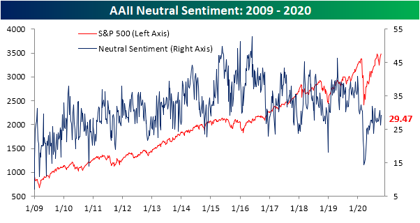
Bulls Almost Back on Top
With equities basically flat over the past week following the past few days’ consolidation, bullish sentiment has gone unmoved. AAII’s reading on bullish sentiment was just 0.04 percentage points higher this week at 34.78%. That is still the highest level of optimism since April 9th’s reading of 36.6%.

Bearish sentiment, on the other hand, experienced a sizeable drop given the lack of a move in bullish sentiment. Bearish sentiment fell over 3 percentage points down to 35.75% this week. That is the lowest level of bearish sentiment since February 20th, one day after the bear market began.

That drop in the percentage of investors reporting as pessimistic led the bull-bear spread to reach a new short-term high. For a record 34 weeks, the bull-bear spread has been negative (a higher percentage of investors reporting as bearish than bullish), but that streak is nearly over and done. For the first time since the first week of March (just two weeks into this record streak), bears have a less than a one percentage point lead over bulls.
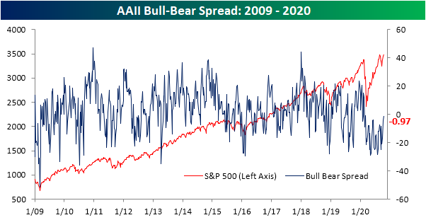
Given bullish sentiment did not move much, those that were formerly reporting as bearish are now neutral. Neutral sentiment is now at 29.47% which outside of October 1st’s 30.69%, is the highest reading of the past two months. Click here to view Bespoke’s premium membership options for our best research available.
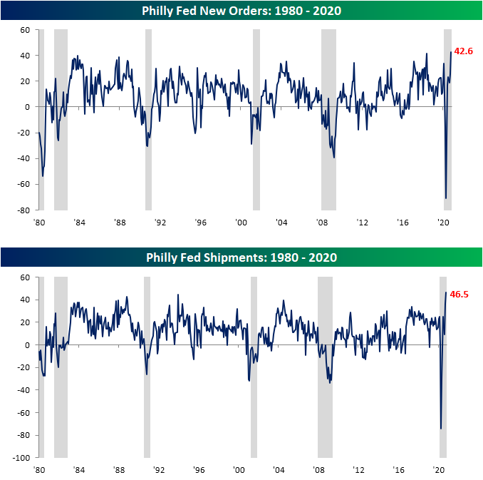
Philly Fed Leaps Higher
The first regional Fed manufacturing indices for the month of October were released today in the forms of the Philly and New York Fed. By far the stronger reading of the two was from the Third District (Philadelphia). The headline number for the Philly Fed soared 17.3 points to 32.3. That is the highest level of the index since February’s reading of 36.7 indicating an acceleration in activity after slowing in August. The month over month rise in the index was significant in the top 5% of all readings in the survey’s history. It was also the 23rd largest increase for any month on record and the largest since June’s record 70.6 increase.


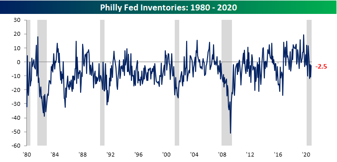
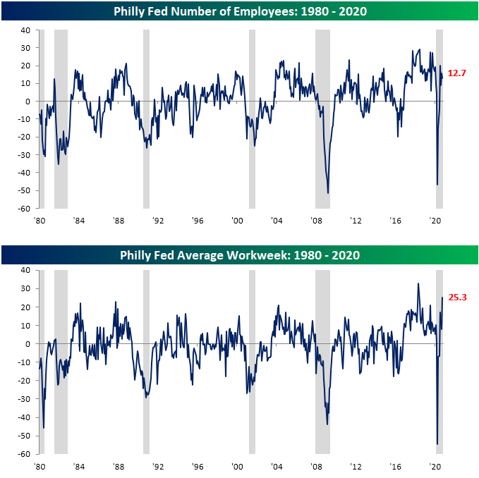
Breadth among the categories of the report remains strong with Inventories the only index that is still in contraction. Additionally, only the indices for Prices Received and Number of Employees were lower in October. Four of the indices are also at or near their highest readings on record. Similarly, the month over month increases in the indices for New Orders and Average Workweek were significant in the top 5% of all monthly moves.

The two indices that reached new record highs in October are those for New Orders and Shipments which rose 17.1 and 9.9 points, respectively. For New Orders, that was the largest one month gain for the index since May and June when it rose over 40 points in both months. The increase in Shipments was smaller and only in the 86th percentile of all months, but that follows a large 27.2 point increase last month. In addition to the index for Unfilled Orders also moving to its highest levels since December of last year, the report paints a picture of surging demand for manufacturers in the Third District.
Given that strong demand, inventories continue to be drawn down as indicated by the contractionary reading in the corresponding index. Granted, the October reading was not as extreme as recent months given the 8.3 point increase MoM. That is the fourth month in a row with a contractionary reading. Additionally, businesses are reporting historically long lead times as the index for Delivery Times has risen to its highest level in three years. That is also the second-highest reading on record. In other words, businesses continue to draw on inventories to meet strong demand, though there do appear to be some supply chain issues as delivery times have exploded higher.

Firms also continue to expand hiring to meet demand as the index for Number of Employees has remained positive at 12.7. That was in fact lower than the 15.7 level last month but is still consistent with more businesses reporting raising rather than lowering employment. Meanwhile, the index for Average Workweek ripped higher to 25.3 from 7.8. Like the index for Delivery Times, that is the second-highest reading on record behind May of 2018’s 32.7.Click here to view Bespoke’s premium membership options for our best research available.
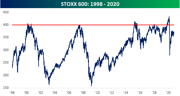
The Unluckiest Index Ever?
The STOXX 600 is a European index comprised of equities from 17 countries that span the market cap spectrum of large, mid, and small-cap stocks. Since its introduction in 1998, the index was meant to act as a gauge of the overall performance of stocks in the European region. Judging by the performance of the STOXX 600 over time, it hasn’t been a good 20+ years to be invested in Europe.
For starters, let’s look at the relative strength of the index versus the S&P 500. During the STOXX 600’s first decade in existence, it slightly underperformed the S&P 500, but throughout that decade there were periods where Europe outperformed the US and vice versa. Since the end of the Financial Crisis, though, it has been a one-way trip lower. How bad has it been for Europe relative to the US? Since the start of 1998, while the STOXX has rallied just under 54%, the S&P 500 is up by nearly 250%!

In addition to underperforming the S&P 500, the STOXX 600 has been stuck in an incredible range for most of its existence. In its first two years, the STOXX 600 saw positive returns, rallying up to 400 in early March 2000. When the dot-com bubble burst, though, European equities weren’t spared as the index lost more than half of its value. Beginning in March 2003, the STOXX started to recover and was back near its prior highs in June 2007. Like the rally in 2000, the good times didn’t last for long, as the STOXX 600 once again hit the wall at the same 400 level. What followed this time around was also similar to what happened from 2000 to early 2003 and European equities once again lost over half of their value. Over the next six-years, the STOXX 600 once again recouped all of its losses and traded at a record high of just over 400.
Sadly, the third time was not the charm in 2015, and once again, the STOXX 600 pulled back from record highs above 400. This time around the decline wasn’t as severe, and in 2018, the STOXX 600 was briefly back around the 400 level, although it couldn’t convincingly breakout…until late 2019. Beginning in November 2019, the STOXX once again topped the 400 level, a level it first traded above nearly 20 years earlier, and from there it kept climbing. On February 19th, the STOXX 600 closed at a record high of 433.9, solidifying what appeared to be a major long-term breakout for stocks in the European region. The sun was shining on Europe again!
But then COVID hit. Just one week after hitting a record high in February, the STOXX 600 was back below 400 and on its way to a decline of 38%. Like most other equity markets around the world, the STOXX 600 has recovered from its COVID lows, but not to nearly the degree as many other areas of the world. Even with the rebound, the STOXX 600 is now underperforming the US more than ever, and as of today it still remains more than 16% below its high from February and nearly 10% below the long-term resistance level of 400. Can someone please give the STOXX 600 a rabbit’s foot? Click here to view Bespoke’s premium membership options for our best research available.
Is Jobless Claims Uptick Seasonality Or Something Worse?
After falling in back to back weeks, seasonally adjusted initial jobless claims rose to 898K this week which was weaker than the forecasted decline to 825K and last week’s level of 845K last week. Now just below 900K, claims are at their highest level since the week of August 21st (before the change in seasonal adjustment methodology meaning comparisons are not exactly like for like) which was also the last time claims were above one million. Additionally, the 53K week over week increase was the largest increase since the week of August 14th when claims rose by 133K.
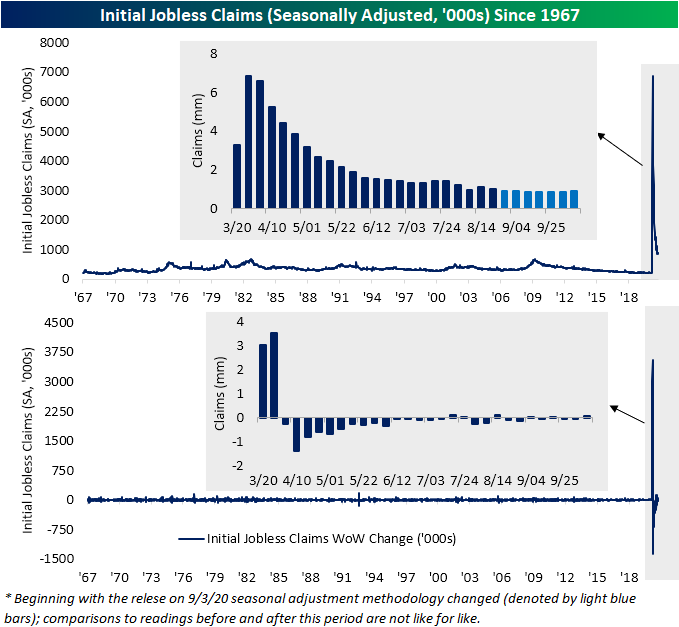
Non-adjusted claims have been a bit more choppy over the past few weeks, but this week marks the first back-to-back increases since the first half of September. Non-seasonally adjusted initial jobless claims rose to 885.9K this week from 809.2K last week. Similar to the adjusted number, that is the highest level since mid-August while the WoW increase was the largest since a 117.7K climb in the week of July 10th.

While non-seasonally adjusted claims have deteriorated for two weeks in a row with particularly weaker results in the most recent print, we would note that seasonality could be a factor. In the charts below we show the level of claims for each given week of the year versus the historical average. As shown, the rise in NSA initial jobless claims is consistent with the seasonal rise that typically occurs from the fall through the end of the year.
As for continuing claims (NSA), the most recent week (40th week of the year) marked the first reading below 10 million since March. While that is certainly a positive and a sizeable improvement—the first weekly decline greater than 1 million since the first week of August—going forward seasonality will be a headwind. As shown in the second chart below, the 40th week of the year has typically marked the seasonal low for the year as claims tend to rise through the year-end.

Reporting of claims from the most populous state, California, is still paused and with the addition of seasonal headwinds, it is a bit tough to decipher whether the uptick in claims is a material worsening in the data as COVID cases have been on the rise or more simply seasonality. Pandemic Unemployment Assistance (PUA) claims would seem to more give more credit towards the latter. For initial claims, PUA claims fell to 372.9K this week, down for a fifth straight week. Behind the first week that PUA claims were reported (April 17th), that is the lowest count of initial PUA claims. For total claims (regular and PUA combined), this week’s reading of 1.26 million marked a new pandemic low.
Similarly, continuing claims are also reaching some of the lowest levels since early in the pandemic. Continuing PUA claims which are lagged another additional week have also continued to fall. The most recent reading for the last week of September came in at 11.172 million. That is the lowest amount since the first week of August.

While new lows in continuing claims are being reached, we would also note that it does not mean all those people are necessarily returning to work. The Extended Benefits program continues relief for workers who have exhausted regular benefits during periods of high unemployment such as the current scenario. The basic program’s extension is up to 13 additional weeks. These claims have been on the rise since July with a new high of 354.7K this week. While the decline in regular claims still outpaces these extensions, it is yet another point that, with some nuance, claims have generally improved but are still a mixed bag. Click here to view Bespoke’s premium membership options for our best research available.

Sentiment By State
Below is a look at the year-to-date reading for the high-frequency Morning Consult daily consumer sentiment indicator. While still well off highs seen prior to the COVID Crash in late February and early March, sentiment has generally been ticking higher off the lows. You’ll notice in the chart below, however, that while the “Future Expectations” reading is still bouncing back nicely, the “Current Conditions” reading has been going more sideways over the last couple of months.

We can also look closer into state level readings from the daily Morning Consult sentiment numbers. In the heat map below, we show the changes in the levels of consumer sentiment for each state since mid-February. As shown, the lower 48 have seen much larger improvements than Alaska or Hawaii with the largest improvements coming in the Northeast and parts of the Midwest. On the other hand, in addition to Hawaii and Alaska, some of the key swing states like Maine, New Hampshire, and Nevada have improved the least. Of all 50 states, Vermont’s current reading on sentiment is the closest to its February levels, but even Vermont is still down 17.9 points. Click here to view Bespoke’s premium membership options for our best research available.

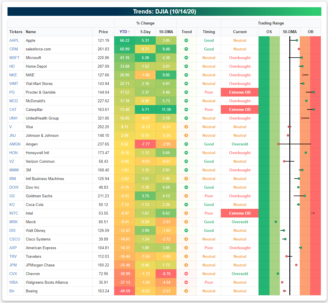
Year-to-Date 2020 Dow Jones Industrial Average Returns
Yesterday we highlighted the year-to-date performance of the major S&P 500 sector ETFs using a snapshot from our Trend Analyzer tool. Below we take a look at the year-to-date performance of the 30 stocks in the Dow Jones Industrial Average.
Apple (AAPL) currently ranks #1 with a year-to-date gain of 66.2%. At the moment, AAPL is 3.85% above its 50-day moving average but not in overbought territory. It’s in a long-term uptrend channel as well.
Ranking second is the newly-added Dow stock salesforce.com (CRM), which is up 61% year-to-date and 9.5% above its 50-day moving average.
There are four more Dow stocks that are up more than 20% in 2020 — Microsoft (MSFT), Home Depot (HD), Nike (NKE), and Wal Mart (WMT). All four of these stocks are trading in long-term uptrends, but they’re currently trading in overbought territory, which means they’re at least one standard deviation above their 50-day moving averages.
Another four stocks are up more than 10% YTD — Procter & Gamble (PG), McDonald’s (MCD), Caterpillar (CAT), and UnitedHealth (UNH). Then you have Visa (V), Johnson & Johnson (JNJ), and Amgen (AMGN) up on the year but only marginally.
While the S&P 500 is up nearly 8% on the year, the Dow 30 at the index level is actually slightly in the red on the year. Of the 30 members, 13 are up YTD and 17 are down.
The biggest losers in the Dow so far this year have been JP Morgan (JPM), Chevron (CVX), Walgreens (WBA), and Boeing (BA). Each of these stocks is down 25% or more, with BA down the most at nearly 50%. Other notable losers that are down 10%+ include Disney (DIS), Cisco (CSCO), American Express (AXP), and Travelers (TRV). Start a two-week free trial to Bespoke Institutional to access Bespoke’s interactive research dashboard and investor tools.