Bespoke Consumer Pulse Report – January 2022
Sentiment Surveys Miss Meeting Minutes
The news of the FOMC’s hawkish meeting minutes and the subsequent declines in markets in reaction to the release likely was not fully captured in sentiment indicators this week due to the timing of collection periods. Nonetheless, respondents to the AAII survey did show a drop in optimism with only 32.8% of respondents reporting as bullish versus 37.7% last week. While back below the historical average, bullish sentiment is not extremely extended below or outside of the recent range of readings.

Bearish sentiment picked up the larger portion of those losses rising from 30.5% last week to 33.3% which is only a few percentage points above the historical average (30.6%).

As a result of these moves, the bull-bear spread dipped back into negative territory, albeit not by much, after last week saw the first positive reading in five weeks.

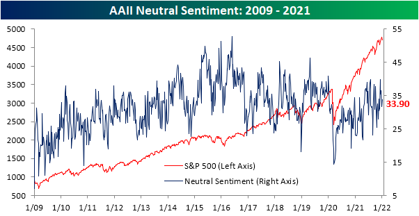
Neutral sentiment picked up the difference rising 2.1 percentage points to 33.9%. As with bearish sentiment, even with that increase, the reading remains below levels from just two weeks ago.
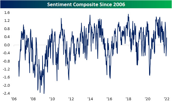
Out of three sentiment surveys—AAII, Investors Intelligence, and the NAAIM Exposure Index—the AAII reading is released the latest of the three, and as such was most likely to pick up any reaction to Wednesday’s declines. As such, both the Investors Intelligence and NAAIM Index saw more bullish readings this week. In fact, the Investors Intelligence survey—which had its first release since before the holidays—saw the largest increase in bullish sentiment since June 2016. That meant for our sentiment composite (which is an average of how many standard deviations from the historical norm the NAAIM index and bull-bear spread for the AAII and Investors Intelligence surveys are), this week saw a continued recovery in bullish sentiment. Click here to view Bespoke’s premium membership options.
Year End Claims Uptick
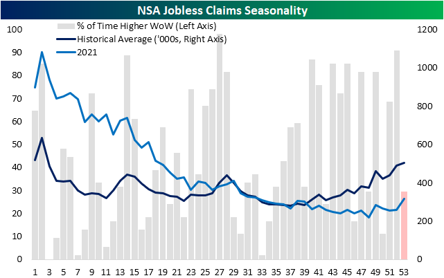
Initial jobless claims data through the final week of 2021 was released this morning remaining above 200K versus expectations of a drop down to 195K. At 207K, seasonally adjusted claims were at their highest level since the last week of November when they were 20K higher. Although claims have not been improving in recent weeks, the current levels are in line with the low end of the range from prior to the pandemic which is also around the strongest levels in several decades.

Looking back on 2021, it was an interesting year for the dataset. The first half of the year saw a steady and rapid decline in claims as they were continuing to come off of historic levels set earlier in the pandemic. By mid-year and continuing into the final quarter, they had essentially returned to levels consistent with the historical average. Then, whereas the final few months of the year have historically marked a time that claims rise into year-end, claims generally fell throughout the fall and only noticeably began to experience that seasonal uptick in November and December. That resulted in claims to finish the year well below the historical average for the current week of the year.
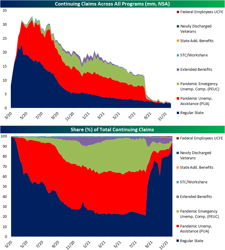
Turning to continuing claims, which are delayed an additional week to the initial claims data, the week of December 24th saw a 36K increase to 1.754 million. While higher, the current level remains over 100K below the one from only two weeks ago.

Pandemic era programs faced official expiration in September, but there were some residual claims reported in the following months. With that said, those levels declined, and by the final week reported (December 10th) total claims across PUA and PEUC programs only accounted for a combined 255.1K. With the new year, the Department of Labor is no longer reporting total national counts for these programs. With those changes over the past several months, that means the composition for continuing claims is comprised massively by regular state programs once again and the other major contributor, though to a much less impactful degree, is extended benefits programs. Total claims across all reported programs are now a fraction of their pandemic highs at only 1.73 million. Click here to view Bespoke’s premium membership options.
Nasdaq Down 3%+ In First Three Trading Days
Historically, the first three trading days of the year have been positive for the NASDAQ with gains more than two-thirds of the time (68.6%). This year has been a different story, though, as the Nasdaq fell 3.4% in the first three days; the fifth-worst 3-day start to a year in the NASDAQ’s history. The only years with a weaker 3-day start were 2000, 2005, 2008, and 2016.
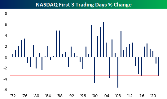
The table below lists the five prior years where the NASDAQ started the year with a decline of 3% or more in the first three trading days. For each year, we also show the index’s performance for the remainder of January as well as the remainder of the year. In the case of these five years, first impressions have been a pretty good indicator of future performance as the NASDAQ’s performance for the remainder of January and the rest of the year was weaker than average. While the range of returns is extremely wide, the average return for the rest of January was a decline of 1.6% (median -1.4%), and the rest of the year averaged a decline of 9.5% (median +5.5%). We’d also note that the two worst three-day starts to a year for the NASDAQ (2000 and 2008) also experienced the two worst rest of year returns for the Nasdaq in its history.

Although the fact that two of the worst years in the NASDAQ’s history were also years where the index dropped more than 3% in the first three trading days of the year, by itself, investors should not take this year’s occurrence as an overly bearish sign. Throughout the index’s history, there has been very little correlation between how it traded in the first three trading days and its rest of year return, and the r-squared between the two is just 0.0132.
While any association with 2000 and 2008 is always scary, in every other year that the NASDAQ traded lower in the first three trading days of the year, its rest of year performance was positive every time. In fact, during the 15 years when the first three days were negative, the average rest of year performance was a gain of 15.7% (median: 15.13%) with positive returns 87% of the time. Meanwhile, in the 35 years where it traded higher in the first three trading days of the year, the average rest of year return was a gain of 10.92% (median: 13.22%) with positive returns 69% of the time. Click here to view Bespoke’s premium membership options.

ARK Innovation (ARKK) Now Underperforming QQQ Since the Pre-COVID Peak
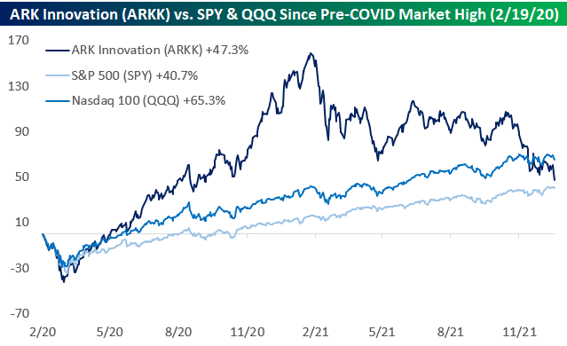
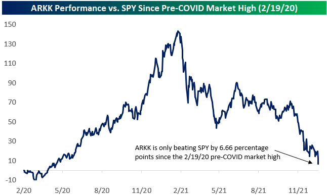
After further declines to start 2022, the ARK Innovation ETF (ARKK) is now up just 47.3% since the pre-COVID peak for the US equity market on 2/19/20 and is now only beating the S&P 500 by 6.66 percentage points since the pre-COVID high. Not only that, but it’s also underperforming the Nasdaq 100 (QQQ) by 17.9 percentage points.
ARKK was the envy of the industry in the year or so after the pandemic hit. Fund assets for the ARKK ETF went from $2.4 billion prior to COVID up to $28.5 billion at its peak last February. At its high, ARKK was absolutely crushing both SPY and QQQ. On 2/12/21, ARKK was outperforming SPY by 143 percentage points since the 2/19/20 pre-COVID peak for the stock market and beating the more tech-heavy Nasdaq 100 by 117 percentage points. Since its peak, ARKK has dropped more than 43%, allowing the more steady SPY and QQQ to catch up. Talk about a real-life “tortoise and the hare” scenario!

Interestingly, if we look at ARKK’s annualized price change from its launch in October 2014 through the pre-COVID peak for the stock market on 2/19/20, it’s roughly the same as ARKK’s annualized price change since the 2/19/20 pre-COVID peak: ~22.8%. Also, throughout its history, ARKK’s annualized total return still stands at ~24.3%, which is nearly 10 percentage points better than SPY’s annualized total return of 14.8% over the same time frame. Click here to view Bespoke’s premium membership options.

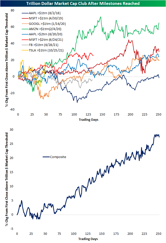
Trillion Dollar Thresholds
Back in August 2018, AAPL became the founding member of the trillion-dollar market cap club here in the US. In the time since then, membership has grown by five, though, only four other stocks currently have market caps above $1 trillion: Microsoft (MSFT) at $2.5 trillion, Google (GOOGL) at $1.95 trillion, Amazon (AMZN) at $1.7 trillion, and Tesla (TSLA) at $1.19 trillion. Facebook (FB) also crossed the $1 trillion threshold halfway through last year, but it has since turned lower. Yesterday, AAPL was the talk of the town as its market cap briefly touched above $3 trillion, though, those levels did not hold and the stock has still yet to close with a market cap above that level. While it has only spanned a few years’ time, there is now a decent sample size of stocks to look back on for past examples of how they perform after hitting the trillion-dollar market cap milestone.
In the chart below, we show the performance of the various mega-cap stocks following their first close with a market cap above $1 trillion (or $2 trillion where applicable). Generally speaking, after reaching such a milestone, the general pattern has been some consolidation lasting upwards of a few months followed by a more consistent resumed uptrend one year out from the occurrence. Amazon (AMZN) has averaged the strongest such response, though, its timing coincided nearly perfectly with the COVID crash (peak on 2/19/20) and the initial stages of the current bull run. Alphabet (GOOGL) is a similar story though it took longer to recover.
With regards to AAPL and the times it hit a $1 trillion and then a $2 trillion dollar market cap, the former instance saw an immediate strong reaction in the following months followed by weaker performance over the next 3 to 12 months. On the other hand, the more recent occurrence in which it crossed a $2 trillion market cap saw a brief spike higher over the next few weeks before moving back below $2 trillion for the span of a few months. That level would then offer support roughly six months later. Click here to view Bespoke’s premium membership options.
Premium for Defensives
Each night in our Sector Snapshot, we show each sector’s P/E ratio as a percentile of their respective ten-year range. Given their surge in the final months of 2021, by far the most elevated valuations (as measured by the trailing P/E) are for defensive sectors like Consumer Staples and Utilities as well as Tech. Each of those is in the top one or two percentiles of their ten-year ranges. Conversely, Financials, Energy, and Materials have much less elevated multiples relative to their own ranges. Financials is the most extreme of these currently in the just the 39th percentile.

Below we show the spread in valuation between the averages (both in equal weight and sector weighted) for the P/E ratios for all defensive sectors (Consumer Staples, Health Care, Real Estate, and Utilities) versus all cyclical sectors (Communication Services, Consumer Discretionary, Energy, Financials, Industrials, Materials, and Technology). For this analysis, P/E ratios are expressed as z-scores or standard deviations from the historical norm. The picture shows that while defensive sectors have seen their valuations rise relative to cyclicals in a significant way, compared to the rest of history, it is not exactly extreme on either an equal weight or market cap-weighted basis. Click here to view Bespoke’s premium membership options.

New Year’s Resolution for Rotation
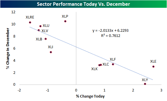
While the broad S&P 500 (SPY) is trading slightly higher to start the new year, individual sectors are mixed and experiencing some pretty extreme moves. Energy (XLE) and Consumer Discretionary (XLY) are surging out of the gate with both sectors gaining over 2% today. For Consumer Discretionary, the bulk of its 2% gain today is thanks to Tesla (TSLA). While TSLA is up more than 10% on the day, the majority of stocks in the Consumer Discretionary sector are down on the day. The Financials sector (XLF) is also up over 1%, while Technology (XLK) and Communication Services (XLC) are both up ~0.6%. Conversely, Industrials (XLI), Utilities (XLU), Materials (XLB), Health Care (XLV), and Real Estate (XLRE) are all down well over 1%.

Rotation out of last month’s winners appears to be the big driver of today’s move. In the chart below, we show each sector ETF’s performance today plotted against performance in the month of December. As shown, last month’s biggest winners are all in the red in today’s session. Defensive sectors, in particular, are down the most today whereas last month they rallied high single to double digits. Meanwhile, cyclicals were up more modestly last month and are today’s biggest winners. Click here to view Bespoke’s premium membership options.
Bespoke Market Calendar — January 2022
Please click the image below to view our January 2022 market calendar. This calendar includes the S&P 500’s average percentage change and average intraday chart pattern for each trading day during the upcoming month. It also includes market holidays and options expiration dates plus the dates of key economic indicator releases. Start a two-week free trial to one of Bespoke’s three research levels.

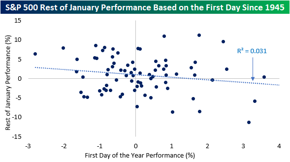
Green on the First Day of the Year
The S&P 500 opened higher on the first trading day of 2022 and is up about 20 basis points (bps) as of 11 AM. It’s widely assumed that positive starts to the year portend good things for the rest of the month, but the data doesn’t necessarily show that. The table below shows the S&P 500’s performance since 1945 for the remainder of January based on how it trades on the first day of trading. Based simply on whether or not the first day of trading is positive or negative, in the 38 years since 1945 where the year started off with a gain, the average rest of month performance was an additional gain of 0.41% (median: 0.71%) with gains just over 55% of the time. In the 39 years where the year started off with a decline, though, performance for the rest of the month was much stronger with an average gain of 1.54% (median: 1.81%) and positive returns 64.1% of the time.
When we filter out by years where the S&P 500 gained or lost 1% on the first day of trading in January, returns for the rest of the month were even more skewed. In the 14 years where the S&P 500 was up 1% on the first day of trading, the average performance for the rest of the year was a decline of 0.51% (median: +0.67%) and positive returns 57% of the time. Conversely, in the 12 years where the first day of the year experienced a decline of 1%+, the average rest of month performance was a gain of 2.03% (median: 3.42%) with positive returns two-thirds of the time. Broadly speaking, therefore, there is little evidence that strong starts to a year are a precursor of a strong January and vice versa.
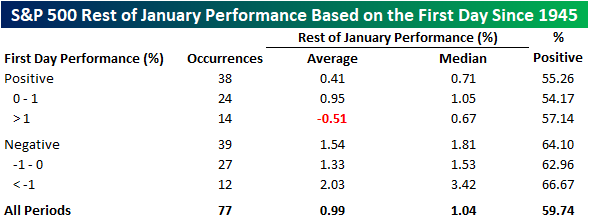
As you can see from the dot plot below, first-day performance tends to have a relatively minimal effect on the rest of the month’s performance. Only about 3.1% of the variance seen in the y variable (rest of January performance) is explained by movements in the x variable (first-day performance). Nonetheless, the slope of the linear line of best fit is still negative, so there is a slight negative correlation between the two variables. Click here to view Bespoke’s premium membership options.