The Bespoke 50 Growth Stocks — 6/16/22
The “Bespoke 50” is a basket of noteworthy growth stocks in the Russell 3,000. To make the list, a stock must have strong earnings growth prospects along with an attractive price chart based on Bespoke’s analysis. The Bespoke 50 is updated weekly on Thursday unless otherwise noted. There were no changes to the list this week.
The Bespoke 50 is available with a Bespoke Premium subscription or a Bespoke Institutional subscription. You can learn more about our subscription offerings at our Membership Options page, or simply start a two-week trial at our sign-up page.

The Bespoke 50 performance chart shown does not represent actual investment results. The Bespoke 50 is updated weekly on Thursday. Performance is based on equally weighting each of the 50 stocks (2% each) and is calculated using each stock’s opening price as of Friday morning each week. Entry prices and exit prices used for stocks that are added or removed from the Bespoke 50 are based on Friday’s opening price. Any potential commissions, brokerage fees, or dividends are not included in the Bespoke 50 performance calculation, but the performance shown is net of a hypothetical annual advisory fee of 0.85%. Performance tracking for the Bespoke 50 and the Russell 3,000 total return index begins on March 5th, 2012 when the Bespoke 50 was first published. Past performance is not a guarantee of future results. The Bespoke 50 is meant to be an idea generator for investors and not a recommendation to buy or sell any specific securities. It is not personalized advice because it in no way takes into account an investor’s individual needs. As always, investors should conduct their own research when buying or selling individual securities. Click here to read our full disclosure on hypothetical performance tracking. Bespoke representatives or wealth management clients may have positions in securities discussed or mentioned in its published content.
More Promise For Supply Chains
Piggybacking off of another contractionary reading in the Empire Fed survey yesterday, the neighboring Philly Fed’s Manufacturing survey also saw its headline reading print a negative number for June. The index for General Business Conditions has fallen sharply over the past three months, now having shed 30.7 points in that time. This month was the smallest month-over-month drop of those months, though, with the index falling from a barely expansionary reading of 2.6 in May to -3.3. Despite the small drop, that is still the first negative reading since May 2020. As for expectations, this month also saw the index fall into contractionary territory, a first since December 2008.
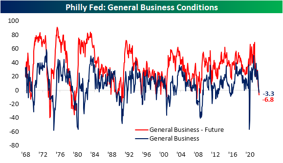
Whereas the Empire Fed report had some silver linings with pretty mixed breadth, this report saw large and broad declines across nearly all categories. Multiple month-over-month moves ranked in the bottom few percentiles of all monthly changes on record in data going all the way back to 1968. There were also three indices (excluding the headline number) that fell from expansion into contraction.

Following up on a retail sales report yesterday that showed the US consumer has cooled off, regional Fed reports are also showing decelerating demand; perhaps even more dramatically so. The Philly Fed’s New Orders index not only fell into contraction and the weakest levels since the spring of 2020, but the 34.5 point decline month over month ranks in the bottom 1% of all monthly moves on record. In fact, that move was large enough to bring the index from the top quartile of its historical range all the way down to the bottom decile. Shipments and Unfilled Orders did not see drops down to quite as extreme levels, but each one went from the 96th percentile to 35th percentile in just one month. Again, their month-over-month declines were some of the largest on record.
Expectations are in even worse shape with similarly large declines. New Orders expectations not only saw the first negative reading since 2008, but at -7.4 it is at the lowest level since 1995. Unfilled Orders expectations have been negative for some time now meaning firms have been expecting to unwind massive backlogs built up during the pandemic due in part to supply chain disruptions. But considering the inflow of New Orders is and is expected to continue declining, Unfilled Orders expectations are at the lowest level since the start of 1974.

As we noted yesterday with the Empire Fed Manufacturing report, the decline in unfilled orders is both bad and good. With regard to the former, it is bad because it appears to in part be due to cooling off of demand. But on the bright side, it also appears to be thanks to massive improvements in supply chains. Not only did the current conditions index for Delivery Times fall sharply in June, but expectations have completely collapsed bringing it to a record low.

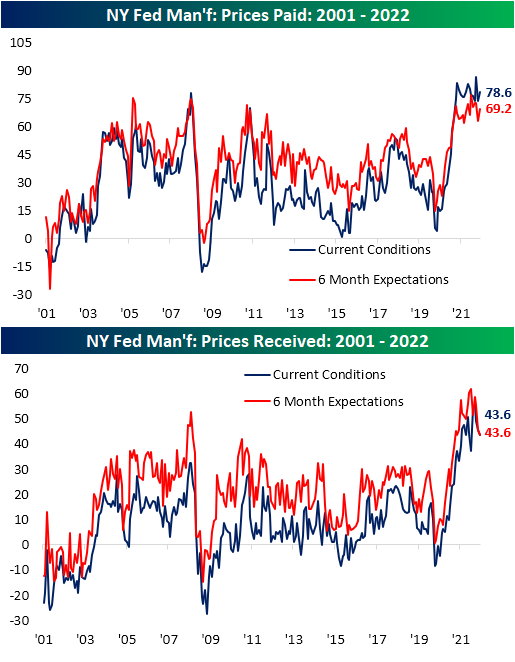
Another welcome sign of the report was cooling inflation as fewer respondents reported higher Prices Paid and Prices Received. Both of these readings have plateaued in recent months alongside expectations.

Employment metrics were mixed this month with the Number of Employees rebounding slightly after a big drop the prior month. Expectations, on the other hand, saw a massive 18.7 point decline. Not only was that one of the biggest declines on record but it follows two other sizeable declines in April and May. That indicates the region’s firms are expecting that hiring will moderate significantly in the coming months. Meanwhile, the Average Workweek has been pulling back with current conditions still at a historically healthy level. Click here to learn more about Bespoke’s premium stock market research service.

Sentiment Staying Low
More hawkish monetary policy and the S&P 500 hitting the bear market threshold have given sentiment plenty of reason to turn lower, and that’s exactly what has happened. After reaching a short-term high of 32% only two weeks ago, the percentage of respondents to the AAII survey considering themselves bullish has fallen back below 20% this week. That may not be as extreme of reading as those in the mid-teens from back in April, but, it is still a historically low reading and in the bottom 2% of all weeks going back to the start of the survey in 1987.
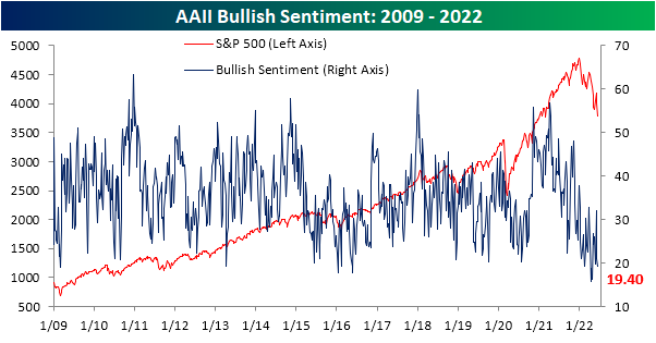
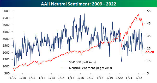
While bullish sentiment has declined, this week’s 1.6 percentage point decline was actually much smaller than the 11 percentage point drop last week. An even bigger decline occurred for those reporting neutral sentiment. That reading fell 9.9 percentage points from a recent high of 32.1%. Now at 22.2%, the percentage of neutral respondents is back down to the lowest level since the start of May.
With both bullish and neutral sentiment falling, the bearish camp picked up the difference. Heading into this week, bearish sentiment was already elevated at 46.9%. The 11.4 percentage point bump this week means that well over half of respondents are now bearish with the current reading just 1.1 percentage points shy of the 59.4% high from the end of April. That ranks as the eleventh highest reading of all weeks on record.

That also means the percentage of bears outweighs bulls by an astounding 38.9 percentage points and is the lowest reading since the last week of April.

Not only do bears outweigh bulls by a large margin, but it has also been a historically long length of time that this has been the case. Smoothing out the reading by taking a four-week moving average of the bull-bear spread, the average has been below -10 (in other words on average over a four-week span bearish sentiment has been at least 10 percentage points higher than bullish sentiment) for 21 straight weeks. That surpassed another long 18-week streak in 2020 and is now only five weeks short of the record stretch of 26 weeks in the early 1990s.

Not only has the AAII survey showed souring sentiment, but so too have the weekly NAAIM Exposure Index and the Investors Intelligence surveys. This week, the NAAIM index showed investment managers only have 32.2% long equity exposure. Meanwhile, the Investors Intelligence survey saw the most negative bull-bear spread in a month. Normalizing each of these three sentiment indicators, the average reading is now 1.28 standard deviations from the historical norm. That is not as bad as last month, but it remains a historically pessimistic reading on sentiment. Click here to learn more about Bespoke’s premium stock market research service.

Jobless Claims Moderate
Jobless claims have been trending higher off of multi-decade lows, indicating a moderating labor market. This week, initial claims would have gone unchanged week over week at 229K if it were not for a modest upward revision to 232K to last week’s number. In other words, claims were little changed this week as they continue to gradually head higher. At these levels, claims remain at the high end of the range from the few years prior to the pandemic.

On a non-seasonally adjusted basis, claims have begun to experience the typical upward swing for this point of the year and that is likely to continue over the next month and change. NSA claims topped 200K this week for the first time since the last week of April which is right in line with the readings from the comparable weeks of the year of 2018 and 2019.

Continuing claims are lagged an additional week to initial claims but this reading has also been making its way off the lows. Granted, the move off the lows for continuing claims has been much more modest than initial claims (only 6K for continuing claims versus 66K for initial). Seasonally adjusted continuing claims rose for the second week in a row this week to 1.312 million which is only the highest level in a month. Click here to learn more about Bespoke’s premium stock market research service.

Weak May Housing Data
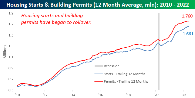
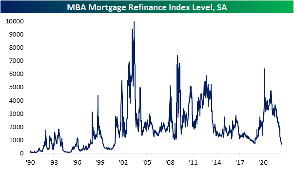
Earlier this week, we highlighted the fact that mortgage activity had fallen off a cliff due to a historic rise in rates. This is an important factor to keep in mind as the housing market tends to be a strong leading indicator for recessions, as every recession besides the COVID crash since the early 1960s has been preceded by a pronounced decline in Housing Starts. Although the NAHB index has already rolled over substantially, Housing Starts and Building Permits are yet to drop on a trailing twelve-month basis. However, the data has been showing signs of weakness, as we have now seen two consecutive months of declines in permits and a significant month-over-month fall in starts.
The table below breaks down this month’s report by type of unit and region and shows both the month-over-month and year-over-year changes. Contrary to what we saw last month, Housing Starts moved higher in the Northeast and Midwest on a m/m basis, while the South and West saw dramatic declines. On a y/y basis, only the Northeast (smallest of the four regions) saw starts move higher. In aggregate, Housing Starts fell by 14.4% month over month and 3.5% year over year. Although multi-units fell more than single units, the decline was substantial for both. In terms of permits, there was no positivity in sight, as every region saw m/m declines. This is not a positive sign for future starts data, as permits must be issued before starts can occur. In aggregate, Building Permits fell by 7.0% month over month, driven by a massive decline in the Northeast.

For the first time since February of 2021, the 12-month average of Housing Starts declined on a m/m basis. A rollover in this figure tends to be a strong recession indicator, which based on prior history would suggest that the economy is not yet in a recession. If this data continues to weaken, though. recession alarms will start ringing.

The charts below show the rolling 12-month average for Housing Starts and Building Permits since 2010 on both an overall basis (top chart) and for single-family units specifically (bottom chart). Overall, the 12-month average for headline starts and permits has experienced headwinds as of late with the rate of increase for both slowing down and starts actually showing a slight decline. The trend for single-family units, however, is much more divergent as permits have already started to roll over after peaking last summer while single-family starts have essentially leveled off during that same span. . Click here to become a Bespoke premium member today!

Bespoke’s Morning Lineup – 6/16/22 – All I Do Is Lose
See what’s driving market performance around the world in today’s Morning Lineup. Bespoke’s Morning Lineup is the best way to start your trading day. Read it now by starting a two-week trial to Bespoke Premium. CLICK HERE to learn more and start your trial.
“Everything is bearable.“ – Wendy Byrde, Ozark

Below is a snippet of content from today’s Morning Lineup for Bespoke Premium members. Start a two-week trial to Bespoke Premium now to access the full report.
We’re not quite sure Wendy Byrde would have had 2022’s financial market meltdown in mind when she uttered the three words above. The bad year has gotten even worse this morning as futures are already indicated to erase all of yesterday’s rally. Making matters worse, economic data this morning was very weak as Housing Starts, Building Permits, Philly Fed, Initial Jobless Claims, and Continuing Jobless Claims all came in weaker than economic forecasts. Housing Starts, for their part, were down over 14.4% m/m. This comes a day after the Fed lowered economic growth forecasts and raised its forecast for the unemployment rate in yesterday’s report of economic projections. Given all the weakness, it seems unbelievable that it has all come with the largest rate hike in nearly 30 years and promises of more to come in upcoming meetings. No one said coming out of COVID and all the stimulus programs would be easy, but they didn’t have 2022 in mind either.
In today’s Morning Lineup, there’s a lot covered as we discuss the latest moves of central banks, Asian and European markets, and overnight economic data.
We’ve been calling it the one step forward and two steps backward market for some time now, and yesterday and today provides another illustration of that pattern. After rallying over 1% following yesterday’s Fed meeting, the S&P 500 is indicated to open down about 2.0% this morning, more than erasing all of Wednesday’s gains. Keep in mind too, that even after Wednesday’s rally, the trailing five-day performance of the S&P 500 was a decline of just under 8%.
Assuming that today finishes in the red, the S&P 500 will have only traded up on 43.5% of all trading days this year. While that may not sound all that extreme, in the post-WWII period, there have only been seven other years where the percentage of up days in the first half of the year was lower, and the only two where the percentage was lower than 40% in the first half of the year were 1962 and 1970.

Start a two-week trial to Bespoke Premium to read today’s full Morning Lineup.
Housing Data and Housing Stocks Erase Pandemic Gains
The past week has seen the national average for a 30 year fixed rate mortgage once again rocket higher. The average currently sits only a few basis points below 6%, the highest rate since the mid-2000s, as it has risen an astounding 42 basis points versus one week ago. As shown in the second chart below, that is one of only a handful of similar rapid upticks since at least 2000. The most recent of these is March 2020, and prior to that the December 2016 surge came close. Looking further back, only June 2013, the fall of 2008, and September 2003 have seen anywhere close to the same size short-term surges in mortgage rates.

Ironically, weekly data from the Mortgage Bankers Association actually got some relief this week. Seasonally adjusted purchases rose 8% week over week. That was the biggest one-week uptick since March but only brings the index back to levels last seen three weeks ago. Even though this week’s 3.66% increase ended a five-week losing streak, outside of last week, refinance applications are at the lowest level since 2000.

Also on the housing docket today was homebuilder sentiment from the NAHB. This report too shows a souring sentiment on the part of builders as higher prices (through both cost of a home and the cost to finance) dampen demand. Each category is dropping sharply and back in the middle of their ranges from the few years before the pandemic at best. The Future Sales index has gotten hit the hardest as it fell to 61 in June. Outside of the much more dramatic drop at the start of the pandemic in early 2020, such a low reading has not been observed since December 2018.

As quickly as homebuilder sentiment rose to historic heights and then erased its pandemic gains, the same applies to homebuilder stocks. The iShares US Home Construction ETF (ITB) had finally broken out of a sideways range at the end of last year but has consistently grinded lower in the months since then. In the past week alone it has fallen another 11% and failed at last month’s support in the process. That leaves two interesting next areas to watch. The first is only 2% away from current levels and traces back to the fall of 2020. A little further below that, and 5.25% away from current levels, is the pre-pandemic February 2020 peak. Click here to learn more about Bespoke’s premium stock market research service.

NY Fed Provides More Positives For Supply Chains
The Empire Fed Manufacturing survey was one of a number of disappointing economic data points released this morning. The headline index did bounce off a near post-pandemic low last month, rising back up to -1.2, but that was below expectations for a move up to an expansionary reading of 2.5. Six-month expectations, meanwhile, have continued to collapse with another post-pandemic low being set as it dropped to 14.
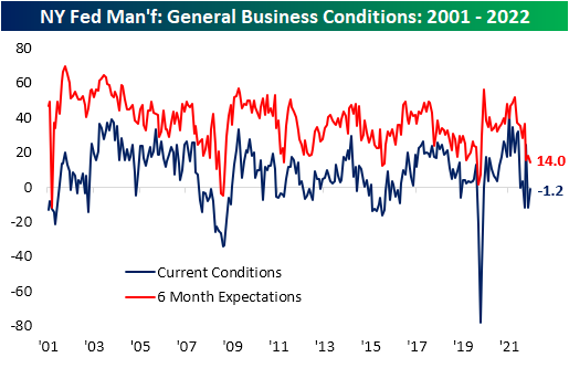
Although the reading on General Business Conditions disappointed, the rest of the report contained some silver linings. Breadth was mixed with four different categories falling month over month while the remaining five improved. In addition to the headline number, only the index for Unfilled Orders came in with a contractionary reading for current conditions. Around half of the categories also continue to have readings in the top few percentiles of their historical range.

Two categories that were major components in the improvement of the headline number were new orders and shipments. After deep contractionary readings last month, these two indices saw month-over-month increases ranking in the top decile of all monthly moves on record. That lifted each of those back into expansionary territory meaning the region’s manufacturers are once again seeing growth in demand. That being said, demand is not growing at the same historic rate as most of the past year, and as such, order backlogs are finally beginning to unwind as inventories are building at a historically strong clip.
In spite of the improvement in current conditions, reported expectations for future new orders is only slightly above levels observed at the depths of the pandemic. Given that more pessimistic outlook for order growth, backlogs are anticipated to fall at a near-record rate. The only lower reading in the history of the data for Unfilled Order expectations was in September 2012.

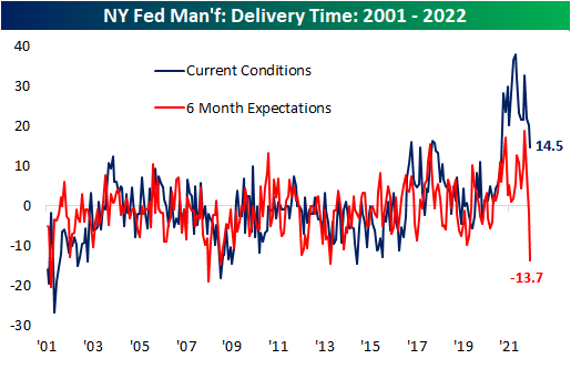
Another key explainer for those improvements in shipments, order backlogs, and inventories has been relieved supply chain stress. Echoing other supply chain-related data that we have touched upon (for a couple of examples see here and here), the index for Delivery Time has continued to plummet. In June, it hit the lowest level since last March. Although that remains a historically elevated reading well above most pre-pandemic levels, expectations have absolutely fallen off a cliff. That index has gone from one end of its historical range (a record high in March) down to the bottom percentile of readings and the lowest level since October 2013.
Those massive improvements in supply chain stress should also be positive on the inflationary front, granted, it has not exactly shown in the same way through the report’s prices indices. Both indices for Prices Paid and Received continue to sit at elevated levels in spite of somewhat promising moves in recent months. Prices Paid have plateaued as Prices Received have begun to roll over.
Pivoting over to employment-related categories, the region’s firms accelerated hiring in June even though the average workweek fell with expectations even weaker dropping into contractionary territory. Meanwhile, the indices for Technology Spending and Capital Expenditure have been rolling over indicating manufacturers have been slowing down non-labor spending, but in June both indices saw modest bounces. Click here to learn more about Bespoke’s premium stock market research service.

Asset Class Performance During QT
As mentioned in our piece from earlier today, gold did not necessarily deliver superior performance during the last QT cycle. This leaves investors to ponder: which asset classes did deliver substantial returns? Is there anywhere to hide? Although the macroenvironment is vastly different this time around, it is still helpful to look at past occurrences to attempt to put a frame of reference around today’s markets. Major differences include rampant inflation (particularly in commodities), supply chain constraints, lapping stimulus benefits, and weakening economic data. Below, we summarize the performance of the S&P 500, bonds, agricultural commodities, and oil during previous QT cycles.
The S&P 500 outperformed Gold during the last QT cycle, gaining 19.2%, which constitutes an annualized return of 10.1%. The graph below outlines the performance of the S&P 500 ETF (SPY) during different cycles of QE and QT. As you can see, equities were not particularly steady during the last QT cycle, but SPY gained significantly after the Fed announced its intent to slow the balance sheet winddown.

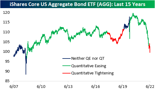
In the last QT cycle, the bond market initially sold off but managed to finish higher for the entire period. The iShares Core US Aggregate Bond ETF (AGG) bottomed at a drawdown of 4.7% about a year after the cycle began but proceeded to gain 6.7% through the final 203 trading days of the cycle. When all was said and done, AGG finished the cycle with gains of 1.7%. Similar to what we saw in gold, much of the gains were seen after the Fed announced its plan to slow the wind-down of the balance sheet. This suggests that rates rose at first but then reversed course when the Fed announced the impending end of QT. So far in the current cycle, AGG has already dropped by 2.7%, but bonds sold off hard in anticipation of QT in late 2021 and early 2022. On a YTD basis, the ETF is down a whopping 12.7%.
Agricultural commodities performed poorly during the last QT cycle, dropping 15.7%. This constitutes an annualized return of -8.9%, but the broader agricultural space was in a downtrend before QT began. Currently, agricultural commodities are in an uptrend, so it will be interesting to watch the price action as QT ramps up. On a YTD basis, the Invesco DB Agriculture Fund (DBA) is up 10.2% and is essentially flat since QT began in early May.

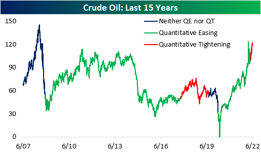
During the last QT cycle, crude oil gained 15.8%, but it would be difficult to attribute these gains to quantitative tightening. Since the Fed began tightening this year, crude oil has jumped 16.0% higher. In the last cycle, oil rallied higher before subsequently crashing, which would certainly be welcomed by many in this cycle. Click here to become a Bespoke premium member today!
Gold Performance During QT
Quantitative tightening (QT) has wide-spanning effects on the economy, as it puts upward pressure on risk-free interest rates due to increased supply in debt markets (assuming all else equal). The Fed announced its QT strategy just one meeting (5/3/22) after hiking its target rates for the first time since 2018 back in March. The previous QT cycle in 2017 did not begin until about two years after the Fed first started hiking rates. The reason for the quick turnaround this time around, though, stems from the fact that inflation has been running rampant, and the balance sheets of consumers and corporates are in relatively strong positions.
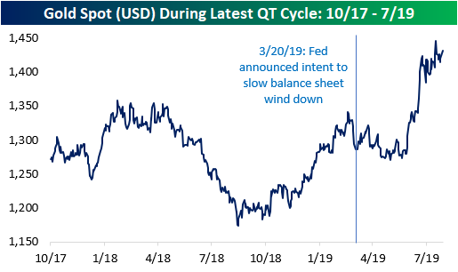
In terms of how various asset classes may perform in the current period of QT, some investors have looked back to the prior period of QT for insight. As mentioned above, there are some important distinctions between the current period and the last period of QT, so it may not be an apples-to-apples comparison, but there are certainly some similarities that can make knowing what happened back then helpful. Using the price of gold over the last 15 years as a backdrop, the chart below shows key events related to periods of quantitative easing (QE) and QT. The event surrounding each dot is summarized in the table below. Click here to learn more about Bespoke’s premium stock market research service.
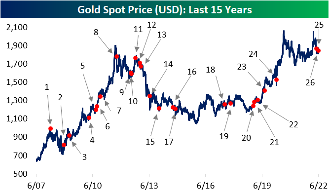

Between October 2017 and July 2019 (the last QT cycle), the price of gold rose by 12.6%, which works out to an annualized return of 6.5%. Over the last 15 years, the price of gold has held an annualized return rate of 6.8%, so there was no clear differentiation in the performance of gold during that period of QT and the last 15 years as a whole. Looking at the chart, though, much of the gains from the last cycle of QT came late in that cycle as the Fed had already announced its intent to end the running off of assets from its balance sheet. In fact, the S&P 500 outperformed gold by more than six percentage points during the last QT cycle. In fact, before the March 2019 announcement that the Fed would wind down its balance sheet, gold was practically unchanged relative to the start of the QT cycle. Click here to become a Bespoke premium member today!