The Best and Worst Performing Stocks of February 2024
The average S&P 500 stock rose 3.87% in February even though the index itself was up more than 5%. You can check out the performance of various ETFs across asset classes in February in this post, but below we take a look at the best and worst-performing individual S&P 500 names during the month.
While NVIDIA (NVDA) got a lot of attention (as always) after its most recent blowout earnings report, two stocks outdid the “King of AI” in February: Constellation Energy (CEG) and Ralph Lauren (RL).
Additional big winners in February included 20%+ gainers like Quanta Services (PWR), GE HealthCare (GEHC), Axon Enterprise (AXON) — the maker of Tasers and video software for police departments, Tapestry (TPR), and Uber (UBER). Other notables include Diamondback Energy (FANG), NXP Semi (NXPI), General Electric (GE), Vulcan Materials (VMC), and Eli Lilly (LLY). And finally, even Disney (DIS) managed to make the list of the 30 biggest winners in February with a gain of 16.17%.

Not everything went up during the month, however. In fact, of the S&P’s 500 stocks, 350 were up and 150 were down in February. That’s pretty weak breadth for a 5%+ up month.
Below is a list of the 30 S&P 500 stocks that fell the most in February. Notably, three of the five biggest losers were from the Communication Services sector: Paramount (PARA), Charter (CHTR), and Warner Bros. (WBD). Other big blue chips that fell in February include Amgen (AMGN), Adobe (ADBE), Palo Alto Networks (PANW), Comcast (CMCSA), and Deere (DE).


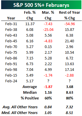
A 5% February: What Worked and What Didn’t
The S&P 500 finished February with a gain of more than 5% for just the 11th time in the index’s history since 1928. Below is a look at prior 5%+ gains in February along with the S&P 500’s performance in March and for the remainder of each year. The last time we had a 5% February was 2015. That March, the S&P fell 1.74%, and the index fell 2.88% from the end of February through year-end. Let’s hope we don’t see that type of action for the remainder of 2024, although a repeat of 2015 would be a lot better than what investors experienced in 1931 when the S&P rallied 11.37% in February only to fall 54.96% for the rest of the year!
Below is a look at our key ETF performance matrix highlighting total returns across asset classes in February, year-to-date, and year-over-year. Mid-cap growth (IJK) was the best area of US markets in February with a 9.58% gain. Dividend stocks (DVY) were the weakest area with a gain of just 1.16% during the month. Looking at sectors, Consumer Discretionary (XLY), Industrials (XLI), and Materials (XLB) actually performed the best in February, beating out Tech’s (XLK) gain of just 4.7% even though the semis (SMH) were up 14%.
Outside of the US, China (ASHR) finally had a big month along with Israel (EIS), which gained 8.6%. Mexico (EWW) and Spain (EWP) were the only two country ETFs that fell in February.
Natural gas (UNG) once again fell sharply, adding to its year-over-year decline of more than 50%. Finally, fixed income ETFs were broadly lower in February, led down by the 20+ Year Treasury ETF (TLT).

Within the S&P 500, there are 67 stocks that show up in at least one of eight “AI” ETFs traded here in the US. As shown below, the 67 “AI” stocks in the S&P were up an average of 5.7% in February compared to a gain of 3.6% for the 433 non-AI stocks. On the year, the 67 “AI” stocks are up 5.9% versus a gain of 2.6% for the non-AI stocks. Given how much some of the most well-known AI names like NVIDIA (NVDA) are up so far in 2024, it’s surprising to us that there isn’t even more separation in performance between the AI and non-AI groups.

Bespoke’s Matrix of Economic Indicators – 2/29/24
Our Matrix of Economic Indicators provides a concise summary analysis of the US economy’s momentum. We combine trends across the dozens and dozens of economic indicators in various categories like manufacturing, employment, housing, the consumer, and inflation to provide a directional overview of the economy.
To access our newest Matrix of Economic Indicators, start a two-week free trial to either Bespoke Premium or Bespoke Institutional now!

Bespoke’s Morning Lineup — 2/29/24
See what’s driving market performance around the world in today’s Morning Lineup. Bespoke’s Morning Lineup is the best way to start your trading day. Read it now by starting a two-week trial to Bespoke Premium. CLICK HERE to learn more and start your trial.
“We must walk consciously only part way toward our goal, and then leap in the dark to our success.” – Henry David Thoreau

Below is a snippet of commentary from today’s Morning Lineup. Start a two-week trial to Bespoke Premium to view the full report.
When looking at the market’s longer-term trend, we like to use a chart of the S&P 500’s 200-day moving average on its own with the daily price changes removed from the chart completely in order to eliminate the day-to-day noise and smooth the trend out. What’s notable here is that the S&P’s 200-day just recently took out its prior all-time high made in early 2022, ending a streak of 460 trading days without a new all-time high for the 200-DMA. While the S&P made a new all-time high on its daily price chart back in January, a new all-time high for the smoothed out 200-DMA is yet another confirmation of the current bull that has been legging higher for the last month or so.


For more analysis of global equities and economic readings released this morning, read today’s full Morning Lineup with a two-week Bespoke Premium trial.
Beware of February 29th
While we can’t buy more time, tomorrow marks the rare occasion that we’ll get an extra day in a year. Leap years, as they’re known, seem straightforward at first glance – every four years, right? However, there’s a small twist. Typically, a year divisible by four is a leap year, but years ending in ’00 are only leap years if they’re divisible by 400. For example, 2000 qualified as a leap year, but 1700, 1800, and 1900 did not.
Now, let’s look at historical data. Since the New York Stock Exchange adopted the five-day trading week in late 1952, the S&P 500’s average performance on the last trading day of February has been flat, with a median change of 0.00%. However, when the last trading day falls on Leap Day (February 29th), performance has been weaker. The S&P 500’s median performance dips slightly to a decline of 0.13% compared to a small gain of 0.06% on the last trading day of non-leap year Februarys. Interestingly, the last trading day of February, regardless of being a leap year or not, has shown weakness in recent years, experiencing negative returns in each of the past nine years. Whether or not the pattern plays out this year remains to be seen, but even if it does, it would be a small price to pay for an extra day!

Bespoke’s Morning Lineup – 2/28/24 – US Takes a Breather
See what’s driving market performance around the world in today’s Morning Lineup. Bespoke’s Morning Lineup is the best way to start your trading day. Read it now by starting a two-week trial to Bespoke Premium. CLICK HERE to learn more and start your trial.
“Truth is not determined by a majority vote.” – Pope Benedict XVI
Below is a snippet of commentary from today’s Morning Lineup. Start a two-week trial to Bespoke Premium to view the full report.
After gains in four of the last five days, equity futures were indicated lower ahead of some key GDP and inflation data this morning. Along with lower equity futures, bond yields are also lower, and that is welcome news for the housing market where Mortgage applications fell over 5% last week after falling more than 10% in the week before that.
US stocks have led the way during the recent bull market, especially since the lows of October 2022. The S&P 500 ETF (SPY) has gained 42.2% since then, compared to 31.0% for the rest of the world (iShares MSCI ACWI ex US ETF, ACWX). However, most of this outperformance occurred after late October. As the chart below shows, both SPY and ACWX were performing similarly until then.

Year-to-date, only the Japan ETF (EWJ) has outperformed SPY, with a gain of nearly 8%. However, international markets have shown recent strength. While the S&P 500 gained 2.05% last week, ETFs for China, Germany, Italy, and France all outperformed it. Only India’s ETF declined.

Looking at all ten country ETFs, most are near or at 52-week highs, except China (MCHI). While they haven’t experienced the same rapid ascent as the US (bottom chart), they have still reached significant levels.


For a closer look at how the market performed following prior moves like we saw yesterday, read today’s full Morning Lineup with a two-week Bespoke Premium trial.
The Closer – Fed Pricing, Home Prices, Durables – 2/27/24
Log-in here if you’re a member with access to the Closer.
Looking for deeper insight into markets? In tonight’s Closer sent to Bespoke Institutional clients, we begin with a look into tonight’s earnings as well as the changes to Fed pricing (page 1). We then review the latest Conference Board and Case-Shiller data (page 2) before pivoting over to the latest hard manufacturing data (page 3). We finish with a recap of today’s healthy 7 year note auction (page 4).

See today’s full post-market Closer and everything else Bespoke publishes by starting a 14-day trial to Bespoke Institutional today!
Democratic (NANC) Trading Trumps Republicans (KRUZ)
Just over a year ago, a pair of interesting ETFs debuted. The Unusual Whales Subversive Republican (KRUZ) and Democrat (NANC) Trading ETFs seek to track the performance of stock investments of sitting Congressional members. The Republican ETF (KRUZ) would track those investments of Republican members while the Democratic ETF (NANC) would track those of Democrats. As shown below, the past year has seen Democrats come out as winners. The over 30% total return for NANC is almost twice that of KRUZ and is also several percentage points stronger than the S&P 500 ETF (SPY).

Not only is NANC the better performer of the two since inception, but it is also significantly larger. As shown in the chart below, NANC currently has assets under management (AUM) of $27.89 million compared to only $9.35 million for KRUZ. While NANC has consistently held a large AUM since inception, we would note that it really took off in the past few months.

Both of these ETF have hundreds of holdings with KRUZ being the smaller of the two with 488 while NANC has 748. NANC is not only large, but is significantly more top heavy. The top ten holdings of that ETF account for roughly half of its weight, whereas KRUZ’s top ten holdings are just under 20% of its weight.
As always, what conversation about top-heaviness is complete without a mention of the mega-caps. That group of stocks are some of the largest holdings in NANC. Microsoft (MSFT) is the single largest with a 7.44% weighting followed by 6.1% from Amazon (AMZN), 5.1% from Apple (AAPL), and 4.7% from NVIDIA (NVDA). Using our Custom Portfolios tool, below we show the 26 holdings of NANC that currently account for at least 0.5% of weight. Continuing its relentless rise, NVDA is of course the best performing one of those stocks and is deeply overbought alongside most others on this list.

Shifting over to KRUZ, as previously mentioned, weights are distributed a bit more evenly. As such, below we show the 28 stocks with weights that are above 1%. The largest holding is Intel (INTC) at a 2.35% weight. Albeit a big drop down the market cap ladder, HVAC company Comfort Systems (FIX) is the next largest holding at 2.24%. That comes as the stock has experienced an impressive rally of close to 40% in the past month alone. ConocoPhilips (COP) is the only other stock with a weight of more than 2%, while Accenture (ACN) is the next largest at 1.99%. While further down the list in terms of its weight, mega caps also make this list with NVIDIA (NVDA) and Amazon (AMZN) on the board.

Beauty Stock ELF Beats the King of AI
NVIDIA (NVDA) is up nearly 2,000% over the last five years, but would you believe that there’s another stock — a non-AI stock — that’s up even more?
As shown below, while NVDA is up 1,937% since February 2019, cosmetics-maker e.l.f. Beauty (ELF) has that number beat with an even bigger gain of 2,639%!

While the two are in completely different industries, one thing they have in common is their penchant for reporting earnings triple plays. As a reminder, an earnings triple play occurs when a stock reports earnings and 1) beats analyst EPS estimates, 2) beats analyst sales estimates, and 3) raises forward guidance.
As shown in the snapshot from our interactive Earnings Explorer below, NVIDIA (NVDA) has now reported five earnings triple plays in a row.

e.l.f. Beauty (ELF) has that topped, though, with seven triple plays in a row dating back to August 2022!

If you’re interested in reading about more stocks that have recently reported earnings triple plays, start a Bespoke Institutional (All Access) trial today and access our latest Triple Play Report (thumbnail preview below).

The Closer – Big Issuance, New Home Sales, Treasury Auctions, CoT – 2/26/24
Log-in here if you’re a member with access to the Closer.
Looking for deeper insight into markets? In tonight’s Closer sent to Bespoke Institutional clients, we discuss a record February for investment grade corporate bond issuance (page 1), a few earnings results after the bell (page 1), some data on manufacturing sentiment (page 1), a detailed breakdown of new home sales data for January (pages 2 & 3), auction recaps for the 2y and 5y UST sales today as well as a preview of the 7y note sale later this week (page 4), and a summary of commitment of traders positioning data from futures markets (pages 5-8).

See today’s full post-market Closer and everything else Bespoke publishes by starting a 14-day trial to Bespoke Institutional today!