Jul 15, 2016
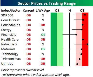 In Thursday’s Sector Snapshots report, we included the chart to the right showing that the S&P 500 and all ten sectors were trading at overbought levels (more than one standard deviation above 50-day moving average). As mentioned in the report, it’s not too common that you see all ten sectors rallying at the same time like they have in the last several days. The last time we saw a similar set up was earlier this year in March. With all ten sectors trading at overbought levels, it would make sense to expect some short-term consolidation as equities catch their breath and let their trading ranges catch up to them. This type of consolidation can either occur in the form of lower prices or time (sideways trading).
In today’s Chart of the Day sent to paid subscribers, we provided a list of 24 prior periods since 1990 where all ten sectors traded to overbought levels simultaneously after not having done so in the prior three months. Included is a summary of how the S&P 500’s performance over the following week, month, and quarter. To view it, please start a 14-day free trial below.
Jul 14, 2016
With June retail sales due out tomorrow from the US Census, we took a look at how our Bespoke Consumer Pulse data does predicting the release. Below we show the close track between MoM retail sales (ex auto and gas) versus our tracker of consumers’ confidence in their finances. As shown, the correlation recently has been very strong, and our June Pulse data is a helpful guide to where retail sales will come in tomorrow. We do not include June data in the chart below.
In today’s Chart of the Day sent to paid subscribers, we update the above chart to show the forecast direction for June retail sales based on our Bespoke Consumer Pulse data. To view it, please start a 14-day free trial below.
Jul 13, 2016
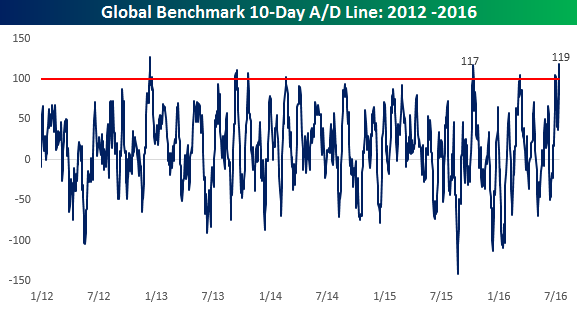
Just about a month ago , when equities were selling off leading up to the 6/23 UK referendum, we published a B.I.G. Tips report (A Global Flush – clients only) highlighting how the four-day advance/decline (A/D) reading in our International Benchmark Breadth Indicator had reached one of its most negative levels of the last ten years. Given the rally in global equities over the last two weeks, we wanted to update this indicator to see how the recent breadth of global equities compares to other periods.
For those unfamiliar with this indicator, our International Benchmark Breadth Indicator tracks the daily changes (in local currency terms) of the benchmark stock indices for the 25 largest economies in the world. As shown in the chart below, through yesterday’s close, the 10-day A/D reading spiked to +119, exceeding the high of +117 from last October for the most positive breadth reading since December 2012.
In today’s Chart of the Day sent to paid subscribers, we take a look at how the S&P 500 performed following prior instances going back to 1998 where the International Benchmark Breadth Indicator reached similar or higher levels. If you are wondering how to approach the market following the monumental rally of the last ten trading days, you need to see this report. To view it, please start a 14-day free trial below.
Jul 12, 2016
The Russell 2,000 index of small cap companies has been on fire recently. In fact, the index is up more than 10% over the last 10 trading days! It hasn’t experienced that kind of move since December 2011. And it has only had 27 similar extreme moves higher over a 10-trading day period in its history going back to 1979.
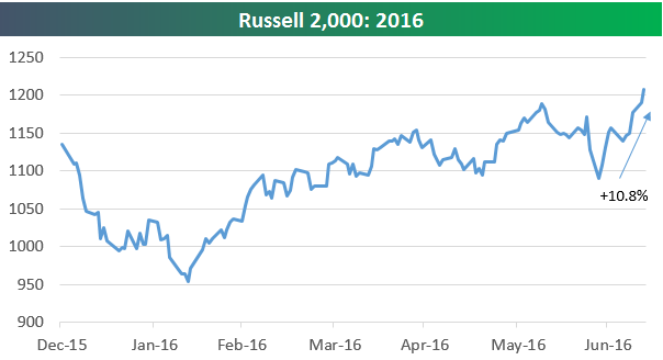
In today’s Chart of the Day sent to paid subscribers, we take a look at how the Russell 2,000 has performed in the past when it has experienced similar moves of 10%+ over 10-trading day periods. To view the report, please start a 14-day free trial below.