Bespoke’s Sector Snapshot — 1/30/20
Sick Day for Sentiment
Although there have not been any major clusters outside of China, the spread of the coronavirus has investors understandably worried. Price action has been choppy in response as the story continues to develop, but investor sentiment is moving lower. The weekly reading on bearish sentiment from AAII fell from 45.6% down to 31.98% this week. That 13.62 percentage point decline is the largest one week drop in bullish sentiment since early August when it dropped 16.78 percentage points. At that time bullish sentiment had fallen to an even lower 21.66%.

The loss in bullish sentiment was picked up by the bears as bearish sentiment rose 12.09 percentage points to 36.86%. As with bullish sentiment, this was the largest one-week buildup in negative sentiment since early August, although it was only about half the size of the 24.14 percentage point rise in the summer. Additionally, sentiment has not become extended in any major way either for bears or bulls which are both now in the middle of their ranges.

The shifts in bullish and bearish sentiment have also led the bull-bear spread to tick back into negative territory meaning a larger share of respondents to the AAII survey are reporting bearish sentiment. This snapped a 15 week-long streak with a positive bull-bear spread, and in the history of the survey dating back to 1987, there have only been 16 other streaks that have reached 15 weeks or more. Only a handful, though, have occurred within the past decade. This most recent streak tied the one that came to a close in March of 2018 but was only half the size of the streak ending at 31 weeks in March of 2015.

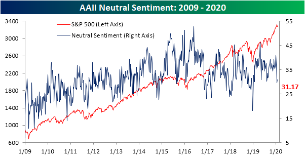
Last week, neutral sentiment fell below 30% for the first time since the first week of 2019 and the week before that it snapped a 22 week-long streak above its historical average. Although it is still below its average, neutral sentiment picked up a bit this week rising back above 30% to 31.17%. Only slightly higher, it is still at the low end of the past year’s range. Start a two-week free trial to Bespoke Institutional to access our interactive economic indicators monitor and much more.
The Bespoke 50 Top Growth Stocks — 1/30/20
Every Thursday, Bespoke publishes its “Bespoke 50” list of top growth stocks in the Russell 3,000. Our “Bespoke 50” portfolio is made up of the 50 stocks that fit a proprietary growth screen that we created a number of years ago. Since inception in early 2012, the “Bespoke 50” has beaten the S&P 500 by 105.6 percentage points. Through today, the “Bespoke 50” is up 241.3% since inception versus the S&P 500’s gain of 135.7%. Always remember, though, that past performance is no guarantee of future returns. To view our “Bespoke 50” list of top growth stocks, please start a two-week free trial to either Bespoke Premium or Bespoke Institutional.

Chart of the Day: Can TDOC Help Treat nCov?
Big Revision in Claims
This week’s initial jobless claims came in at 216K which was slightly above expectations of 215K. That leaves claims basically in the middle of the past year’s range although it is an improvement from last week’s revised number of 223K.
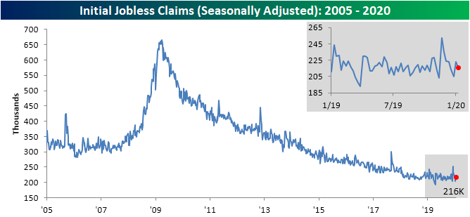
Given they remain in a range, the revision to last week’s print was one of the more notable aspects of this week’s data. Originally, last week’s seasonally adjusted number was much stronger at 211K, but that was revised 12K higher to 223K. While that does not leave claims significantly higher than any of the past year’s readings—it was the highest since the last week of December’s equivalent reading—the size of the revision was very large. The chart below shows the difference between the first revision and the first release of jobless claims over the past 20 years. Last week’s 12K revision was the joint largest revision since the 12K upwards revisions in December and November of 2012. Before that, you would have to go back to March of 2012 to find a larger revision (16K). While those are big, there were multiple revisions that were ever larger like the 27K revision in January of 2012, 26K revision in September of 2005, 33K revision in March of 2002, and 26K revision in December of 2000.

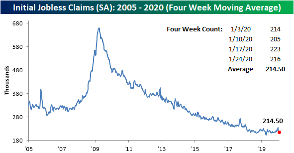
Despite that upward revision, the four-week moving average has fallen for a fourth consecutive week. Now at 214.5K, it is at its lowest level since early October when the moving average was 213.75K.
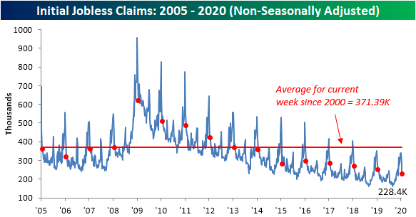
In terms of the non-seasonally adjusted data, claims are continuing to work off of their seasonal peak, falling to 228.4K this week from 282.1K last week. Given that the data is non-seasonally adjusted those week to week comparisons do not mean much and a better look is through the year-over-year change. By this measure, claims fell 22.4K YoY. Start a two-week free trial to Bespoke Institutional to access our interactive economic indicators monitor and much more.
Bespoke’s Morning Lineup – 1/30/20 – Flatter Curves
See what’s driving market performance around the world in today’s Morning Lineup. Bespoke’s Morning Lineup is the best way to start your trading day. Read it now by starting a two-week free trial to Bespoke Premium. CLICK HERE to learn more and start your free trial.

Long-term treasuries are rallying this morning on a combination of yesterday’s dovish FOMC statement and press conference coupled with a move out of riskier assets on renewed concerns that the coronavirus will have a negative impact on global growth. With the move in US Treasuries, the yield curve (10-year vs 3-month) is on the verge of inverting for the first time since last October as optimism over a global economic rebound has been called into question.

The Closer – FOMC, Major Earnings, GDP Impacts, Financial Conditions, ICI, EIA – 1/29/20
Log-in here if you’re a member with access to the Closer.
Looking for deeper insight on markets? In tonight’s Closer sent to Bespoke Institutional clients, we review today’s FOMC meeting and Fed Chair Powell’s following presser in addition to the confusing market reaction. Next, we take a look at tonight’s major earnings announcements including Facebook (FB), Microsoft (MSFT), and Tesla (TSLA). Turning to macroeconomic data, we show how trade, inventories, and residential construction are poised to impact GDP. We also show financial conditions and fund flows before finishing with our weekly look at EIA data and the technical setups for oil and gasoline.

See today’s post-market Closer and everything else Bespoke publishes by starting a 14-day free trial to Bespoke Institutional today!
Fixed Income Weekly – 1/29/20
Searching for ways to better understand the fixed income space or looking for actionable ideas in this asset class? Bespoke’s Fixed Income Weekly provides an update on rates and credit every Wednesday. We start off with a fresh piece of analysis driven by what’s in the headlines or driving the market in a given week. We then provide charts of how US Treasury futures and rates are trading, before moving on to a summary of recent fixed income ETF performance, short-term interest rates including money market funds, and a trade idea. We summarize changes and recent developments for a variety of yield curves (UST, bund, Eurodollar, US breakeven inflation and Bespoke’s Global Yield Curve) before finishing with a review of recent UST yield curve changes, spread changes for major credit products and international bonds, and 1 year return profiles for a cross section of the fixed income world.
In this week’s report we discuss the drivers of lower interest rates and recent credit spread changes.

Our Fixed Income Weekly helps investors stay on top of fixed income markets and gain new perspective on the developments in interest rates. You can sign up for a Bespoke research trial below to see this week’s report and everything else Bespoke publishes free for the next two weeks!
Click here and start a 14-day free trial to Bespoke Institutional to see our newest Fixed Income Weekly now!
Bespoke’s Global Macro Dashboard — 1/29/20
Bespoke’s Global Macro Dashboard is a high-level summary of 22 major economies from around the world. For each country, we provide charts of local equity market prices, relative performance versus global equities, price to earnings ratios, dividend yields, economic growth, unemployment, retail sales and industrial production growth, inflation, money supply, spot FX performance versus the dollar, policy rate, and ten year local government bond yield interest rates. The report is intended as a tool for both reference and idea generation. It’s clients’ first stop for basic background info on how a given economy is performing, and what issues are driving the narrative for that economy. The dashboard helps you get up to speed on and keep track of the basics for the most important economies around the world, informing starting points for further research and risk management. It’s published weekly every Wednesday at the Bespoke Institutional membership level.
You can access our Global Macro Dashboard by starting a 14-day free trial to Bespoke Institutional now!
