January Employment Report Preview
After a much better than expected ADP Private Payrolls report on Wednesday and today’s Jobless Claims report, which was the lowest since last April, US employment data has really shown signs of improvement after a shaky December. While a strong labor market would normally stoke fears of a tighter Fed, there is widespread agreement that Powell and Co. will not be raising rates anytime soon. Eventually, that will change, but until it does, the market is reacting positively to positive economic news.
Heading into tomorrow’s Non-Farm Payrolls report, economists are expecting an increase in payrolls of 163K, which would be an 18K decline from December’s reading of 145K. In the private sector, economists are expecting a similar increase relative to December with a reading of 150K. Job growth in the manufacturing sector is expected to decline by 1K compared to December’s reading of –12K. With expected job growth right around 150K, economists are expecting the Unemployment Rate to stay unchanged at 3.5% while average hourly earnings are forecast to increase 0.3% compared to December’s anemic growth rate of just 0.1%.

Ahead of the report, we just published our eleven-page preview of the January jobs report. This report contains a ton of analysis related to how the equity market has historically reacted to the monthly jobs report, as well as how secondary employment-related indicators we track looked in January. We also include a breakdown of how the initial reading for January typically comes in relative to expectations and how that ranks versus other months.
For anyone with more than a passing interest in how equities are impacted by economic data, this January employment report preview is a must-read. To see the report, sign up for a monthly Bespoke Premium membership now!
Chart of the Day: BlackLine Bottom Line
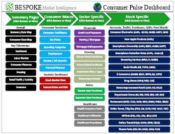
Bespoke’s Consumer Pulse Report — February 2020
Bespoke’s Consumer Pulse Report is an analysis of a huge consumer survey that we run each month. Our goal with this survey is to track trends across the economic and financial landscape in the US. Using the results from our proprietary monthly survey, we dissect and analyze all of the data and publish the Consumer Pulse Report, which we sell access to on a subscription basis. Sign up for a 30-day free trial to our Bespoke Consumer Pulse subscription service. With a trial, you’ll get coverage of consumer electronics, social media, streaming media, retail, autos, and much more. The report also has numerous proprietary US economic data points that are extremely timely and useful for investors.
We’ve just released our most recent monthly report to Pulse subscribers, and it’s definitely worth the read if you’re curious about the health of the consumer in the current market environment. Start a 30-day free trial for a full breakdown of all of our proprietary Pulse economic indicators.
The Bespoke 50 Top Growth Stocks — 2/6/20
Every Thursday, Bespoke publishes its “Bespoke 50” list of top growth stocks in the Russell 3,000. Our “Bespoke 50” portfolio is made up of the 50 stocks that fit a proprietary growth screen that we created a number of years ago. Since inception in early 2012, the “Bespoke 50” has beaten the S&P 500 by 107.4 percentage points. Through today, the “Bespoke 50” is up 249.8% since inception versus the S&P 500’s gain of 142.4%. Always remember, though, that past performance is no guarantee of future returns. To view our “Bespoke 50” list of top growth stocks, please start a two-week free trial to either Bespoke Premium or Bespoke Institutional.

Claims Come Down
Initial jobless claims were forecast to drop slightly this week from 217K to 215K. Instead, this morning’s release was much better than expected falling to 202K. That is the biggest one-week decline since mid-December’s 17K decline as the indicator now sits at its lowest level since April’s cycle and half-century low of 193K.
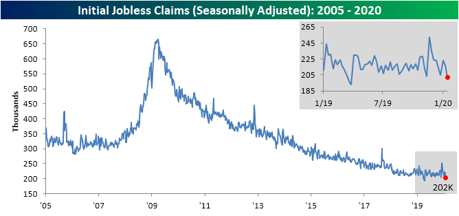
With the seasonally adjusted number falling in seven of the last eight weeks, the four-week moving average has continued to grind lower. This week, it has fallen 3K down to 211.75K, which is only 10.25K above the cycle low that was put in place the week of April 12th of last year. Now, the moving average is at its lowest level since the week after that cycle low when the moving average totaled 206K. Additionally, the moving average has fallen for five consecutive weeks which is the longest such streak since September of 2018.

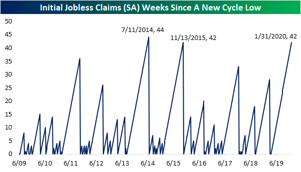
As mentioned above, seasonally adjusted jobless claims are now just off of their cycle lows in terms of both the level of the data and the moving average. That is a welcome sign considering it has been quite some time, 42 weeks to be exact, since the data has last put in a cycle low. That is the joint longest streak—alongside another 42 week long streak in 2015—since the 44 week long streak that came to a close on July 11th of 2014. As for the 4-week moving average, the current 42-week run is tied with a streak that ended in December of 2012 for the longest streak of the current cycle without a new cycle low.

The non-seasonal adjusted data has been similarly strong as it works through its seasonal downdraft. Non-adjusted claims fell to 224.4K this week, which is well below the average for the current week of the year since 2000 of 380.32K in addition to the comparable weeks of the past few years. Start a two-week free trial to Bespoke Institutional to access our interactive economic indicators monitor and much more.

Bespoke’s Morning Lineup – 2/6/20 – Trade Headlines Make a Comeback
See what’s driving market performance around the world in today’s Morning Lineup. Bespoke’s Morning Lineup is the best way to start your trading day. Read it now by starting a two-week free trial to Bespoke Premium. CLICK HERE to learn more and start your free trial.
Global equities are in rally mode again this morning on easing concerns over the impact of the coronavirus and news of possible treatments. One number we’ve been watching closely over the last couple of weeks is the mortality rate which continues to drop. Through the latest reported global statistics, the mortality rate has dropped down to 2.01% which is the lowest we have seen since statistics have been published.
In economic news this morning, the ADP Private Payrolls report came in much higher than expected (291K vs. 157K). This was the strongest monthly print since May 2015 and the best report relative to expectations since the December 2011 report on 1/5/12 (325K vs 178K).

Shares of Twitter (TWTR) are poised to gap up over 7% this morning. From our Earnings Explorer, we found that since the company’s IPO over five years ago, TWTR has gapped up over 5% in reaction to earnings eight different times. Of those occurrences, the stock has continued higher from the open to close five times, but there was only one time where the stock sold off more than 2% from its opening print after gapping up over 5%.

The Closer – Dollar Breakout or Rollover, Trade Retreat – 2/5/20
Log-in here if you’re a member with access to the Closer.
Looking for deeper insight on markets? In tonight’s Closer sent to Bespoke Institutional clients, we show the US dollar’s breakout and some reasons to doubt a strong run. We then take a quick look at the global auto industry before turning to the US trade balance. We finish tonight with our weekly review of EIA data.

See today’s post-market Closer and everything else Bespoke publishes by starting a 14-day free trial to Bespoke Institutional today!
Bespoke Matrix of Economic Indicators
Our Matrix of Economic Indicators is the perfect summary analysis of the US economy. We combine trends across the dozens and dozens of economic indicators in various categories like manufacturing, employment, housing, the consumer, and inflation to provide a directional overview of the economy.
To access our newest Matrix of Economic Indicators, start a two-week free trial to either Bespoke Premium or Bespoke Institutional now!

Big Blue Bounds
Of the stocks that have skyrocketed in the last few weeks, there is one that might come as a surprise: International Business Machines (IBM). This left-for-dead technology giant reported earnings on January 21st with strong results. Big blue reported an earnings triple play with EPS 2 cents above estimates, sales $155.1 mm above estimates, and raised guidance. The stock rose 3.39% in response, but in the following days, those gains did not hold. Fortunately for IBM, its recent earnings report is not the only reason it has been in the news lately. Less than a week ago, the company announced that the president and CEO of the past eight years, Ginni Rometty, will be stepping down in April. This resulted in the stock jumping over 5% last Friday with considerable follow-through since then. As of today, IBM has risen 11.75% from the close prior to its earnings report and 13.72% since the CEO announcement, taking out previous highs from the fall.
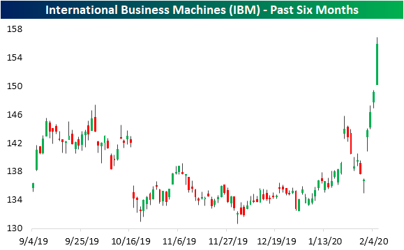
Not only has this move taken out late September/early October highs, but it has also brought the stock to fresh 52-week highs as shown in the chart below. Today’s further gain of another ~5% leaves IBM around 3% above the July high of $151.36.

While IBM has broken out on a shorter-term chart, the technical picture over the long run is at more of a crossroads. For much of the past decade, IBM has been stuck in a prolonged downtrend. The run-up over the past couple of weeks has brought IBM right to the top of resistance at this downtrend line. A breakout above this line would be a promising sign.
At the same time, the fundamental picture still is attractive relative to its peers. IBM currently has one of the lowest valuations and highest yields of the S&P 500’s Technology sector stocks. Currently trading at 11.96x earnings, IBM is deeply discounted when compared to the average P/E for the sector of 41.8. Additionally, even with the recent move, IBM yields 4.14%, which is second only to Seagate Technology’s (STX) 4.74% yield, which is the highest in the sector.

Again, in spite of its low valuation, IBM is very overbought. Thanks to the over 10% rally in the past five days, IBM has now moved over 4 standard deviations above its 50-DMA, meaning it could be due for some mean reversion. Looking back through the stock’s history, there have only been 14 other times that it has risen over 10% in a five-day span without having done so in the prior year. After prior 10%+ rallies in the span of 5 days, the stock has averaged a decline of 0.86% over the next week. Over the next year, however, IBM has averaged a gain of 12.6%. Start a two-week free trial to Bespoke Institutional to access all of our premium research and interactive tools.

Fixed Income Weekly – 2/5/20
Searching for ways to better understand the fixed income space or looking for actionable ideas in this asset class? Bespoke’s Fixed Income Weekly provides an update on rates and credit every Wednesday. We start off with a fresh piece of analysis driven by what’s in the headlines or driving the market in a given week. We then provide charts of how US Treasury futures and rates are trading, before moving on to a summary of recent fixed income ETF performance, short-term interest rates including money market funds, and a trade idea. We summarize changes and recent developments for a variety of yield curves (UST, bund, Eurodollar, US breakeven inflation and Bespoke’s Global Yield Curve) before finishing with a review of recent UST yield curve changes, spread changes for major credit products and international bonds, and 1 year return profiles for a cross section of the fixed income world.
In this week’s report we take a look at which types of stocks are most closely tied to interest rates.

Our Fixed Income Weekly helps investors stay on top of fixed income markets and gain new perspective on the developments in interest rates. You can sign up for a Bespoke research trial below to see this week’s report and everything else Bespoke publishes free for the next two weeks!
Click here and start a 14-day free trial to Bespoke Institutional to see our newest Fixed Income Weekly now!