The Bespoke Report – 5/1/20 – May-be Not?
This week’s Bespoke Report newsletter is now available for members.
Was April just a mirage? After the strongest month for the S&P 500 since 1987, equities started off the month of May with a big thud. The S&P 500 finished the week with another ’Corona Friday’ falling 2.8% for the worst start to a month since…last month. How quickly we forget, don’t we? Last month, the S&P 500 kicked off April with a decline of over 4% and then rallied more than 17% for the remainder of the month. Here’s to hoping the encore is even better!.
In this week’s Bespoke report, we cover all of this week’s market and economic data and cover the latest trends so far in earnings season. To read the report and access everything else Bespoke’s research platform has to offer, start a two-week free trial to one of our three membership levels. You won’t be disappointed!

Daily Sector Snapshot — 4/30/20
B.I.G. Tips – How Often Does the S&P 500 Retest Bear Market Lows?
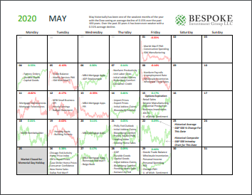
Bespoke Market Calendar — May 2020
Please click the image below to view our May 2020 market calendar. This calendar includes the S&P 500’s average percentage change and average intraday chart pattern for each trading day during the upcoming month. It also includes market holidays and options expiration dates plus the dates of key economic indicator releases. Start a two-week free trial to one of Bespoke’s three research levels.
Bespoke Matrix of Market Indicators
Our Matrix of Economic Indicators is the perfect summary analysis of the US economy. We combine trends across the dozens and dozens of economic indicators in various categories like manufacturing, employment, housing, the consumer, and inflation to provide a directional overview of the economy.
To access our newest Matrix of Economic Indicators, start a two-week free trial to either Bespoke Premium or Bespoke Institutional now!

Post-Covid Earnings Triple Plays
Earnings season continues to chug along, and so far this season there have been a total of 18 triple plays. Triple plays are essentially the cream of the crop on earnings in which a company beats EPS and revenue estimates in addition to raising guidance. Below is a list of the 18 triple plays so far this season along with how their share prices performed on the day they reported the triple play. On average, triple plays have gained 3.7% on their earnings reaction days this season, which is still strong, but it’s slightly less than they’ve normally gained throughout history.
Given the massive changes to the economy due to the coronavirus, one might not expect more cyclical names to report strong quarters but that has not necessarily been the case. The biggest representation has come from the Technology space. Half of the triple plays so far this earnings season have been technology companies. Five of these—Teradyne (TER), Silicon Motion (SIMO), Monolithic Power (MPWR), M/A Com Tech (MTSI), and NeoPhotonics (NPTN)—are semiconductor names. Additionally, Prologis (PLD) who was the first triple play of earnings season, reported a solid quarter despite the REIT’s business primarily being exposed to logistics and supply chain facilities. Aegion (AEG) and S&P Global (SPGI) from the cyclical Industrial and Financial sectors also reported strong quarters in spite of COVID-19. Other triple plays come from areas of the economy that are more unsurprisingly holding up in the COVID economy including a couple Health Care names—USANA (USNA) and Anthem (ANTM)—and Consumer Staples stocks like Keurig Dr Pepper (KDP). Perhaps the most expected triple play so far this season has come from the cleaning product manufacturer Clorox (CLX). Members can track all of these names using this custom portfolio. Start a two-week free trial to Bespoke Institutional to access our custom portfolios, Earnings Explorer, and much more.

FAANG & MSFT Lead The Charge, But Their Contribution Is Smaller Than You’d Think
With just five companies (Facebook, Amazon, Apple, Alphabet, and Microsoft) accounting for one-fifth of the S&P 500, stocks are pretty top-heavy. The famed FAANGs (FB, AMZN, AAPL, NFLX, GOOGL) plus MSFT account for 22% of the S&P’s market cap and are up an average of 12% YTD.
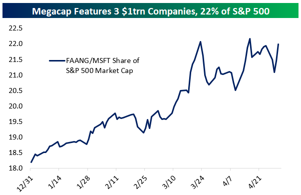
However, that doesn’t mean they’ve actually moved the markets that much. Year-to-date, FAANG+MSFT has added only 1.2% to the total market gain, meaning excluding those names the market would be down 11.2% YTD versus down 10% actuals.

Despite the fact that these names have outperformed the S&P 500 since the 2/19 market highs, their performance has had a positive impact of 1.2 percentage points on the S&P 500. That’s basically just one third of the impact they would have had if they performed inline with the rest of the market. Finally, since March 23rd when equity markets bottomed, these stocks have only added about exactly what you would expect them to based on their market caps: 6.7 percentage points (22%) of the 29.88% leap for the market over that period. In short, the S&P 500 is a very big ship to turn with outperformance, even when 20% of it is concentrated in a few names. Start a two-week free trial to Bespoke Institutional to access our Chart Scanner, custom screens, and much more.

A Look at Big Moves Lower on Earnings for Amazon (AMZN)
Amazon (AMZN) is currently trading down 6% after reporting earnings yesterday evening. While it may seem like a rare move lower for Amazon (AMZN), the fact is that big moves lower on earnings are nothing new for this mega-cap online retail/Tech company. From our Earnings Explorer tool, below is a snapshot of all instances in which AMZN shares opened lower by 5% or more following a quarterly earnings report. Today was the 27th time the stock has experienced a big selloff like this on earnings out of 75 quarterly reports since 2001. That’s 36% of AMZN’s quarterly reports! For some perspective, even though the stock has opened down 5%+ on more than a third of its quarterly releases since 2001, it’s up 25,000% over this entire time period. Start a two-week free trial to Bespoke Institutional to access our Earnings Explorer tool and all of our equity market research.

Since its IPO in 1997, Amazon (AMZN) shares are up 180,000%. Thinking back to its early days as a public company during the Dot Com bubble, AMZN was one of those high-flying Internet stocks of the late 90s that experienced remarkable moves higher on a daily basis. Below is a chart of AMZN during the Dot Com bubble and burst showing a 7,000% rally at its peak in 1999 before giving up nearly all of those gains in a couple of years by 2001.

Amazingly, the Dot Com bubble that was so frothy at the time now barely registers on the chart of Amazon’s performance since its IPO in 1997. What a remarkable run it has been.

Fund Flow Rebound Continues
This week the Investment Company Institute reported fund flows across ETFs and mutual funds for the week ending April 22nd. Below, we summarize flows across a range of periods as well as how those numbers stack up to historical ranges since 2013. The most recent week saw massive flows into commodity ETFs as vehicles like USO saw massive interest from retail investors. Total inflows to commodity ETFs totaled $14bn in the four weeks ended April 22. The current week is a record result. For equities, the week was mostly weak with $9.5bn in overall outflows mostly thanks to $7.9bn in global equity outflows. Bond funds continued to reverse their extreme outflows from March with $9.8bn in inflows across ETF and mutual funds.
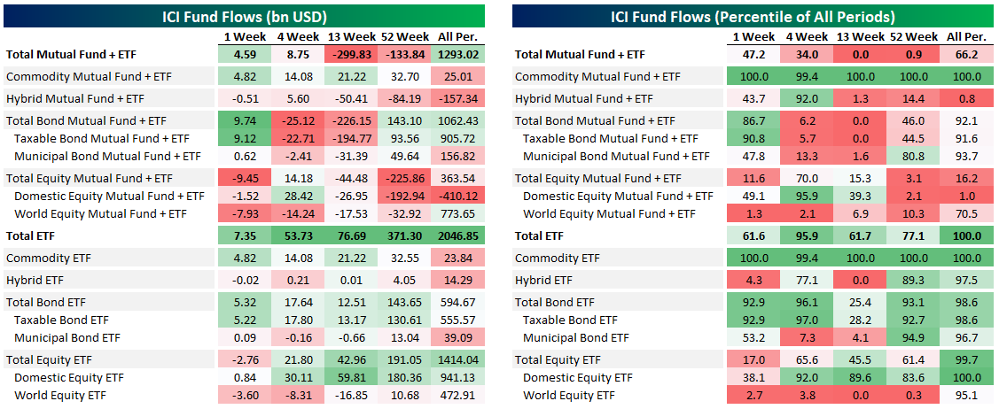
Mid-April saw the aggregate fund universe draw inflows for two straight weeks after massive outflows in March. As we discussed above, the biggest cause for outflows was bond markets, with $306bn leaving the combined ETF and mutual fund universe in six weeks from March 4th to March 8th. Equity flows have been much more muted, as shown in the second chart below. Gain access to Bespoke’s most actionable investment research with a two-week free trial to Bespoke Premium.

10-Day Advance/Decline Lines Running Hot
The gains in the first half of the week lifted every sector but two—Utilities and Financials—above their 50-DMAs. Meanwhile, Health Care had even touched overbought territory (over 1 standard deviation above its 50-day) earlier in the week, making it the first sector to be overbought since late February.
When it comes to another measure we monitor, the 10-day advance/decline line, conditions are more broadly appearing overbought. The 10-day advance/decline line measures the average number of daily advancers minus decliners in an index or sector over the last 10 trading days. Very high readings suggest that things have gotten extended in the very near term and downside mean reversion can be expected. Very low reading suggest the opposite.
The 10-day A/D lines for sectors have been pretty strong recently indicating broad participation in the rally, but this has led these readings to become elevated indicating conditions may be running a bit too hot in the near term. Outside of the defensive sectors like Consumer Staples, Utilities, and Real Estate, every sector’s 10-day A/D line has been in overbought territory at some point over the past week. The same can also be said for the 10-day A/D line for the S&P 500. We’d note, though, that while A/D lines are extended, they’re not at extreme levels seen at other points over the past year. Start a two-week free trial to Bespoke Institutional to access our Sector Snapshot report and much more.
