Bespoke Brunch Reads: 5/17/20
Welcome to Bespoke Brunch Reads — a linkfest of the favorite things we read over the past week. The links are mostly market related, but there are some other interesting subjects covered as well. We hope you enjoy the food for thought as a supplement to the research we provide you during the week.
While you’re here, join Bespoke Premium for 3 months for just $95 with our 2020 Annual Outlook special offer.
Code Problems
Facebook will pay $52 million in settlement with moderators who developed PTSD on the job by Casey Newton (The Verge)
After widespread reports of PTSD were reported by workers on the team responsible for moderating Facebook content, a preliminary settlement will grant $52mm in relief, working out to at least $1,000 per worker. [Link]
The Confessions of Marcus Hutchins, the Hacker Who Saved the Internet by Andy Greenberg (Wired)
The young Brit who became a hero in white hat hacker circles for stopping the WannaCry malware mess was arrested by the FBI for writing code that would later become its own malware package. [Link]
Health Care
Hospitals Knew How to Make Money. Then Coronavirus Happened. by Sarah Kliff (NYT)
As surgeries and other procedures were suspended in the wake of the COVID-19 outbreak, hospitals’ biggest source of revenue dried up and threatens to wreck the industry. [Link; soft paywall]
Doctors are turning to GoFundMe to stay afloat during the pandemic by Brooke Borel-Undark (Fast Company)
As practices have been shuttered and patients pause activity, doctors are asking for cash on GoFundMe in order to keep afloat despite the pandemic. [Link]
Baseball
Prince Fielder Could End Up Being MLB’s Highest Paid Player in 2020 by Dan Gartland (SI)
Retired slugger Fielder retired four years ago but his contract still entitles him to cash after a neck injury ended his career back in 2016. [Link]
More than 40 youth baseball teams participate in Missouri tournament during pandemic by Dawson White (The Kansas City Star)
Despite the risks of COVID transmission, more than five hundred baseball players under the age of 15 took to fields in west St. Louis over Mother’s Day weekend. [Link; auto-playing video]
COVID Markets
Home-Buying Demand Passes Pre-Coronavirus Levels; Inventory Down 24% by Adam Wiener (Redfin)
Interest in buying homes (which to be sure does not mean actual sales) measured by Redfin has surged as buyers look outside of major cities amidst low interest rates and tight inventories. [Link]
The Car Is Staging a Comeback, Spurring Oil’s Recovery (Bloomberg)
With public transit seen as risky, low gas prices, and rebounding economic activity, car travel is becoming increasingly attractive around the world. [Link; soft paywall]
Remote Work
Manhattan Faces a Reckoning if Working From Home Becomes the Norm by Matthew Haag (NYT)
How might real estate markets adapt if firms stick with flexible work arrangements that the COVID crisis has made a necessary part of keeping businesses running? [Link; soft paywall]
Twitter Will Allow Employees To Work At Home Forever by Alex Kantrowitz (BuzzFeed)
After two months of remote work, Twitter employees have been given the all-clear to work from home indefinitely, a huge change for a major tech organization. [Link]
OnlyFans, Influencers, And The Politics Of Selling Nudes During A Pandemic by Claire Downs (Elle)
The pandemic is leading to an increase in remote sex work on the popular site OnlyFans, but some of the new arrivals are drawing scorn for their approach. [Link]
COVID Concerns
JetBlue’s Founder Helped Fund A Stanford Study That Said The Coronavirus Wasn’t That Deadly by Stephanie M. Lee (BuzzFeed)
A widely-cited study that gave the impression COVID-19’s death rate was much lower than had previously been estimated was funded by an airline executive, creating a massive conflict of interest. [Link]
The Case for Reopening Schools by David Zweig (Wired)
One side of the debate about school reopening, which claims children are much less likely to be hurt by COVID-19 and don’t transmit it at the same pace as adults. On the other side of the coin, New York continues to investigate a rare expression of the disease that has a brutal impact on children specifically. [Link]
Food Fights
A private chef quarantined with his wealthy bosses in the Hamptons. He reveals what it’s like to shop for groceries in a ‘war zone’ and make ‘drug deals’ for flour to cook for 17 people. by Hilary Hoffower (BI)
Imagine getting locked into quarantine with your bosses, their family, and taking on the task of cooking to-order for their friends every day. [Link]
There’s Plenty of Meat in America — For Those Who Can Afford It by Lydia Mulvany, Deena Shanker, and Kim Chipman (Bloomberg)
While the conventional meat supply has bent to the breaking point thanks to COVID outbreaks in meatpacking plants around the country, higher-end meats that don’t get processed at the same scale are still widely available…for a price. [Link; soft paywall]
Even If You’re Trying To Avoid Grubhub By Calling Your Favorite Restaurant Directly, Grubhub Could Still Be Charging It A Fee by Venessa Wong (BuzzFeed)
The online delivery platform (which has had merger talks with Uber for a buyout) reaches its hand into the pocket of restaurants by creating phone numbers for them. [Link]
Movie Stories
‘Mad Max: Fury Road’: The Oral History of a Modern Action Classic by Kyle Buchanan (NYT)
A long, detailed look back at the most ambitious and iconic action movie of the 2010s, five years later, with fascinating stories about the actors, producers, and set. [Link; soft paywall]
Weird Science
The Bicycle Is Still A Scientific Mystery: Here’s Why by Charlie Sorrel (Fast Company)
It may be surprising to discover, but the physics of the bicycle are poorly understood, with competing theories and mixed evidence about why bikes are so stable. [Link]
Corporate Taxes
Companies Start Reaping Billions in Tax Breaks to Ride Out Economic Slump by Richard Rubin and Theo Francis (WSJ)
The CARES Act (Washington’s first major bill addressing COVID relief) included $650bn in total tax benefits for US businesses; so far 50 different public companies have disclosed deferrals (which eventually must be paid) and savings totaling $2.8bn. [Link; paywall]
Weird Markets
Traders scratch their heads as financial stock soars 2,800% by Filipe Pacheo (MSN/Bloomberg)
An Emirati fish farm is trading at a market cap of $14bn for no obvious reason; its gain over the past year is the biggest in the world for companies with more than $1bn market cap. [Link]
Read Bespoke’s most actionable market research by joining Bespoke Premium today! Get started here.
Have a great weekend!
The Bespoke Report — 5/15/20
This week’s Bespoke Report newsletter is now available for members.
In this week’s Bespoke Report we review improving short-term data and the limits of that improvement. We discuss the lagging economic data and some of the leading price action from markets in the US and around the world, as well as reviewing the latest data on COVID-19 in the United States, the latest earnings numbers, and economic data from around the world. To read these two reports and access everything else Bespoke’s research platform has to offer, start a two-week free trial to one of our three membership levels. You won’t be disappointed!
 In this week’s Bespoke Report we review improving short-term data and the limits of that improvement. We discuss the lagging economic data and some of the leading price action from markets in the US and around the world, as well as reviewing the latest data on COVID-19 in the United States, the latest earnings numbers, and economic data from around the world.

Daily Sector Snapshot — 5/15/20
Empire Fed Improved But Still Very Weak
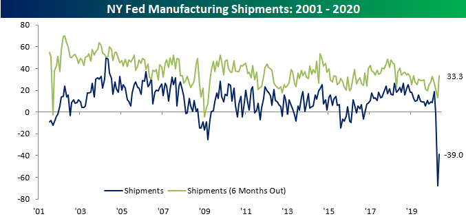
Last month, the New York Federal Reserve’s manufacturing index plummeted to a record low level of -78.2 on broad weakness across its categories. One month later, the index has improved rising to -48.5 but is still pointing to an extremely weak level of activity in the New York region.

To put into context just how far the index has fallen and how weak conditions are, this month’s 29.7 increase was the second largest month-over-month increase on record (the largest was a 30.2 point jump in May of 2003), and that still leaves the index at a lower level than every month in the history of the data outside April. Similarly, the index for Shipments, Number of Employees, and Average Workweek all remain at very low levels even though they rose by the most in a single month on record. Overall, activity remains very weak though not to the same extent as last month.

Looking at demand, the indices for New Orders and Unfilled Orders moved in opposite directions in May. While New Orders recovered a bit, rising to -42.4, the index for Unfilled Orders fell further down to -20.3. The respective indices for expectations six months out for these categories saw the same type of movement. For New Orders, the 23.9 point increase was the fourth-largest since the data begins in 2001, but like the headline number, that massive improvement still leaves it at one of the lowest levels in history. Meanwhile, the index for unfilled orders fell to -20.3 which is its lowest level since December of 2014.
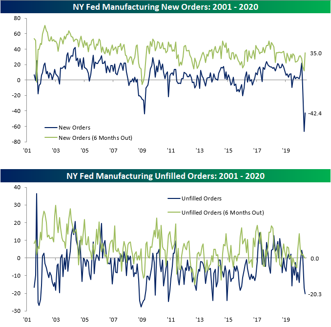
As for shipments, the 29.1 point increase in May was the largest one month jump on record. But again, the actual level of the index is the second-lowest ever. In other words, demand has continued to deteriorate significantly though perhaps not at the same rate as was observed in April.
As for the indices covering employment, there was also a substantial pickup in May with the indices for Number of Employees and Average Workweek rising by the largest amount of any month in the history of the data. Unlike some of the other categories, this increase brings Number of Employees back to the low end of the post-financial crisis range rather than a near-record low. So while there were still fewer employees with shorter workweeks, the readings moderated a bit from April. Start a two-week free trial to Bespoke Institutional to access our interactive economic indicators monitor and much more.

The Return to the Road
Thursday afternoon, Elon Musk tweeted the chart below showing usage (as a percentage of maximum) of Tesla charging stations by global region on a rolling 7-day basis. While the APAC region broadly has not skipped a beat during the COVID-19 pandemic, North America, as well as the EMEA region (Europe, Africa, and the Middle East), saw usage crater in the past few months as stay at home orders were observed and fewer people traveled. But things look to have bottomed out in April as the economy shows hints of reopening and people take to the roads.
At the lows, these two regions saw charge station usage fall to the high 20%/low 30% range just like China did earlier this year. Focusing on China, once the lockdowns were lifted, usage saw a one-way street higher as it climbed back up to more normal levels. If North America and EMEA follow similar patterns, within a month they too should be back up to their prior ranges.

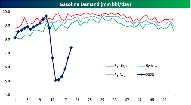
Although the electric car market is a fraction of the size of combustion engine cars, gasoline-powered cars have been showing a similar trend as could be inferred from recent petroleum-based data. The chart below shows gasoline demand from the EIA’s Weekly Petroleum Status Report. Although demand for the fuel that powers the bulk of the world’s vehicles remains at historically low levels, it too has begun to pick up in recent weeks after bottoming in the first week of April. This week actually marked the fifth straight week with an increase in demand. Again that is likely in part thanks to the economy reopening but seasonality is also another factor. As seen in the chart below, the summer months typically see the highest demand for the year. Overall, while demand is still far from normal levels, the combined pickup, as well as charger usage, seems to point that drivers in the US and around the globe are at least partially taking to the roads again whether that be in the form of the daily commute or summer getaway. Start a two-week free trial to Bespoke Institutional to access our interactive economic indicators monitor and much more.
Sentiment Unexpectedly Improves
The preliminary read on sentiment from the University of Michigan was a surprising bright spot in Friday’s weak economic data as the headline reading improved from 71.8 up to 73.7 versus expectations for a decline to 68.0. Even with this increase, sentiment remains near a 10-year low, so it’s not as though investors are actually positive, they’re just less negative. While the increase in sentiment was a bit of a surprise, it makes sense. April was a month where the economy was essentially shut down, so the impact of that sudden stop on sentiment was intense. However, now that things have started to thaw a little bit, you can’t fault people for becoming more optimistic.

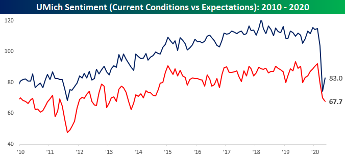
While consumers are feeling a bit better about the way things are, they are still extremely uneasy about the future. The chart below breaks down sentiment towards current conditions and expectations about the future. While the current conditions component showed some improvement, the expectations component saw further declines.
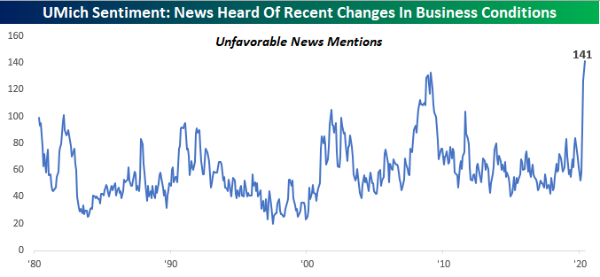
One question in the monthly survey that caused us to do a double-take was the question that asks, “During the last few months, have you heard of any favorable or unfavorable changes in business conditions? And what did you hear?” In this month’s survey, the index that tracks instances of unfavorable news mentions hit a record high of 141. This series goes all the way back to 1959, and never before has it been near current levels. The prior high for this index was back in the depths of the financial crisis when the index peaked at 133. There hasn’t been much good news lately, but even this reading is extreme. Start a two-week free trial to Bespoke Institutional for full access to our research and interactive tools.
Retail Sales – R.I.P.
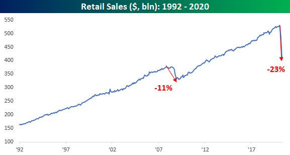
We were expecting the worst monthly report on record in today’s Retail Sales report for April, and the bar wasn’t set nearly low enough. While economists were forecasting a 12.% m/m decline in sales, the actual decline was much larger at 16.4%. Ex Autos and Ex Autos and Gas, the declines were even weaker. Not bad enough for you yet? Well, March’s report was also revised lower. To put the last two months in perspective, total retail sales have declined by more than 23%. That’s nearly a quarter of total sales!
Among individual sectors, the sharpest decline in sales has come from the Clothing sector. From its recent peak, the monthly rate of sales in this sector has declined by nearly 90%. Apparently, we’re becoming a nation of nudists!

For anyone with more than a passing interest in how the economic shutdown is impacting economic data, our monthly update on retail sales is a must-read. To see the report, sign up for a monthly Bespoke Premium membership now!
Breadth Picking Up But Still Low
With the S&P 500 range bound over the past couple of weeks, short term breadth has left something to be desired. So far in May less than half of trading days have seen a positive net number of advancing stocks in the S&P 500 . As such, and as we noted earlier this week, the 10-day advance/decline lines across sectors had broadly entered oversold territory this week. Some of the more beaten down sectors like Consumer Discretionary and Financials did so to a more extreme degree than other sectors. But yesterday’s intraday reversal higher marked the first day this week with positive breadth for the index which allowed the 10-day A/D lines of Communication Services, Energy, Utilities and the S&P 500 to exit oversold territory. Meanwhile breadth for Consumer Discretionary, Financials, Industrials, Materials, and Real Estate all remain pretty weak. Start a two-week free trial to Bespoke Institutional to access our Daily Sector Snapshot and much more.

Bespoke’s Morning Lineup – 5/15/20 – Got That Over With
See what’s driving market performance around the world in today’s Morning Lineup. Bespoke’s Morning Lineup is the best way to start your trading day. Read it now by starting a two-week free trial to Bespoke Premium. CLICK HERE to learn more and start your free trial.
We mentioned that today was probably going to be the weakest day for economic data ever, and the results have so far lived up to expectations. Retail sales dropped -16.4% on a headline basis which was weaker than expected (-12.0%) and also the weakest on record. Empire Manufacturing, however, wasn’t quite as disastrous. While economists were expecting a reading of negative 60.0, the actual reading was ‘only’ -48.5. Still on deck, we have Industrial Production, Capacity Utilization, Business Inventories, and Michigan Confidence. All of these will be bad too.
While the data is horrible, it shouldn’t be a surprise. When you shut down the economy, activity comes to a halt.
Be sure to check out today’s Morning Lineup for a rundown of the latest stock-specific news of note, Chinese economic data, the latest global and national trends related to the COVID-19 outbreak, and much more.

The 10-year yield is probably one of the more important charts to watch these days. Despite the market’s rally off the lows and the flood of new debt being issued, the yield on the 10-year US Treasury is still stubbornly low. With a move down of 4 basis points (bps) this morning, the yield is currently sitting at 0.60, which is just six bps above its record closing low. With strong demand for the 10-year even at these low yields, investors are still exhibiting a good degree of concern.
