Bespoke’s Morning Lineup – 6/24/20 – Narrow Definition of Narrow
See what’s driving market performance around the world in today’s Morning Lineup. Bespoke’s Morning Lineup is the best way to start your trading day. Read it now by starting a two-week free trial to Bespoke Premium. CLICK HERE to learn more and start your free trial.
After a record closing high for the Nasdaq yesterday capping off eight straight days of gains, US equity futures are under some pressure this morning but off their lows from around 5:30 Eastern time. The culprits for the decline this morning are two-fold. First, concerns over rising COVID case counts in parts of the country are raising fears of renewed regional shutdowns in the US. The second and just as impactful catalyst this morning is news of $3.1 billion in proposed new US tariffs on EU imports of olives, beer, gin, and trucks and increased tariffs on aircraft, cheese, and yogurt. The downturn in US futures accelerated at the European open when news of the tariffs first hit the wires.
Be sure to check out today’s Morning Lineup for a rundown of the latest stock-specific news of note, a discussion of how current polling sees the outcome of this November’s election, European markets and data, global and national trends related to the COVID-19 outbreak, and much more.

If you’re like us, you’ve heard a lot of talk about how narrow the rally in equities has been lately. The five largest stocks in the S&P 500 account for what seems like a record share of the entire index, and the argument goes that if you don’t own those five stocks, you’re probably underperforming. That’s hardly the case.
Take the Nasdaq 100. Quarter to date, the index is up over 30%, and the five largest stocks in the US, which are all part of the index (Apple, Microsoft, Amazon, Alphabet, and Facebook), have rallied an average of 37% with gains ranging from 25.99% for Alphabet to 45.23% for Facebook, So yes, these five stocks are collectively outperforming the index. What’s also important to note, however, is that of the remaining 95 stocks in the index, 18 have a better QTD performance than all five of them. That doesn’t exactly strike us as a narrow rally.
The table below lists the 18 stocks in the Nasdaq 100 that are outperforming Facebook (the top-performing of the ‘fab-five’) so far this quarter. Leading the way higher, MercadoLibre (MELI) has doubled, while another three stocks are up over 80%.

Daily Sector Snapshot — 6/23/20
Bespoke Stock Scores — 6/23/20
Richmond Rebound
This morning, the Richmond Federal Reserve Bank updated its monthly data on manufacturing activity in the region. The report showed manufacturing activity was unchanged in June as the index rose to 0 from -27 in May. That was the first non-contractionary reading since March. Additionally, the 27 point month over month increase was the largest one month gain on record. That follows a very strong reading in May when it rose by 26 points which at the time tied March of 2016 for the largest on record.

As for the sub-indices of the report, there were five in addition to the headline index—Backlog, Capacity Utilization, Local Business Conditions, Capital Expenditures, and Average Workweek—that rose by the most in a single month. While a massive improvement, most of these readings sit at the lower end of their historical range and there are still roughly an equal amount of sub-indices for current conditions in contraction as expansion. Expectations, on the other hand, are much more optimistic with multiple categories now at the upper end of their historical ranges. For the indices for future expectations, those of Shipments, New Orders, Capacity Utilization, Local Business Conditions, Services Expenditures, Number of Employees, and Average Workweek also all rose by a record amount.
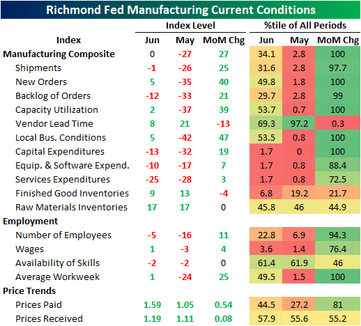

Looking at the service side of the economy, the results were less rosy. Every service index is still deep in contraction and at the lower end of their historical range and that is even after some of, if not the largest monthly increases on record. As with the manufacturing indices, though, expectations for the future are more optimistic after huge improvements in June. The only areas for expectations that remain notably weak and at the low end of their historical ranges are those of capital expenditures (all of which are in the bottom 2% of all readings) and employment. While employment is still low, the 24-point gain in June brought it into expansionary territory. Click here to view Bespoke’s premium membership options for our best research available.


Gold vs. Treasuries: Who’s the Better Hedge?
Given the high level of equity prices following the huge rally off March lows, investors may be looking for assets that can provide a hedge in case the recent rally cools. The two classic hedge assets are of course gold and Treasuries. We use roll-adjusted futures returns for both, using ten-year future returns for the Treasury series. Over the very long term, neither of these assets are actually very differentiated from equity markets; betas (volatility relative to the market) for both are very low. Of course, that doesn’t mean they don’t offer value as a source of diversification, just that daily returns from both don’t tend to move in opposite directions in the long term.
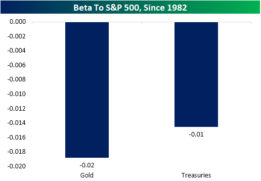
What about during periods of stress? In the chart below we show the average rolling 3 month beta for gold and ten-year notes versus the S&P 500 during periods when rolling 3-month S&P 500 returns are in the bottom 5% of all periods. In other words, this chart shows how much these hedge assets tend to move versus the S&P 500 when the S&P 500 is stressed. As shown, Treasuries consistently have more upside exposure when the S&P 500 is down, and that’s a stable relationship. Gold, which used to be an excellent hedge asset, has now flipped and is likely to fall with the S&P 500 during large declines.

On the flip side, large rallies in the S&P 500 tend to see a positive beta for gold, while Treasuries maintain their negative beta. An argument could be made that while gold often falls when the S&P 500 does, it might be a more attractive hedge asset because it incurs a lower cost to holding if the hedge doesn’t end up being necessary. Click here to view Bespoke’s premium membership options for our best research available.

Speculators Shorting USD
From its peak earlier this spring to its low earlier this month, the dollar had fallen over 7.5%. Around those recent lows there was a stretch of 12 straight days closing below its 200-DMA, as shown below. While the greenback managed to move back above its 200-DMA on Thursday and Friday of last week, it’s giving up the ghost this week falling around 0.5% yesterday and another 0.43% today as of this writing. Yesterday’s decline brought it back below its 200-DMA.

That decline comes on overall bearish sentiment for the dollar. In our Closer every Friday, we include the Commodity Futures Trading Commission’s data from the Commitments of Traders Report on speculator positioning. Last week’s report showed a massive shift in open interest getting short on the dollar. A net percentage of 26.9% are now short the dollar compared to +13.82% net long the prior week. That 40.71 percentage point shift was the largest move in favor of speculators getting short behind a 48.47 percentage point decline back in September 2005 as shown in the second chart below.


It is not just the dollar that speculators are short though. As for US equities, 31.13% of open interest are net short the Dow. That is the most pessimistic positioning speculators have taken on the index since August 2005. For other indices like the S&P 500, positioning is not as extreme but similarly holds a bearish bias. Click here to view Bespoke’s premium membership options for our best research available.

B.I.G. Tips – Best Quarter in 40 Years? 80 Years? or 20 Years?
Real Estate and Rates Showing Good Timing
In our Trend Analyzer and Chart Scanner tools, we offer a number of different screens including ones for 52-week highs and lows and golden (rising 50-DMA moving above rising 200-DMA) and death crosses (falling 50-DMA moving below falling 200-DMA). Another screen we offer looks at the long term trends and timing scores from our algorithms. Typically, stocks that are overbought and in a downtrend will have poor timing while those in long term uptrends that are not overbought pose as better long ideas, and as a result, earn a good timing score. At the moment, due to the sharp declines and not everything having fully recovered from the bear market, there are still more stocks that are in downtrends and have poor timing (154) than those in uptrends and with good timing scores (21).
There is an interesting composition of stocks and ETFs that are currently in long term uptrends with good timing scores. The bulk of those 21 tickers are either Real Estate or Consumer Staples stocks or Treasury related ETFs as shown in the snapshot of our Trend Analyzer below. Typically seen as safe havens during market downturns, many of these held up during the bear market allowing them to not only maintain but also boost the picture for their long term uptrends. As risk appetite has improved over the past few months, the momentum of these names has slowed with each one now neutral rather than overbought which helps to earn their good timing scores.
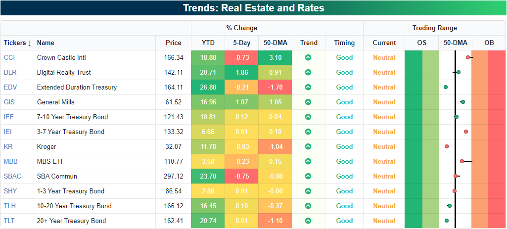
As shown in the charts from our Chart Scanner below, all of these are in uptrends since the start of the year albeit with some volatility during the bear market. Broadly speaking for Treasury ETFs like EDV, IEI, IEF, TLH, and TLT in addition to a mortgage-backed security ETF (MBB), they have been in slight downtrends or trending sideways over the past few months after massive runs earlier this year. As a result, their 50-DMAs have caught up to price which now leaves them in neutral territory. Meanwhile, Real Estate names like Crown Castle (CCI) and SBA Communications (SBAC)—both in the business of cell towers—have pulled back to the bottom of their uptrends around their 50-DMAs.The same can be said for Consumer Staples names like General Mills (GIS) and Kroger (KR). These names have certainly sat out much of the rally in recent weeks, but any stress in the broader market from currently overbought levels will likely result in these stocks seeing increased interest. Click here to view Bespoke’s premium membership options for our best research available.

Chart of the Day: Golden Crosses In Pandemic Proof Themes
Bespoke’s Morning Lineup – 6/23/20 – He Loves Me, He Loves Me Not
See what’s driving market performance around the world in today’s Morning Lineup. Bespoke’s Morning Lineup is the best way to start your trading day. Read it now by starting a two-week free trial to Bespoke Premium. CLICK HERE to learn more and start your free trial.
Trying to read the tea-leaves in the ongoing saga between the US and China has become increasingly difficult these days with last night being a perfect example. Shortly before Asia opened for trading, US futures were moderately higher, but then Trump adviser Peter Navarro dropped a tape-bomb saying the US-China trade deal was ‘over’. That sent Dow futures from up over 200 to down over 400 in a matter of minutes. Navarro later walked back those remarks, and even the President took to Twitter to say the trade deal was ‘fully intact‘. (Twitter hasn’t put any warnings or labels on that tweet, so we’ll assume that it’s accurate info!)
After all the overnight ups and downs, futures are actually higher now than they were before Navarro made his comments, indicating a 1.25% gain at the open.
Be sure to check out today’s Morning Lineup for a rundown of the latest stock-specific news of note, how Navarro’s comments have impacted the market in the past, the latest batch of June PMI data out of Europe, global and national trends related to the COVID-19 outbreak, and much more.
Crude oil prices are back above $41 per barrel for the first time since March 9th when Russia and Saudi Arabia started their price war. What a trip it’s been over the last three and a half months as prices have seen a round trip of around $80 lower and higher during that span.

While crude oil prices have recovered all of their losses since the gap down on March 9th, the S&P 500 Energy sector isn’t quite back to its levels from prior to March 9th and has some catching up to do. At yesterday’s close, the Energy sector was still down over 6.5% from where it closed on Friday, March 6th.
