Bespoke Stock Scores — 8/25/20
Fifth District Flies While Future Outlook Falls
This morning, the Richmond Fed released the results of their monthly manufacturing survey for the month of August. The report showed a solid expansion of activity in August albeit on waning optimism for the future. General manufacturing activity in the Fifth District continued to expand in August with the index rising 8 points to 18. That is the highest level since an equivalent reading in October of 2018. That eight-point increase is still fairly large relative to the rest of history (in the 80th percentile of all month over month changes), but it was actually the least volatile move in the index since March.

In the tables below we show the results of this month’s survey for each of the sub-indices of the report for both current conditions and future expectations. While the indices for current conditions broadly improved—as evident through the headline number’s rise—expectations have declined dramatically. As shown in the second table, last month saw most readings in the top percentiles of all historical readings for the indices for future conditions, but this month every index with the exception of Capital Expenditures has fallen with those declines in the bottom 2.5% or worse of all monthly moves. This was the first time since October of 2015 that all but one of the 17 indices for future expectations fell in the same month. Sentiment towards the future saw a pretty significant turnaround in the span of a month.


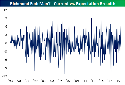
The big divergence between the moves in the indices for future expectations and current conditions can be illustrated in the chart below. In it, we show the spread between the counts of indices for current conditions rising less the number for future expectations that are rising MoM. With 12 current conditions higher compared to only 1 for future expectations, this spread was at its highest level on record.
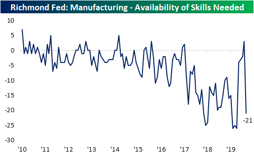
Future indices were not alone in experiencing historically big moves though. As shown below, the index for the Current Number of Employees climbed to its highest level since March of last year thanks to a 20 point jump in August. That is the most this index has gained in a single month ever. Additionally, that marked the first expansion in employment since February. But on the other hand, the index for Availability of Skills Needed plummeted by 24 points to a contractionary reading of -21. That marks a return to contractionary readings after a one month break in July and the lowest level for this index since March. In other words, businesses are beginning to ramp up hiring, but they are struggling to find workers with the right skills.

Alongside labor, capital is also on the up and up with the indices for Equipment and Software Expenditure and Capital Expenditure both moving into expansionary territory for the first time since March. For Capital Expenditures, this month’s increase was in the top decile of historical moves as well. Meanwhile, Business Services Expenditure remains weak but likewise improved in August rising from -23 to -18.

In addition to the manufacturing indices, the Richmond Fed also released service counterpart indices. These have fared far worse throughout the pandemic with most readings continuing to sit in contraction territory, but there has continued to be some improvement. August saw all but one of these indices for current conditions increase. This brought the indices for Revenues, Employees, and Wages all out of contraction. But, like the manufacturing report, future expectations hit the brakes. Start a two-week free trial to Bespoke Institutional to access our interactive economic indicators monitor and much more.


Chart of the Day: Big Changes for the DJIA
Weak Breadth in Strong Months
Yesterday’s 1% rally for the S&P 500 was also accompanied by positive breadth (for a change) as 412 stocks in the index finished in positive territory on the day. On a net basis, subtracting the number of decliners from the number of advancers, yesterday’s A/D reading of +322 was the strongest breadth reading since late July. Prior to yesterday’s rally, the strongest daily breadth reading for the month of August was +214 on August 7th. For a month where the index was already up 4% heading into the day, that’s pretty weak.
Breadth in August has been so weak in fact that Monday’s rally was only the 8th day out of 16 trading days in August where the S&P 500 had positive breadth. There’s still another five trading days left in the month, so breadth still has plenty of room to improve, but at the current rate, this month would go down as just the 12th month since 1990 where the S&P 500 was up over 4% but saw negative daily breadth on at least half of all trading days. The last time that happened was in July…of this year. And before that, May. We’ve already had two months in 2020 where the S&P 500 was up at least 4% and half of all trading days had negative breadth readings, and we’re now on pace for the third.
The chart below shows each of the prior times since 1990 where we saw similarly strong months with lackluster breadth. Before the two prior occurrences this year, the most recent was March 2009. Looking at the chart, that occurrence preceded a great time to be long the market. Before that, though, returns following similar breadth divergences were mixed as there were occurrences right in the middle of the bear markets from 2007-2009 as well as 2000-2002, and before that there were six occurrences in the 18 months leading up to the March 2000 peak. Click here to view Bespoke’s premium membership options, including the must-have Morning Lineup report.

Bespoke’s Morning Lineup – 8/25/20 – Switcheroo
See what’s driving market performance around the world in today’s Morning Lineup. Bespoke’s Morning Lineup is the best way to start your trading day. Read it now by starting a two-week free trial to Bespoke Premium. CLICK HERE to learn more and start your free trial.
“You have people walking around with all the knowledge of humanity on their phone, but they have no idea how to integrate it.” – David Epstein – Range
Today’s quote of the day is one reason why Apple (AAPL) is the most valuable company in the world. Was it not for the original iPhone, who knows how the revolution in mobile computing would have played out? Now, we literally have a world of information at our fingertips. If only we knew how to use it properly, instead of twerking videos on TikTok or yelling at everybody who bothers us on Twitter, who knows what we could accomplish?
Futures are higher this morning as positive headlines concerning trade between the US and China has lifted futures. Positive China Trade headlines? That’s a blast from the past. With higher equities, US Treasuries are lower and oil is rallying as sentiment related to the trajectory of the COVID outbreak continues to improve,
Be sure to check out today’s Morning Lineup for a rundown of the latest stock-specific news of note, market performance in the US and Europe, trends related to the COVID-19 outbreak, and much more.

Standard and Poors, the firm responsible for maintaining the composition of the Dow Jones Industrial average announced the most significant reshuffling of the index since 2013 that will take effect after the close on Monday. Salesforce.com (CRM) will replace Exxon Mobil (XOM), Amgen (AMGN) will replace Pfizer (PFE), and Honeywell (HON) will replace Raytheon (RTX). The changes will take effect at the open on August 31st and will also coincide with Apple’s (AAPL) 4-1 split. In the table below, we summarize the Dow as it now stands with each component’s weight in the index and how those components and weights will change effective 8/31.
The biggest change effective 8/31 will not even involve one of the components being added or removed. Because the DJIA is weighted by each company’s share price, once AAPL’s split becomes effective, its weight in the index will drop from 12.20% down to 2.99%. This is an interesting shift because so far this year AAPL’s 71% gain has had a positive impact on the DJIA of 1,455 points. After the stock splits, AAPL’s total weight in the index will only be 2.99%, or the equivalent of 846 points. In other words, AAPL could go to zero between next Monday and year-end and its impact on the DJIA for the year would still be a gain of over 2%! Stock splits may be meaningless in terms of a company’s fundamentals but for a price-weighted index like the DJIA, they can have a large impact! That and the fact that the index only has 30 components is one big reason why much less money is indexed to the Dow than the S&P 500.
Besides the AAPL split, the other notable aspect of the index reshuffling is that the average share prices of the stocks going into the index are four times higher than the ones going out. As a result, AMGN will go into the index with the third-highest weighting, CRM will have the fifth-highest weighting and HON will be the ninth highest-weighted component.

After next week’s changes, there will also be some significant shifts in sector weightings for the DJIA. Technology will still have the largest weighting at 23.1% but will still see its share of the index decline by the largest amount (4.6 percentage points). Behind Tech, Energy is the only other sector that will see its weighting decline by more than a full percentage point, falling from 3.1% down to 2.1%. On the upside, Health Care’s weighting will increase by 4.4 percentage points, rising from 14.2% up to 18.6%, while Industrials will see its share increase from 13.2% up to 15.3%. Given the fact that it’s called the Dow Jones Industrial Average, it only makes sense that the Industrials sector will see its share of the index increase. Maybe one day it will see its share increase even more or the index will change its name to the Dow Jones Technology Index.

Daily Sector Snapshot — 8/24/20
Gas Prices Flatline
The summer driving season is typically defined as the period between Memorial Day and Labor Day. This year, the summer season has been a bit different due to COVID, and while many Americans who would have traveled outside the United States have opted to stay domestic, overall driving is down. With fewer people driving to work and driving around in general, gas prices have been pushed down to extremely low levels relative to recent history.
The table below shows the historical price of the national average price for a gallon of gas based on AAA data. At the current national average of $2.19, a gallon of gas hasn’t been this cheap at this time of year since at least 2005. While prices were up on a YTD basis every year from 2005 through 2019 by an average of 18.3%, this year the national average price is down over 15%.
The chart to the right of the table below compares gasoline prices this year (red line) to a composite of gas prices during the ‘average’ year (blue line). So far this year, the pattern of prices is nearly the exact opposite of the average year. While prices tend to rise through the first five months of the year, this year they trended lower, bottoming right in late April. After a decent increase in prices from May through early June, prices have completely flat-lined in the last two months.

While it’s not uncommon for prices to remain steady throughout the summer months, the current flat-lining of prices has been nearly without precedent. The chart below shows the rolling two-month (60 calendar days) high low range of the national average price of gasoline since early 2004. With the current two-month range spanning $2.174 to $2.201, or 1.24%, the only other time the range was narrower was in late June/early July 2014. Throughout the last fifteen years, there has never been a time where gas prices have been this low at this time of year or this stable. Click here to view Bespoke’s premium membership options for full access to our research and interactive tools.

Chart of the Day: Overbought Apple (AAPL)
Worlds Apart: YTD Sector Performance
If you want to see an example of where the term winners and losers couldn’t be more applicable, take a look at the performance of S&P 500 sector ETFs on a YTD basis. The chart below is derived using performance numbers from our Daily Sector Snapshot report, which provides investors with an easy-to-read matrix of technical analysis, breadth and internal readings, and fundamental data points. It’s the perfect way to get an aerial snapshot of both current readings and the way they’ve been trending for each of the major sectors. This perspective also allows investors to see how sectors stack up versus each other as well as relative to themselves on a historical basis.
2020 has clearly been a case of the have and have nots. On the haves side, Technology (XLK) and Consumer Discretionary (XLY), which is basically Amazon (AMZN) and a few other retailers, top the list. Rounding out the top three, Communication Services (XLC) is the only other sector up over 10% and outperforming the S&P 500. On the have-nots (or in this case, the ‘nearly halves’) side, we have Energy leading the way lower with a decline of 41%, followed by Financials (XLF) which is down 21.2%.
There was a time not long ago when Energy and Financials were considered the life-blood of a capital intensive economy, but these two sectors have been deemed irrelevant by the market in the current work-from-home world where interest rates are zero and money is practically free. Instead, Communications, Technology, and Retailers with a strong online infrastructure are the ever-important cogs in the digital economy. Today, it may seem that this is a secular shift in the shape of our economy, which in many respects is true. But don’t count out the old leaders just yet. Someday, ‘going to work’ will once again mean more than just rolling out of bed and over to your desk chair. In that environment, people and goods will increasingly move, capital intensive infrastructure projects will be undertaken and interest rates just might move higher. Click here to view Bespoke’s premium membership options, including the must-have Daily Sector Snapshot report.

Bespoke’s Morning Lineup – 8/24/20 – Another Monday Rally
See what’s driving market performance around the world in today’s Morning Lineup. Bespoke’s Morning Lineup is the best way to start your trading day. Read it now by starting a two-week free trial to Bespoke Premium. CLICK HERE to learn more and start your free trial.
“Behind every stock is a company. Find out what it’s doing.” – Peter Lynch
Sundays may be for “Meet the Press”, but if its Monday, it’s a market rally. US futures are following the rest of the world higher this morning with all the major averages looking at gains of nearly 1% at the open. European equities are even stronger with most benchmarks trading up over 2%. Breadth, which has been a nagging issue in the US over the last couple of weeks, is strong in Europe with advancing stocks outnumbering decliners by more than 9-1.
News driving stocks higher today is mostly due to hopes of a fast-tracked vaccine by as soon as Election Day. The economic calendar is quiet to kick off the week. The only US data point is the Chicago Fed National Activity Index which came in well below forecasts. Economists were expecting a headline reading of 3.70 for July, but the actual reading came in at just 1.18. We would note, though, that June’s reading was revised sharply higher (from 4.11 up to 5.33).
Be sure to check out today’s Morning Lineup for a rundown of the latest stock-specific news of note, market performance in the US and Europe, trends related to the COVID-19 outbreak, and much more.
In this “Monday rally” for US equities, the Nasdaq 100 is on pace to open up roughly 1%. A gain of that magnitude is right in line with what has become the norm over the last several weeks as the index has traded higher by at least 1% on eight of the last ten Mondays. The only exceptions were on 7/13 (-2.2%) and 8/10 (-0.55%). A 1%+ gain today would make it nine of eleven.

Given all the focus on narrowing breadth in the market lately, we wanted to see if that trend was evident during these Monday rallies as well. The chart below shows the number of advancing issues in the Nasdaq 100 on each of the days listed above. For the eight Mondays days in the last ten weeks where the Nasdaq 100 rallied more than 1%, the average number of advancing issues per day was 78.5, but each of the last two saw daily readings of just 72. Additionally, the last two occurrences rank as tied for the second weakest of the eight prior days. Based on these two factors, it’s certainly valid to say that breadth has been narrower more recently. At this point, though, it’s hardly a glaring divergence, and unless we were already looking for signs of narrow breadth in this relationship, it probably wouldn’t have stuck out.
