B.I.G. Tips – S&P 500 Surrounding The Election
Chart of the Day: Brimming With Confidence
Global Activity Still Bouncing Back, But Remains In A Hole
Overnight we got a bunch of cyclical data that is helpful in showing where the global economy currently sits across regions and categories, similar to Markit PMIs.
Korea, Sweden, and the Eurozone all released indices of manufacturing and services sector sentiment that are not directly comparable on a like-for-like basis (as is the case with Markit PMIs) but do tend to send similar messages about the state of the global economy. We show them in the chart below, presented as a Z-score (current reading less average, measured in standard deviations) which normalizes them for their volatility and to the same scale.
As shown, economic activity continues to bounce broadly from the extreme lows of Q2, but September readings are still generally well below the pre-COVID norm and are below average. Similar to the US economy, global activity is still bouncing, but is far from pre-COVID levels in our view. This analysis was originally published in our pre-open report — The Morning Lineup — this morning. Click here to start a free trial to Bespoke Institutional and receive our daily Morning Lineup for the next two weeks, featuring more commentary and data on macro markets.

Fed Speak Surges
There are six scheduled Fed speakers today, including multiple appearances from Governor Quarles. That’s a lot to keep track of and it may feel like that’s the new normal after an absolute deluge of public comments from FOMC members following the introduction of their new long-term monetary policy strategy in September and more detail around its implementation at the September policy meeting. The result is a record number of headlines from FOMC members. By our count, based on actual public appearances through September 28th and scheduled appearances the rest of the week, the two weeks ending Thursday will have been the busiest slate of Fed speakers since we began tracking all public comments from the FOMC in mid-2017.
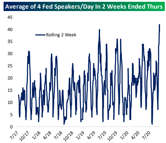
As for what they’ve been saying, we note two themes: first, outright dovishness about the outlook, but also an insistence that more fiscal policy is necessary even as more and more members of the FOMC come to the realization that there won’t be any more fiscal support until next year. As shown below, using our rolling 20-speech average assessment, we grade the recent run of Fed speakers as one of the most dovish since our tracking began. For a full summary of all speeches, make sure to check out our Fedspeak Monitor, which is regularly updated with brief summaries of FOMC comments (and links to their full speeches when possible). This analysis was originally published in our post-market macro report — The Closer — last night. Click here to start a free trial to Bespoke Institutional and receive our nightly Closer for the next two weeks, featuring more commentary and data on macro markets.

Bespoke’s Morning Lineup – 9/29/20 – Another Seasonal Tailwind
See what’s driving market performance around the world in today’s Morning Lineup. Bespoke’s Morning Lineup is the best way to start your trading day. Read it now by starting a two-week free trial to Bespoke Premium. CLICK HERE to learn more and start your free trial.
“There is only one side to the stock market; and it is not the bull side or the bear side, but the right side.” – Jesse Livermore
There’s nothing like ending one week with a gain of 1.6% and starting the next with another 1.6% rally. Even after the 3%+ gain over the last two days, though, the S&P 500 still was not able to close above its 50-DMA yesterday. It traded above there for part of the day on Monday but finished the day just shy, closing two points below its 50-DMA. Futures have been trading on either side of the flat line this morning, as investors digest the gains of the last two trading days ahead of tonight’s debate between President Trump and former Vice President Biden.
Be sure to check out today’s Morning Lineup for a rundown of the latest stock-specific news of note, market performance in the US and Europe, economic activity in the manufacturing and services sectors, trends related to the COVID-19 outbreak, and much more.

Like the old adage to “sell in May and go away,” there’s another less well-known axiom that says to ‘sell Rosh Hashanah and buy Yom Kippur’. While there’s not much in the way of a good explanation behind the saying, with Yom Kippur ending Monday night at sundown, we wanted to provide a quick look at how the strategy has performed this year and in the past. Even with this September being as weak as it has been already, we were a bit surprised to see that the S&P 500 was positive during the Rosh Hashanah to Yom Kippur period this year. With a gain of less than 1%, though, Monday’s rally basically accounts for the entire positive move.
Longer-term, the ten-day period between the two holidays has been negative more often than positive. Since 2000, the S&P 500 has seen an average decline of 0.92% (median: -0.50%) with gains just 43% of the time. In the two weeks after Yom Kippur, though, performance has been much better with the S&P 500 averaging a gain of 0.99% (median: 1.04%) and positive returns 75% of the time. For the remainder of the year, performance has been even stronger with the S&P 500 averaging a gain of 4.13% (median: 5.75%) with positive returns 70% of the time.
Since the S&P 500 rose during the period this year, does that mean we can expect the opposite trend to also play out in the next two weeks and for the remainder fo the year? Not necessarily. In the eight prior years since 2000 where the S&P 500 was positive in the Rosh Hashanah to Yom Kippur period (shaded years in the table), the S&P 500 averaged a gain of 2.14% (median: 1.59%) over the next two weeks with gains all eight times. For the remainder of the year, the S&P 500 saw an average gain of 4.08% (median: 7.02%) with gains 75% of the time.

Daily Sector Snapshot — 9/28/20
Chart of the Day: It’s Almost Over
Wave Three?
“By early October the first fall outbreaks and the memory of those in the spring had already suggested that the virus attacked in a cycle; it took roughly six weeks from the appearance of the first cases for the epidemic to peak and then abate in civilian areas, and from three to four weeks in a military camp with its highly concentrated population. After the epidemic abated, cases still occurred intermittently, but not in the huge numbers that overwhelmed all services.” – John M. Barry, The Great Influenza: The Story of the Deadliest Pandemic in History

If you’re looking for an account of the 1918 flu pandemic as well as a great example of history repeating itself in terms of mistakes and lessons learned, John Barry’s book on the subject is a must-read. In reading through it, so many aspects of the pandemic in 1918 have similarities to the COVID pandemic in terms of the virus’s progression and how people reacted to it. In looking at the latest trends in the current outbreak of COVID across the country, we were reminded of one such similarity described in the above quote which described the ebb and flow of the virus across the country in 1918.
The chart below shows the seven-day average in the number of daily confirmed COVID cases across the United States. The first wave of the COVID outbreak, which was centered in the northeast, began on 2/24 when the US started to average at least one new confirmed COVID case per day. That wave peaked 46 days later on April 10th. Over the next 48 days, the number of cases gradually drifted lower through the end of May. On 5/28, the decline in cases reached a low, but then started rising again as the second wave of the outbreak flared up in the sunbelt.
During the second wave of the outbreak, the number of cases quickly increased to new highs before peaking on July 22nd, a period spanning 55 days. As case counts across the sunbelt surged, states in the northeast continued to see cases but not to nearly the same degree as they did during the first wave. From 7/22 through 9/12 (52 days), the second wave of the outbreak started to ebb, but ever since then, we’ve started to see a renewed uptick in cases. This time, however, the states most affected by this third wave of the outbreak have been concentrated in the midwest, while case counts in the states impacted by the first two waves are nowhere near their prior peaks.
What’s also notable about the first two waves of the outbreak is that all of the legs higher and lower have spanned a period of between 46 and 55 days or six to eight weeks. That’s similar to the ‘roughly six weeks’ that each wave lasted during the 1918 pandemic. Given the fact that the second wave saw more cases than the first wave, does that mean the third wave will see a higher number of cases than the second? Not necessarily. Anything can happen but with the states being hit hardest by COVID now collectively having smaller populations and less geographic density than the areas hit hardest in the first two waves, the likelihood of larger caseloads would seem less likely.

Taking the seven-day average case counts from notable states around the country further illustrates the similarities between now and 1918. States like New York, Arizona, Florida, and California all appear to be past the peaks of the epidemic in their regions, and while case counts haven’t disappeared, new reported cases have been much less frequent and continuous than they were at their peaks. Meanwhile, states in the midwest, like Missouri, which were previously spared by much of the new case burden, are only just now hitting the peaks of their outbreaks. How the COVID-19 pandemic progresses from here through the winter months is impossible for anyone to predict, but the fact that the current outbreak has been following similar patterns to the way the 1918 pandemic played out provides some degree of encouragement. Like what you see? Click here to for a free trial to Bespoke’s premium membership options.

Eleventh District Elevates
The final regional Fed manufacturing survey of the month was out today with the release of the Dallas Fed’s manufacturing survey. General business activity rose 5.6 points in September to 13.6. That marks back to back months with expansionary activity since August and September of last year. This month also marked the strongest reading since November of 2018 as the index has risen for five straight months. After pulling back in the early summer, the index for expectations of general business activity has continued to rebound in a big way rising to 28 from 20.4 last month. That is now at the highest level since October 2018 indicating a generally positive outlook for the future.

With general business activity improved, breadth in this month’s report continued to be strong. Consistent with other surveys this month, the only index that remains in contraction is that of Finished Good Inventories. While it remains in contraction, this month’s 15.4 point rise was a big improvement from the prior month when the index stood at a reading of -17.3. That is the highest level since March of last year. Of the other components, there were four that fell in September: Company Outlook, Unfilled Orders, Shipments, and Hours Worked. Although these indices fell, they each remain in the upper quintile of their respective historical ranges with readings that indicate further growth, just at a slower pace than August.

One major strength of recent manufacturing data has been surging order volumes. The Dallas Fed’s survey for September was no exception as the index for New Orders rose for a fifth straight month to 14.7. The only higher reading in the past two years was back in January of this year. Not only did new orders rise, but it was also at a faster clip than August as the index for New Orders Growth rose to 13.2 from 11.8. Again this was the highest reading since the second half of 2018. While both indices remain around some of their strongest levels of the past couple of years, Unfilled Orders and Shipments both fell by 1.8 points in September. That was the second consecutive lower reading for Unfilled Orders and the first since April for shipments. Regardless of those declines, these indices all show that businesses continue to increasingly receive and fill orders at a strong rate.

Given that orders remain high and inventories continue to be worked off, production has continued to ramp back up. The index for production rose to 22.3 which brings the index right back to where it was two years ago.

With production on the rise, so too is employment. Hours worked continued to rise (albeit at a slowed pace from August) and the index for Employment rose to 14.5 as a higher share of businesses report net hirings than firings. This index is now at its highest level in one year. Click here to view Bespoke’s premium membership options for our best research available.

2020 Weekday Market Performance
Below is an updated look at the performance of the S&P 500 by weekday so far this year. The numbers shown highlight how you’d be doing this year if you only owned the S&P 500 on each weekday.
Tuesday tops all other days on the upside while Thursday stands out on the downside. If you only owned the S&P on Tuesdays this year, you’d be sitting on a gain of 16.5%. If you only owned on Thursdays, however, you’d be down 15.3%.
Wednesdays and Mondays have both returned slightly positive numbers, while Fridays are just barely in the red at -0.7%. As you can see in the chart, Mondays, Wednesdays, and Fridays have been creeping higher and higher over the past few months, while Tuesdays have actually been somewhat flat since seeing a big jump earlier in the year. Thursday is the one weekday that continues to see weakness as we get set for the fourth quarter. Click here to view Bespoke’s premium membership options for our best research available.
