Stocks for the COVID Economy — 3/30/20
The Closer – Small Caps in the Cold – 3/30/20
Log-in here if you’re a member with access to the Closer.
Looking for deeper insight on markets? In tonight’s Closer sent to Bespoke Institutional clients, we begin with a look at small caps which are once again lagging. We then review positioning around Eurodollar futures before show our complete Five Fed Manufacturing Composite for March. Delving deeper into regional Fed data, we show the results of the various supplemental questions related to COVID-19 that the Dallas Fed asked in this month’s survey.

See today’s post-market Closer and everything else Bespoke publishes by starting a 14-day free trial to Bespoke Institutional today!
Daily Sector Snapshot — 3/30/20
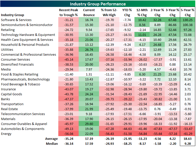
S&P 500 Industry Group Performance Numbers After COVID Crash
Looking at the S&P 500’s industry groups, every one is now up over the last week since last Monday’s low. The only standout is the Food & Staples Retailing group which is only up 1.3%. But as we frequently highlighted last week, that is a result of it being the group that also held up the best during the time between the 2/19 peak through last Monday’s low. In fact, that industry is currently the one that is closest to its 52 week high at 11%. The Consumer Durables and Apparel group, on the other hand, has performed the best over the past week rising nearly 30%. That comes as it was one of the most beaten down sectors, nearly being cut in half during the initial COVID crash. Even with the recent rally, that still leaves it another 31.65% below its 52-week high.
The size of the declines over the past month and a half have erased a lot of the past few years of progress. There are currently only five industry groups higher than they were one year ago. Only half are up over the past two and three years. Fortunately, over a longer time horizon—the past five years—the majority of industries are still higher with some industries like Software and Services, Semiconductors, and Retailing still up around 100% or more. Autos and Energy, however, are both down more than 50% over the last five years. Start a two-week free trial to Bespoke Premium to see our list of “Stocks for the COVID Economy.”
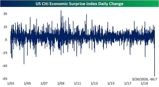
Claims Collapses Citi Surprise Index
The economic impacts of COVID-19 have begun to appear in the past few weeks’ data releases. Given that these impacts have been decidedly negative, the Citi Economic Surprise Index for the US has turned sharply lower. This index measures how economic data comes in relative to forecasts. Rising or positive numbers indicate more releases are beating expectations and vice versa. On March 13th the index peaked, reaching its highest level since early 2018 at 73.8. It then pulled back off of those highs but was still fairly high in the low 60s all the way up until last Wednesday. But it then fell out of bed dropping to -1.5 today.

Given the index weights various releases differently, most of the blame for that decline can be put on last Thursday’s initial jobless claims number. Thanks to the massive miss, from Wednesday to Thursday the index fell from 61.7 all the way to 1. While that did not drop the index itself to any new low as it is now back to similar levels as the start of the year, that one day decline was the largest ever as shown in the chart below. Start a two-week free trial to Bespoke Institutional to access our interactive economic indicators monitor and much more.
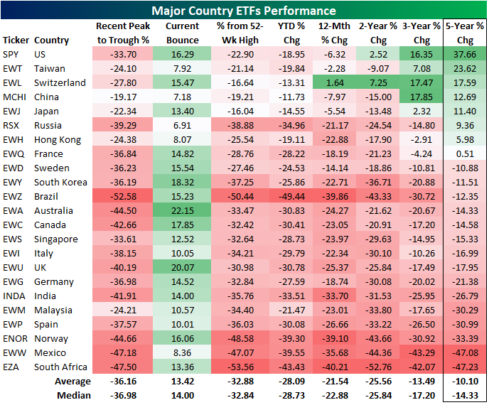
Country ETF Performance After COVID Crash
We track 23 major country ETFs traded on US exchanges closely. Below is a look at their performance numbers over multiple periods. We first show how much each country ETF fell from its most recent peak to its most recent trough during the initial COVID market crash. We also show how much each country has bounced off of its recent low. We then show its distance from its 52-week high, its year-to-date change, and its 12-month, two-year, three-year, and five-year change.
The average country ETF crashed 36% from its recent peak to trough, and the average bounce back so far has been +13%. Brazil (EWZ) remains the furthest below its 52-week high at -50%, while Japan (EWJ) is the closest to its 52-week high at -16.04%. The average country ETF is 32.9% from its 52-week high.
On a year-to-date basis, Brazil (EWZ) is down the most at -49%, while China (MCHI) is down the least at -11.7%. Switzerland (EWL) is the only country that is up over the last 12 months, while the US (SPY) is down 6.3% over the same time period. South Africa (EZA) and Brazil (EWZ) are down the most year-over-year at -40%.
Notably, returns now look very weak around the world on a two, three, and five year basis. The average country ETF is down 25% over the last two years, down 13.5% over the last three years, and down 10% over the last five years. More than half of the country ETFs are down more than 10% over the last five years, with countries like Spain (EWP), Norway (ENOR), Mexico (EWW), and South Africa (EZA) are down more than 30%. The US (SPY) is by far the best performer over the last five years with a gain of 37.66%. Start a two-week free trial to Bespoke Premium to see our list of “Stocks for the COVID Economy.”
Declines Bigger In Texas
Over the past couple of weeks, we have been highlighting the record declines in the regional Federal Reserve banks’ manufacturing indices for the month of March (see here and here). The most recent of these indices, from the Dallas Fed, was released this morning, and results were as bad as the others. The headline reading fell to -70 from 1.2 last month. That is a record low for business activity eclipsing even the 2009 lows and was by far the largest month over month decline in the history of the survey (second chart). As for expectations six months later, the index fell to 39.5 from 18 which is likewise the largest decline on record. That leaves expectations at their lowest level since December of 2008.


That weak headline number comes on weakness across all of the individual components of the report. Many of these categories also experienced record declines which has completely changed the picture just a month ago. Last month, there were only three components across both current condition and six month outlook indices that were negative. Today there are only two (wages and benefits), and both of these have fallen dramatically.
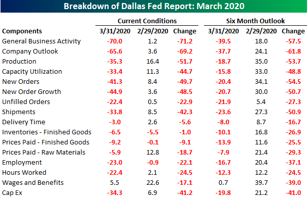
In this month’s survey, the Dallas Fed surveyed respondents on a number of COVID-19 related questions. Over three-quarters of respondents reported a negative impact on production and sales as a result of the virus while 67.5% reported weaker demand. The subindices echo these results. Each of the categories tracking demand like new orders, unfilled orders, and shipments fell dramatically in March as shown below. New orders (both current and the six-month outlook) experienced the largest decline on record. That leaves the index for current conditions at its lowest level since 2009 and the index for future expectations at its lowest level on record. The indices for unfilled orders are also at their lowest level since the financial crisis after experiencing the second-largest decline on record for the current conditions index and the largest decline ever for expectations. Given this lack of demand, shipments have also plummeted by an unprecedented amount.

It should come as no surprise following last week’s jobless claims number, but as with so many other components of this month’s survey, the indices for unemployment have also collapsed experiencing the largest declines ever. Both current conditions and future expectations indices are now at their lowest levels since 2008/2009. Start a two-week free trial to Bespoke Institutional to access our interactive economic indicators monitor and much more.

This Week’s Economic Indicators – 3/30/20
US economic data is beginning to show adverse effects from the coronavirus with several indicators doing so in dramatic fashion. About half of last week’s 30 releases came in worse than expected or than the prior period. Bloomberg’s weekly consumer comfort was one of the first releases of the week out on Tuesday. The headline index fell from 63.0 to 59.7, its largest one week decline since August of 2007. Markit’s preliminary PMIs for the month of March were released at the same time on Tuesday. While the reading on manufacturing did not fall as much as expected, it still came in with a contractionary reading which was also the weakest on record. The services counterpart on the other hand fell to 39.1 which was worse than the consensus forecast of 42 as well as a record low. MBA’s weekly mortgage applications came out the next morning falling 29.4% week-over-week; the largest decline since 2009. That was just a couple weeks after one of the strongest readings on record. Preliminary durable and capital good numbers were also released on Wednesday with core measures all showing declines in February. The biggest release of last week which we discussed on Thursday was jobless claims which more than doubled expectations of 1.5 million claims.
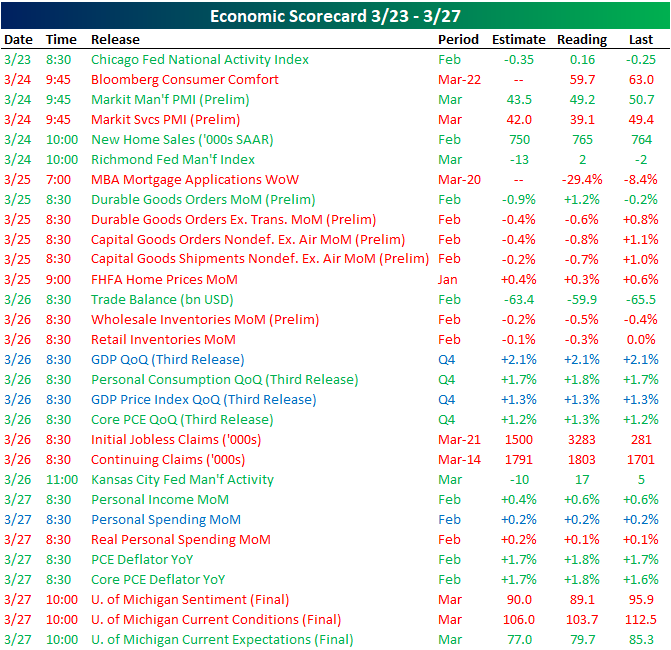
Turning to this week, we are likely to see more large swings in economic data as more February and March prints continue to come in. The Dallas Fed’s reading on the manufacturing sector and pending home sales were both out earlier this morning. While pending home sales held up reasonably well in February, the Dallas Fed’s index for March plummeted to a record low of -70. If Bloomberg’s weekly readings have been any indication, consumer sentiment as seen through the Conference Board’s indices is likely to take a major hit when they are released tomorrow morning. Forecasts are currently predicting a reading of 110 for the headline number which would be the sixth largest MoM decline on record. Following weak preliminary readings last week, final Markit numbers for March will also be out later this week with further declines penciled in. ISM’s manufacturing and non-manufacturing indices are also due out the same days. Labor data will once again be a hot topic this week with jobless claims once again expected to read in the millions. Additionally, the Nonfarm payroll number on Friday is expected to show the first negative reading in nearly a decade. Start a two-week free trial to Bespoke Institutional to access our interactive economic indicators monitor and much more.

Chart of the Day: 10%+ Weekly Gains
Why Is The VIX So High?
With the equity market surging last week, seeing VIX close little-changed versus the prior Friday may have been confusing for some investors. But keep in mind that VIX is a measure of volatility, not just an inverse market index. In other words, it’s not just crashing down that sends the VIX higher but also crashing up. Generally, the realized volatility of the market and its level are inversely correlated in the short-term, so that big declines drive the VIX higher while grinding rallies send it plunging. But last week the S&P 500 moved at least 2.9% on four of five days…even though it gained over 10% on the week. That still-high realized volatility is why options markets that the VIX measures are still pricing high implied volatility. To illustrate this relationship, the chart below shows the average absolute percent change move (so big up and down days are counted the same) on a rolling two-week basis versus the VIX. Through Friday, the level of realized volatility (absolute changes in the market) and implied volatility (the VIX) were pretty consistent. Start a two-week free trial to Bespoke Premium to see our list of “Stocks for the COVID Economy.”
