Sentiment Staying Home
Like the S&P 500 and many Americans practicing social distancing, investor sentiment hasn’t moved too far over the past week. Bullish sentiment rose from 32.9% to 34.24%. That is one of the smaller moves in recent weeks which leaves the indicator just about in line with the average for bullish sentiment (34.44%) since the bear market began on 2/19.

It may not have been by much, but bearish sentiment dropped below 49.7% for the first time since the first week of March. While lower, bearish sentiment remains very elevated compared to the past decade. The over 10% rally for the S&P 500 since last Monday’s low has not been enough to persuade a more optimistic outlook for the bulk of investors.
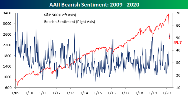
Not all the losses in bearish sentiment went to bulls. 16.03% of investors reported neutral sentiment this week which is a full percentage point higher than last week’s reading. While that is an improvement, this reading remains at the extreme end of the past several years’ range. Start a two-week free trial to Bespoke Institutional to access our interactive economic indicators monitor and much more.

New Record Doubles The Old Record
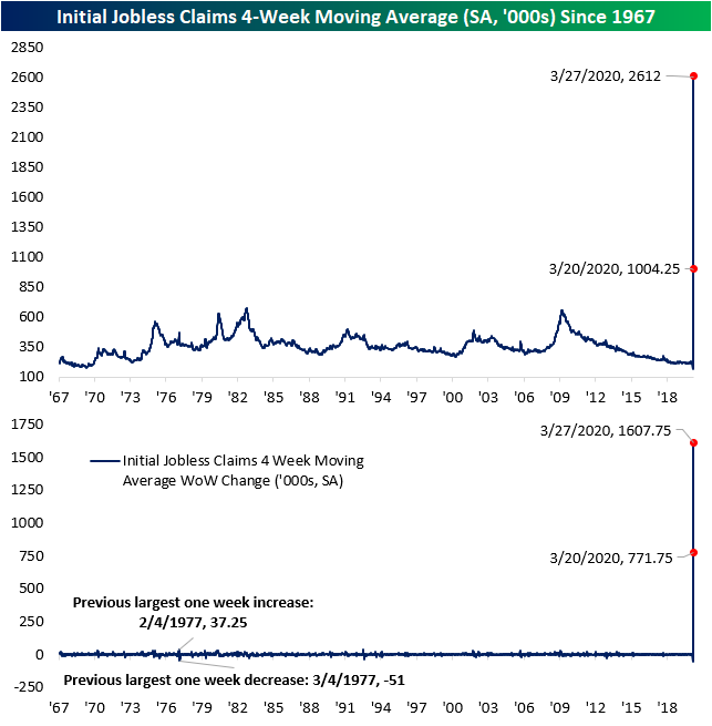
Last week, a record number of Americans filed for unemployment as initial jobless claims surged to 3.283 million. That number was revised higher to 3.307 million this week setting an even higher bar for a new record. Despite that, this week’s print doubled last week’s record number as jobless claims came in at 6.648 million. Put another way, that is roughly 2% of the entire US population filing for unemployment this week alone! Not only did this week’s release double last week’s record print, but it was also above the most aggressive forecasts of 6.5 million. With claims having risen this much, any historical precedent has been utterly blown out of the water. The past few weeks are multiples larger than even past recessions’ peaks. Additionally, the size of the week over week changes have also been much larger than anything previously observed in the history of the data.

One silver lining of the report is due to seasonal factoring, the adjusted number is about 824K higher than the non-seasonally adjusted number which came in at 5.824 million this week. In other words, the actual number reported before seasonal adjustment is still very bad, but not quite as bad as the seasonally adjusted number lets on. As with the adjusted number, this did double what was already a record print last week on the largest week over week change ever.

Normally, the four-week moving average would help to smooth out any week to week fluctuations of this data. But seeing as the current situation is far from normal, there is not much smoothing happening. Even the moving average has ripped higher by more than any other period in history. Start a two-week free trial to Bespoke Institutional to access our interactive economic indicators monitor and much more.
Bespoke’s Morning Lineup – 4/2/20 – 2% of the Population Files For Unemployment
See what’s driving market performance around the world in today’s Morning Lineup. Bespoke’s Morning Lineup is the best way to start your trading day. Read it now by starting a two-week free trial to Bespoke Premium. CLICK HERE to learn more and start your free trial.
All eyes were on jobless claims this morning, which were expected to rise by 3.7mm, though estimates were wide-ranging from 800,000 to 6.5mm. So, where did they come in? How about 6.648 million. That was above all economists forecasts!
Equity markets were pricing a gain of more than 1% but have given up half of those gains in the immediate aftermath of the report.
Read today’s Bespoke Morning Lineup for a discussion of the latest trends and statistics of the outbreak, overnight moves in the market, and some really weak employment-related data out of Spain.

Last week’s jobless claims reading reflected the fact that 1% of the US population filed for unemployment. With claims doubling this week, that means 2% of the US population filed for claims this week Not the labor force but the entire population. Given the moves in claims over the last two weeks, the historical chart of claims is essentially useless. That surge in claims we saw during the financial crisis? It looks like nothing more than a speed bump in relation to what we’re going through now.

The Closer – The Markets’ New Me, Same As The Old Me – 4/1/20
Log-in here if you’re a member with access to the Closer.
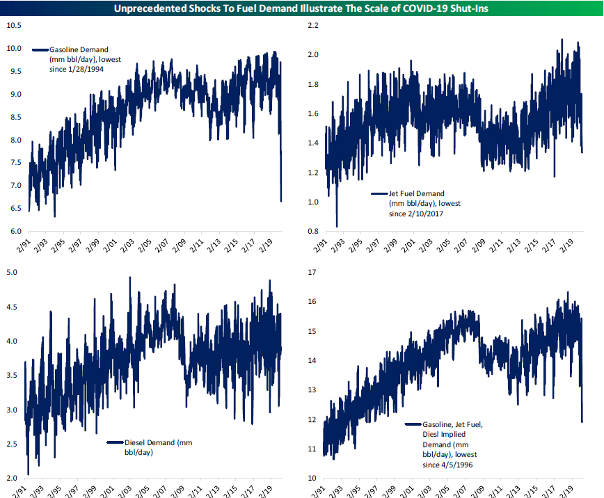
Looking for deeper insight on markets? In tonight’s Closer sent to Bespoke Institutional clients, we show how the past couple of day’s price action is similar to the start of the bear market. We then delve into the Fed’s repo operations before turning to over to today’s ISM release. We close out tonight’s report with a look at the shock to petroleum stockpiles and demand as well as weekly fund flows.
See today’s post-market Closer and everything else Bespoke publishes by starting a 14-day free trial to Bespoke Institutional today!
Daily Sector Snapshot — 4/1/20
Chart of the Day: April Intra-Month Performance
Fixed Income Weekly – 4/1/20
Searching for ways to better understand the fixed income space or looking for actionable ideas in this asset class? Bespoke’s Fixed Income Weekly provides an update on rates and credit every Wednesday. We start off with a fresh piece of analysis driven by what’s in the headlines or driving the market in a given week. We then provide charts of how US Treasury futures and rates are trading, before moving on to a summary of recent fixed income ETF performance, short-term interest rates including money market funds, and a trade idea. We summarize changes and recent developments for a variety of yield curves (UST, bund, Eurodollar, US breakeven inflation and Bespoke’s Global Yield Curve) before finishing with a review of recent UST yield curve changes, spread changes for major credit products and international bonds, and 1 year return profiles for a cross section of the fixed income world.
In this week’s report we discuss the income opportunities in S&P 500 dividends.

Our Fixed Income Weekly helps investors stay on top of fixed income markets and gain new perspective on the developments in interest rates. You can sign up for a Bespoke research trial below to see this week’s report and everything else Bespoke publishes free for the next two weeks!
Click here and start a 14-day free trial to Bespoke Institutional to see our newest Fixed Income Weekly now!
The Good, The Bad, and the Ugly Commodities in Q1
Very few assets have been winners recently, especially in the commodities space. As shown in the table below, no major energy or metal commodities (front-month futures) rose in March and gold was the only one to rise in the first quarter. The degree of those declines varied greatly. While gasoline and WTI futures (crude oil) were more than cut in half, gold and iron ore fell less than one percent in March. Considering iron ore’s cyclical nature, that small decline is somewhat surprising but as for Q1, iron ore’s performance was much weaker with a decline of over 10.5%. Granted, that is still a far better performance than copper which was down by more than twice that. Given the size of these declines, every one of the commodities highlighted below sits well off of its 52-week high. Gasoline and crude oil are the worst of these at 74.14% and 69.63%, respectively. As for where they finished the quarter relative to their 52-week lows, things are mixed. Gasoline, gold, and silver are off those lows by double-digit percentages while the rest are less than 10% away.

As with many charts across assets, the technical picture of these commodities looks ugly. Almost every one has broken below significant support levels and safe-haven gold is the only one currently in anything other than a downtrend. Although it finished the month just off of the lows, crude oil fell all the way to its lowest levels since 2002 after crashing through support in February. The same can be said for gasoline. Natural gas remains a pain trade with the downtrend of the past several months still firmly in place.
Given its safe-haven status, gold has again been an outperformer approaching some of its highest levels of the past decade during the risk asset rout of the past couple of months. But it has recently been a more volatile trade. The yellow metal has yet to break above resistance around 1,700/oz and has even fallen to support around the 50-DMA. Despite also having the precious metal status, silver has been a serial underperformer to gold. Silver never shared gold’s rally over the past couple of months as it fell to its lowest levels since 2009.
As for industrial metals, copper has been hovering around its lowest levels since the final quarter of 2016 after falling through the past year’s support around $2.50. On the bright side, the technicals of iron ore have been slightly more constructive as it has still held up at support around $75. Start a two-week free trial to Bespoke Institutional to access our interactive economic indicators monitor and much more.

Q1 2020 Asset Class Performance Matrix
Below is a look at total returns in Q1 2020 across asset classes using key ETFs that we track closely on a daily basis. For each ETF, we show its return in March, since the 2/19 all-time closing high for the S&P 500, and for the full first quarter of the year.
Looking at US equity index ETFs at the end of March, the S&P 500 (SPY) was down 12.46% on the month, 23.35% since the 2/19 all-time high, and 19.43% year-to-date. The Dow 30 (DIA) was down slightly more than SPY over all three time frames, while the Tech-heavy Nasdaq 100 (QQQ) was down much less in both March (-7.3%) and in the first quarter (-10.3%).
Small-caps and mid-caps have both been hit harder than large-caps, while growth outperformed value by a wide margin.
Looking at US sectors, Technology (XLK) was down the least in Q1 at -11.9%, while Energy (XLE) was down the most at -50%. The Financials sector (XLF) was down the 2nd most in Q1 with a drop of 31.8%.
Outside of the US, the hardest hit country ETFs in both March and the first quarter were Brazil (EWZ) and Mexico (EWW). Brazil was down 38.6% in March and 50% in the first quarter. Mexico was down 31.9% in March and 37% in Q1. The commodities ETF (DBC) was down 29.5% in Q1, but the oil ETF (USO) was down 67% while the gold ETF (GLD) was up 3.6%.
Treasury ETFs were up in March, with longer duration up the most. The 20+ Year Treasury ETF (TLT) was up 6.38% in March and up 22% in Q1. Start a two-week free trial to Bespoke Premium to see our list of “Stocks for the COVID Economy.”

Under the Hood Weakness From ISM
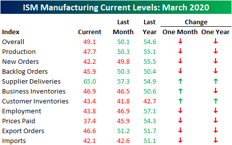
As we have been highlighting over the past couple of weeks, soft manufacturing data for the month of March from regional Federal Reserve districts was horrendous with several record lows and record month over month declines. The ISM Manufacturing index for March was not nearly as bad. Forecasts were calling for the headline number to fall to 45 from 50.1 in February. That would have been the lowest level for the index since May of 2009. Instead, it only fell to 49.1 which is still a contractionary reading but much better than expected and actually 1.3 points above the December low of 47.8.

While the headline number has held up fairly well, under the hood this month’s report was not as strong. All but three categories fell in March, and the ones that rose are not positive signs. Supplier Deliveries, Business Inventories, and Customer Inventories all rose meaning products from suppliers are taking longer to reach manufacturers and existing inventories are not being drawn down on as they were previously. Additionally, whereas most readings were expansionary one year ago, now only Supplier Deliveries is, which again is not a positive sign.
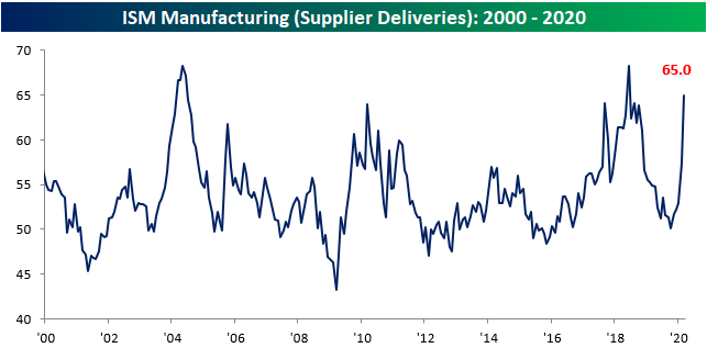
When the index for Supplier Deliveries is rising, this indicates that it is taking longer for manufacturers to receive products from their suppliers. This month, the index rose 7.7 points to 65 which is the highest level since June of 2018 when it reached 68.2. Of all readings since 1948, that is in the 89th percentile. That last time that the index rose by this much was nearly 15 years ago in September of 2005. Prior to that, you would need to go all the way back to 1988 to find a time that Supplier Deliveries rose by a larger amount. In other words, the shutdowns and slowdowns from COVID-19 are certainly beginning to disrupt supply chains.

Not only are supply chains taking a hit but so is demand. As we mentioned in Monday’s Closer, readings on new orders across other surveys have plummeted and the March ISM report is no exception. The index for New Orders fell 7.6 points to 42.2 in March. While that is not necessarily the sharpest decline in recent history (December of 2018 saw a larger decline of 8.7 points), New Orders is now at its lowest level since March of 2009.

Additionally, this month’s report has begun to show some of the adverse effects of COVID-19 on the labor market. The Employment component fell 3.1 points to 43.8 which is also the lowest level since the Spring of 2009.

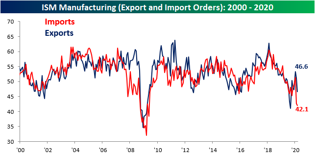
In last month’s report, we noted the record decline in imports. As could be expected, that decline continued in March, albeit at not nearly as dramatic a pace with the index for Imports falling slightly more to 42.1. That still leaves it at its lowest level since the financial crisis. Export orders, on the other hand, caught up with a sizable decline of their own. Exports fell 4.6 points to 46.6. That is the largest decline since last August and it also leaves it around similar levels to then. Either way, these two indices are pointing to an all-around slowdown of trade activity as a result of the coronavirus. Start a two-week free trial to Bespoke Institutional to access our interactive economic indicators monitor and much more.