Bespoke’s Weekly Sector Snapshot — 9/30/21
Bearish Sentiment Back Above 40%
As the S&P 500 continued to decline over the past week, survey results from the American Association of Individual Investors have shown investor sentiment has taken a more negative tone. 28.1% of respondents this week reported as bullish versus 29.9% last week. While lower, that is still several percentage points above the recent low of 22.4% from a couple of weeks ago.

Bearish sentiment picked up the bulk of those losses to bullish sentiment as 40.7% reported pessimistic sentiment this week. That is the highest reading in exactly a year. With bearish sentiment having risen by 13.5 percentage points since the low of 27.2% in the week of September 9th, it is now a full standard deviation above its historical average of 30.55%.
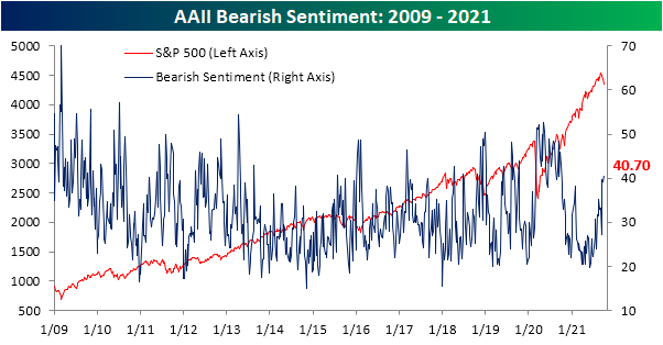
Even though bearish sentiment came in at a new high, the bull-bear spread was only slightly lower at -12.6. That is still above the low of -16.9 from two weeks ago.

Bearish sentiment did not pick up all of the losses to bullish sentiment either. Neutral sentiment was also slightly higher this week gaining 0.2 percentage points.

Other readings on sentiment are also echoing the decline in optimism. One other sentiment indicator, the National Association of Active Investment Mangers’ Exposure Index, has also seen a significant drop this week. This index shows how exposed managers are to equities with a reading of 200 being the max and meaning respondents are leveraged long whereas -200 would be leveraged short. A reading of +100 (-100) would indicate managers are full long (short), and a reading of zero would indicate they are market neutral. The index has fallen in back-to-back weeks now with this week seeing a 22.68 point drop to the lowest level since May. That week over week change also ranks in the bottom 5% of weekly moves going back to the start of the data in 2006, although there have been a handful of similar if not larger drops in the past year like a 26.98 point decline in mid-August and a 40.93 point drop back in May. Now at 55.02, the index indicates managers have stepped back and are far less exposed to equities than they have been for most of the past year. Click here to view Bespoke’s premium membership options.

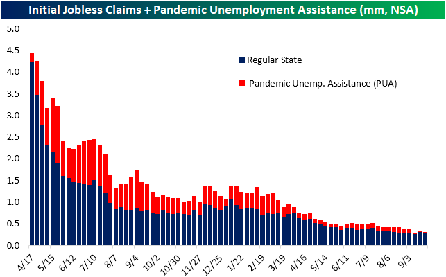
Pandemic Claims Evaporate
This week’s initial jobless claims number disappointed with a surprise increase to 362K rather than the anticipated 21K decline to 330K. After that increase, claims are at the highest level since the first week of August when total adjusted claims were 15K higher at 377K.

While seasonally adjusted claims were disappointing, the unadjusted number actually improved week over week falling back below 300K. Albeit lower, claims are still off their low of 265.9K from two weeks ago which could be expected given the seasonal tendency for claims to rise at this time of year. With the program’s official end date now a few weeks in the rearview, PUA claims remain muted, but there was actually an increase of early 2K this week.
Seasonally adjusted continuing claims fell this week to 2.802 million. Although lower, that was not as large of a decline as expected. That makes for the second-lowest reading of the pandemic outside of the first week of September when continuing claims came in at 2.715 million.

On a non-seasonally adjusted basis and including all auxiliary programs creates a couple of weeks of lag to the data making the most recent reading through September 10th. That was the first week of data to encapsulate the end of pandemic programs, and the drop was significant. Total claims across all programs were more than cut in half falling 6.22 million to 5.03 million. As could be expected, declines in PUA and PEUC claims drove that decline with the two programs shedding a combined 6.49 million claims. That being said, these two programs still have a total of over 2 million claims left on the table and likely to fall off over the coming weeks. Click here to view Bespoke’s premium membership options.
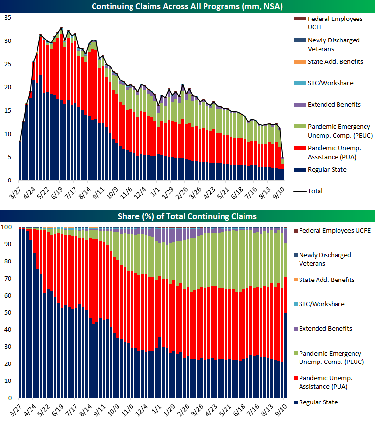
Chart of the Day: Millennials Pile Into The Housing Market
The Bespoke 50 Growth Stocks – 9/30/21
Bespoke’s Morning Lineup – 9/30/21 – Futures Off Highs Again
See what’s driving market performance around the world in today’s Morning Lineup. Bespoke’s Morning Lineup is the best way to start your trading day. Read it now by starting a two-week trial to Bespoke Premium. CLICK HERE to learn more and start your trial.
“If you don’t have a competitive advantage, don’t compete.” – Jack Welch
Futures are higher this morning heading into the opening bell, but they’re off their highs of the overnight session, and if you are sensing a pattern of overnight strength in futures with weakening towards the opening bell, you’re not imagining it. Today marks the last trading day of the quarter and bulls will be happy to see the month come to an end.
Between now and the closing bell, though, there’s a good deal of economic data on the calendar including jobless claims, GDP, Personal Consumption, and Chicago PMI. Jobless claims came in higher than expected on both an initial and continuing basis while revised GDP and Personal Consumption both modestly topped forecasts.
One piece of positive non-economic news concerns COVID trends in the United States where case counts, hospitalizations, and deaths continue to roll over.
Read today’s Morning Lineup for a recap of all the major market news and events from around the world, including the latest US and international COVID trends.
It’s been an especially rough week so far for the Nasdaq 100, and the index of large-cap tech-like stocks is down nearly 4% in just the first three trading days of the week. At the other end of the market cap spectrum, small caps have held up considerably better as the Russell 2000 is down just 1%. Below we show the relative strength of the Nasdaq 100 (QQQ) versus the Russell 2000 (IWM) since the start of 2020 where a rising line indicates outperformance of QQQ. Towards the right side of the chart, you can see the recent weakness in the Nasdaq 100 showing up in the chart as its relative strength versus small caps peaked in late August. You’ll notice that we saw a similar pattern play out last year where the Nasdaq 100’s relative strength peaked at the start of September before beginning a six-month slide relative to small caps. That period of underperformance for QQQ last year followed an insane period of outperformance earlier in the year. This year also saw a period of strong (but not as strong as in 2020) outperformance on the part of QQQ relative to small caps throughout the late spring and early summer, so small caps are certainly due for some catch-up, but one key difference between this year and last is that the fiscal and monetary backdrop is currently much less accommodative now than it was in late 2020.

Start a two-week trial to Bespoke Premium and read today’s full Morning Lineup.
Daily Sector Snapshot — 9/29/21
B.I.G. Tips – October, Q4 Seasonality
How Has the 10 Year Yield Historically Correlated to Growth Stock Performance?
Recently, all it seems investors can talk about is the relationship between the performance of growth stocks and interest rates. The general idea is that rising yields have a negative impact on the performance of growth stocks as the risk-free rate of return increases and future cashflows for high-growth companies are discounted at a higher rate. To highlight this relationship, today we wanted to take a look at a comparison between the relative strength of the Vanguard Mid Cap Growth ETF (VOT) versus the Vanguard Value ETF (VOE) versus the yield on the 10-year US Treasury.
Looking first just at the relationship between the two this year, the chart below shows the relative strength of growth vs value (blue line) compared to moves in the 10-year US Treasury (red line). When the blue line is rising, it indicates that growth stocks are outperforming value and vice versa. For pretty much the entire year, when yields have moved higher, growth stocks have underperformed, but when yields have pulled back, growth stocks start to lead the market. Over the last several days, the inverse relationship has been even more pronounced where the two lines have completely moved in the opposite direction. For this year at least, higher interest rates have been kryptonite for growth stocks.

The chart below is the same as above but goes all the way back to 2010 instead of just this year. Looking at the chart, while there were periods of inverse correlation in the early and mid-2010s, the trend really didn’t fully take hold until late 2018/early 2019. Since then, when rates have fallen, growth has outperformed and vice versa.

The inverse correlation has reached extreme levels this year. The chart below shows the correlation coefficient between the daily ratio of the VOT (mid-cap growth) versus VOE (mid-cap value) versus the yield on the 10-year US Treasury. Since 2010, there have been five years where the correlation coefficient was positive and in only three of those years was the positive reading anything more than negligible (2012, 2015, and 2018). In each of the past three years, what we’ve seen is the inverse correlation only intensify. Back in 2019, the only other year before that where the inverse correlation was more pronounced was in 2016, but then 2020 saw what was at the time the most inverse correlation since 2010. Based on this year’s relationship, though, 2020’s record may not last long. Through Tuesday’s close, the correlation coefficient between the relative strength of growth stocks and the 10-year yield was -0.87. While the inverse relationship between growth stock performance and interest rates may not continue to be as pronounced as it is now in the future, any continued increase in long-term interest rates is likely to act as a headwind for the performance of growth stocks. Click here to view Bespoke’s premium membership options.
