Breadth Disconnects
As we mentioned in today’s Sector Snapshot and yesterday’s Chart of the Day, breadth for the S&P 500 has ripped higher recently. In the charts below, we show the price and cumulative advance/decline (AD) lines for each of the eleven sectors and the S&P 500. The cumulative advance/decline line measures the daily number of advancers minus decliners within a sector or index over a given time frame. Bulls want to see this reading make new highs when the index or sector’s price makes new highs. Right now, every sector but Communication Services and Energy is seeing new highs in the cumulative AD line. Three sectors have seen their cumulative AD line make new highs this week even though the index’s price has not yet made a new high — Consumer Discretionary, Financials, and Industrials. That’s a hugely positive divergence. Click here to view Bespoke’s premium membership options.

Bulls Bounce Back
Only two weeks ago, bullish sentiment according to the AAII had collapsed to some of the weakest readings of the post-pandemic period. Over the past two weeks, sentiment has gradually recovered with a significant pick up in this final week of the year. Now at 37.7%, bullish sentiment gained 8.1 percentage points this week for the largest increase since October. While recovered, the actual level of bullish sentiment is far from notable essentially in line with the historical average of 38%.
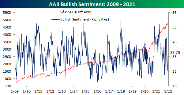
The increase in bullish sentiment over the past two weeks largely borrowed from bears. Bearish sentiment fell 3.4 percentage points in the most recent week following a 5.4 percentage point drop last week. Now at 30.5%, the share of respondents reporting as bearish is right in line with the historical average.
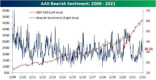
Given the inverse moves of the two readings, the bull-bear spread is now back into positive territory after five weeks of negative readings. At 7.2, the spread is not particularly elevated and only 0.2 points away from the historical average of 7.4.

Not all of the gains to bullish sentiment have come from former pessimists. The share of respondents reporting neutral sentiment has also unwound this week falling from 36.6% to 31.8%. That is the lowest reading since the first week of the month when exactly 31% of respondents reported neutral sentiment. Click here to view Bespoke’s premium membership options.

The Bespoke 50 Growth Stocks – 12/30/21
The “Bespoke 50” is a basket of noteworthy growth stocks in the Russell 3,000. To make the list, a stock must have strong earnings growth prospects along with an attractive price chart based on Bespoke’s analysis. The Bespoke 50 is updated weekly on Thursday unless otherwise noted. There were nine changes to the list this week.
The Bespoke 50 is available with a Bespoke Premium subscription or a Bespoke Institutional subscription. You can learn more about our subscription offerings at our Membership Options page, or simply start a two-week trial at our sign-up page.

The Bespoke 50 performance chart shown does not represent actual investment results. The Bespoke 50 is updated weekly on Thursday. Performance is based on equally weighting each of the 50 stocks (2% each) and is calculated using each stock’s opening price as of Friday morning each week. Entry prices and exit prices used for stocks that are added or removed from the Bespoke 50 are based on Friday’s opening price. Any potential commissions, brokerage fees, or dividends are not included in the Bespoke 50 performance calculation, but the performance shown is net of a hypothetical annual advisory fee of 0.85%. Performance tracking for the Bespoke 50 and the Russell 3,000 total return index begins on March 5th, 2012 when the Bespoke 50 was first published. Past performance is not a guarantee of future results. The Bespoke 50 is meant to be an idea generator for investors and not a recommendation to buy or sell any specific securities. It is not personalized advice because it in no way takes into account an investor’s individual needs. As always, investors should conduct their own research when buying or selling individual securities. Click here to read our full disclosure on hypothetical performance tracking. Bespoke representatives or wealth management clients may have positions in securities discussed or mentioned in its published content.
Sub-200K Claims Come Back
After holding above 200K the past two weeks, seasonally adjusted initial jobless claims dropped back below that level coming in at 198K. That compares to expectations of an unchanged reading from the revised level of 206K. While lower, claims remain above the multi-decade low of 188K from the first week of December.

On an unadjusted basis, claims were slightly higher rising by a little over 1K to 256.15K. With the continued unwinding of the program, PUA claims fell below 1K for the first time. Over the past few months, we have been noting the change in seasonal trends for initial claims. Historically, the final quarter has been marked by a period of rising claims whereas the opposite has generally been true in Q4 2021. The current week of the year, in particular, has seen claims rise over 90% of the time since 1967; ranking second behind the 27th week of the year (typically the last week of June/first week of July) as the week of the year that NSA claims most consistently increase on a week over week basis. While the rise in claims this week could have been expected, the uptick was much lower than normal as the current week of the year has averaged an increase of almost 50K. In other words, the trend in claims to close out 2021 has diverged from the normal trend.


Continuing claims saw a substantial drop this week with the adjusted number falling by 140K. That was the largest one-week decline since mid-October and the lowest level since the first week of March 2020.
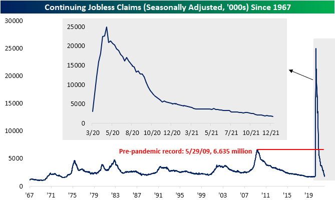
Adding in all programs delays the data an extra week making the most recent reading as of the week of December 10th. That week saw regular state claims rise by over 93K to 1.828 million. Albeit higher, that was still below the levels from two weeks prior. Other programs similarly saw higher readings, but the Extended Benefits program provided a boost to the aggregate read on claims after being cut by 45.7%. At only 67.5K versus 124.3K, this program has now seen the lowest reading since July 2020. As expected headed into year-end, this is another point showing pandemic era programs continue to account for increasingly insignificant portions of jobless claims. Click here to view Bespoke’s premium membership options.

B.I.G. Tips – Charts We’re Watching – Year-End 2021
Bespoke’s Morning Lineup – 12/30/21 – Almost There
See what’s driving market performance around the world in today’s Morning Lineup. Bespoke’s Morning Lineup is the best way to start your trading day. Read it now by starting a two-week trial to Bespoke Premium. CLICK HERE to learn more and start your trial.
“Time sometimes passes quite quickly.” – Jimmy Page
Futures are higher but not rising as fast as the number of daily Omicron cases in the United States which has now reached the parabolic stage. Given the light volumes, it’s hard to read too much into this morning’s market moves, so we won’t try to force any narrative to what’s behind the strength. Initial jobless claims came in both below 200K and consensus expectations while continuing claims also experienced a large drop falling to 1.716 mln which is consistent with levels prior to Covid. The last economic release of the year will be the Chicago PMI at 9:45.
Read today’s Morning Lineup for a recap of all the major market news and events from around the world, including the latest US and international COVID trends.
When it comes to small-cap stocks, not all indices tracking the sector are created equal. The chart below compares the performance of the ETFs that track the Russell 2000 (IWM) and the S&P Small Cap 600 (IJR). Early on in 2021, both indices tracked each other very closely, but late in the first quarter, the two ETFs started to diverge and have continued to do so throughout the year. Through yesterday’s close, IJR was up 25.3% YTD while IWM was up just 13.9%. One lesson from 2021, therefore, is that sometimes even picking the right asset class isn’t enough. You also have to pick the right vehicle to put that investment thesis into place.

Start a two-week trial to Bespoke Premium to read today’s full Morning Lineup.
Daily Sector Snapshot — 12/29/21
Battered BRICS Breaking Down
In the table below, we show a breakdown of US-listed ETFs for the equity markets of the 23 major global economies that we track in our Global Macro Dashboard. In 2021, the United States’ S&P 500 (SPY) is headed out on top of the world with a year-to-date gain of 27.57%. December alone has been a solid month with a 4.7% gain as SPY reached a 52-week high only a few days ago. That being said, SPY’s MTD gain pales in comparison to Mexico (EWW) which has rallied double digits in December for the 21st best month on record in its history dating back to March 1996. But that has not brought it to a new high. In fact, in addition to the US, only Taiwan (EWT) and Switzerland (EWL) have also hit 52-week highs this month and these two countries also rank as the runner-up and fourth-best performing country ETFs in 2021. At the moment, SPY and EWL are also the most overbought with EWL currently over 2 standard deviations above its 50-DMA. Panning across its peers, most country ETFs are below their own 50-DMAs with many down by at least a full standard deviation, though most have also been rallying this month.

The BRIC countries have been a particular area of weakness for US investors lately. The Brazil (EWZ) and China (MCHI) ETFs have had a rough year with each being cut by around 25%. December in particular has seen sizable declines of 6.67% for MCHI and 5.52% for EWZ, which leaves it at a new 52-week low today. Russia (RSX) has been hit even harder though having declined over 7% month to date. India (INDA) too is lower, granted, it remains up double digits year to date. Click here to view Bespoke’s premium membership options.

Chart of the Day: Limping Towards the Finish Line
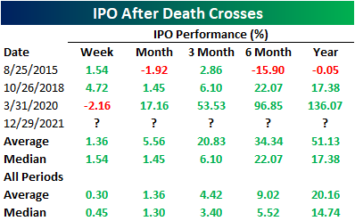
IPO Death Cross
The past two years have seen an explosion in new equity issuance in terms of the number of deals, and especially in terms of the dollar value of those deals. According to Bloomberg data, US average monthly issuance has been $23.83 billion over the past year. That is well above any point in the past few decades including the late 1990s. The actual number of stocks hitting the market has also set records this year, surpassing the 1990s peak.
While there has been a huge slug of new issuance, the performance of these names have been lackluster. The Renaissance IPO ETF (IPO) does not necessarily track every new name to hit the market, but it does act as a reasonably good proxy for the space. IPO reached an all-time high early in the year in February, but since then it has generally been rangebound fluctuating around its moving averages. Since the fall, and particularly in the past month and a half, the ETF has taken a significant leg lower. IPO has now fallen over 18% since the October 25th closing high, taking out its moving averages in the process. Today, IPO is setting up for what is typically viewed as a negative technical pattern: the death cross (when a downward sloping 50-DMA falls below a downward sloping 200-DMA).

IPO does not have an extremely extensive history only going back to October 2013, and as such, there is only a small handful of prior examples of other death crosses without another instance in the prior three months. In the table below, we show those past instances. Albeit there is a small sample size, contrary to the name and pattern’s reputation, prior death crosses have generally been followed by decent performance going forward. Click here to view Bespoke’s premium membership options.