Mortgage Rates Move the Other Way of Treasury Yields
While the past week has seen Treasury yields fall sharply, mortgage rates have continued to rise as has been the case consistently over the past few months with the FOMC slated to begin raising rates. At current levels, various measures on the national average for a 30-year fixed-rate mortgage like the longer-dated weekly series from Freddie Mac or the higher frequency series from Bankrate.com have now reached the highest levels since 2019. For the rate from Freddie Mac, as of the most recent update last Thursday, the national average for a 30-year fixed-rate mortgage stood at 3.89%. For the more recent and higher frequency reading from Bankrate.com, each day of the past week has seen readings at or above 4.25%.

As previously mentioned, the recent changes in US Treasuries have been the opposite of mortgage rates. Quantifying this, in the ten days since the February 15th high in the 30-year US Treasury, the yield has fallen 25.26 bps through yesterday’s close. Meanwhile, the 30-year fixed-rate mortgage from Bankrate.com has risen 6 bps. For mortgages, that is far from the largest 10-day change as that reading recently was above 40 bps in mid-February, but regardless, relative to the decline in the 30-year yield, yesterday saw a 31 basis point spread between the two rates’ 10-day changes. As shown in the chart below, that stands in the 98.8th percentage of all periods going back to the start of the mortgage rate data in 1998. June of last year and the COVID crash were the most recent periods to see such a divergence in the moves in 30 year Treasury and mortgage rates.

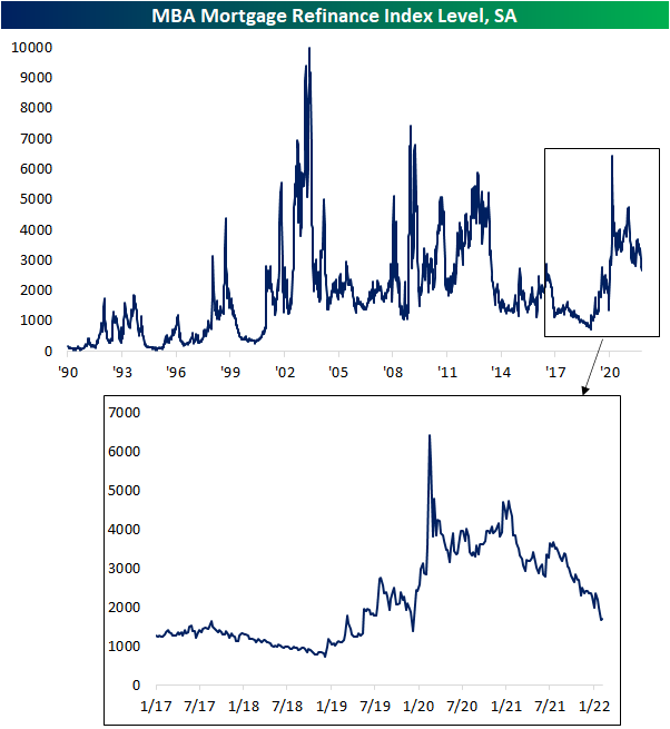
Given it continues to get more expensive to finance a home, purchase applications from the MBA fell again this week (albeit the 1.76% WoW decline was far less severe compared to the previous week’s 10.14% decline) as the index is now at the lowest level since May 2020.

Refinance applications were actually slightly higher this week, but in spite of that small respite, the index still hovers around some of the lowest levels of the past two years. Click here to view Bespoke’s premium membership options.
Commodity Driven Stocks Underperforming Commodities
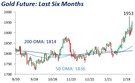
Both oil and gold futures hit 52-week highs in the last week, largely due to Russia’s invasion of Ukraine. Gold is viewed as the classic store of value, which explains the commodity’s recent uptick. Investors are increasingly pursuing hard assets, which spikes the demand for gold while supply remains relatively consistent. Oil futures have sky-rocketed due to a few factors. First, demand for the commodity has increased as the economy has fully reopened and travel has begun to recover. At the same time, we are in a supply-restricted environment as sanctions on Russia have hurt supplies given its status as the world’s second-largest producer.

Although the price of these commodities has risen substantially, equities with direct exposure to these prices have reacted differently relative to the underlying commodity. Starting with oil, the energy sector benefits from increased oil prices as margins expand, thus propping up EPS and allowing for more cash to be returned to shareholders. However, while oil has risen by 15.3% in the last month as of yesterday’s close, the energy sector has only gained 2.7%. This has resulted in a lower ratio between energy stocks and the price of oil, which is pictured below. Since 1990, the performance of the S&P 500 Energy sector and WTI crude oil has been highly correlated, with a correlation coefficient of 0.88 between their closing prices. However, over the last month, the coefficient is just 0.52 and is slightly below the average trailing month correlation coefficient since 1990, which is 0.59. Currently, the ratio of the price of the Energy sector to oil is 5.3, which is well below the median ratio of 6.4 (since 1990). The last time oil topped $100 per barrel was between 2011 and 2014, and we saw the ratio of energy stocks to oil remain at roughly our current level throughout this time period. Once oil definitely broke through the $100 level, the ratio increased.

When looking at the ratio of the price of gold vs gold mining stocks, we are seeing the opposite pattern play out. While the price of an ounce of gold has increased 8.4% since the start of February (as of yesterday’s close), the price of the VanEck Gold Miners ETF (GNX) has appreciated by 17.5%. Since we emerged from the global financial crisis in 2008, this ratio has remained elevated, as the performance of the gold miners has not been as strong as the performance of the underlying commodity. It is worth noting that GNX was launched in mid-2006, so for the chart below we used a contiguous index, using pricing data from Newmont Corp. (NEM) for the period from 1990 through mid-2006. Since 1990, the performance correlation of the two assets has been relatively minimal, holding a correlation coefficient of 0.42. However, over the last month, this reading has ticked higher to 0.97. The rolling one-month correlation coefficient between gold and the miner stocks has had an average 0.72 (median: 0.81), meaning that the miner stocks are more correlated to the movements of gold than they typically have been since 1990. The current price ratio of 15.2 is much higher than the median since 1990 (5.2) but is essentially in line with the ratio since the start of 2014 (15.6).


To summarize, while a number of factors will impact the price of energy and gold related stocks besides just the price of the underlying commodities they deal in, energy stocks have been less correlated in recent history than they have in the past, but we see the opposite in gold miners relative to the price of gold. Additionally, energy stocks have underperformed oil over the last month, and the inverse is true for gold mining stocks relative to gold. Click here to view Bespoke’s premium membership options.

Bespoke’s Morning Lineup – 3/2/22 – “Crisis Mode”
See what’s driving market performance around the world in today’s Morning Lineup. Bespoke’s Morning Lineup is the best way to start your trading day. Read it now by starting a two-week trial to Bespoke Premium. CLICK HERE to learn more and start your trial.
“The lesson of history is that you do not get a sustained economic recovery as long as the financial system is in crisis.” – Ben Bernanke
Futures are looking to bounce back from yesterday’s weakness, but it’s still early and there are a lot of events on the horizon for today. St. Louis Fed President James Bullard will be speaking right at the open and then a half-hour later, Fed Chair Powell will be testifying in front of a House Panel. Then at 2 PM, we’ll get the release of the Fed’s Beige Book. The only economic indicator of note today was the ADP Private Payrolls report which came in higher than expected. More noteworthy, though, was the 800K positive revision to last month’s report.
News on the Russia-Ukraine front has been relatively quiet. Nothing much new to speak of, but the Russian shelling of Ukrainian targets has continued.
Read today’s Morning Lineup for a recap of all the major market news and events from around the world, including the latest US and international COVID trends.
Yesterday, we highlighted the fact that the Nasdaq 100 has traded in an intraday range of over 1% every day this year. Yesterday, another shorter but pretty incredible streak also came to an end as it was the first time since 2/18 that QQQ was not up and down at least 0.5% in the same trading session. Swings from intraday gains of at least 0.5% to intraday losses of 0.5% (or in the opposite order) on an intraday basis indicate a volatile session, and five trading days in a row indicates extreme volatility and uncertainty.
The chart below shows historical streaks where QQQ saw intraday gains and losses of 0.5% in the same trading session. At five trading days, the streak that just ended is tied for the longest since February 2008 (six trading days), but it was well off the record of 18 trading days back in October 2000 – a period where there were multiple streaks with 0.5% intraday swings between gains and losses.
Looking at all the dates shown, though, the thing that stands out is that these types of streaks aren’t common, and they have only been seen during periods where the market was in a period of varying degrees of crisis.

Start a two-week trial to Bespoke Premium to read today’s full Morning Lineup.
Daily Sector Snapshot — 3/1/22
Bespoke Market Calendar — March 2022
Please click the image below to view our March 2022 market calendar. This calendar includes the S&P 500’s average percentage change and average intraday chart pattern for each trading day during the upcoming month. It also includes market holidays and options expiration dates plus the dates of key economic indicator releases. Start a two-week free trial to one of Bespoke’s three research levels.

Bespoke Stock Scores — 3/1/22
Chart of the Day: Decile Analysis
Bespoke’s Morning Lineup – 3/1/22 – Volatility: It’s All Relative
See what’s driving market performance around the world in today’s Morning Lineup. Bespoke’s Morning Lineup is the best way to start your trading day. Read it now by starting a two-week trial to Bespoke Premium. CLICK HERE to learn more and start your trial.
“One doesn’t recognize the really important moments in one’s life until it’s too late.” – Agatha Christie
It was a pretty quiet night in markets, but things have taken a turn for the worse since Europe opened for trading. What was looking like a flat open for the markets about four hours ago is now looking more like a decline of close to 1%. In yesterday’s post, we noted that despite the big moves following the weekend’s events neither crude oil nor gold managed to take out their prior highs from last week. Well, this morning both are rallying again, and while gold has yet to take out its recent intraday high, WTI is trading above $100 per barrel and at new multi-year highs. Bottom line is that no one knows where this is all going, so it’s probably best to avoid making a big stand in one way or the other but use extreme market moves (in either direction) to your advantage.
In economic news today, investors will be watching Markit Manufacturing at 9:45 and then Construction Spending and the ISM Manufacturing report at 10 AM.
Read today’s Morning Lineup for a recap of all the major market news and events from around the world, including the latest US and international COVID trends.
Yesterday was the 39th trading day of the year, and it was also the 39th straight day where the intraday range of the Nasdaq 100 ETF (QQQ) was more than 1%. Seems like a lot, right? Looking back over the last ten years, 39 straight trading days of 1% ranges on an intraday basis ranks as one of the longer streaks we have seen. The longest streak during this period was 46 trading days coinciding with the COVID crash, and besides that, the only one that was longer was the 41 trading days ending 1/10/19.

While the current streak ranks as one of the longest of the last ten years, it is nowhere near the longest on record. In the chart below, we show streaks of 1% intraday ranges in QQQ going back to its inception in early 1999. Notice anything in the chart? From early 1999 through October 2003 – a period encompassing more than four and a half years – QQQ traded in an intraday range of more than 1% every single day! How’s that for volatile? The current streak of 39 trading days also pales in comparison to streaks of more than 100 trading days that QQQ experienced during the financial crisis, but in the chart, those streaks barely even register to the 1999 to 2003 period. As volatile and hectic as the last eight weeks have been for markets, it’s still nothing compared to the ‘old days’.

Start a two-week trial to Bespoke Premium to read today’s full Morning Lineup.
The State of the Union
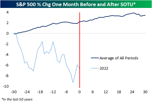
Tonight, President Biden will present to Congress and the nation his first official State of the Union address (SOTU). In terms of timing, this will be the latest into a new year that a SOTU has been held in at least 50 years. Therefore, when looking at market performance leading up to and after the address, we’ll be dealing with different than normal seasonal factors for this SOTU. Still, the S&P 500’s performance in the month leading up to the current SOTU address ranks as the fourth worst since 1945, outperforming only 2016, 2008, and 1982. Whereas the average performance in the month prior to the SOTU is a gain of 2.2%, this year, the S&P 500 is down by about 6.6% in the month leading up to Biden’s first SOTU address (chart below).
In the last 50 years, there have only been four other years where the S&P 500 traded down 5%+ in the month leading up to a SOTU address. In those four other years, the S&P 500’s performance in the month after the SOTU was a loss of 1.5%, but the median was a gain of 0.7%, indicating that results varied widely. For perspective, the average one-month return for all periods in the last 50 years is a gain of 1.1% (median: 1.8%). Regarding treasuries, in the four years where the S&P 500 was down 5%+ leading up to the SOTU, the 10-year yield’s performance was all over the map both before and after the address.

Below is a table that summarizes the performance of the S&P 500 and the 10-year yield in the month before and after the SOTU address. For the S&P 500, performance in the week after the SOTU has generally been positive, but one major exception was 2020 when the S&P 500 declined more than 27% as COVID crashed the markets and economy. Regarding the 10-year, it’s performance is relatively trendless, although its yield tends to rise modestly the day after the address as investors ponder how all the ‘goodies’ that the President mentions in the speech will be paid for.

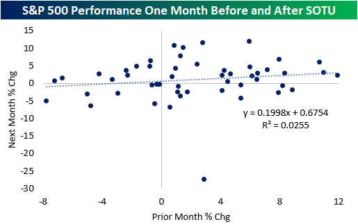
Although the past month’s performance has been weak relative to the other periods, there is little correlation between performance the month before and after the SOTU address. Although there is a slight positive relationship, only 3% of the variance in the y-variable is explained by movements in the x-variable. Essentially, this is not a tradeable event.
Ukraine and the pandemic will likely be the main focusses of tonight’s address, and investors will eye the President’s comments about each situation for a read on the President’s view on each situation. Positive comments about these situations may not necessarily be positive for the market, as easing in these areas would imply an increased probability of more aggressive Fed rate hikes. In any event, though, investors should not be making trading decisions based on previous market movements leading up to and after the SOTU, as every year bears unique political circumstances. Click here to view Bespoke’s premium membership options.