A Little Gun-Shy
As unrest has erupted around the country this year, Federal background checks for firearms have been rising to record levels. Just three months ago, in June, there were a record 3.931 million background checks. In July that total declined by nearly 300K to 3.639 million. Figures for the month of August were released earlier today and showed an additional decline of 524K to 3.115 million. While August’s decline was the largest m/m decline in background checks going back to 1998, the total number of background checks was still the 6th highest monthly total on record, and all but one (December 2015) of the five months that saw larger numbers of background checks were all this year (March, May, June, and July).

Despite what was one of the largest monthly declines on record, the y/y change in background checks was still more than 30% which while down from the 79% y/y rate in July is still a blistering pace. Start a two-week free trial to Bespoke Institutional to access all of our research and interactive tools.
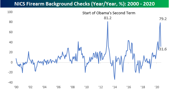
Chart of the Day: Who’s Next?
Not Much Pickup in New Highs
Every day in our Daily Sector Snapshot, we provide a look at the net percentage of S&P 500 stocks that are making new 52-week highs (percentage of new 52 week highs minus the percentage of new 52 week lows). Even though the S&P 500 has continued to hit new highs recently, the same cannot be said for much of the individual stocks that the index is comprised of. Historically for the S&P 500 when it has reached all-time highs, the average reading on the net percentage of new highs has stood at 12.35%. Today, it is around 5 percentage points lower at 7.33% and is off the post bear market low peak of 10.1% from July 23rd. The same can also be said for each of the eleven sectors. At the moment there is only one sector, Materials, that is currently at its highest level since the bear market low. Every other sector is currently off-peak with no stocks reaching new highs in Energy, Real Estates, and Utilities. Meanwhile, Consumer Staples has seen its share of stocks at new highs fall the most dramatically recently with the reading as of yesterday’s close the lowest since August 13th. Financials also continue to show positive readings but those remain far more muted than what was observed prior to the pandemic. On the other hand, unsurprisingly the sector with the highest net percentage of new highs currently is Technology at 16.9%, but that too is off the peak of nearly 20% from just about a week ago. Granted, for Tech that reading has generally been trending higher recently as it also has for Health Care, Industrials, Communication Services, and Consumer Discretionary. Start a two-week free trial to Bespoke Institutional to access our interactive economic indicators monitor and much more.

Zoom Video (ZM) Now The Best Performing Nasdaq 100 Stock YTD
Zoom Video Communications (ZM) is the talk of the town today after reporting a triple play after the close last night. ZM reported EPS and guidance more than double estimates and revenues one third higher than forecasts. In response to the blowout quarter, the stock has surged over 38% in today’s trading. That is the best single day for the stock since it IPO’ed back in April of last year.

Using data from our Earnings Explorer, in the table below we show the 25 stocks that have seen the biggest positive price reactions to second-quarter results this year. As shown, ZM’s massive surge of buying today leaves it as the fifth best performing stock behind Brightcove (BCOV), Groupon (GRPN), Tupperware (TUP), and Conduent (CNDT). CNDT saw the biggest one-day gain on earnings of these when it rose over 82% on August 7th. One notable difference between ZM and the other top 5 best performers is intraday performance. Whereas ZM has only risen around 2.5% intraday, TUP, GRPN, and BCOV all rose double digits from open to close, and while it did not rise double digits, even CNDT saw much stronger performance intraday. Of the top 25 best reactions to earnings, in addition to ZM, there were only two other triple plays (EPS and sales beat plus raised guidance): Aspen Tech (AZPN) and Boston Beer (SAM).
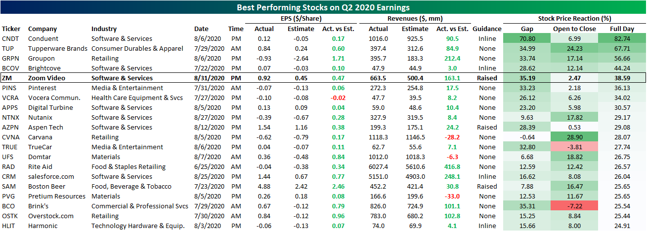
Not only does ZM find itself on a “best of” list in terms of reactions to earnings, but with the massive boost from today’s performance, ZM has now overtaken Tesla (TSLA) as the best performing Nasdaq 100 stock in 2020. In the table below we show the top-performing quarter of the index YTD through today. As shown, the COVID economy staple tops the chart with an over 540% gain compared to the runner up — Tesla (TSLA). In terms of market cap, ZM is now the 28th largest stock in the index having added roughly $72.9 billion year to date. For comparison’s sake, that is roughly $0.5 billion less than the current value of Goldman Sachs (GS). Given these massive moves, the stock is very much trading at a premium (which we discussed in more depth in today’s Morning Lineup) and is very elevated versus its moving averages. ZM is currently 65% above its 50-DMA and 174.64% above its 200-DMA. The only comparable overbought stock in the index at the moment is TSLA. Click here to view Bespoke’s premium membership options for our best research available.

Chart of the Day: 95 Cents on the Dollar
New Orders Blowout
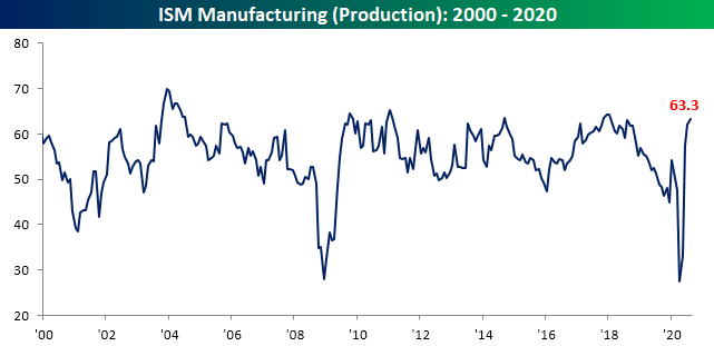
The Institute for Supply Management’s August reading on the manufacturing sector showed a third straight month of accelerating expansionary activity. The headline index rose to 56 compared to expectations of 54.8 and 54.2 in July. That is now the highest level of the index since November of 2018 when it read 58.8.

Breadth across each of the individual components of the report continues to be solid with just about every index higher month over month. The only two indices to fall were both for inventories. The index for Employment along with these indices for Business Inventories and Customer Inventories are also the only ones that remain in contraction as has been the case for the past few months. Employment has been on the rise over the past few months, so it’s not all bad though. Additionally, the declines in inventories may not necessarily be a bad thing as it coincides with strong demand and rising production, meaning strong demand is likely drawing on inventories rather than supply issues.

Demand is extraordinarily strong. Consistent with solid readings for New Orders across regional Federal Reserve manufacturing surveys, the ISM’s reading on New Orders has consistently risen over the past few months and is now around the top 5% of all historical readings going back to 1948. The 6.1 point increase to 67.6 leaves the index at its highest level since the final months of 2003/January of 2004. Prior to that, you have to go all the way back to 1983 to find a time that New Orders were this strong. That is an enormous turnaround compared to where things stood as recently as April when the index was at its low of 27.1; in fact, it is the most the index has risen in four months on record (second chart below). The 40.5 point rise in New Orders in that time surpasses a 39.5 point increase that went from June to October of 1980.


Given the historically strong demand, manufacturers continue to ramp up production. That index rose to 63.3 from 62.1 last month. That is the strongest reading since January of 2018.
Additionally, US manufacturers also appear to be ramping up general trade activity as both indices for Imports and Exports have risen. Export Orders index are at the same levels as January of this year after rising 2.9 points this month while Imports are even stronger at their highest level since June of 2018. Assuming those imports are mostly inputs, that could be a positive sign for future production.

Even though production continues to rise, it still appears that demand is outpacing supply as Backlog Orders also expanded for a second straight month. Backlog orders rose 2.8 points to 54.6. That 2.8 point month over month increase is in the top decile of all monthly changes and leaves the index at the highest level since November of 2018.

Further evidence of demand outpacing output can be seen through inventories. As mentioned earlier, the only areas of the survey that remain in contraction concern inventories. Both Business Inventories and Customer Inventories remain deep in contraction at 44.4 and 38.1, respectively. For Business Inventories, that is the lowest since January of 2014.
For Customer Inventories, that was the largest decline in a single month since December of last year and that is now the lowest level in over a decade with the last time it was this low being June of 2010. With inventories dwindling and demand historically elevated, these should act as tailwinds for future improvements to employment and production (as well as prices)
Click here to view Bespoke’s premium membership options for our best research available.

This is a Recession?
According to the National Bureau of Economic Research (NBER), the US economy peaked in February of 2020 with the economy beginning its downturn in March. With August just finishing, until the NBER says otherwise, we are now six months into the current recession. This morning’s ISM Manufacturing report for the month of August, however, would beg to differ.
Not only did the August report surpass expectations, but it also came in above 50 (expansion territory) for the third straight month. What stood out even more than the headline reading, though, was the commentary section of the report (shown below). Do these sound like the types of responses you would expect to see in a recession? Outside of one comment in the Transportation Equipment sector and another in the Machinery sector, all of the other responses were not only positive but in many cases, they were downright bullish. Interested in staying on top of the latest trends related to the market and economy? Start a two-week free trial to Bespoke Premium by clicking here.

Health Care Relative Strength
You would think that the Health Care sector (XLV) would be one of the best performing areas of the stock market during a global pandemic. While Health Care was a top performer early on during COVID, the sector has been seriously lagging the broad market lately.
Nothing stands out too much in the price chart (first chart below) of the Health Care ETF (XLV) as it is still in a solid uptrend and in fact making new all-time highs. It’s the chart that compares XLV to the S&P 500 that does stand out. In the second snapshot below, we provide relative strength charts of the eleven major sectors versus the S&P 500. A rising line indicates outperformance versus the broad market while a falling line indicates underperformance. As you can see in the yellow highlighted chart for Health Care, the sector has recently given up all of the gains it made versus the market early on during COVID. From late February through the end of April, Health Care dramatically outperformed, but its relative performance has slowly and steadily trended lower since then. The chart almost looks like the COVID case curve in the NYC region! At this point, the Health Care sector is performing right inline with the S&P 500 over the last year. Bespoke Premium members have access to these sector relative strength charts on a daily basis. You can start a two-week free trial to Bespoke Premium by clicking here.


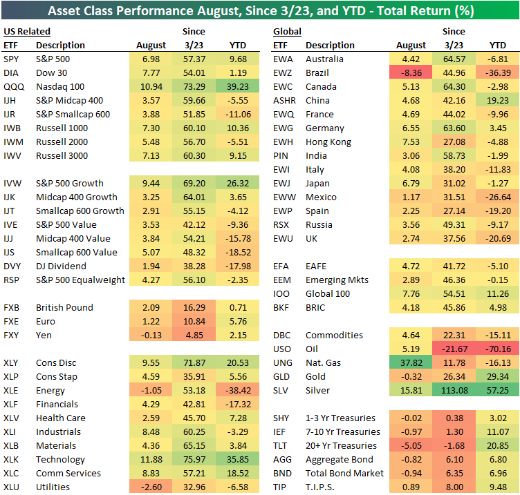
August and YTD Asset Class Performance
Below is a look at the recent performance across asset classes using key ETFs traded on US exchanges. All performance numbers represent total returns. The S&P 500 (SPY) gained 6.98% in August, but the Dow (DIA) and the Nasdaq 100 (QQQ) did even better with gains of 7.77% and 10.94%, respectively. The tech-heavy Nasdaq 100 has been the biggest winner by far across global index ETFs. It’s up 39.23% year-to-date and 73.29% since the March 23rd low made after the COVID Crash.
While everything is up off the March lows, there is wide performance disparity on a year-to-date basis across sectors, size, and themes like value and growth. Large-cap ETFs are now up solidly on the year, while small-cap ETFs like IWM and IJR are still in the red. Mid-cap value (IJJ), small-cap value (IJS), and the Dow Jones Dividend ETF (DVY) are all still down 15%+ on the year.
Looking at sectors, we saw Technology (XLK), Consumer Discretionary (XLY), Industrials (XLI), and Communication Services (XLC) gain 8%+ in August, while Utilities (XLU) and Energy (XLE) both declined during the month. Year-to-date, Tech (XLK) is up 35.9% while Energy (XLE) is down 38.4%.
Outside of the US, every country ETF tracked in our matrix was up in August with the exception of Brazil (EWZ), which actually fell 8.4%. Year-to-date, EWZ is still down 36.4%, while countries like Italy (EWI), Mexico (EWW), Spain (EWP), and the UK (EWU) are down double-digit percentage points as well. Germany (EWG) is the one European country in our matrix that’s up on the year. China (ASHR) is up 19.23%, which is 10 percentage points better than the S&P 500 (SPY).
Commodities have been all over the map in 2020, with the oil ETF (USO) down 70% YTD while silver (SLV) is up 57%. The natural gas ETF (UNG) had a banner August with a gain of nearly 38%, but it’s still down 16% YTD.
Fixed-income ETFs had a rough August as interest rates moved higher, but across the duration spectrum, Treasury ETFs are still up solidly on the year. Click here to view Bespoke’s premium membership options for our best research available.
Bespoke Market Calendar — September 2020
Please click the image below to view our September 2020 market calendar. This calendar includes the S&P 500’s average percentage change and average intraday chart pattern for each trading day during the upcoming month. It also includes market holidays and options expiration dates plus the dates of key economic indicator releases. Start a two-week free trial to one of Bespoke’s three research levels.
