Jobless Claims Back to Pandemic Lows
Initial jobless claims fell to 364K this week from last week’s upwardly revised level of 415K (originally 411K). That 51k decline was the biggest one-week drop since a 156K decline between the first and second week of April. Additionally, this week’s print leaves claims 10K below the previous low of the pandemic.
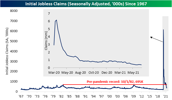
On a non-seasonally adjusted basis, claims were likewise lower falling from 397.4K to 359.1K. It is somewhat unusual for the current week of the year to experience a decline as historically it has seen claims rise three-quarters of the time. While regular state claims were lower, PUA claims rose for a third week in a row. Rising to 115.27K, PUA claims are at the highest level since the week of April 23rd. In spite of the two programs having moved in opposite directions, the drop in regular state claims was larger as total combined claims fell back below 500K and are roughly 40K above the low of 435.8K from three weeks ago.

Continuing claims were once again not as strong as the reading continues to flip back and forth between increases and decreases week to week. This week saw a small 56K uptick which left seasonally adjusted claims at 3.469 million. While higher and 56K off last week’s low, claims remain at a healthier level than the rest of the pandemic.

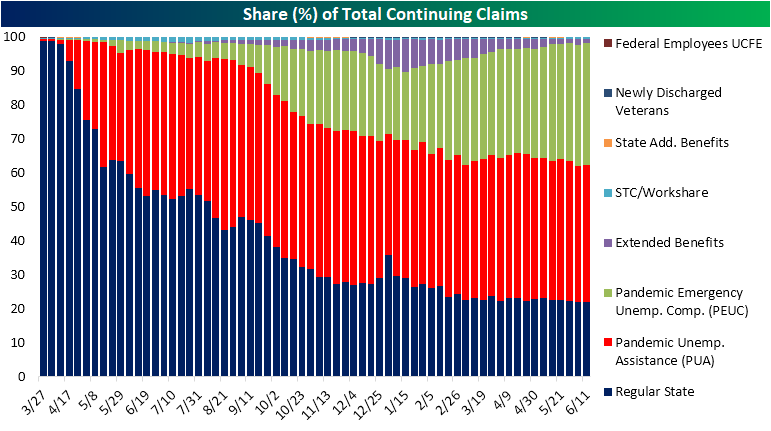
On a non-seasonally adjusted basis and including all other programs through the week of June 11th, claims fell from 14.87 million down to 14.68 million. That marked the seventh week in a row that total claims across all programs fell week over week. The Extended Benefits program was the biggest contributor to that decline as the program saw 86.82K fewer claims than the previous week. Regular state programs were the next biggest contributor to the overall decline with claims dropping 64.7K. With the consistent declines in regular state programs, pandemic era programs (PUA and PEUC) now account for 76.3% of all continuing claims. That share is likely to drop in the coming weeks though as there will be an acceleration in states withdrawing from those programs which will begin to be reflected in this data. Click here to view Bespoke’s premium membership options for our best research available.

Energy and Ethereum Lead The Way Higher in First Half
The first half of 2021 is now in the books. Below is a look at our Asset Class Performance Matrix highlighting total returns in June, Q2, and the first half of 2021 using key ETFs that we monitor on a regular basis.
Across asset classes, energy was the winning theme with commodities like oil (USO) and natural gas (UNG) boasting some of the strongest first-half returns alongside Energy sector stocks (XLE). USO was the top performer of these with its 51.11% total return since the start of the year. Alongside XLE and UNG’s over 40% gains, the Ethereum Trust (ETHE) also rallied 44.32%, albeit there has been a significant pullback in the past month. Although ETHE posted big gains, Bitcoin (GBTC) took a loss with a 6.84% decline in the first half. That is not to say it was not up significantly at one point during the first half as Q2 alone saw a 40.43% loss that brought it into the red for the half. The only other assets to have fallen by more than Bitcoin in the first half were the Japanese Yen (FXY), Gold (GLD), and long bonds (TLT). TLT saw the weakest returns of all of these over the course of the past six months but more recently it has experienced better performance relative to other assets. In fact, its 4.42% rally in June was almost double that of the S&P 500.
In the equities space, again Energy was the top performer while small caps and value outperformed as well in the first half. That was not necessarily the case in June though as there was evidence of rotation out of value and into growth. The NASDAQ 100 (QQQ) and S&P 500 Growth (IVEW) were two of the top-performing ETFs in June and Q2 while value stocks actually fell in June.
As for international equities, Canada (EWC) and Russia (RXS) were the strongest country ETFs in the first half. While it was not enough to lift its first-half gain to the high end of the range of countries shown, Brazil (EWZ) did see a large degree of outperformance in Q2 with a 23.05% gain. That is nearly double the next best performer, Russia. Additionally, these were the only two countries up significantly in June as most countries saw a loss. Year-to-date, China (ASHR) and Japan (EWJ) have been the weakest of the country ETFs. Click here to view Bespoke’s premium membership options.

Chart of the Day – Five Quarters of Five Percent Gains
Bespoke Basket Changes
Stocks Only Going Up In The First Half
One of the most remarkable aspects of the past six months has been the lack of a significant pullback. The S&P 500 has not seen a 5% pullback since October, and since the start of the year, the most it had fallen from a high was 4.23% from mid-February to March 4th. Besides that and another smaller 4% pullback in May, it has been a one-way trip higher. Looking back through the history of the S&P 500, there are not many other years in which the index went the entire first half without at least a 5% pullback. Below we show the chart of the S&P 500 for each of the 14 years that, like this year, did not experience a pullback of at least 5% in the first half. . As shown, six of these (highlighted in green)—1954, 1958, 1964, 1993, 1995, and most recently 2017—actually did not see a 5% or larger pullback in the second half of the year either.
As for the other years, the S&P 500 did generally tend to move higher for at least part of the second half, but there have been a range of declines. The year with the largest decline in the second half was 1986 when the index fell 9.42% in September. And that was after a 7.53% decline shortly after the midpoint of the year in the first two weeks of July. The 1959 occurrence similarly saw a 9.17% decline from August through September. While it did not necessarily all happen within the second half of the year, the declines in the final days of the 1961 occurrence actually marked the beginning of a bear market that ultimately would see the S&P 500 fall 23.6% from its late 1961 peak. Click here to view Bespoke’s all of Bespoke’s premium membership options and to sign up for trial.

Chart of the Day: Junk Bond Yields Fall Below CPI
Bespoke Consumer Pulse Report – July 2021
Bespoke’s Consumer Pulse Report is an analysis of a huge consumer survey that we run each month. Our goal with this survey is to track trends across the economic and financial landscape in the US. Using the results from our proprietary monthly survey, we dissect and analyze all of the data and publish the Consumer Pulse Report, which we sell access to on a subscription basis. Sign up for a 30-day free trial to our Bespoke Consumer Pulse subscription service. With a trial, you’ll get coverage of consumer electronics, social media, streaming media, retail, autos, and much more. The report also has numerous proprietary US economic data points that are extremely timely and useful for investors.
We’ve just released our most recent monthly report to Pulse subscribers, and it’s definitely worth the read if you’re curious about the health of the consumer in the current market environment. Start a 30-day free trial for a full breakdown of all of our proprietary Pulse economic indicators.

Intraday Performance on the Last Day of the Half
Today marks the last day of what was a strong quarter and first half for the S&P 500. The index is on pace to notch a 14.33% gain in the first half of 2021 which, behind the 17.35% rally in 2019, marks the second-best first half of a year since 1998. So does a strong first half mean that investors will take some money off the table on this final day? In the charts below, we show the average percentage change from the prior close for the S&P 500 on the final day of the quarter/half going back to 1983. Generally, across the last day of a quarter or a half (last day of Q2 or Q4), the S&P 500 tends to move higher for most of the session, but the final hour of trading typically sees that move get erased bringing the index down to the flatline on the day. Taking a more specific look at the last day of Q2 or the first half, the S&P 500 is usually pretty flat in the morning before taking a leg higher in the mid-afternoon. Granted, as with other quarter ends, the index tends to reverse lower at the end of the day although it finishes more solidly in the green.
With such a big move higher so far this year, we also wanted to take a look at just the years in which the S&P 500 was up double digits through the first half of the year. As shown in the second chart below, the standard performance in those years is a bit different with a decline in the morning but a rebound in the early afternoon. We would note though, the occurrence from 1999 weighs heavy on the average. On that day, the Federal Reserve hiked rates a quarter-point but took a dovish stance with respect to rate increases on the horizon. That led the S&P 500 to go from a nearly 1% decline at the day’s lows to an over 1.5% gain by the end of the day. As such, excluding that one occurrence in 1999 shows an intraday pattern that is more similar to the norm for all quarter ends with a drift lower in the final couple hours of trading. Click here to view Bespoke’s premium membership options for our best research available.

Bespoke’s Morning Lineup – 6/30/21 – One of the Biggest Surprises of the Quarter
See what’s driving market performance around the world in today’s Morning Lineup. Bespoke’s Morning Lineup is the best way to start your trading day. Read it now by starting a two-week free trial to Bespoke Premium. CLICK HERE to learn more and start your free trial.
“There’s not many things less important than the score at halftime.” – Bill Self
After a weak open in Europe, US futures sold off earlier but have been clawing their way back ever since. The weakness in Europe has mainly been on concerns of the spread of the Delta COVID variant as well as weak manufacturing data out of China. As shown in our economic indicator charts in today’s Morning Lineup, many global manufacturing gauges have clearly shown signs of peaking out in terms of their growth rates. That’s not a surprising trend as base effects start to wear off, but it has helped to keep a bid under the treasury market. What is one of the more surprising aspects of the current quarter, though, has to be the fact that with the long-term US Treasury ETF (TLT) rallying 6.1% this quarter, it is actually outperforming the Dow, and underperforming the S&P 500 by less than two percentage points.
Read today’s Morning Lineup for a recap of all the major market news and events from around the world, a look at the explosive move in Tin, notable economic data from Asia, Europe, and North America, the latest US and international COVID trends including our vaccination trackers, and much more.

In a post yesterday, we noted the breakout to new highs in the semiconductor sector after a four-month period of consolidation. On a relative strength basis, the sector has also picked up the pace over the last six weeks. The chart below shows the relative strength of the Semiconductor ETF (SMH) versus SPY over the last year. SMH’s peak on a relative basis began in mid-February just when the sector’s trading range peaked. For the next three months, the sector significantly underperformed the S&P 500, and it wasn’t until May 13th – the day after the April CPI report – that the sector’s underperformance troughed. Since then, semis have bounced back in a big way, and over the last two trading days have finally broken the downtrend that has been in place since that mid-February peak. New highs and a broken downtrend? It’s been a big week for semis.
