SHOP for a Tesla (TSLA)
Tesla (TSLA) has gobbled up a ton of news coverage over the last few months as its stock price has soared. Less than a year ago the stock was languishing at the same level it was trading at in early 2014, but since it started its lift-off in early June 2019, shares are up 334%.
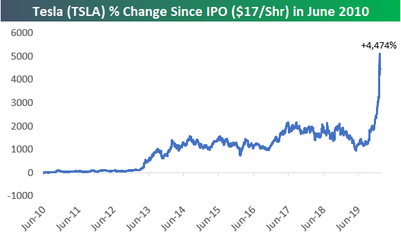
Below is a chart showing Tesla’s (TSLA) percentage change since it IPOd at $17/share back in June 2010. Investors who managed to get in at the IPO price (and have stayed in) are now sitting on a return of 4,474%. Start a two-week free trial to Bespoke Institutional to access our full range of research reports and interactive tools.
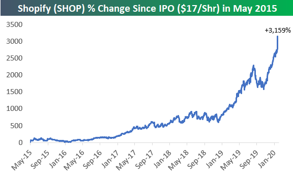
While it hasn’t gotten nearly the same amount of coverage as Tesla (TSLA), a company that’s headquartered in Canada is really giving Tesla a run for its money. As shown below, e-commerce company Shopify (SHOP) — which IPOd at the same $17 share price as TSLA in May 2015 — has returned 3,159% since it went public less than five years ago.
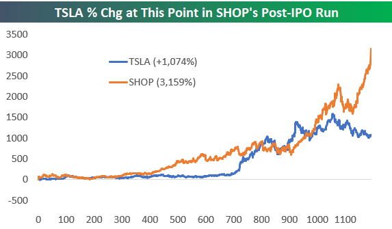
Below we show the percentage change for both Tesla (TSLA) and Shopify (SHOP) from their IPO price. While Tesla is currently in the lead by more than 1,000%, SHOP has done more in a shorter amount of time.

If we show where Tesla (TSLA) was trading at this point in SHOP’s lifespan as a public company, SHOP is the clear winner:
Even if we look at more recent returns, SHOP has quietly managed to keep up with TSLA. Since the start of 2019, SHOP is actually up 300% versus TSLA’s gain of 134%.

It’s only over the very near term that TSLA has been stronger. Even still, over the last three months, SHOP has put up a gain of 81% versus TSLA’s 122% gain.

As mentioned above, Tesla (TSLA) is up 4,472% since it IPOd on June 28th, 2010. We wanted to see which, if any, stocks had put up similar performance numbers over the same time frame.
Below is a look at the best-performing stocks in the Russell 3,000 since TSLA’s IPO. There are actually four stocks that have done better, with Paysign (PAYS) on top by a mile. Back in June 2010, PAYS was trading at $0.05/share, so its current price of $9.15 gives it a gain of more than 18,000% over this time frame. Patrick Industries (PATK), MMC Capital (MMAC), and LendingTree (TREE) are the three other stocks that have outperformed TSLA since its IPO date.
Some of the biggest companies to put up huge returns since TSLA’s IPO include NVIDIA (NVDA) with a gain of 2,338%, Netflix (NFLX) with a gain of 2,151%, and Amazon (AMZN) with a gain of 1,734%. Since it went public after TSLA, SHOP is not on the list, but with a market cap of over $60 billion, it’s hardly a small company. Other notable winners include names like ACADIA Pharma (ACAD), Domino’s Pizza (DPZ), MarketAxess (MKTX), Lithia Motors (LAD), Cheniere Energy (LNG), and Align Tech (ALGN). At Bespoke we offer a full suite of easy-to-use investor tools to go along with our market research. CLICK HERE to read more about these useful tools now.

Fixed Income Weekly – 2/12/20
Searching for ways to better understand the fixed income space or looking for actionable ideas in this asset class? Bespoke’s Fixed Income Weekly provides an update on rates and credit every Wednesday. We start off with a fresh piece of analysis driven by what’s in the headlines or driving the market in a given week. We then provide charts of how US Treasury futures and rates are trading, before moving on to a summary of recent fixed income ETF performance, short-term interest rates including money market funds, and a trade idea. We summarize changes and recent developments for a variety of yield curves (UST, bund, Eurodollar, US breakeven inflation and Bespoke’s Global Yield Curve) before finishing with a review of recent UST yield curve changes, spread changes for major credit products and international bonds, and 1 year return profiles for a cross section of the fixed income world.
In this week’s report we review the plunge in bond yields for Greece.

Our Fixed Income Weekly helps investors stay on top of fixed income markets and gain new perspective on the developments in interest rates. You can sign up for a Bespoke research trial below to see this week’s report and everything else Bespoke publishes free for the next two weeks!
Click here and start a 14-day free trial to Bespoke Institutional to see our newest Fixed Income Weekly now!
Bespoke’s Global Macro Dashboard — 2/12/20
Bespoke’s Global Macro Dashboard is a high-level summary of 22 major economies from around the world. For each country, we provide charts of local equity market prices, relative performance versus global equities, price to earnings ratios, dividend yields, economic growth, unemployment, retail sales and industrial production growth, inflation, money supply, spot FX performance versus the dollar, policy rate, and ten year local government bond yield interest rates. The report is intended as a tool for both reference and idea generation. It’s clients’ first stop for basic background info on how a given economy is performing, and what issues are driving the narrative for that economy. The dashboard helps you get up to speed on and keep track of the basics for the most important economies around the world, informing starting points for further research and risk management. It’s published weekly every Wednesday at the Bespoke Institutional membership level.
You can access our Global Macro Dashboard by starting a 14-day free trial to Bespoke Institutional now!

A Record Pace of Records
Let’s preface this with the fact that it’s still early in the year and the rest of the year is unlikely to closely follow the path we have seen so far, but the S&P 500 is currently on pace for its 11th record closing high this year. While we’re just 29 trading days into the year, in the post-WWII period, 2020 already ranks as the 33rd highest number of record closing highs for the S&P 500 in a given year (out of 76). What’s even more notable, though, is that at the current pace the S&P 500 would have 96 record closes this year, which would dwarf the total from every other year. For reference, the highest number of record closing highs in a given year was 77 in 1995, and there are only four other years (1961, 1964, 2014, and 2017) where there were more than 50 record closes. Start a two-week free trial to Bespoke Institutional to access our full range of research reports and interactive tools.

US Continues to Gain Share of World Market Cap
The United States dominates the rest of the world in terms of its share of total equity market capitalization. Currently, US stocks make up over 40% of global equities’ total market cap. No other country comes even close to this size with the next largest country being China with just 8.47% and then Japan with 7.09%. Hong Kong is the only other individual county with a share larger than 5%. While France is the largest European Union country stock market in terms of the percentage of world market cap at only 3%, the total share of all EU countries shown sits at over 10%. Former EU member, the United Kingdon, is also one of the larger countries but has consistently lost share over the past decade. So far this year it has lost another 0.2%.
One interesting change that we noted at the end of last year has been the massive increase in Saudi Arabia’s share thanks to one of the world’s largest companies, Saudi Aramco, hitting public markets. Although it has led to a massive jump over the long run, since the start of the year Saudi Arabia’s share of market cap has fallen 14 bps likely due to Saudi Aramco being a one-way trade lower off of its highs that were put in place only a few days after its IPO. Meanwhile, the US has taken another 1.17% of the world’s market cap in 2020 alone.

While there are several individual countries that are actually outperforming the US so far in 2020, generally speaking, the US has outperformed the rest of the world which is why the US has taken more market cap this year. Whereas the S&P 500 was up 3.93% YTD as of yesterday’s close, MSCI’s World Index excluding the US is just about flat. That trend of US outperformance has been in place for much of the past year well before the coronavirus hit Asia in December.

Another interesting country to note is China. 2020 has been off to a rocky start thanks to the coronavirus. This had sent the country’s share of global market cap plummeting down to ~8% on February 3rd. That was its lowest level since February of last year. But as this month has progressed and the situation surrounding the virus has improved, China has regained some of those losses and is now sitting with a larger share of world market cap than it ended 2019 with. Start a two-week free trial to Bespoke Institutional to access our full range of reports and interactive tools.

Bespoke’s Morning Lineup – 2/12/20 – Auto Pilot
See what’s driving market performance around the world in today’s Morning Lineup. Bespoke’s Morning Lineup is the best way to start your trading day. Read it now by starting a two-week free trial to Bespoke Premium. CLICK HERE to learn more and start your free trial.
For a recap of the latest on the coronavirus, trading in Asian and European markets, and a recap of the latest earnings and economic data out of Europe check out today’s Morning Lineup.

The S&P 500 closed at another record high yesterday, so we wanted to take this opportunity to provide an update on market breadth in terms of S&P 500 industry groups. As of yesterday’s close, 79.2% of the 24 groups were above their 50-DMA which isn’t an especially strong reading for a market at record highs. One caveat here, though, is that three of the five industry groups below their 50-DMA are within 1% of that level (Telecom Services, Banks, and Food & Staples Retail), so those three could easily top their 50-DMA with just one good market day. The only other two groups below their 50-DMAs are Energy and Autos which are both more than 5% below their respective levels.

The Closer – Term Structure Evolved, Dems Priced, Particulate, JOLTS, Debt – 2/11/20
Log-in here if you’re a member with access to the Closer.
Looking for deeper insight on markets? In tonight’s Closer sent to Bespoke Institutional clients, we take a look at the term structure of WTI futures and Democratic primary odds headed into tonight’s New Hampshire primary. Next, we delve into what pollution data out of China is indicating for activity in the country. Moving onto US economic data, we show the big drop in job openings and take an in-depth look into Q4 consumer debt growth.

See today’s post-market Closer and everything else Bespoke publishes by starting a 14-day free trial to Bespoke Institutional today!
Chinese Stocks Diverge Based on Market Cap
Just like in the US where large caps have been outperforming their smaller-cap peers recently, we’re seeing signs of the same trend playing out in the Chinese equity market as well; especially since the recent highs in January. For starters, though, it’s pretty amazing to think that China’s Shanghai Composite Index is down just 7% from its recent highs. With a large percentage of the country’s citizens virtually under house arrest and many businesses and factories across the country closed, a 7% decline seems like a walk in the park. Admittedly, those declines were a lot steeper at this time last week, but the magnitude of the bounce, even if it was aided by government stimulus, is impressive.

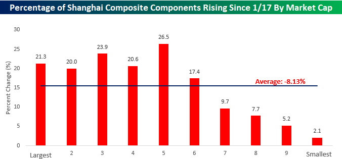
While the Shanghai Composite is down just 7%, the average stock in the index is down a full percentage point more at 8.13%. Looking at how stocks have performed based on market cap shows that there has been a clear relationship between size and performance. The chart below shows the average performance of the approximately 1,500 stocks in the Shanghai Composite Index since the close on 1/17 grouped by decile according to market cap. While the decile of the largest stocks in the Shanghai Composite is down less than 5%, the three deciles with the smallest components are all down 11% or more.

When looking at the percentage of stocks in each decile with positive returns since 1/17, it’s a similar picture as a higher percentage of larger components in the index have seen positive returns than their smaller peers. Whereas more than 21% of the Shanghai Composite Index’s components have had positive returns since 1/17, barely 2% of the Shanghai Composite’s smallest 150 components are positive during that span. Start a two-week free trial to Bespoke Institutional for full access to our highly sought market analysis and interactive investment tools.
Dividend Stock Spotlight: Calmer Waters Ahead for Carnival Cruise Lines (CCL)?
There are few groups that have gotten hit harder from the 2019-nCov virus than the major cruise lines like Carnival (CCL), Royal Caribbean Cruises (RCL), and Norwegian Cruise Line (NCLH). Each of these stocks put in place a recent high on January 17th but have fallen dramatically since then. In the immediate days following that date, the first US cases were confirmed, and the first travel restrictions and other precautionary measures like airport screenings began to be put in place. Since then, each of these three stocks has fallen by double-digit percentages with the biggest loser being CCL which at yesterday’s close was down 19.5% since 1/17 alone.
The reason for CCL’s outsized declines compared to its peers is in part due to the fact that it has already confirmed cases of the virus aboard one of its ships which may not come as that big of a surprise considering CCL has the largest fleet of these three companies; as such, it would naturally have a higher probability of being exposed to the virus.

Despite a reprieve today with the stock up over 3%, the recent declines for CCL come in the context of a much longer downtrend that has been in place since early 2018. Over the course of the past two years, the 200-day moving average has acted as stiff resistance for the stock with the only significant break above that level being a fake-out in September 2018. More recently, though, there has been another after a solid response to earnings in December sent CCL surging. CCL held above these levels, successfully retesting the 200-day and putting in a higher high over the next few weeks with the 50-DMA even catching up and crossing above the 200-DMA. That is until coronavirus fears sank the stock back below both moving averages creating an overall mixed technical picture. Now at very oversold levels, CCL has the potential to sail back up to last month’s highs if the worst of the coronavirus fears is behind us and the negative headlines subside. On the downside, any break below last year’s low just above $40 would negate any of the technical positives that CCL has achieved over the last several weeks.

Adding to the reasons CCL could see a rebound is its attractive valuation. CCL is the largest cruise liner stock by market cap ($25.8 billion) and fleet size (over 100 ships). Despite its size, compared to RCL and NCLH it has the lowest price-to-earnings, price-to-book, price-to-sales, and EV/EBITDA. As shown in the charts below, the P/E and P/S ratios are now around their lowest level of the past decade. Although it is not quite at the same extreme, the P/B ratio is similarly at the low end of the past decade’s range. Finally, CCL is also a very high yielder with a dividend yield of 4.8%. That is not only larger than those of the other cruise lines but is also the seventh-highest yield of the S&P 500’s Consumer Discretionary stocks. Carnival has consistently paid this dividend over the past ten years and appears capable of continuing to do so going forward given the payout ratio is remains healthy at just 46%. Start a two-week free trial to Bespoke Institutional to access the full range of research and interactive tools.

JOLTS Jolted
The December Job Openings and Labor Turnover Survey (JOLTS) from the BLS showed a sharp drop in the number of available jobs in the US economy. While economists were expecting total job openings of 6.925 million, the actual level of available jobs was just 6.423 million. That’s an enormous miss! Since economist forecasts for this report are available (~2012), the latest report was the biggest shortfall relative to expectations in the history of the survey. Not only that but December’s miss followed November’s report which was also much weaker than expected (6.80 mln vs 7.25 mln forecast), ranking as the third worst report relative to expectations in the history of the survey.
With back to back weak reports, the JOLTS has now seen its largest two-month decline on record (since 2001), and it’s not even close. Behind the current two-month decline of over 900K available jobs, the next largest was in September 2015 when the two-month decline was 697K. While there was no recession in 2015, there was major weakness in the Energy sector. Furthermore, the only three other times the JOLTS fell more than 500K in a two-month span all occurred during recessions. The most notable aspect of the weakness in the JOLTS report over the last two months, though, is how disconnected it is from just about every other employment-related report we have seen recently.

While there’s been a collapse in the number of available jobs in the US economy, we would note that there are still more available jobs than there are people looking for them. The chart below compares the monthly number of job openings to the number of US Americans who are unemployed and looking for work. Prior to 2018, there was never a time in the history of the JOLTS report when there were more job openings than there were unemployed Americans. That changed in January 2018 and has been the same ever since. While the spread has narrowed substantially from more than 1.5 million two months ago, there’s still a historic amount of tightness in the labor market even if the number of job openings has suddenly started to shrink. Start a two-week free trial to Bespoke Institutional for full access to our highly sought market analysis and interactive investment tools.
