Jun 30, 2016
We’ve just released our weekly Sector Snapshot report (see a sample here) for Bespoke Premium and Bespoke Institutional members. Please log-in here to view the report if you’re already a member. If you’re not yet a subscriber and would like to see the report, please start a 14-day trial to Bespoke Premium now.
Below is our trading range screen of the S&P 500 and its ten sectors. For each sector, the dot represents where it’s currently trading within its range, while the tail end represents where it was trading one week ago. Moves into the red zone are considered “overbought,” while moves into the green zone are considered “oversold.”
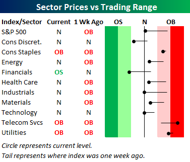
The black vertical “N” line in the screen represents each sector’s 50-day moving average. After the declines Friday and Tuesday, it’s hard to believe that the S&P 500 is trading just shy over overbought levels, and that Consumer Staples, Telecom Services, and Utilities are all extremely overbought.
To see our full Sector Snapshot with additional commentary plus six pages of charts that include analysis of valuations, breadth, technicals, and relative strength, start a 14-day free trial to our Bespoke Premium package now. Here’s a breakdown of the products you’ll receive.
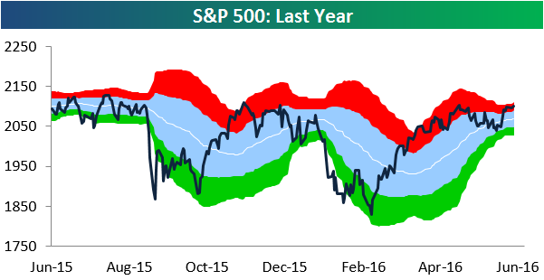
Jun 23, 2016
We’ve just released our weekly Sector Snapshot report (see a sample here) for Bespoke Premium and Bespoke Institutional members. Please log-in here to view the report if you’re already a member. If you’re not yet a subscriber and would like to see the report, please start a 14-day trial to Bespoke Premium now.
Below is our trading range screen of the S&P 500 and its ten sectors. For each sector, the dot represents where it’s currently trading within its range, while the tail end represents where it was trading one week ago. Moves into the red zone are considered “overbought,” while moves into the green zone are considered “oversold.”
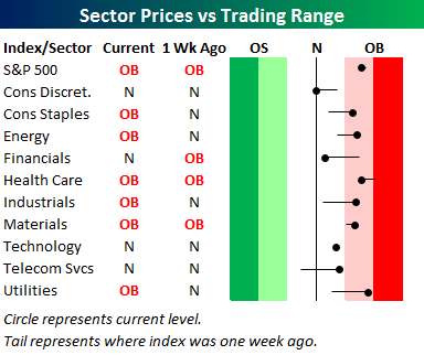
The black vertical “N” line in the screen represents each sector’s 50-day moving average. Solid gains today pushed the S&P and all ten of its sectors above their 50-day moving averages. That’s a healthy sign in our view.

Notably, even with the index trading slightly overbought from a price perspective, the S&P 500’s 10-day advance/decline line is slightly negative. That means underlying internals are far from overheated. This suggests that there’s still plenty of room to run on the upside if investors can just stay upbeat.
To see our full Sector Snapshot with additional commentary plus six pages of charts that include analysis of valuations, breadth, technicals, and relative strength, start a 14-day free trial to our Bespoke Premium package now. Here’s a breakdown of the products you’ll receive.

Jun 16, 2016
We’ve just released our weekly Sector Snapshot report (see a sample here) for Bespoke Premium and Bespoke Institutional members. Please log-in here to view the report if you’re already a member. If you’re not yet a subscriber and would like to see the report, please start a 14-day trial to Bespoke Premium now.
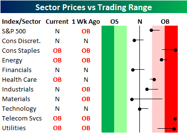
Below is our trading range screen of the S&P 500 and its ten sectors. For each sector, the dot represents where it’s currently trading within its range, while the tail end represents where it was trading one week ago. Moves into the red zone are considered “overbought,” while moves into the green zone are considered “oversold.” The S&P 500 slipped below its 50-day moving average this morning, but an afternoon rally left the index just above its 50-day by the close. The Industrials and Technology sectors are now sitting right on top of their 50-days as well. The only two sectors below their 50-days are Consumer Discretionary and Financials, while Utilities, Consumer Staples and Telecom are overbought.
To see our full Sector Snapshot with additional commentary plus six pages of charts that include analysis of valuations, breadth, technicals, and relative strength, start a 14-day free trial to our Bespoke Premium package now. Here’s a breakdown of the products you’ll receive.
Jun 9, 2016
We’ve just released our weekly Sector Snapshot report (see a sample here) for Bespoke Premium and Bespoke Institutional members. Please log-in here to view the report if you’re already a member. If you’re not yet a subscriber and would like to see the report, please start a 14-day trial to Bespoke Premium now.
Below is our trading range screen of the S&P 500 and its ten sectors. For each sector, the dot represents where it’s currently trading within its range, while the tail end represents where it was trading one week ago. Moves into the red zone are considered “overbought,” while moves into the green zone are considered “oversold.” While the S&P 500 has barely budged within its range over the last week, we’ve seen a lot of underlying sector movement. Consumer Staples, Energy, Industrials, Materials, Telecom and Utilities have all moved higher, while Consumer Discretionary, Financials, and Health Care have moved lower.
To see our full Sector Snapshot with additional commentary plus six pages of charts that include analysis of valuations, breadth, technicals, and relative strength, start a 14-day free trial to our Bespoke Premium package now. Here’s a breakdown of the products you’ll receive.
Jun 2, 2016
We’ve just released our weekly Sector Snapshot report (see a sample here) for Bespoke Premium and Bespoke Institutional members. Please log-in here to view the report if you’re already a member. If you’re not yet a subscriber and would like to see the report, please start a 14-day trial to Bespoke Premium now.
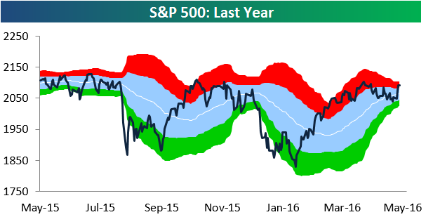
Below is our trading range chart for the S&P 500 that’s always included in the Sector Snapshot. The green area in the chart represents oversold territory for the index, while the red area represents overbought territory. The S&P 500 has basically traded sideways over the last week, and it remains slightly overbought. Due to the decrease in volatility and sideways action over the last two months, the S&P’s trading range has tightened significantly as well. Usually when this happens, the market is winding up for a big move either higher or lower!
To see our full Sector Snapshot with additional commentary plus six pages of charts that include analysis of valuations, breadth, technicals, and relative strength, start a 14-day free trial to our Bespoke Premium package now. Here’s a breakdown of the products you’ll receive.
May 26, 2016
We’ve just released our weekly Sector Snapshot report (see a sample here) for Bespoke Premium and Bespoke Institutional members. Please log-in here to view the report if you’re already a member. If you’re not yet a subscriber and would like to see the report, please start a 14-day trial to Bespoke Premium now.
Below is our trading range chart for the S&P 500 that’s always included in the Sector Snapshot. The green area in the chart represents oversold territory for the index, while the red area represents overbought territory. As you can see, the market trended right down to oversold territory last week but has bounced back into overbought territory as we approach the end of this week. Market bulls are now looking for the S&P to take out its 2016 high from April 20th and eventually its May 21st, 2015 all-time high. Both are less than 2% away from current levels.
To see our full Sector Snapshot with additional commentary plus six pages of charts that include analysis of valuations, breadth, technicals, and relative strength, start a 14-day free trial to our Bespoke Premium package now. Here’s a breakdown of the products you’ll receive.