We’ve just released our weekly Sector Snapshot report (see a sample here) for Bespoke Premium and Bespoke Institutional members. Please log-in here to view the report if you’re already a member. If you’re not yet a subscriber and would like to see the report, please start a 14-day trial to Bespoke Premium now.
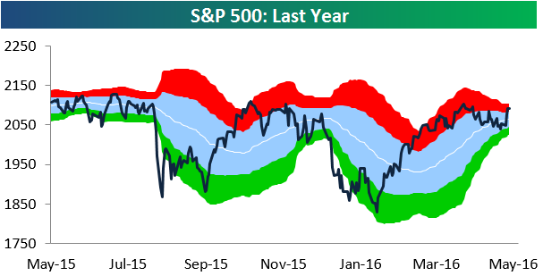
Below is our trading range chart for the S&P 500 that’s always included in the Sector Snapshot. The green area in the chart represents oversold territory for the index, while the red area represents overbought territory. As you can see, the market trended right down to oversold territory last week but has bounced back into overbought territory as we approach the end of this week. Market bulls are now looking for the S&P to take out its 2016 high from April 20th and eventually its May 21st, 2015 all-time high. Both are less than 2% away from current levels.
To see our full Sector Snapshot with additional commentary plus six pages of charts that include analysis of valuations, breadth, technicals, and relative strength, start a 14-day free trial to our Bespoke Premium package now. Here’s a breakdown of the products you’ll receive.