We’ve just released our weekly Sector Snapshot report (see a sample here) for Bespoke Premium and Bespoke Institutional members. Please log-in here to view the report if you’re already a member. If you’re not yet a subscriber and would like to see the report, please start a 14-day trial to Bespoke Premium now.
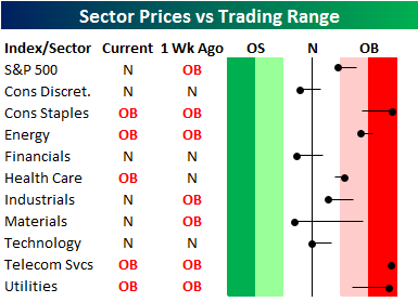
Below is our trading range screen of the S&P 500 and its ten sectors. For each sector, the dot represents where it’s currently trading within its range, while the tail end represents where it was trading one week ago. Moves into the red zone are considered “overbought,” while moves into the green zone are considered “oversold.”
The black vertical “N” line in the screen represents each sector’s 50-day moving average. After the declines Friday and Tuesday, it’s hard to believe that the S&P 500 is trading just shy over overbought levels, and that Consumer Staples, Telecom Services, and Utilities are all extremely overbought.
To see our full Sector Snapshot with additional commentary plus six pages of charts that include analysis of valuations, breadth, technicals, and relative strength, start a 14-day free trial to our Bespoke Premium package now. Here’s a breakdown of the products you’ll receive.
