We’ve just released our weekly Sector Snapshot report (see a sample here) for Bespoke Premium and Bespoke Institutional members. Please log-in here to view the report if you’re already a member. If you’re not yet a subscriber and would like to see the report, please start a 14-day trial to Bespoke Premium now.
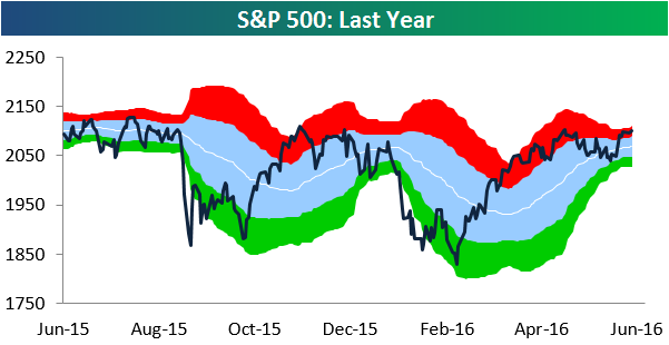
Below is our trading range chart for the S&P 500 that’s always included in the Sector Snapshot. The green area in the chart represents oversold territory for the index, while the red area represents overbought territory. The S&P 500 has basically traded sideways over the last week, and it remains slightly overbought. Due to the decrease in volatility and sideways action over the last two months, the S&P’s trading range has tightened significantly as well. Usually when this happens, the market is winding up for a big move either higher or lower!
To see our full Sector Snapshot with additional commentary plus six pages of charts that include analysis of valuations, breadth, technicals, and relative strength, start a 14-day free trial to our Bespoke Premium package now. Here’s a breakdown of the products you’ll receive.