Camping World (CWH) Saved by 2020
Along with a huge spike in Google search interest for boats and lawns, another HOT industry in the wake of COVID-19 appears to be camping. As shown below, Google searches for camping are at 5-year highs and holding pretty steady at this higher level over the last month or so.

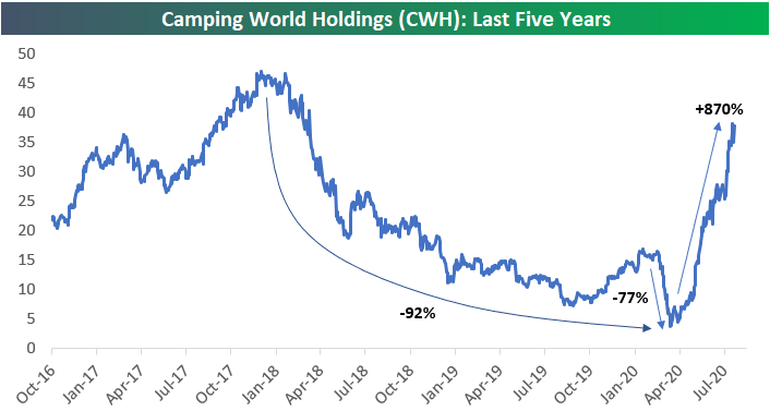
Obviously a beneficiary of a new camping boom would be a stock like Camping World Holdings (CWH). Prior to COVID, Camping World (CWH) appeared to be in pretty big trouble. Shareholders could not have been happy with the 92% decline seen from a high in the mid-$40s at the end of 2017 to $3.40/share when it bottomed in mid-March.
As shown below, since bottoming on March 18th, CWH is up more than 1,000% on an intraday basis and 870% on a closing basis.
What we find most interesting about CWH is how incorrect investors initially were in predicting the impact that COVID would have on the stock. During the COVID crash from mid-February to mid-March, CWH fell 77%. So much for “efficient” markets.
With the share price back into the high $30s from a low in the $3s in less than five months, we doubt there are a lot of major CWH shareholders crying about 2020 the way most others are! Click here to view Bespoke’s premium membership options for our best research available.
Uncertainty Remains in Texas
This morning the Dallas Fed updated its July reading on the manufacturing sector. Overall, the report was mixed showing conditions continue to deteriorate but at a slower rate than earlier this year while businesses remain cautiously optimistic. The reading on general conditions remains negative at -3.0, but that was up from -6.1 in June.
Although current conditions are still weak, companies do not appear to be overly worried about their own futures. While slightly lower this month, expectations for general business activity six months in the future remain positive and the reading for company outlook is likewise positive; rising another 3.2 points this month. This month’s survey also included some special supplemental questions including the following: “Given your current outlook, how likely is it that your business will permanently shut down within the next 12 months?”. To that question, 91.2% reported not likely. Of the remaining respondents, only 3.1% reported that permanent closure is very likely.


While most businesses are not expecting closures and have a generally more optimistic tone, it is perhaps more fitting to say they are cautiously optimistic. While a newer series only dating back to 2018, meaning there is not much history to compare to, the index for the uncertainty of company outlook did rise to 20.9 from 9.1 last month. Although off the highs of the past few months, it remains in the upper end of the range since this question began to be tracked. The commentary section backed this up with comments like: There is still a lot of uncertainty as COVID numbers surge, There are many more ‘what-ifs’ questions to be answered, and We feel uncertainty will remain.

Those results are echoed throughout other individual categories as well. In the table below, we break down the report by each of its components for both current conditions and the six-month outlook. Again, companies seem to be cautiously optimistic with every reading continuing to be positive but several categories falling in July. In terms of current conditions, every category with the exception of General Business Activity, Inventories, and Capital Expenditure are now positive and returning to more historically normal readings. Meanwhile, the indices for inventories and Prices Paid for Raw Materials were the only ones lower in July.

Similar to how the survey results for future outlook are actually a bit mixed, the same can be said for the indices measuring various labor market aspects. The index for employment and hours worked tipped positive in July indicating businesses are on net hiring and increasing hours.

As employment rises so too have wages and benefits, but growth in this area does remain muted. As shown below, while the index for Wages and Benefits is positive indicating companies plan to increase wages and benefits both in the immediate term and six months out, the reading remains lower than most other months over the past decade. In other words, businesses are bringing people back to work and are raising wages, but at a slower rate than pre-COVID. Click here to view Bespoke’s premium membership options for our best research available.
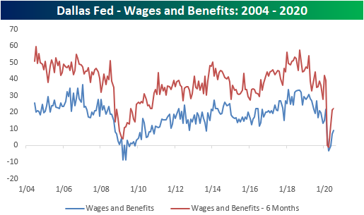
Chart of the Day – Summer Seasonality
Gold (GLD) Back to Outperforming
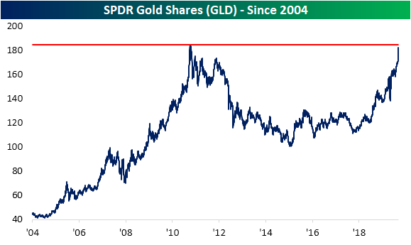
As the US Dollar has fallen, gold (GLD) has continued to surge. While front-month gold futures are on pace for a seventh straight day of gains and are now at a record high, surpassing the high of $1,920.70 from September 2011, the SPDR Gold Shares (GLD) still has a bit further to go. GLD has traded around $182 this morning, which is about 1.4% away from its September 2011 highs as shown below.
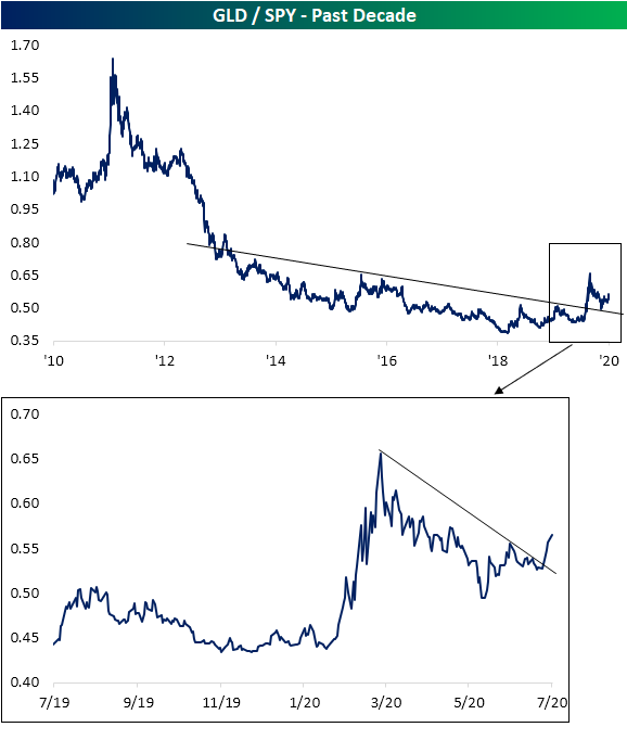
As we have frequently noted recently, precious metals have been some of the strongest performing assets in 2020 even outperforming equities. In the chart below, we show the ratio of GLD to the S&P 500 (SPY). As shown, over the past decade there have only been a handful of brief periods in which gold has outperformed. That is, up until now, none of those periods have been particularly long-lasting or have resulted in a significant breakout above the past decade’s downtrend line. In the initial months of the equity market rally off the March 23rd low, that outperformance of gold subsided as equities surged. But in the past several days, gold outperformance has begun to break out once again.
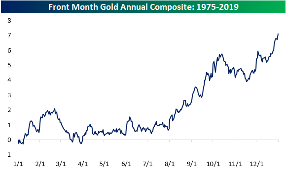
This recent strength comes leading up to what has historically been the stronger half of the year for the yellow metal. In the chart below, we show the average year to date performance of gold across all years since 1975. As shown, from the start of August through October has been the time of the year that gold has tended to see its largest gains. While performance has tended to subside in October, gold has picked back up in the final months of the year. Click here to view Bespoke’s premium membership options for our best research available.
Bespoke’s Morning Lineup – 7/27/20 – The Golden Days
See what’s driving market performance around the world in today’s Morning Lineup. Bespoke’s Morning Lineup is the best way to start your trading day. Read it now by starting a two-week free trial to Bespoke Premium. CLICK HERE to learn more and start your free trial.
Get ready for a busy week of economic, earnings, political, and Federal Reserve news. Futures are indicated higher to start to the week on little in the way of a concrete catalyst, but gold is surging as the dollar continues its decline.
Be sure to check out today’s Morning Lineup for a rundown of the latest stock-specific news of note, key earnings news in Europe and the US, global economic data, trends related to the COVID-19 outbreak, including some new charts tracking the outbreak, and much more.

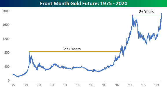
OK. There’s a lot not to like about the world around us right now, whether it be from a societal, health, or economic perspective. While there are also plenty of silver linings, it’s not likely we’ll ever be looking back at this period as a ‘golden’ year. That doesn’t mean gold can’t shine, though. Prices are surging to kick off the week and appear locked and loaded on an eventual run to $2,000 per ounce as the precious metal is on pace for its 7th straight day of gains.

Longer-term, today’s rally has also pushed gold to new record highs eclipsing the prior record high of $1920.7 from September 2011. With a gap of nearly nine years since its last record high, it may seem like a long time since gold last made a new high, the prior gap was much longer. After topping $800 per ounce in early 1980, gold then went more than 25 years without making another new high. Talk about a drought!
Bespoke Brunch Reads: 7/26/20
Welcome to Bespoke Brunch Reads — a linkfest of the favorite things we read over the past week. The links are mostly market related, but there are some other interesting subjects covered as well. We hope you enjoy the food for thought as a supplement to the research we provide you during the week.
While you’re here, join Bespoke Premium with a 30-day free trial!
Remote Work
Companies Start to Think Remote Work Isn’t So Great After All by Chip Cutter (WSJ)
As the great experiment in working from home moves forward, some of the longer-term costs of giving up office space are starting to emerge after companies noticed immediate benefits up front. [Link; paywall]
When Work Goes Remote by Adam Ozimek (UpWork)
Global freelancing platform Upwork identifies large gaps between high cost metros and the rest of the country, creating a huge opportunity for higher real wages from remote work, as well as lower costs for employers. [Link; 13 page PDF]
New York
Wall Street Firms Consider Moving Jobs from NYC, Study Says by Henry Goldman (Bloomberg)
One in four firms in New York’s financial and professional-services industries intend to reduce their headcount footprint by at least 20%, with 16% expecting to move jobs out of the city. [Link; soft paywall]
NYC is now the worst place to do business, retailers say by Lisa Fickenscher (NY Post)
National retailers report a slower bounce in New York than the rest of the country, driven by fewer tourists and commuters in Manhattan; while locals are out and about, travel and commutes are being shirked aggressively. [Link]
Dystopia
How corporations are buying up houses — robbing families of the American Dream by Larry Getlen (NY Post)
Corporations bought one out of every ten suburban homes that traded hands in 2018, putting pressure on affordability around the country. Buyers are snapping up anything that costs less than it would to rebuild. [Link]
Yelp says more than half of restaurants temporarily closed are now permanently shuttered by Sasha Lekach (Mashable)
Less than a quarter of restaurants which were closed on Yelp back in March were permanently shuttered. That number is over 50% today. [Link]
Markets
Goldman Spots A Historic Inversion In The Market (ZeroHedge)
A recent report from Goldman Sachs showed that the daily notional value of single-stock options traded exceeded the daily value of actual stocks traded. We should note that notional value is always much higher in dollar terms than the direct exposure (delta) to the underlying stocks in dollar terms. Still, this is an unprecedented inversion. Goldman also identifies an extreme tilt towards very short-term options focused on calls. [Link]
Everyone’s a Day Trader Now by Michael Wursthorn, Mischa Frankl-Duval and Gregory Zuckerman (WSJ)
Exploding brokerage account openings, higher volatility, and an expanded universe of equity market investors are driving the stampede into stocks by every day people. [Link; paywall]
BlackRock Quant Sees Stock Valuation a Mystery Not Worth Solving by Justina Lee (Bloomberg)
The senior quantitative analyst at BlackRock argues that valuation based on traditional metrics is no longer worthwhile, and argues alternative data is a better source of signals for how stocks will move. [Link; soft paywall]
Economics
How Do Restrictions on High-Skilled Immigration Affect Offshoring? Evidence from the H-1B Program by Britta Glennon (NBER)
The author finds that restricting access to H-1B visas force multinational firms to increase the number of employees and their use, with Canada, India, and China specifically benefitting. In other words, restricting H-1B visas does not raise American employment but employment in other countries. [Link]
Gambling
Michigan man used phony faces to steal over $100G at casinos, feds say by Caitlin McFall (Fox News/NY Post)
A Michigan man used faked drivers licenses to pose as elderly customers of casinos, taking out cash advances using the casino’s customer loyalty program kiosks to get access to the cash. [Link]
Deep Dive: Stacking in Season-Long Fantasy by Mike Leone (Establish The Run)
“Stacking” fantasy lineups to include both high-performance quarterbacks and the players which catch their passes tend to create edge over the course of a full season. [Link]
On The Lighter Side
Pentagon Has ‘Off-World Vehicles Not Made on This Earth’ by Andrew Daniels (Popular Mechanics/Yahoo!)
The agency that tracks UFO sightings for the Pentagon has been instructed to submit a report to Congress detailing what they know about “unidentified aerial phenomena”. [Link]
Dog Influencers Take Over Instagram After Pandemic Puppy Boom by Tracy Alloway (Bloomberg)
With a surge in dog adoptions and purchases thanks to COVID, Instagram has becoming a booming venue (as well as big business venture) for the canine influencers of the world. [Link; soft paywall]
Read Bespoke’s most actionable market research by joining Bespoke Premium today! Get started here.
Have a great weekend!
The Bespoke Report – Acting Up
This week’s Bespoke Report newsletter is now available for members.
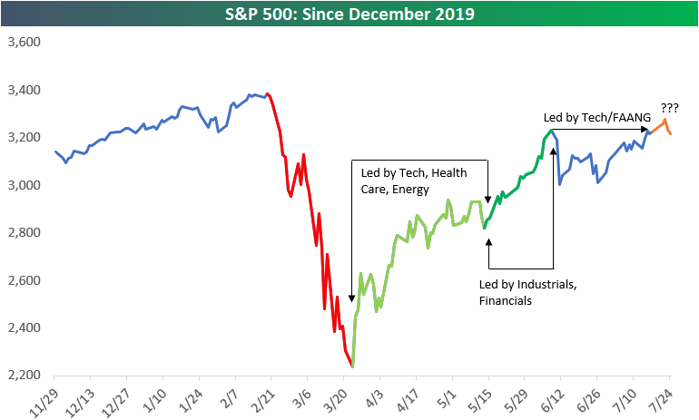
In our Bespoke Report from two weeks ago, we broke the bull market rally off the March lows into three acts, each of which had different leadership characteristics. With the S&P 500 eclipsing its 6/8 high this past Monday, we have provided an update to the three act chart below, and now wonder if we are in the beginning of Act IV.
To summarize each of the acts so far:
Act I spanned 3/23 through 5/13 and was led by Tech and stay at home names which were either the least impacted or even benefitted from the economic shutdown and stay at home orders. Health Care stocks benefitted given the race for a vaccine and treatments, while bombed out Energy stocks bounced.
Act II spanned nearly a month beginning on 5/13 through 6/8. During this phase of the rally, the re-opening stocks rallied along with cyclicals in the Industrials sector as well as Financials as it became clear that the first wave of the Covid outbreak was ebbing.
Act III began in early June as signs emerged that the south and southwest was starting to flare up. As re-openings were rolled back, investors rotated back into tech, work from home, and FANG stocks.
That leaves us where we are now. With the S&P 500 reaching new post-Covid highs this week (before pulling back on Friday), is this the beginning of a new act, and if so, which areas will lead the market going forward? In this week’s Bespoke Report, we break down the latest trends regarding Covid, the market, earnings, and the economy in order to help answer that question. To read the report and access everything else Bespoke’s research platform has to offer, start a two-week free trial to one of our three membership levels. You won’t be disappointed!

Daily Sector Snapshot — 7/24/20
Baseball and Betting Are Back
Baseball is back with the first official games of the MLB season taking place last night and today. Next week, the NBA is also set to resume its season on Thursday. With the return of the biggest sports leagues, sports betting is also back. As shown in the chart below, Google searches for “sports betting” have surged the past couple of weeks. In fact, it has reached the highest level since New Jersey legalized sports betting in 2018. While that one time spike is likely to subside eventually, it is showing a massive interest/pent up demand for sports betting. Additionally, one factor to note of the data is it is highly seasonal with spikes each year in early September which coincides with the start of the NFL season. Time will tell if COVID shutdowns carry through to the NFL season, disrupting that usual pattern.

While many gambling-related stocks remain beaten down, one stock that is likely to benefit from this surge in interest is online sportsbook DraftKings (DKNG). The stock hit the market just about a year ago and it has truly taken off in 2020. As shown below, at its highs a few months ago, DKNG was up more than 300% YTD. While currently off those highs, it has been gaining steam again in the second half of July. Click here to view Bespoke’s premium membership options for our best research available.

Biggest Companies Reporting Earnings Next Week
The earnings slate continues to ramp up next week with 712 total companies scheduled to report. In the table below, we show the largest stocks by market cap that are set to report quarterly results. On Monday, there will be no company with a market cap above $100 billion reporting with the largest companies being Alexandria Real Estate (ARE) and multiple banks. On Tuesday, payment processor Visa (V) will be out with earnings in addition to Pfizer (PFE), Amgen (AMGN), McDonald’s (MCD), and Raytheon (RTX). Visa has historically averaged the strongest stock price reaction to earnings of these names but it has gapped down for six straight quarters. That will be followed by another payment processor, Paypal (PYPL) on Wednesday. In addition to Paypal, Facebook (FB) is also scheduled to report that same day. While both stocks have averaged over 2% gains on earnings days historically, ServiceNow (NOW) has seen an even stronger performance with an average gain of 3.64%. Another major earnings report that will be widely watched is Boeing (BA) to get a gauge on how demolished travel demand has affected the company. On Thursday, three of the world’s largest stocks will also be out with earnings: Apple (AAPL), Amazon (AMZN), and Alphabet (GOOG). Each one has averaged a 1%+ gain on earnings days. Apple (AAPL) has seen some of the strongest results in recent history with last quarter snapping a streak of four consecutive triple plays. On Friday, two of the largest energy stocks, Chevron (CVX) and Exxon Mobil (XOM), will round out the week and July’s earning calendar. Both stocks have historically averaged declines on earnings days. Click here to view Bespoke’s premium membership options for our best research available.
