Chart of the Day: Drawdowns During Bounces
Stabilized Sentiment
This week’s readings on sentiment through the American Association of Individual Investors‘ weekly survey was little changed following choppy price action over the past week. Bullish sentiment fell just 0.23 percentage points to 24.14% marking a second straight week with less than a quarter of respondents reporting as bullish and the lowest reading since May 14th’s 23.31%. That small drop this week on top of the declines the prior two weeks also marks the first back to back to back declines in bullish sentiment since the three weeks ending January 9th. That’s right, not even during the bear market did bullish sentiment fall for three consecutive weeks. While there may not have been another period since January with consistent declines like the current stretch, there were other three week spans with larger declines. From April 16th to May 5th there was an 11.19 percentage point decline and from February 20th to March 12th there was a 10.86 percentage point decline compared to the current 10.41 percentage point decline from the June 4th high to today.

Likewise, neutral sentiment moved slightly lower falling from 27.85% to 26.96%.

Meanwhile, bearish sentiment remains the predominant position among survey respondents, rising for a second straight week to 48.9%. Like bullish sentiment, this week did not see a particularly large move with the bearish camp only rising 1.12 percentage points. The current reading is now the highest since May 14th when more than half of respondents reported as bearish.

That has sent the bull-bear spread further into negative territory. Now at -24.76, the bull-bear spread is now at its widest level in favor of bears since May 14th.

While AAII’s survey holds a bearish bias at the moment, the Investors Intelligence survey is much more bullish. Bullish sentiment in this survey rose from 54.9% last week to 57.3% this week which is the highest level since January 22nd. That is also at the upper end of the past decade’s range in the 86th percentile. Bearish sentiment on the other hand fell for a 13th straight week which is its longest stretch of consecutive declines since at least 1997. Now at 18.4%, bearish sentiment is at its lowest level since January 22nd. Click here to view Bespoke’s premium membership options for our best research available.

Continuing Claims Back Below 20 Million
For a record 12th straight week, jobless claims declined this week. While they’re moving in the right direction, over those same 12 weeks, claims have actually exceeded consensus forecasts nine times. Seasonally adjusted claims totaled 1.48 million which was down 60K from a revised 1.54 million last week (the original release was 1.508 million). While that 60K decline was larger than the 26K decline the previous week, the rate of improvement in jobless claims remains toned down from what was observed over the past few months.

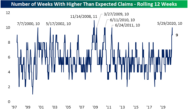
As previously mentioned, jobless claims have been consistently coming in above estimates. In the three months that jobless claims have declined, there have only been three weeks (April 10th, April 17th, and June 5th) that claims have come in better than expectations. In the chart below, we show the count of weeks in rolling a 12-week span that claims were above forecasts. The current reading of 9 weeks is actually just off the recent peak of 10 weeks thanks to the recent beat on June 5th. Prior to that, at the end of May, 10 of the 12 weeks had seen claims miss estimates. Before that, you would have to go all the way back to 2011 a stretch of weaker than expected reports that were this weak. The weakest 3-month span relative to estimates was back in the 12 weeks ending November 14th, 2008 when claims had missed estimates for 11 of 12 weeks.
To put it briefly, while any drop in jobless claims is welcomed and that has been observed over the past three months, claims have seemed to have hit a bit of a plateau in terms of improvement. Non-seasonally adjusted claims embody that dynamic of shrinking improvements. Non-seasonally adjusted claims only fell by 6K to 1.457 million this week. That 6K decline was actually the smallest weekly move in absolute terms since a 5.1K decline back in early February- back before the surges of the COVID era.

Unlike initial claims, continuing claims actually beat estimates this week falling below 20 million for the first time since mid-April. Continuing claims have now fallen for four of the past five weeks since the peak of 24.912 million claims on May 8th. Also unlike initial claims, this was actually a larger improvement than what has been observed in recent weeks. The first reading after the aforementioned peak in claims was the largest one week drop on record totaling 4.071 million claims. This week’s 767K decline to 19.522 million continuing claims was the second-largest on record. It was also more than double the prior week’s decline. Granted, even with those improvements more than a tenth of the US workforce is currently unemployed. Click here to view Bespoke’s premium membership options for our best research available.

Bespoke’s Morning Lineup – 6/25/20 – No Bounce Yet
See what’s driving market performance around the world in today’s Morning Lineup. Bespoke’s Morning Lineup is the best way to start your trading day. Read it now by starting a two-week free trial to Bespoke Premium. CLICK HERE to learn more and start your free trial.
Optimism is hard to come by this morning as COVID case numbers are moving in the wrong direction across most of the country. Also, an announcement from Disney that it would delay the re-opening of its California theme park throws the whole timetable of the economic reopening into question.
Jobless claims were just released, and while initial claims fell for a record 12th straight week, they were higher than expected. In the last 12 weeks that claims have declined, they have come in higher than expected nine times! Continuing claims, however, were a bit more positive as they dropped below 20 million for the first time since mid-April. Who would have ever thought that a sub-20 million number would be a good thing? The reaction in the futures market to all this data was negative at first but as we type, they have been quickly recovering. Stay tuned.
Be sure to check out today’s Morning Lineup for a rundown of the latest stock-specific news of note, European markets and data, global and national trends related to the COVID-19 outbreak, and much more.

Yesterday was the 20th day since the February peak that the S&P 500 was down 2%+ in a single day. In terms of percentages, that’s 22.22% of all trading days during that period. The table below highlights each of the prior occurrences during that span along with the S&P 500’s performance the following day and week. In recent history at least, the S&P 500 has had a positive bias following these occurrences with an average gain of 1.28% (median: +0.58%) and gains 63% of the time. Over the following week, the average change is not as positive with an average decline of 0.47% (median: +0.57%) and gains just barely half of the time.
One thing to note, though, is that the tide really started to shift after St. Patrick’s Day (3/17). Since then, the S&P 500 has been up the day after a 2% decline eight out of ten times and up the following week nine out of ten times. Before 3/17, the trend was overwhelmingly negative. It’s still early, but hopefully, the bulls’ luck hasn’t run out.

Daily Sector Snapshot — 6/24/20
B.I.G. Tips – Mortgage Purchases Snap Their Streak
Chart of the Day – Years Like 2020
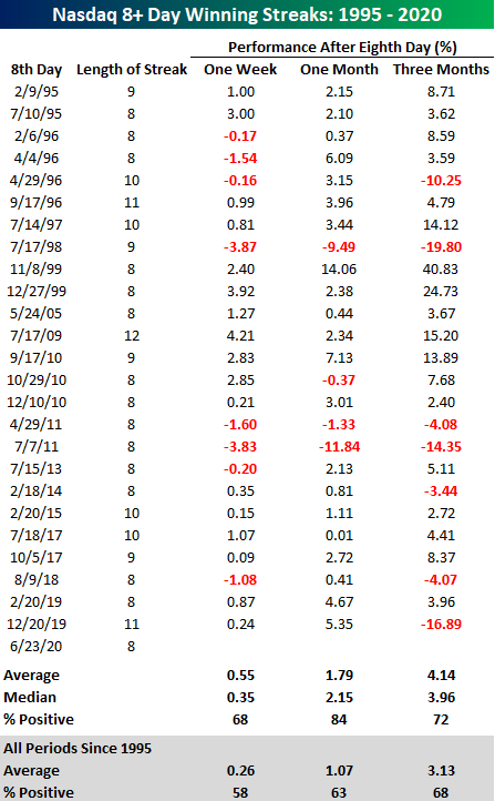
Eight Was Enough
After eight straight days of gains, the Nasdaq looks like it’s ready for a breather today as the index is down over 1%. The current streak represented the longest string of back to back gains for the Nasdaq of 2020 and the longest streak since the 11-day streak that came to an end last December. Throughout the Nasdaq’s history going back to 1971, there have been over 80 streaks of at least eight trading days, but since the tech boom really took off in the late 1990s, these streaks haven’t been as frequent with just 26 now since 1995.

Once a winning streak of eight or more days comes to an end, one would think that short-term returns going forward would be below average. However, looking back at how the Nasdaq performed following prior eight-day winning streaks, more often than not, the index has actually tended to have better than average short-term forward performance. In the week that followed these prior streaks, the Nasdaq averaged a gain of 0.55 (median: 0.35%) with positive returns 68% of the time. One month later, the average gain increased to 1.79% (median: 2.15%) with positive returns 84% of the time. Three months later, the effect of an eight-day winning streak probably didn’t mean much, but even here the Nasdaq averaged a gain of 4.14% (median: 3.96%) with gains 72% of the time. What’s notable about all of these performance numbers is that they are all better and more consistent to the upside than the Nasdaq’s historical average one week, one month, and three-month returns. Today’s performance is ending the Nasdaq’s winning streak with a thud, but history shows that prior streaks have typically been part of longer periods of outperformance.
One item worth noting about today’s decline for the Nasdaq, though, is that with a decline of over 2%, the only other time where an eight-day winning streak ended with a decline of more than 2% was back in July 1986. Like What you see? Click here to view all of Bespoke’s membership options for access to the best research available.
Tech Overbought for Over 50% of the New Bull Market
Most sectors have drifted lower in the past week with defensives like Real Estate and Utilities having taken it on the chin the most down 4% and 3.16%, respectively. The move has brought the Utilities sector back below its 50-day moving average. At the moment, it is the only sector below its 50-DMA. On the other hand, Technology and Communication Services stocks have continued to press higher up 2.35% and 1.05% in the past week respectively. Now the Tech sector is over 10% above its 50-DMA and is easily the most overbought sector. Alongside Tech, Communication Services and Consumer Discretionary are the only other sectors that are currently overbought. Most of the other sectors were overbought within the past week but recent declines have left them in neutral territory.

As shown in the trading range charts from our Daily Sector Snapshot below, the majority of sectors have been consistently trading in overbought territory over the past couple of months. Before declines in the past few weeks, some of these had even traded at over 2 standard deviations above their 50-DMAs. With most having since returned to neutral territory, they broadly remain off their highs, though, Consumer Discretionary and Technology are trading around fresh 52 week highs.

As previously mentioned, Communication Services, Consumer Discretionary, and Technology are still overbought and that should not come as a surprise. These three sectors have consistently been overbought in the three months since the bear market low on March 23rd as shown in the charts above and below. Since that low, Technology has been overbought more than 50% of trading days and both Communication Services and Consumer Discretionary have been overbought for 47.06% of days. Given these three sectors account for just under half of the weight of the whole S&P 500, the broader index has not been far behind trading overbought for 38% of days since 3/23. Looking at the other end of the spectrum, Consumer Staples has been overbought the least at only 7.35% of days. Other groups that were stronger during the bear market but have since seen performance wane like Health Care and Utilities also have been overbought far less frequently. Click here to view Bespoke’s premium membership options for our best research available.

Nasdaq 100 to S&P 500 Ratio Nears Record
The ratio of the Nasdaq 100 to the S&P 500 rose to 3.26 as of yesterday’s close. As shown below, this is as high as the ratio has been since the peak of the Dot Com Bubble back in early 2000. In fact, there have only been two trading days in the history of the Nasdaq that have seen a higher ratio — March 9th and March 10th of the year 2000. March 10th, 2000 turned out to be the peak for the Nasdaq at the very top of the Dot Com Boom. The index would go on to fall 66% over the next two years. Click here to view Bespoke’s premium membership options for our best research available.

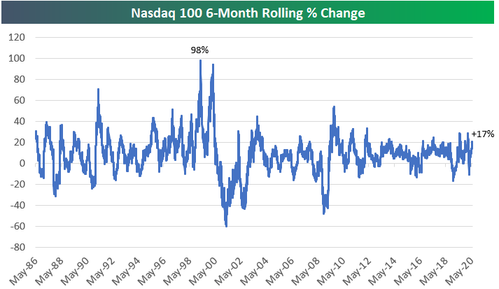
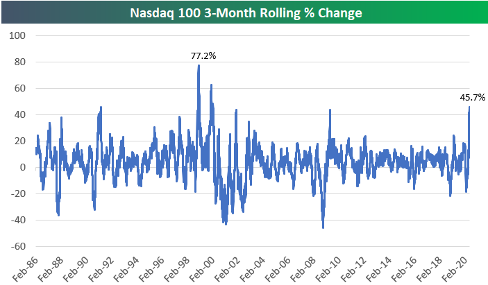
There has of course been a lot of discussion recently about the Nasdaq’s huge run higher since late March. We are now exactly three months past the low point of the COVID Crash on March 23rd, and as shown below, the Nasdaq 100 is up 45.7% since then. This three-month period has been the strongest run the Nasdaq 100 has experienced since the Dot Com Boom of the late 1990s.
While a 45.7% three-month gain is definitely huge, there were stronger three-month periods in 1999 and early 2000. On January 20th, 2000, the rolling 3-month return hit 62.63% for the Nasdaq 100, while on January 11th, 1999, the reading was +77.2%!
One important difference between the recent three-month run for the Nasdaq 100 and the runs experienced in the late 1990s is the level of the index at the start of the rally. Prior to the current 45% rally, the Nasdaq had fallen 20% over the prior three months. This leaves the index up 17% over the past six months. That’s still a strong six-month gain, but it doesn’t even register as an outlier when looking at the six-month rolling performance chart below. During the late 1990s, there were two six-month periods that each saw gains of nearly 100%.