Stocks for the COVID Economy — 7/8/20
Gold Cup
The gold ETF (GLD) has gone through a nine-year drought from new all-time highs, but as it gets closer to its prior highs from September 2011, there are three possible upcoming technical set-ups. The first would be a massive multi-year “cup and handle” pattern. You can see the “cup” that has been forming over the last nine years. For the “handle” to form, GLD would need to go into a sideways consolidation phase from here for a bit. Once that consolidation phase occurs, the pattern would suggest a significant leg higher over potentially years (rather than months).
The second — and more negative — setup would be a bearish “double top.” This would happen if GLD gets right up to its highs from September 2011 and fails to break through that resistance
Finally, the third setup would simply be a breakout higher from here. GLD could simply continue moving higher and break right through resistance at its 2011 high.
Regardless of what happens, the “cup” that has been forming for nearly a decade now is something you don’t see often. It will be interesting to watch this pattern from a technical perspective over the next few months. Keep an eye on it! Click here to view Bespoke’s premium membership options for our best research available.

China Stock Market Surge — You Ain’t Seen Nothin’ Yet
Today marked the 7th straight day of gains for China’s Shanghai Composite, and as shown below, the index has now exploded above prior highs over the past year.

Over the last 20 trading days, China’s Shanghai Composite is up 15.9%. While that may seem like a lot, it hardly registers as one of the bigger 20-day moves for Chinese stocks over the past 25 years. China’s Shanghai Composite Index has had prior 20 trading day moves of more than 30% multiple times. For Chinese investors, the recent move has been nice, but they may still be thinking “you ain’t seen nothin’ yet.” Click here to view Bespoke’s premium membership options for our best research available.

Record Low Mortgage Rates; Highest Purchases Since 2009
Over the course of the past couple of years, the national average for a 30 year fixed rate mortgage has been on the decline with the only significant spike higher being a temporary one in March of this year. By April, the national average had fallen back to levels prior to the spike, and beginning in June mortgage rates began accelerating to the downside. Just yesterday, the national average was 3.21% which is the lowest level since at least 1998.

As a result of those affordable rates, purchases have continued to surge. Despite the back to back weekly declines over the past two weeks—snapping a record streak of increases in purchase applications at nine consecutive weeks long and the first back to back declines since April—MBA’s purchase index came roaring back this week rising 5.34% WoW. That brings the index to its highest level since the first week of January 2009. This week’s increase was also the largest WoW gain since the week of May 22nd.
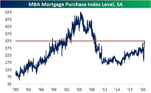
On a non-seasonally adjusted basis, purchase applications were actually lower on the week, but that does not mean that they were not strong. As shown in the chart below, on a non-seasonally adjusted basis, as could be expected due to seasonal trends, purchases remain below their peak from the second week of June of this year but are also still well above any readings for the current week of the year over the past decade.
Taking the Fourth of July holiday into account, this week’s reading was perhaps even more impressive. Purchases typically experience a sharp drop during the week of July 4th. In the past decade, the index has declined an average of 37 points during the Fourth of July holiday week, but this year, the decline was just half of that with the NSA index only falling 18 points. In other words, seasonal trends around the holiday appeared to have been softer than normal this year.

With this week’s strength, there is another positive that comes from this morning’s release. Over the past several weeks’ we have noted that despite strength in purchases later than seasonally normal, damage from earlier in the year had left purchases down on a year to date basis versus last year. That changed this week. With a stronger than normal July 4th week, average purchase apps YTD through the first 27 weeks of the year are now actually the highest of the past decade. Click here to view Bespoke’s premium membership options for our best research available.

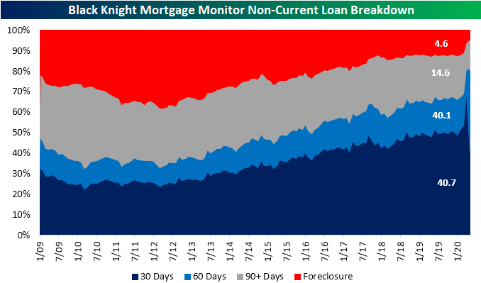
Seriously Delinquent Mortgages Surge
In an earlier post, we highlighted the continued strength of MBA’s weekly reading on mortgage purchases. But another indicator released earlier this week, Black Knight’s Mortgage Monitor, is painting a weaker picture of the US housing market as 4.3 million of all loans are late or in foreclosure. In their release of May data on Monday, the company reported 7.76% of all mortgage loans are now delinquent. That is up from 6.45% in April and the second-largest monthly increase on record behind the 3.1 percentage point increase from March to April of this year. The delinquency rate is now at its highest level since December of 2011.

Of the 4.3 million loans that are delinquent, 200K have moved into foreclosure. As shown below, that leaves both the foreclosure rate and the number of new foreclosures at record lows. While that would normally be a sign of strength, as we have highlighted in the past, foreclosures are low because there has been a moratorium on them. That trend is likely to continue at least for the next couple of months as the FHFA recently extended foreclosure and eviction moratoriums through the end of August from the end of June.

Breaking down non-current loans based on the severity of their delinquency offers some interesting insights. In May, 40.7% (1.75 million) of all non-current loans were delinquent by 30 days. That was down significantly from 69.5% (2.5 million) of all non-current loans the prior month. But the share of non-current loans that are more seriously delinquent (by 60 or 90+ days) rose meaning many delinquent loans remain late on a payment. The number of loans delinquent by 60+ days roughly quadrupled from 427K in April to 1.734 million in May. In total, more than 40% of non-current loans are delinquent by at least 60 days. Loans even more seriously delinquent (90 days) also rose in May to 631K, which works out to 14.6% of all non-current loans and up from 12.8% in April.
Overall, while the number of non-current loans is up, newly delinquent loans as a percentage of total delinquencies declined due to the fact that many borrowers who had previously failed to make payments continued to be delinquent on their loans. Additionally, although there was not a major uptick in new delinquencies in May, that could change in the next few months as forbearances come to an end. In the report, Black Knight noted the schedule for forbearances, and holding constant any extensions, nearly half of all forbearances were set to expire in June with another quarter ending in July. Click here to view Bespoke’s premium membership options for our best research available.
Bespoke CNBC Appearance (7/8)
Bespoke co-founder Paul Hickey appeared on CNBC’s Closing Bell on Tuesday to discuss a number of topics including the massive run in Tesla (TSLA). To view the segment, please click on the image below.

The chart below was highlighted in the segment, and it shows Tesla’s performance since its IPO in June 2010. In the chart, each label on the y-axis indicates a doubling of Tesla’s share price. What’s pretty amazing about the ten years that Tesla has been public is that the vast majority of its gains have been confined to two separate six-month windows – the six-month period from April through September 2013 and the last six months. In fact, keeping all things equal, if you were to back out out TSLA’s performance in these two periods, instead of trading just under $1,400 per share right now, Tesla would be under $90 per share. Talk about a lot happening in a little bit of time! Like what you see? Click here to start a two-week free trial for full access to all of our research and market commentary.
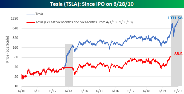
Chart of the Day – Economic Indicator Diffusion Index Modestly Positive
The Definancialization of US Equities
The huge underperformance for banks so far this year has helped the S&P 500 Financials sector see its share of weighting in that broad index continue to collapse. From just shy of one-quarter of market cap in the mid-2000s to the mid-teens share most of the past decade, the S&P is now to a large extent “definancialized” as the share of its market cap accounted for by financial sector stocks is about as low as it has gotten in the past forty five years. Longer-term, there’s precedent for further declines, though. As shown in the chart below, Financials were less than 5% of the index back in the 1940s. While we aren’t predicting a return to that level, it can’t be outside the range of possibility given the collapse in Financials’ share over the past few years. We’ve already seen the Energy sector’s weighting fall from 15% or so in the mid-2000s down to <3% as well. We discussed this chart and other retail enthusiasm indicators in last night’s Closer report, which is available to Bespoke Institutional members. Click here to start a two-week free trial.

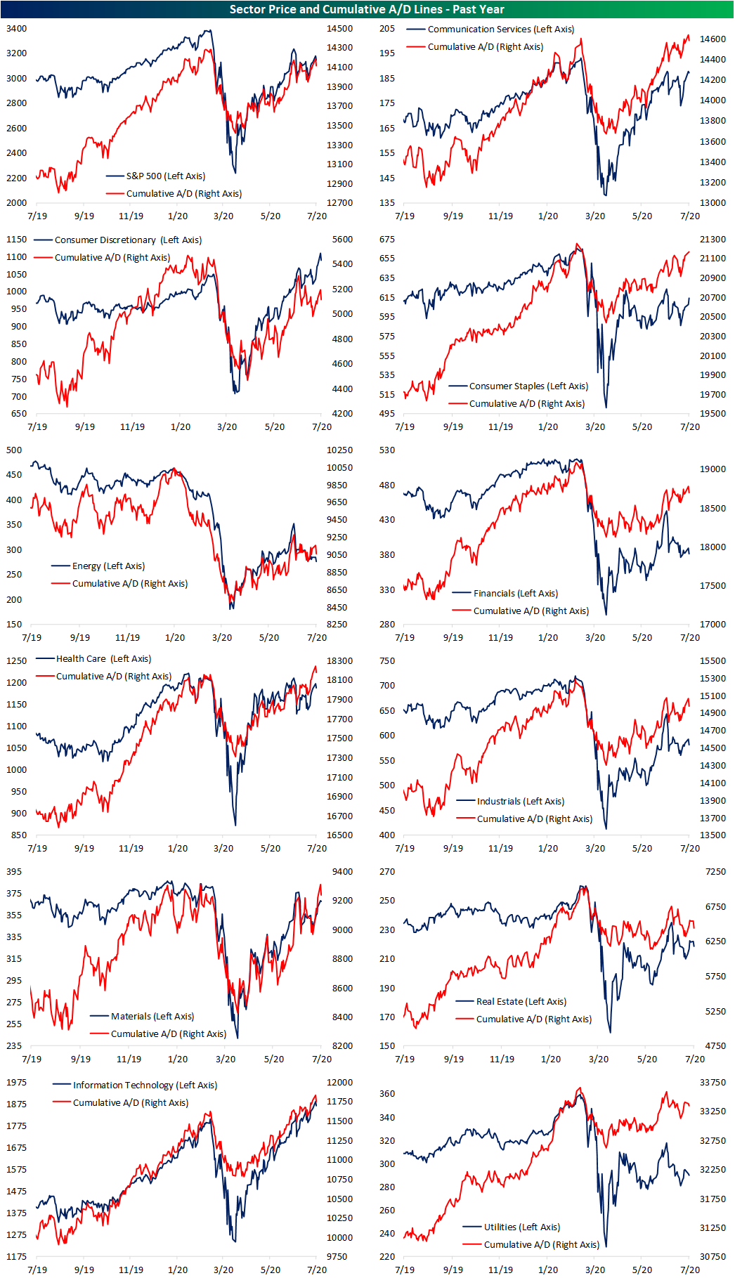
Cumulative A/D Lines Out of Sync
In the past few days, the S&P 500 has made a lower high, unable to reclaim its early June highs. While price has not made a push higher, the index’s cumulative A/D line has. The S&P 500’s cumulative A/D line reached its highest level since February 21st on Monday before yesterday’s weak breadth led to a slight drop. As for the individual sectors, Consumer Staples, Financials, Health Care, and Materials are all experiencing the same dynamic in which the cumulative A/D line has made a new high while price has not done the same.
On the other hand, Consumer Discretionary has seen the opposite occur in which price has made a new high, but the cumulative A/D line has not confirmed the move as it sits firmly below its prior highs from early June. As for the other sectors like Technology, Real Estate, and Utilities, these have seen price and breadth moving hand in hand with one another. For Tech, those trends have been upwards while the more defensive Real Estate and Utilities sectors have been trending sideways at best in recent months. Click here to view Bespoke’s premium membership options for our best research available.
Bespoke’s Morning Lineup – 7/8/20 – Wednesday Lull
See what’s driving market performance around the world in today’s Morning Lineup. Bespoke’s Morning Lineup is the best way to start your trading day. Read it now by starting a two-week free trial to Bespoke Premium. CLICK HERE to learn more and start your free trial.
With earnings season not kicking off until next week, it’s an unusually quiet day in terms of data as there are no major earnings reports to speak of and the economic calendar is pretty much empty. Futures are modestly higher as we type this and have been vacillating above and below the unchanged level all morning. Gold is rallying to its highest levels since 2011, and copper isn’t far from 52-week highs.
Be sure to check out today’s Morning Lineup for a rundown of the latest stock-specific news of note, auto sales in China, global and national trends related to the COVID-19 outbreak, and much more.

Nasdaq futures are up considerably more than the S&P 500 this morning, continuing a trend of outperformance for the Nasdaq that has been in place for several months now. The Nasdaq 100’s decline yesterday ended a streak of five straight days where the index was up at least 0.5%. While that sounds impressive at face value, back in May, there was actually a streak of six trading days. Prior to that streak, the last time the Nasdaq 100 was up more than 0.5% for five straight days was in June 2019, and before that, you have to go all the way back to 2011 to find the last streak before that.

After five straight days of gains, one might think that the Nasdaq 100 was getting ahead of itself, and while a short-term pullback may be in the cards, these streaks of 5 or more days of 0.5% gains have been relatively common throughout the Nasdaq 100’s history. As shown in the chart below (on a log scale where each label on the y-axis represents a doubling in price), while there were a couple of occurrences near the 2000 peak, there were also loads of similar streaks in the entire runup of the 1990s.
