Bespoke Stock Scores — 9/22/20
Chart of the Day: Growth vs. Value Duke It Out
Silver (SLV) Slides Back Below Its 50-DMA
The Silver Trust ETF (SLV) is currently sitting on a year-to-date gain of more than 35% even after falling 16.15% since its early August high. Yesterday’s session had a significant part to play in those recent declines as SLV had a rough start to the week with a decline of 7.6%. As shown below, since SLV began trading in 2006, there have only been 21 days (0.58% of all trading days) in which SLV has fallen greater than 7% in a single day with yesterday marking the 19th worst day on record. In what has been a volatile year, that was the biggest decline since August 11th’s 13.6% drop; one day after its 52-week high. Prior to that, there was a 12.3% decline on March 16th, but before that, you would have to go back to 2013 to find another day with as large of a move.
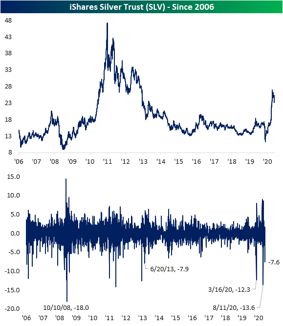
One other thing that yesterday’s drop marked was a fall back below SLV’s 50-DMA. SLV has been trading above its 50-DMA every day since May 7th (94 consecutive trading days). That brings to an end the second-longest streak on record that SLV spent above its 50-DMA. The only longer such streak was one that lasted exactly 100 days that came to a close on January 13th, 2011. Back during that streak, SLV had risen 59% compared to the 79.1% rally from May through yesterday. Click here to view Bespoke’s premium membership options for our best research available.

Sector Mean Reversion
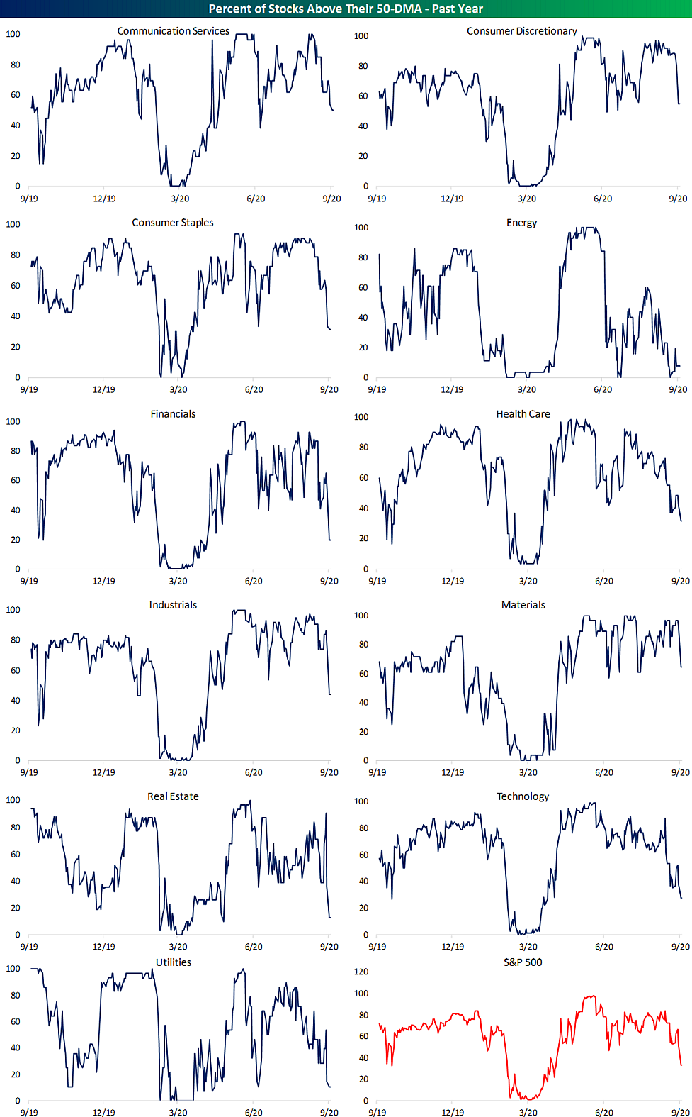
With the S&P 500 seeing another decline yesterday, the index finished the day roughly 1.9% below its 50-DMA. As shown in the charts from our Sector Snapshot below, that is the furthest below its 50-DMA since April 21st; about one month after the bear market low. As for the eleven major sectors, the majority are likewise below their moving averages. The worst of these is Energy which finished the day yesterday 10.7% below. The second worst sector, Real Estate, is much closer to its 50-DMA at only 3.59% below its 50-DMA. On the other hand, Industrials and Materials are the only sectors above their 50-DMAs at 0.76% and 1.05%, respectively. That is not to say they are not trending in the same direction as the other sectors, though. As shown below, even though they are currently above, these two sectors are seeing falling 50-DMA spreads just like every other sector.

A higher number of individual stocks in each sector are also falling below their 50-DMAs. Yesterday’s session marked a bit of a tipping point for the percentage of stocks trading above their 50-DMAs. We finished last week with 52.48% of S&P 500 stocks trading above their 50-DMAs, but at yesterday’s close, only 33.27% were above. Other than yesterday, since the second half of April there was only one other day (June 26th) that less than half of S&P 500 stocks closed above their 50-DMAs. Similarly, the 19.21 percentage point drop in the percentage of stocks above their 50-DMAs for the S&P 500 was the largest single-day decline since June 24th (20.04 percentage points). Prior to that you would have to go back to the start of the COVID bear market, February 24th, to find another day with a bigger single-day drop in this reading.
Looking across the sectors, Energy, Utilities, and Real Estate have the fewest stocks above their 50-DMAs. Meanwhile, Communication Services, Consumer Discretionary, and Materials all still have at least 50% of stocks above. Materials boasts the strongest reading at 64.29%. Click here to view Bespoke’s premium membership options for our best research available.
Bespoke’s Morning Lineup — Apple Picking — 9/22/20
See what’s driving market performance around the world in today’s Morning Lineup. Bespoke’s Morning Lineup is the best way to start your trading day. Read it now by starting a two-week free trial to Bespoke Premium. CLICK HERE to learn more and start your free trial.
“In the middle of difficulty lies opportunity.” – Albert Einstein
All eyes will be on Powell and Mnuchin this morning as they testify in front of the House Financial Services Committee today regarding the CARES Act. We’ll also get Existing Home Sales for August at 10 AM. Futures are trying to stabilize after yesterday’s decline, but the foundation for any rally today has so far been on shaky ground. Finally, in the UK PM Boris Johnson is calling for increased restrictions to help ward off a building second wave of the COVID outbreak in that country.
Be sure to check out today’s Morning Lineup for a rundown of the latest stock-specific news of note, market performance in the US and Europe, discussion of the political ramifications of the upcoming SCOTUS fight, trends related to the COVID-19 outbreak, and much more.

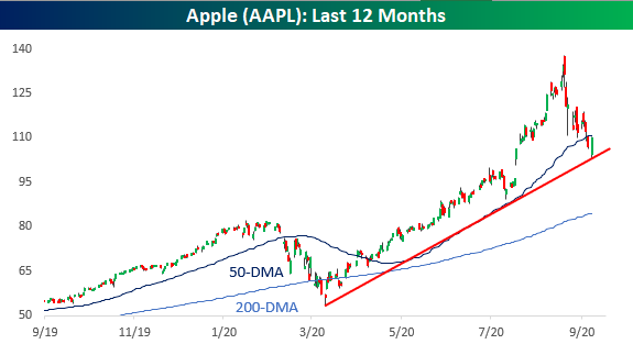
In yesterday’s Chart of the Day, we took a look at historical bear markets for Apple (AAPL) in the post-iPod era, including a look at the typical length and magnitude of decline for the stock during other periods when it dropped 20% or more. Yesterday, the stock had a bit of a respite from the selling as it bounced right at the support of its uptrend off the March lows. The bounceback in Apple helped to stabilize the entire market and technology specifically, but it wasn’t quite able to move back above its 50-DMA so that technical level will loom on the stock today.
Daily Sector Snapshot — 9/21/20
Technology Heavy as Energy and Financials Thin Out
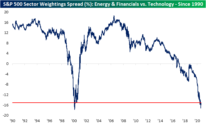
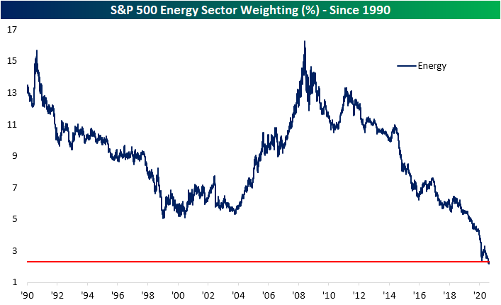
In an earlier post, we noted some of the recent changes in sector weightings; namely those of Energy, Financials, and Technology. Whereas Energy and Financials stood as the bulk of the weight of the S&P 500 back in the mid-2000s, since the Financial Crisis, the Tech sector has stolen share away. The COVID era has only exacerbated this trend as Energy and Financials’ combined weighting has completely diverged from that of Technology. While Technology currently accounts for 27.37% of the S&P 500, Energy and Financials together now account for only 12.28%. These two sectors combined for a weighting of more than 32% at their peak just before the Financial Crisis!
As shown below, for Technology, only the late 1990s/early 2000s has seen higher readings and there is basically no historical precedent (since at least 1990) for the low weighting of Energy and Financials. As for the spread between the combined weightings of Energy and Financials versus the weighting of Technology, only 2000 has seen similar readings to current levels (currently ~15). Click here to view Bespoke’s premium membership options for our best research available.

Sector Weight Loss
Since the S&P 500’s last all-time high on September 2nd, the Technology sector has been the hardest hit group having dropped over 13%. As a result of those declines, the sector’s weighting in the S&P 500 has dropped roughly 1.5 percentage points from 28.85% down to 27.35%. In terms of moves in sector weighting over 12-day spans since 1990, that stands in the bottom 2%.
Comparatively, the sector that has taken the next biggest hit in terms of S&P 500 weighting is Communication Services which has fallen a much more modest 0.39 percentage points in that same time. Other than those two, only Consumer Discretionary has also seen its weighting in the index decline. As shown in the chart below, the Technology sector has now erased all of its weight gain from August, and it is back to similar levels from July. Granted, the sector still boasts its highest weighting since the dot com era.

Meanwhile, the Energy sector has been the fourth worst-performing sector since the September 2nd high having fallen over 8%, but it has actually gained weight with its S&P 500 weighting having risen 0.06 percentage points to 2.3%. Inverse to the Technology sector, and granted it was a much less significant move, the Energy sector still has a historically low weighting (2.2%) that is unlike anything observed since at least 1990.
The Financial sector also continues to get smaller and smaller. As shown below, the sector’s current weighting is around its lowest levels of the past three decades. Remarkably, the Financial sector’s weighting is now right around where it was at the lows of the Financial Crisis. Click here to view Bespoke’s premium membership options for our best research available.
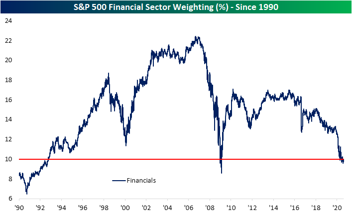
Chart of the Day: Apple (AAPL) Bear Markets
Northeast Still Hanging In There
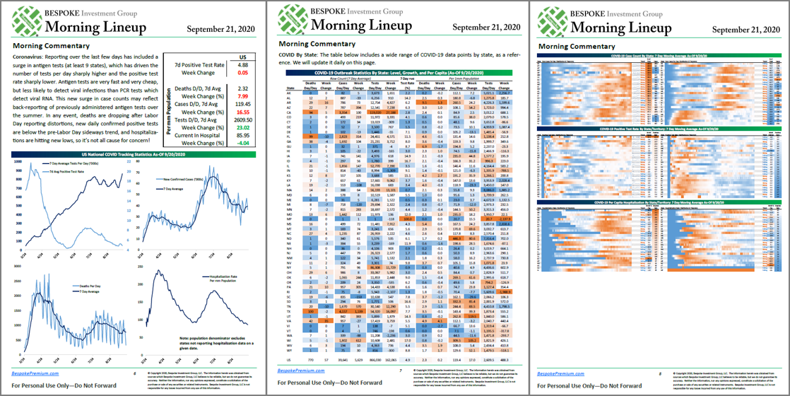
With Europe beginning to see a resurgence in COVID cases, concerns are rising on this side of the Atlantic about a possible bigger wave here as the weather cools. One great way to track the trajectory of the COVID outbreak is in our Morning Lineup each day. In each morning’s report, which is available to Bespoke Premium members, we include three pages of updates on key COVID trends in the US.
On the first page (left image), we include a quick recap of the latest developments as well as a summary chart of the national trends concerning average daily testing, the positivity rate, the number of new cases, and the number of deaths and hospitalizations. The second page (middle image) summarizes the outbreak on a state-by-state level and shows the daily number of deaths, cases, and tests performed each day on an individual state basis. Finally, on the third page (right image), we provide a heat map that shows each state and how the current number of cases in each state compares to that specific state’s peak and whether or not the current trend of positive cases is rising or falling.
Using the data on the third page of our daily summary, we created the map below which shows each state and where their current average daily number of new cases ranks relative to its peak readings since the onset of the outbreak. Looking at the map, it’s interesting to see how the outbreak has progressed throughout the country. While both the coasts and the south now have case counts well below their peak levels, it’s now the middle of the country that is seeing case counts at or near their peak levels. The five states that currently have the fewest number of cases relative to their peak readings (NY, NJ, VY, MA, and CT) are all in the northeast US. Meanwhile, the states where current case counts are either at or near a peak level are in the center of the country.

Looking at the map above, there is a decent amount of red which indicates that many states have case readings that are closer to peaks than troughs. In fact, 17 states currently have caseloads that are at or above 75% of their peak readings while 28 are still above 50% of their peak readings. What’s important to note, though, is that the states currently experiencing the highest caseloads relative to their peaks aren’t major population areas.
The map below shows the percentage of the total US population that each state accounts for. As shown at the bottom, the ten states that currently have the lowest caseloads relative to their peaks collectively account for nearly a quarter of the US population (23.2%), while the ten states that are either at or closest to their peak caseloads account for just 10% of the total population. So while a lot of states are currently seeing rising caseloads relative to their respective peaks, most of these states are small in terms of population. The key areas to watch going forward into the fall are the major population states that each account for at least 5% of the US population like California, Texas, Florida, and New York, and then to a lesser degree states that account for 3%+ of the population like Illinois, Pennsylvania, Ohio, Georgia, North Carolina, and Michigan. As things currently stand, these ten states currently have an average caseload that is more than 50% below their peak levels of the outbreak. Receive our COVID-tracking charts and analysis in your inbox each morning with a two-week free trial to Bespoke Premium.
