Bespoke’s Morning Lineup – 8/31/20 – Icing on the Cake
See what’s driving market performance around the world in today’s Morning Lineup. Bespoke’s Morning Lineup is the best way to start your trading day. Read it now by starting a two-week free trial to Bespoke Premium. CLICK HERE to learn more and start your free trial.
“Compound interest is the eighth wonder of the world. He who understands it, earns it … he who doesn’t … pays it.” – Albert Einstein
The last day of August and the first day of the week are on pace for gains, but futures are trading off their highs from earlier this morning. It was a busy weekend on the political scene as polling and betting markets continue to show a much tighter Presidential race and race for control of the Senate as well. What does that mean? Even more political ads for the next two months than you would have expected!
Be sure to check out today’s Morning Lineup for a rundown of the latest stock-specific news of note, market performance in the US and Europe, economic data out of Asia, trends related to the COVID-19 outbreak, and much more.

2020 has definitely been the year or large-cap Nasdaq stocks. Besides rallying more than 35%, the Nasdaq 100, which tracks the Nasdaq’s largest stocks, has traded higher on more than 64% of all trading days so far in 2020. We’ve been updating the chart below throughout the summer, and it shows the percentage of up days for the Nasdaq 100 by year. While 2020 has often been near the top of the rankings, through 167 trading days, no other year in the Nasdaq 100’s history (since 1985) has had a higher percentage of positive days. The only years that have even been close were 1995 (63.5%) and 2017 (63.5%).

Bespoke Brunch Reads: 8/30/20
Welcome to Bespoke Brunch Reads — a linkfest of the favorite things we read over the past week. The links are mostly market related, but there are some other interesting subjects covered as well. We hope you enjoy the food for thought as a supplement to the research we provide you during the week.
While you’re here, join Bespoke Premium with a 30-day free trial!
COVID
New Thinking on Covid Lockdowns: They’re Overly Blunt and Costly by Greg Ip (WSJ)
Back in March and April, detailed research around COVID transmission wasn’t available, so lockdowns were used in order to avoid the catastrophic overload of hospitals seen in Italy and Wuhan. Since, better understanding of the spread suggests looser restrictions on gatherings, mask wearing, and shifting activities outdoors are all preferable to full lockdowns in terms of the economic tradeoffs involved. [Link; paywall]
Biogen conference likely led to 20,000 COVID-19 cases in Boston area, researchers say by Jonathan Saltzman (Boston Globe)
A new study attributes a staggering 20,000 cases of COVID to an international Biogen (BIIB) conference in Boston during the month of February; it turned just a few cases from different parts of the world into a mass of infections for attendees and local people alike in one of the most stark “super-spreader” events from this pandemic. [Link; soft paywall]
Personal measures taken to avoid COVID-19 (YouGov)
Survey data tracking the experience and response to COVID from respondents around the world, including a number of both developed and emerging markets with outbreaks of varying sizes. [Link]
Their school refused to require masks, but bans spaghetti straps. These girls protested — and won. by Caroline Kitchener (The Lily)
Two girls were frustrated that their school had enforced a rigorous dress code, but wasn’t willing and claimed to be unable to enforce mask-wearing. Their protest over the contradiction forced the school to introduce mask wearing. [Link]
Conquering Disease
Africa declared free of wild polio in ‘milestone’ by Naomi Scherbel-Ball (BBC)
Widespread vaccination appears to have eradicated polio in Africa, leaving Pakistan and Afghanistan as the only remaining wild disease reservoirs left. [Link]
Groceries
Walmart’s Supermarket Rivals Are Eating Into Its Grocery Share by Matthew Boyle (Bloomberg)
While still dominant in grocery, Walmart is facing huge competition and shifting wallet share in that market due to COVID and its impact on the eating and spending habits of American consumers. [Link; soft paywall]
Local News
City officials cheekily vow to name sewage plant after John Oliver following his anti-Danbury rant by Bryan Alexander (USA Today)
After a rant on his Last Week Tonight show targeting Danbury, CT, the town is planning to name its sewage treatment plant after the comedian. [Link]
In Southfield, a ‘thorough investigation’ into how woman declared dead returned to life by James David Dickson (The Detroit News)
A Michigander was still alive while being delivered to a funeral home after half an hour of revival attempts appeared to have failed; she is now recovering in an area hospital. [Link]
Is This The Top?
Former House Speaker Paul Ryan Starts Blank-Check Company by Maureen Farrell (WSJ)
Blank-check companies that go public with the intention of buying a private company and therefore skirting the IPO process have seen a surge in popularity and interest, and former Vice Presidential candidate Paul Ryan is getting in on the game. [Link; paywall]
Counter-Hacking
Tesla employee foregoes $1M payment, works with FBI to thwart cybersecurity attack by Simon Alvarez (Teslarati)
When he was approached by a Russian national seeking a way to deploy malware at Tesla, a Nevada employee flipped and helped the FBI nab the attempted heist. [Link]
Read Bespoke’s most actionable market research by joining Bespoke Premium today! Get started here.
Have a great weekend!
The Bespoke Report – “That’s a Keeper”
This week’s Bespoke Report newsletter is now available for members.
We just published our weekly Bespoke Report newsletter, which covers all of the major events of the week, including the economy, sentiment, politics, and the Covid outbreak. To read the report and access everything else Bespoke’s research platform has to offer, start a two-week free trial to one of our three membership levels. You won’t be disappointed!
Below we have updated our ETF Asset Allocation Matrix which summarizes the performance of key ETFs across the spectrum of asset classes this week, this month, and YTD.
Weeks don’t get much more positive than this one. Outside of the Utilities sector ETF (XLU) and a number of fixed income ETFs, every other ETF was up on the week. Leadership this week was centered in large caps, growth, Technology, Communication Services, and even—hold on to your hats– Financials! Among individual countries, Brazil, China, and India all traded up over 3%. Commodities were also strong on the week with all five of the ETFs tracked in our Matrix gaining more than 4%.
Looking through the various MTD performance numbers, they look more like returns you would see for an entire year! The Nasdaq 100 ETF and the Tech sector Spyder (XLK) are both up over 10% MTD. The only laggards of note have been Brazil (EWZ), Long-Term Treasuries (TLT), and the Utilities sector ETF (XLU).
Year to date, eight ETFs are up over 20%, led by Silver (SLV) which has gained more than 50%, while just three ETFs (Energy—XLE, Brazil—EWZ, and Mexico—EWW) are down more than 20%.


Daily Sector Snapshot — 8/28/20
New Lows for Dividend Yields, Still Better Than Treasuries
Back at the February all-time highs prior to the pandemic bear market, the median dividend yield for S&P 500 stocks was 2.19%. With the S&P 500 back at all-time highs, the median yield is now down to just 1.65%. As shown in the chart below, the trailing 12-month dividend yield spiked to 2.7% at the March 23rd low, but with the market’s rapid rally and some companies cutting their payouts, that yield has ground lower and now stands at just 1.72%. In just this past week, it took out the mid-January low around 1.77% and is now at the lowest levels since November of 2004.

As we have in the past, in the charts below we plot the S&P 500 dividend yield versus the yield on the 10 year Treasury. The past few years have seen some back and forth between which of these assets yield more, but since mid-January, equities have been the clear leader. Even though the dividend yield is at some of its lowest levels in over 15 years and the 10 year Treasury has seen a significant rally this month with its yield now at 0.728%, equities still yield over a full percentage point more than the 10 year Treasury. That difference in yields is well off the peak of 192 bps at the bear market low on March 23rd, but even with that decline, the spread remains well above any period outside the past few months and the Global Financial Crisis. Click here to view Bespoke’s premium membership options for our best research available.


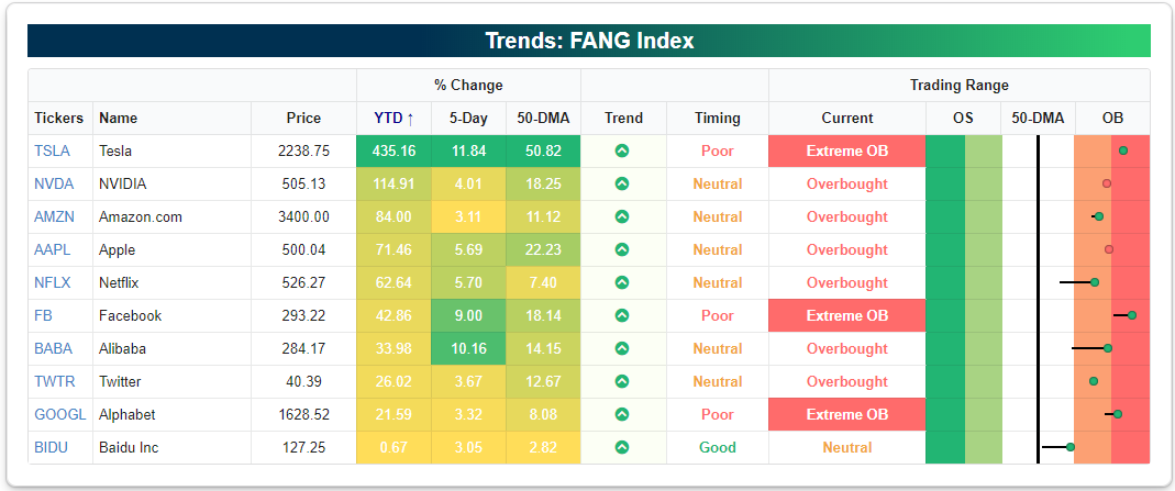
FANG Explosion
The ten members of the NYSE FANG+ index went on an epic run in the mid to late–2010s that many thought was “bubble” like at the time. From early 2016 to mid-2018, the FANG+ stocks went up 200%. After peaking in June 2018, though, the FANG+ index fell nearly 50% before finally finding a floor. After the big decline in late 2018, many investors moved on from the FANG trade, but now anyone that did is kicking themselves.
The FANG+ stocks went on another big run in 2019 and early 2020 only to collapse 34% during the one-month COVID Crash in late February and early March. Since making its COVID-Crash low on March 18th, however, the FANG+ index has experienced one of the most remarkable runs that any investor can expect to see in their lifetimes. As shown in the second chart below, the FANG+ index is up more than 60% over the last six months, and it has more than doubled since its March 18th low. Those prior highs made back in 2018 are now a distant memory with the index now ~85% above that level. Click here to view Bespoke’s premium membership options for our best research available.


Below we compare the NYSE FANG+ index since its inception in 2014 to the S&P 500. The performance disparity continues to get wider and wider with the FANG+ index up 455% and SPY up 74% over the same time frame.


The NYSE FANG+ index is made up of the four FANG stocks (FB, AMZN, NFLX, GOOGL) plus six additional names that have certainly contributed their fair share to the index’s performance. Stocks like NVIDIA (NVDA), Apple (AAPL), and Tesla (TSLA) stand out the most, with Tesla of course being the most epic winner of them all. Year-to-date, TSLA is up 435%, and it’s now 50% above its 50-day moving average. If you’d like to track the FANG+ stocks or any other portfolio of your choosing, you can do so with our Custom Portfolios tool on our website. Simply start a two-week free trial to Bespoke Premium or Bespoke Institutional to gain access to our Custom Portfolios tool and the rest of our popular Interactive Tools. You’ll also gain access to a rich library of equity research to keep you on top of the market.
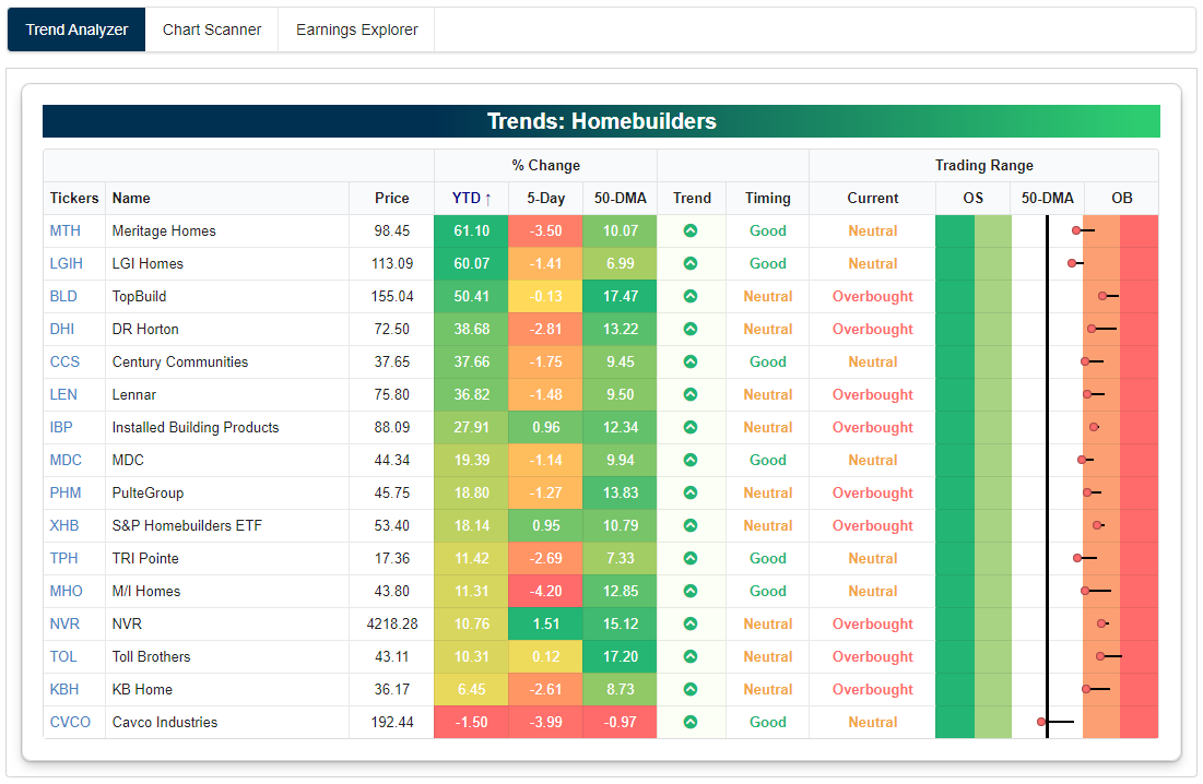
Homebuilders Up Huge
As with many areas of the market, the homebuilder group has skyrocketed higher over the last few months after initially plummeting during the COVID Crash in late February and early March.
Below is a chart of the S&P 1500 Homebuilder group since 1994. After experiencing a bubble of pretty epic proportions during the real estate boom of the mid-2000s, the homebuilders went on to fall more than 86% during the Financial Crisis. From the group’s lows in late 2008, it took more than 10 years to finally re-claim its prior highs back in February. The new all-time highs were made just a few days before COVID hit, and in a cruel turn of events, the group promptly fell 57% in less than a month!
But the homebuilders are now getting the last laugh. During the COVID Crash, investors sold first and asked questions later. When they eventually decided to stop panicking, they realized that the new COVID economy would actually be a positive for the homebuilders. Lockdowns caused people to re-assess their living situations, and a lot of people decided they wanted a change — especially those living in cities that suddenly wanted more space in the suburbs with no commute to worry about.
From the group’s low on March 18th to today, the homebuilder index has surged 150% and re-taken those prior all-time highs once again.

At no time during the housing bubble of the early 2000s did the homebuilder group experience a move like the one seen post-COVID Crash. As shown below, the group’s 100-day rate of change nearly hit +150% recently, which is more than double the best move seen during any prior 100-day period since 1994.

Below is a snapshot of the individual stocks that make up the homebuilder group run through our Trend Analyzer tool. While these stocks have experienced some downside mean reversion from very overbought levels over the past week, nearly all of them are still extended well above their 50-day moving averages. Every single stock in the group is in a long-term uptrend based on our proprietary “trend” algorithm, and 14 of 16 names are up more than 10% YTD.
After hitting an extreme roadblock during the COVID Crash, the homebuilder stocks have been some of the very best performers of the market over the last few months. Click here to view Bespoke’s premium membership options for our best research available.
Bespoke’s Morning Lineup – 8/28/20 – And They’re Off
See what’s driving market performance around the world in today’s Morning Lineup. Bespoke’s Morning Lineup is the best way to start your trading day. Read it now by starting a two-week free trial to Bespoke Premium. CLICK HERE to learn more and start your free trial.
“If I had asked the public what they wanted, they would have said a faster horse.“ – Henry Ford
The conventions for both parties are done, and the race is officially on as President Trump and former Vice President Biden will take the next two months to make their case to the American people. What was looking like a runaway for Biden just a few weeks ago has become a bit closer. Biden still has the lead over Trump, but the gap has narrowed by close to two-thirds from its widest levels in July. It’s natural for candidates to see a bounce after their conventions, and this week alone Trump has seen his contract to win the election increase by three percentage points. We’ll know soon enough if that bounce was a sugar rush or something more lasting.

In other news this morning, futures are higher again as the S&P 500 looks to make it seven straight positive days in a row. In order to get there, though, the market will have to get through a busy slate of economic data with Personal Income (better than expected), Personal Spending (better than expected), Wholesale Inventories (better than expected), Chicago PMI, and Michigan Confidence all coming out between now and 10 AM. The dollar is also weaker today and gold is rallying following news that Japanese PM Abe will step down at the end of his term and that has the yen rallying.
Be sure to check out today’s Morning Lineup for a rundown of the latest stock-specific news of note, market performance in the US and Europe, trends related to the COVID-19 outbreak, and much more.
With the market at record highs, there are a number of conflicting signals concerning investor sentiment. While the AAII sentiment survey routinely shows negative sentiment, and the latest Consumer Confidence report showed a lack of enthusiasm for equities, other sentiment surveys like Investors Intelligence or put/call ratios show a more optimistic backdrop. Another indicator of sentiment showing optimism on the part of investors is the National Association of Active Investment Managers (NAAIM) Exposure Index Index.
The NAAIM Exposure Index tracks the exposure of its members to US equity markets. Each week members are asked to provide a number that represents their exposure to markets. A reading of -200 means they are leveraged short, -100 indicates fully short, 0 is neutral, 100% is fully invested, and 200% indicates leveraged long. This week’s reading of 106.56 indicates one of the highest readings in the history of the index.

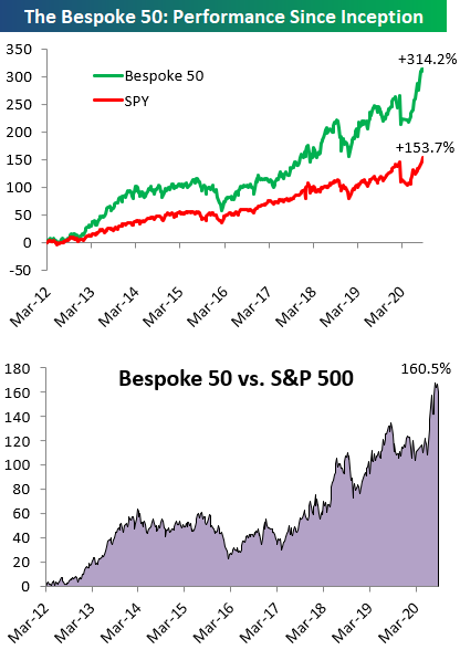
The Bespoke 50 Top Growth Stocks — 8/27/20
Every Thursday, Bespoke publishes its “Bespoke 50” list of top growth stocks in the Russell 3,000. Our “Bespoke 50” portfolio is made up of the 50 stocks that fit a proprietary growth screen that we created a number of years ago. Since inception in early 2012, the “Bespoke 50” has beaten the S&P 500 by 160.5 percentage points, which hit a new high this week. Through today, the “Bespoke 50” is up 314.2% since inception versus the S&P 500’s gain of 153.7%. Always remember, though, that past performance is no guarantee of future returns. To view our “Bespoke 50” list of top growth stocks, please start a two-week free trial to either Bespoke Premium or Bespoke Institutional.