Twitter (TWTR) Down on Earnings…Again
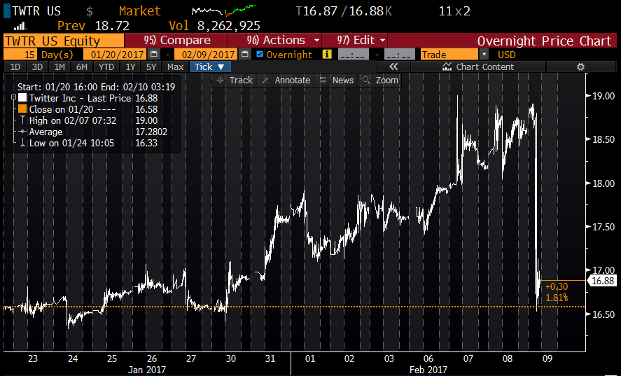
As shown below in the intraday chart of Twitter (TWTR) over the last 15 days, the stock took the stairs up and is now taking the elevator down. After basically rallying from $17 up to $19 from the end of January through yesterday, today it has given it all back on earnings.
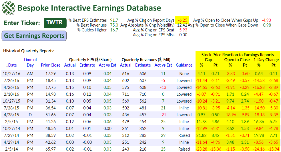
Big drops on earnings are nothing new for Twitter (TWTR). Below is a snapshot from our Interactive Earnings Report Database (start a 14-day free trial to sample) showing Twitter’s historical earnings reports since it went public back in late 2013. The stock has now had 13 earnings reports, and its share price has fallen on its report day 10 times. Shares have only traded up on earnings 3 out of 13 times. The stock’s average price move on its historical earnings reaction days has been absolutely horrid at -6.25%.
As mentioned above, TWTR has historically averaged a one-day drop of 6.25% on days it reports earnings. Using our Interactive Earnings Report Database, we checked to see how that compared to the entire universe of US stocks. As shown below, we found that TWTR is the fourth worst stock in the US when it comes to reacting to earnings reports. There are only three stocks that have historically averaged bigger one-day drops on their earnings reaction days — PRMW, FEYE, and LOCO. That’s a pretty brutal ranking to hold.
Start a 14-day free trial to sample our Interactive Earnings Report Database now.
(The table below lists the stocks that have historically averaged the biggest one-day declines on their earnings reaction days. For stocks that report before the open, we use that day’s trading. For stocks that report after the close, we use the next day’s trading. Only stocks with at least 10 quarterly earnings reports on record are included, and to make the list, the stock had to be trading above $10/share as of yesterday’s close.)
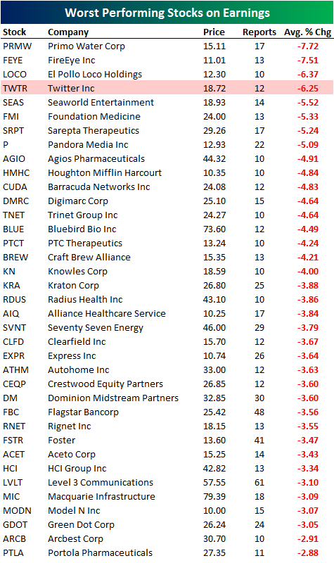
Chart of the Day: Marine Misery?
ETF Trends: International – 2/9/17
Gold and precious metals continue to surge relative to other areas of the financial markets. Long-term Treasury bonds have also performed very well over the last week or so as rates have backed up notably. With that duration outperformance, equity sectors like Consumer Staples, REITs, and Utilities have also outperformed. Energy equities continue to underperform while European country ETFs are have moved notably lower over the last five days.

Bespoke provides Bespoke Premium and Bespoke Institutional members with a daily ETF Trends report that highlights proprietary trend and timing scores for more than 200 widely followed ETFs across all asset classes. If you’re an ETF investor, this daily report is perfect. Sign up below to access today’s ETF Trends report.
See Bespoke’s full daily ETF Trends report by starting a no-obligation free trial to our premium research. Click here to sign up with just your name and email address.
Individual Investors Slightly Less Depressed
After dropping below a third in the last two weeks, bullish sentiment on the part of individual investors saw a modest rebound this week, rising from 32.8% up to 35.8%, which is still an extraordinarily low level given where the market is. This week’s level also marks the 110th straight week where bulls have not been in the majority.
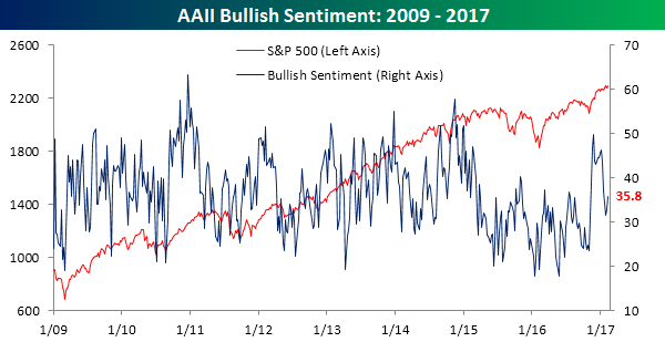
While bullish sentiment saw just a modest rebound, bearish sentiment saw a pretty sizable drop, falling from 34.17% down to 27.65%. That’s the largest one-week decline in bearish sentiment since early October.
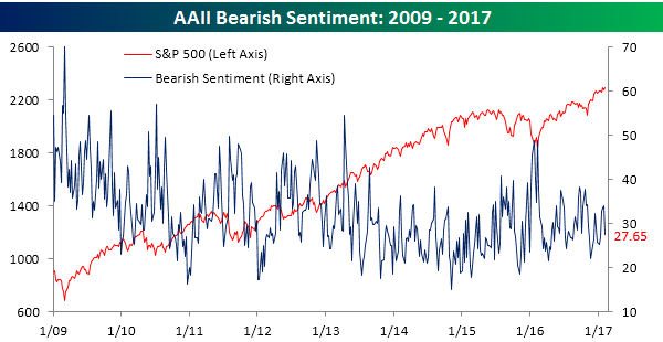
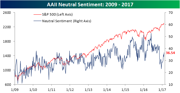
With Trump’s agenda seemingly hitting a speed bump in recent days as tax reform appears to be getting pushed further and further back, a plurality of investors couldn’t make up their minds. Neutral sentiment jumped to 36.54% this week, which is the highest level since the election.
Bespokecast Episode 6 — Rob Bartenstein — Now Available on iTunes, GooglePlay, Stitcher and More
 We’re happy to announce that the newest episode of Bespokecast is now available to the general public both here and via the various podcast platforms. Be sure to subscribe to Bespokecast on your preferred podcast app to gain access to our full collection of episodes. We’d also love for you to provide a review as well!
In our newest conversation on Bespokecast, we speak with investment advisory industry veteran Rob Bartenstein. Rob is the CEO of Kestra Private Wealth, and he’s also a regular guest on financial networks like CNBC and Fox Business. Kestra is a platform for registered investment advisors. In our conversation, we discuss the current state of the investment advisory industry including the pending Department of Labor fiduciary rule. Rob also discusses his views on the market and the outlook for the economy. We learned a lot talking to Rob and think you will too!
Each new episode of our podcast features a special guest to talk markets with, and Bespoke subscribers receive special access before it’s made available to the general public. If you’d like to try out a Bespoke subscription in order to gain access to these podcasts in advance, you can start a two-week free trial to check out our product. To listen to episode 6 or subscribe to the podcast via iTunes, GooglePlay, OvercastFM, or Stitcher, please click below.

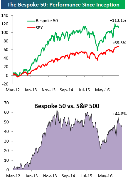
the Bespoke 50 — 2/9/17
Every Thursday, Bespoke publishes its “Bespoke 50” list of top growth stocks in the Russell 3,000. Our “Bespoke 50” portfolio is made up of the 50 stocks that fit a proprietary growth screen that we created a number of years ago. Since inception in early 2012, the “Bespoke 50” has nearly doubled the performance of the S&P 500. Through today, the “Bespoke 50” is up 113.1% since inception versus the S&P 500’s gain of 68.3%.
To view our “Bespoke 50” list of top growth stocks, sign up for Bespoke Premium ($99/month) at this checkout page and get your first month free. This is a great deal!
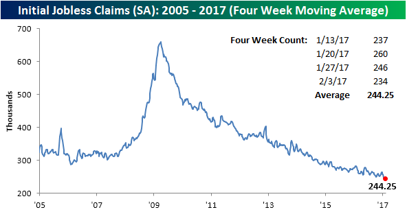
101 Weeks Below 300K
Jobless claims dropped considerably more than expected this week, falling from 246K to 234K and well below consensus expectations for an increase to 249K. This week’s level is the second lowest reading of the current cycle, behind only the 233K reading from early November. It is also the 101st week that claims have been below 300K, which is the longest streak since 1970. It wasn’t too long ago that getting below 300K in weekly claims was considered a milestone. Now, the last time weekly claims were above that level seems like a distant memory.
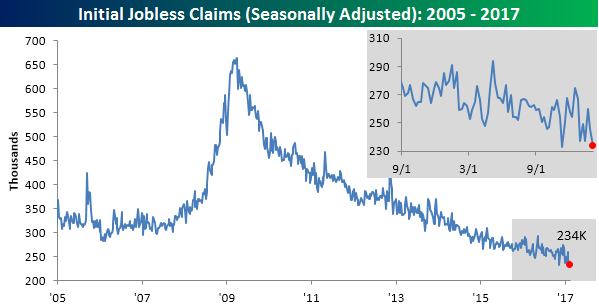
With this week’s big decline, the four-week moving average also went on to make another post-recession low, dropping to 244.25K.
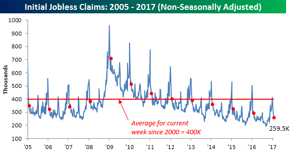
On a non-seasonally adjusted basis, claims declined from 278.6K down to 259.5K. That’s more than 140K below the average for the current week of the year going back to 2000 and is the lowest reading for the current week of the year since 1969.
The Closer — Vol Stays Low — 2/8/17
Log-in here if you’re a member with access to the Closer.
Looking for deeper insight on global markets and economics? In tonight’s Closer sent to Bespoke Institutional clients, we take a look at declining volatility and recap EIA data on the petroleum market.

The Closer is one of our most popular reports, and you can see it and everything else Bespoke publishes by starting a no-obligation 14-day free trial to our research!
Earnings Season Triple Plays — 2/8/17
Here at Bespoke, our job is to identify winners and losers, and one of the ways we try to find earnings-season winners is through our list of “triple plays.”
Long-term Bespoke subscribers know how much we like triple plays, but for those that haven’t heard of the term, we came up with it back in the mid-2000s for companies that beat analyst earnings estimates, beat analyst revenue estimates and also raise guidance. Investopedia.com is one of the best online resources for financial markets education, and they’ve actually given us credit for coining the “triple play” term on their website. We consider triple play stocks to be the cream of the crop of earnings season, and we are constantly finding new long-term buy opportunities from this basket of names each quarter.
There have been a total of 40 “triple plays” so far this season out of roughly 1,000 earnings reports. Throughout earnings season, Bespoke sends Premium and Institutional members its “Earnings Triple Plays Report.” The report keeps a running tally of recent triple plays, and it also provides a list of “Top Triple Plays.” We’ve just published our first Earnings Triple Plays Report for this earnings season, featuring a list of the 40 stocks that have registered triple plays this earnings season plus the 12 that we’ve identified as having the most attractive chart patterns. Learn how to see the stocks below!
See our Top Earnings Season Triple Plays by signing up for a monthly Bespoke Premium membership now. Click this link for a 14-day free trial.