Shorts Still Piling Into Retail
The charts below are part of our semi-monthly update on short interest for stocks in the S&P 1500. To gain access to these charts for every sector and group in the S&P 1500, start a 14-day free trial to Bespoke’s research today!
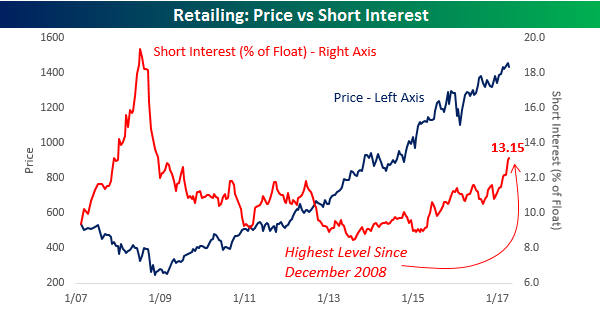
Short interest figures for the middle of April were released after the close on Tuesday, and in what has become a consistent trend over the last several months, traders continue to pile into the Death By Amazon trade. The chart below compares the price of the S&P 1500 Retailing Index (left axis) to the average level of short interest (as a percentage of float) for stocks in the group (right axis). After hitting its lows for the bull market in mid-2013, the average level of short interest started trending higher and the pace really began to accelerate to the upside in early 2015. Since then, the pace of increase has only accelerated and currently stands at 13.15%. That’s the highest reading for the group since December 2008! Looking at the chart, it would appear as though investors who are shorting the group are getting taken out to the woodshed as the group’s price is right near bull market highs. This chart is quite misleading, though, as stocks like Amazon.com (AMZN) and Home Depot (HD) mask the overall trend. Underneath the surface, there is a lot of weakness in individual names.
Another group that has seen a rather steady but unnoticed increase in its average level of short interest is the Transportation group. While short interest in these stocks is nowhere near as high as it is in the Retailing group, at a level of 6.56%, the group’s average short interest as a percentage of float is the highest it has been since November 2010.
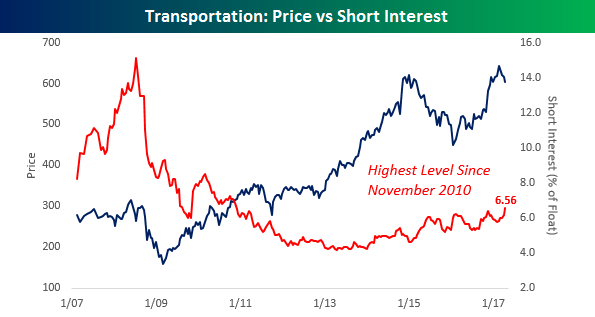
Chart of the Day: Two Green Lights and a Stop
Bespoke’s Chart of the Day is published Monday through Thursday. It’s available across all three of Bespoke’s membership levels, which you can learn more about here. We’ve decided to make today’s Chart of the Day available to our Think B.I.G. readers. Enjoy!
Bespoke’s Chart of the Day for 4/26/17:
Three Bespoke Model Growth Portfolio names have moved huge on earnings in the last 24 hours. Two are current members of the portfolio, while a third is one we were stopped out of just last week. Below we provide a few thoughts on each. (You can view the entire portfolio along with performance numbers here.)
We’ll start with a huge win for Steve Wynn’s Wynn Resorts (WYNN), which beat on EPS and revenues last night. The business continues to improve as Chinese activity rebounds and one analyst upgraded the stock. Macau revenues are exploding as the Palace property builds steam, with combined Macau + Palace segment revenues +75% YoY. We’re still bullish on WYNN here even though we have an 87.5% gain on the position since we entered at $67.03 on 1/4/16. Note the chart below. Even though WYNN is now up 144% off its multi-year low, remember that back in early 2014 this was a $250 stock. At its current price, it still needs another double to get back to new highs.

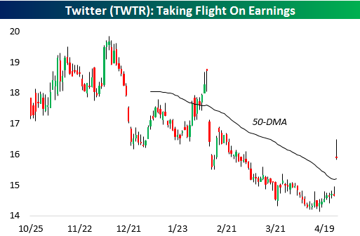
Moving on to our second position, Twitter (TWTR) is up 9.6% on the day after having ground lower almost constantly over the past year as take-out prospects dimmed and the business continued to show soggy user growth versus peers. GAAP EPS losses were half of analyst estimates in this morning’s announcement, though, with revenues and users also beating estimates. The name is still down from our $18.70 entry level but the beat this quarter and subsequent price rise means that nearly universal negative sentiment towards the name finally appears to be turning.
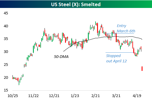
Our last name is US Steel (X). We liked the name in Q1 and added it to the portfolio on March 6th. Unfortunately, we were dead wrong, and the name sunk lower during our holding period, ultimately stopping us out on April 13th with a significant loss. That said, we were glad we respected the $29.60 stop that had been set. By exiting the name at that level, we avoided the catastrophe that was today’s earnings. X delivered an 83-cent per share loss on a comparable basis versus 35 cents profits estimated, a brutal performance. This is a good example of why we always respect stops, our most important risk management tool.
To unlock all of our Chart of the Days as well as our Bespoke Model Portfolio, choose any membership level now at our products page. Both are included with all three membership levels.
Bespoke Short Interest Report: 4/26/17
Fixed Income Weekly – 4/26/17
Searching for ways to better understand the fixed income space or looking for actionable ideals in this asset class? Bespoke’s Fixed Income Weekly provides an update on rates and credit every Wednesday. We start off with a fresh piece of analysis driven by what’s in the headlines or driving the market in a given week. We then provide charts of how US Treasury futures and rates are trading, before moving on to a summary of recent fixed income ETF performance, short-term interest rates including money market funds, and a trade idea. We summarize changes and recent developments for a variety of yield curves (UST, bund, Eurodollar, US breakeven inflation and Bespoke’s Global Yield Curve) before finishing with a review of recent UST yield curve changes, spread changes for major credit products and international bonds, and 1 year return profiles for a cross section of the fixed income world.
In this week’s note, we analyze the impact of a possible “tax holiday” (reduced taxes on repatriation of offshore profits) on the US dollar, concluding that the dollar will not rally on repatriation flows, which are extremely likely to be held in USD-denominated instruments already.

Our Fixed Income Weekly helps investors stay on top of fixed income markets and gain new perspective on the developments in interest rates. You can sign up for a Bespoke research trial below to see this week’s report and everything else Bespoke publishes free for the next two weeks!
Click here to start your no-obligation free Bespoke research trial now!
ETF Trends: US Sectors & Groups – 4/26/17
French equities were the best performers in the world over the last five days, joined by Turkey, Italy, Poland, the broad Euro Stoxx 50. Other European ETFs have also delivered strong gains. Gold miners, silver, Japanese yen, long-term Treasuries, and oil are the worst performing in the universe we track over the last five days.

Bespoke provides Bespoke Premium and Bespoke Institutional members with a daily ETF Trends report that highlights proprietary trend and timing scores for more than 200 widely followed ETFs across all asset classes. If you’re an ETF investor, this daily report is perfect. Sign up below to access today’s ETF Trends report.
See Bespoke’s full daily ETF Trends report by starting a no-obligation free trial to our premium research. Click here to sign up with just your name and email address.
Chart Watching: What a Difference a Day Makes
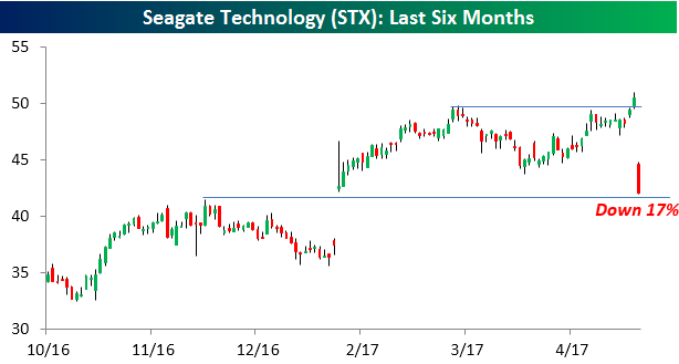
Shares of Seagate Technology (STX) are down over 17% today after the company reported better than expected EPS but came up short on the revenue and guidance front. Recently, the first quarter hasn’t been a particularly positive period for STX as the day after last year’s Q1 report it dropped 19%. While the negative reaction to this morning’s earnings report from STX seems excessive, part of the outsize reaction may be due to the fact that heading into the report, the stock appeared to be on the verge of a technical breakout above its highs from March. For a lot of chart watchers out there, that breakout heading into earnings probably sucked them into the stock on the long side.
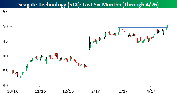
Following the disappointing result, though, those traders that were looking for a short-term rally on a breakout have likely rushed for the exits. As it stands now, shares of STX are currently testing support just below $42 — representing the highs from December and the opening level from the gap higher after Q1 earnings. When it comes to chart reading, what a difference a day makes
Mega-Tech Market Cap Swells to $2.75 Trillion
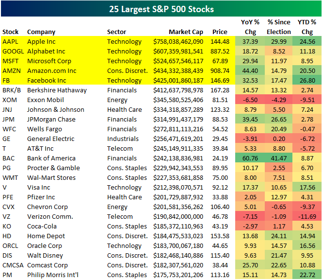
The five largest stocks in the US equity market are now Technology stocks, and together they make up more than $2.75 TRILLION in market cap. (While Amazon.com’s official sector categorization is Consumer Discretionary, we consider it Tech first and foremost.)
Below is a list of the 25 largest S&P 500 stocks (through 4/25/17). The top five are highlighted in yellow — Apple (AAPL), Alphabet (GOOGL), Microsoft (MSFT), Amazon.com (AMZN), and Facebook (FB). It wasn’t long ago that Exxon Mobil (XOM) was the largest stock in the world, and prior to that, it was General Electric (GE). Now XOM ranks 7th and GE ranks 11th. Brick-and-mortar behemoth Wal-Mart (WMT) also used to rank in the top three, but it has slipped all the way down to 15th with a market cap that’s just over half the size of online competitor Amazon.com.
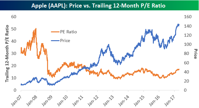
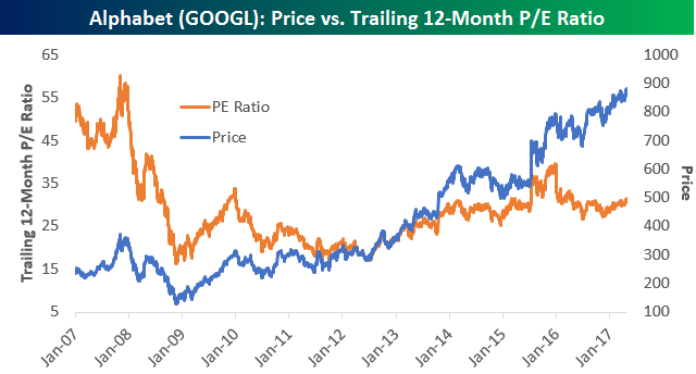
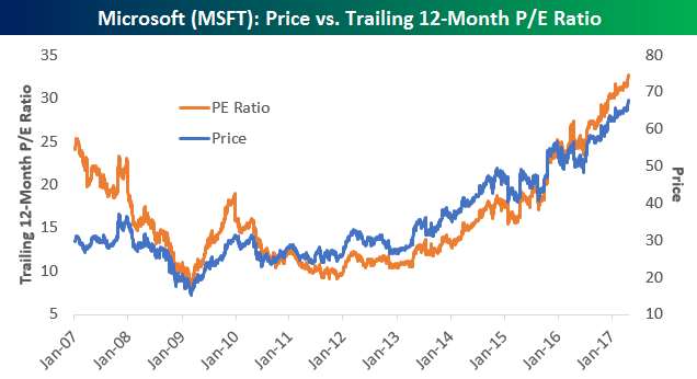
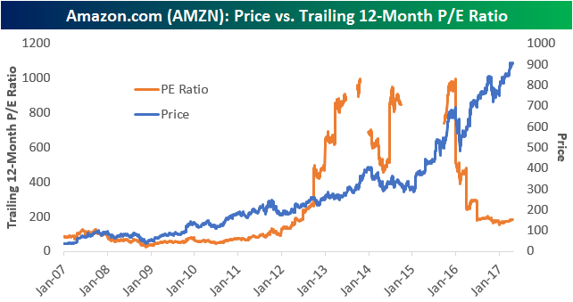
We thought we’d take a look at historical valuations for the five largest stocks in the S&P 500 using trailing 12-month P/E ratios.
As shown below, Apple used to trade much more like a “growth” stock prior to the Financial Crisis. During the current bull market, though, Apple’s average P/E has been 15 — which is more in-line with where a value stock trades. At 17.25x trailing 12-month earnings at the moment, Apple’s valuation is above its bull market average but not excessively so.
Alphabet’s (formerly Google) earnings have been growing nicely since the start of 2016, as its P/E is down even though its price is up sharply. Alphabet’s average trailing 12-month P/E over the last 10 years has been 28.83, and its P/E right now is just above that at 31.4.
Microsoft’s trailing 12-month P/E has been rising sharply along with its stock price over the last seven years. While the stock was considered “dead money” for much of the 2000s after its 1990s heyday, its re-invention in the cloud computing space has turned it back into a “growth” stock that now trades with a higher valuation. While stocks like Alphabet and Apple currently have P/Es that are just a blip above their 10-year averages, MSFT’s current P/E is double its 10-year average (32.7 now vs. 10-year average. of 16.1).
Amazon.com (AMZN) is a stock that has never traded based on the typical valuation metrics that investors like to use. Those investors that have traded the stock based on valuation are ones who have made negative bets on it — to the detriment of their portfolios. Even still, below we show AMZN’s trailing 12-month P/E ratio over the last 10 years. (The P/E was either above 1,000 or negative when you see it disappear on the chart.) Laughably, AMZN’s current trailing 12-month P/E of 183.83 is well below its 10-year average of 250+.
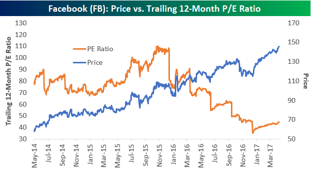
Finally, Facebook’s (FB) trailing 12-month P/E ratio has been drifting lower and lower since the start of 2016. Given that its stock price has been trending higher and higher over this time frame, that means earnings (the “E” in P/E) have been growing even faster than price. Since it IPOd in 2012, Facebook’s average trailing P/E ratio has steadily trended lower to its current level of 44.7.
Narrow Rally is #FakeNews
We’ve been hearing a lot of talk over the last few days that just a handful of stocks are driving the rally in US equities. This suggests that the gains aren’t representative of broad market strength, but instead strength in just a handful of stocks. We’ll be the first to agree that the S&P 500’s gains this year are the result of gains in some of the index’s largest members, but that’s only because they have grown so large. As we noted earlier this week, the five largest companies in the S&P 500 have a combined market cap of over $2.75 trillion, and the four largest companies in the index have a greater market cap than the entire Russell 2000 small-cap index. Just because the largest companies in the S&P 500 are doing so well doesn’t mean that the rest of the index is doing poorly though.
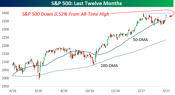
The first chart below shows the S&P 500 market cap weighted index over the last twelve months. As shown in the chart, after the rally of the last few days the index is currently just 0.52% below its all-time high from 3/1.
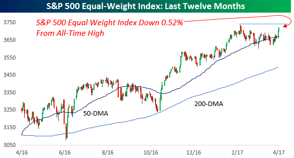
Because the S&P 500 is a market cap weighted index, if the largest stocks in the index were driving all of the gains, we would expect the S&P 500 equal-weight index to be underperforming. That isn’t the case, though. In fact, the S&P 500 equal-weighted index is actually down the exact same percentage amount as its market cap weighted peer. With both indices down by the same percentage amount from their bull market highs, it’s hard to argue that just a handful of stocks are propping the market up.
The Closer — Richmond, New Homes, European Lending, Case-Shiller — 4/25/17
Log-in here if you’re a member with access to the Closer.
Looking for deeper insight on global markets and economics? In tonight’s Closer sent to Bespoke Institutional clients, we recap Richmond Fed district activity indices, new home sales, Case-Shiller home prices, and ECB bank lending survey data for Q2 updated today.
The Closer is one of our most popular reports, and you can sign up for a free trial below to see it!
The Closer is one of our most popular reports, and you can see it and everything else Bespoke publishes by starting a no-obligation 14-day free trial to our research!
The Best of the Blue Chips (and the Worst)
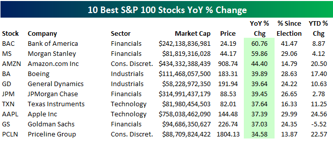
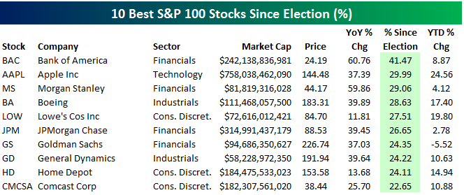
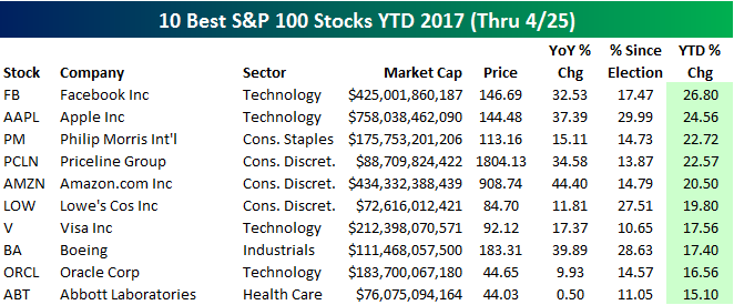
Below we provide tables highlighting the 10 best performing stocks in the S&P 100 (100 largest stocks in the S&P) over three different time periods — year-over-year, since the 11/8/16 election, and year-to-date.
As shown, Bank of America (BAC) and Morgan Stanley (MS) top the list of winners over the last year with gains of 60%. Amazon.com (AMZN) ranks third with a gain of 44.4%, followed by Boeing (BA) and General Dynamics (GD). Apple (AAPL) ranks 8th best with a YoY gain of 37.39%.
With a gain of 41.47%, Bank of America (BAC) also tops the list of biggest winners since last November’s election. Tech-behemoth Apple (AAPL) ranks second best with a gain of 29.99%. Even though it’s the biggest company in the world, Apple has quietly posted huge returns over the last 6-12 months.
Facebook (FB) has also quietly posted big gains recently. The stock is currently the top performer in the S&P 100 in 2017 with a gain of 26.80%. Apple (AAPL) ranks second with a gain of 24.56%, while Philip Morris International (PM) is up the third most at +22.72%.
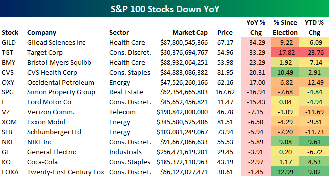
Of course not every stock is up. In the S&P 100, there are 14 stocks that are down over the last year, and we highlight them in the table below. Gilead (GILD) and Target (TGT) are down the most with declines of more than 33%. Bristol-Myers (BMY) and CVS Health (CVS) are the two remaining names that are down 20%+. Other notables on the list of YoY losers include Ford (F), Verizon (VZ), Exxon Mobil (XOM), Nike (NKE), General Electric (GE), and Coca-Cola (KO).