The Closer – Auto Sales, Mortgage Applications and Foreclosures, EIA, Fund Flows – 10/2/19
Log-in here if you’re a member with access to the Closer.
Looking for deeper insight on markets? In tonight’s Closer sent to Bespoke Institutional clients, we show just how bad breadth was today across GICS Level 2 industry groups with particular focus on the weakness in autos, despite stronger data. Next, we turn to some housing data including MBA’s mortgage applications and monthly mortgage payment performance from Black Knight. We finish with our weekly looks at EIA petroleum stockpiles and ICI fund flows.

See today’s post-market Closer and everything else Bespoke publishes by starting a 14-day free trial to Bespoke Institutional today!
Bad Breadth on Both Sides of the Atlantic
On a Wednesday when the Dow was down almost 2% and the S&P 500 down nearly 1.8%, it’s no surprise that market breadth was very weak. For the S&P 500 as a whole, just 25 stocks in the index were up on the day. What makes today’s sell-off even more severe is that breadth was not only bad here, but it was also very poor on the other side of the Atlantic where only 12 stocks in the entire STOXX 600 were up on the day. On a combined basis, just 37 of the 1,100 stocks in the S&P 500 and Euro STOXX 600 were up on the day, and that doesn’t happen very often. The last time breadth on both sides of the Atlantic was this week was on August 5th, and there have only been 30 trading days since the start of 2009 where the combined number of advancing stocks in the two indices was less than 50.
The chart below shows the S&P 500 going back to the start of 2009, and in it we have included red dots to denote each time there was similarly weak breadth. Prior to the two most recent occurrences (today and 8/5), you have to go all the way back to September 2015 to find the last one. What’s interesting to note about these prior occurrences is that nearly all of them came in bunches during periods where the market was in consolidation/correction mode. In fact, the only one that occurred in isolation during a market uptrend was on 6/20/13 when the market freaked out about the Fed’s ‘taper’ program. Remember that one? Start a two-week free trial to Bespoke Institutional for full access to our research and market analysis.

Ford Truck Sales Slow
While Ford used to release vehicle sales on a monthly basis, that changed in 2018 when the company began to switch to a quarterly reporting period. Whenever companies make the decision to give less rather than more performance data, it usually comes at a time when the numbers are getting worse rather than better. After all, have you ever heard of a company choosing to give less information when their business is booming? With that in mind, it shouldn’t come as much of a surprise that sales figures for Ford vehicles have been weakening. This morning, Ford released sales figures for the third quarter, and overall sales fell 5.6% relative to the third quarter of 2018 and are down 3.9% on a YTD basis relative to last year.
On these pages, we tend to focus on sales of Ford F-Series trucks. The reason for this is that sales of pickup trucks are often a sign of strength or weakness in the small business and construction sectors as these types of businesses are the most common users of these vehicles. Similar to the overall sales figures from Ford, sales of F-Series trucks have also been weak which suggests a more sluggish environment for small businesses. In the third quarter, total sales came in at 214,176 which was a full 6% below the same quarter last year. That may not sound like much, but the last time there was this large of a decline in Q3 sales on a y/y basis was in 2008.
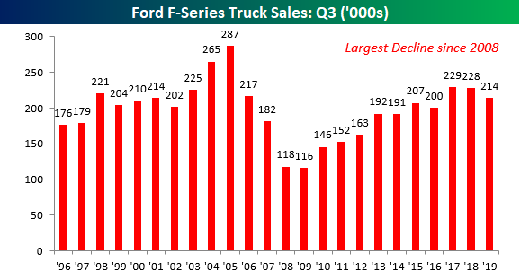
Year to date, total sales of Ford F-Series trucks are down 2.4%, falling from 679K down to 662.6K. Here again, that may not sound like a whole lot, but it is only the second time since 2009 where the y/y sales pace was negative and this year’s decline is the largest since 2009. Start a two-week free trial to Bespoke Institutional for full access to our research and market analysis.

Fixed Income Weekly – 10/2/19
Searching for ways to better understand the fixed income space or looking for actionable ideas in this asset class? Bespoke’s Fixed Income Weekly provides an update on rates and credit every Wednesday. We start off with a fresh piece of analysis driven by what’s in the headlines or driving the market in a given week. We then provide charts of how US Treasury futures and rates are trading, before moving on to a summary of recent fixed income ETF performance, short-term interest rates including money market funds, and a trade idea. We summarize changes and recent developments for a variety of yield curves (UST, bund, Eurodollar, US breakeven inflation and Bespoke’s Global Yield Curve) before finishing with a review of recent UST yield curve changes, spread changes for major credit products and international bonds, and 1 year return profiles for a cross section of the fixed income world.
In this week’s report we take a look at how corporate debt issuance is looking.

Our Fixed Income Weekly helps investors stay on top of fixed income markets and gain new perspective on the developments in interest rates. You can sign up for a Bespoke research trial below to see this week’s report and everything else Bespoke publishes free for the next two weeks!
Click here and start a 14-day free trial to Bespoke Institutional to see our newest Fixed Income Weekly now!
Chart of the Day: S&P 500 Annual Sector Total Returns Since 1990
A Blowout Year For Treasuries
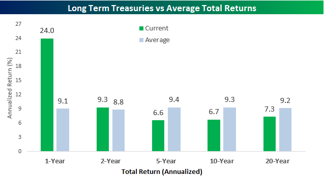
As noted in a post yesterday, the last 12 months haven’t been great for the S&P 500 with the index posting a total return of 4.3% compared to an average one year gain of 11.7%. For long-term treasuries, though, it has been the complete opposite. Based on returns of the Merrill Lynch 10+ Year US Treasury index, long term treasuries have had a total return over the last year of 24%, which is more than two and a half times the historical average of 9.1%. While one-year returns for long-term treasuries have been much better than average, relative to other time frames, historical returns of treasuries have been much more inline or even below their historical averages. Two-year returns are only slightly above their historical average, while five, ten, and twenty-year returns are all below their historical averages.
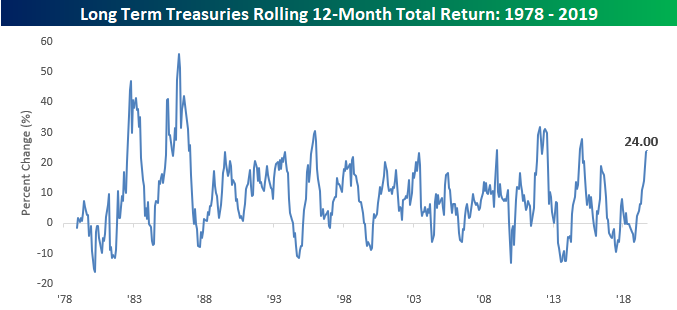
The chart below shows the rolling 12-month total return of long-term US treasuries going back to 1978. The recent surge in performance of Treasuries has taken returns to their highest levels since late 2015 and before that 2012. In fact, compared to all other 12-month rolling returns, the current gain of 24% ranks in the 90th percentile. Not a bad year at all! Start a two-week free trial to Bespoke Institutional for full access to our research and market analysis.
Bespoke’s Global Macro Dashboard — 10/2/19
Bespoke’s Global Macro Dashboard is a high-level summary of 22 major economies from around the world. For each country, we provide charts of local equity market prices, relative performance versus global equities, price to earnings ratios, dividend yields, economic growth, unemployment, retail sales and industrial production growth, inflation, money supply, spot FX performance versus the dollar, policy rate, and ten year local government bond yield interest rates. The report is intended as a tool for both reference and idea generation. It’s clients’ first stop for basic background info on how a given economy is performing, and what issues are driving the narrative for that economy. The dashboard helps you get up to speed on and keep track of the basics for the most important economies around the world, informing starting points for further research and risk management. It’s published weekly every Wednesday at the Bespoke Institutional membership level.
You can access our Global Macro Dashboard by starting a 14-day free trial to Bespoke Institutional now!

Bespoke’s Morning Lineup – 10/2/19
See what’s driving market performance around the world in today’s Morning Lineup. Bespoke’s Morning Lineup is the best way to start your trading day. Read it now by starting a two-week free trial to Bespoke Premium. CLICK HERE to learn more and start your free trial.

The Closer – Incorrect Signal for Markets – 10/1/19
Log-in here if you’re a member with access to the Closer.
Looking for deeper insight on markets? In tonight’s Closer sent to Bespoke Institutional clients, we first take a look at stocks’ triple top and the dollar’s double top. We then turn to macro data including the small miss in construction spending and weak ISM data, which has negative implications for the economy. Finishing on a more positive note, we show performance after similarly bad starts to Q4.
See today’s post-market Closer and everything else Bespoke publishes by starting a 14-day free trial to Bespoke Institutional today!
You Call This A Bull Market?
By just about all accounts, investors have been spoiled over the last ten years as the S&P 500 has rallied more than 13% on an annualized basis. However, when you compare returns for the market over the last one, two, five, ten, and twenty years, current returns are hardly at any sort of historical extreme. The chart below compares the S&P 500’s annualized performance on a total return basis to the average annualized return for all similar time frames. Looking just at the last year (through 9/30), the S&P 500’s total return is 4.3%, which is less than half of the historical average one year total return of 11.7%. Looking at two and five-year annualized performance figures, current returns are just modestly above their historical average. While the ten-year annualized return is almost three percentage points above the historical average, the current 20-year annualized gain of 6.3% is well below the S&P 500’s historical average of 11.0%.
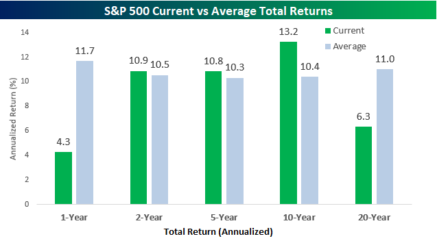
When we compare current returns to all other periods in terms of the percentile rank, they’re even less impressive. Over the last year, the S&P 500’s current one-year gain only ranks in the 31st percentile compared to all other periods. Over the two and five year periods, current returns are just under the 50th percentile compared to all other two and five year periods, and for the ten-year time period, which is the best relative to average of the five time frames shown, current returns are only in the 61st percentile. Where performance really looks pathetic, though, is the 20-year window. The S&P 500’s current annualized return of 6.3% only ranks in the 5th percentile, meaning that 95% of all other 20-year periods have been better than the current 20-year window. Start a two-week free trial to Bespoke Institutional for full access to our research and market analysis.
![]()