
A Banner Year for US Equities
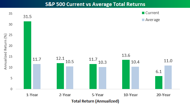
2019 was surely a banner year for US equities. With a total return of 31.5%, the S&P 500’s gain in 2019 was nearly three times the historical average 12-month return of 11.7%. That’s strong! In the chart below we compare the S&P 500’s annualized returns over the last one, two, five, ten, and twenty years to its average annualized returns over those same time frames since 1928. While the one-year return sticks out like a sore thumb, we would note that the S&P 500’s annualized returns over the last two, three, and ten years are also above average. Almost as notable as the fact that the one year return has been so much stronger than average is that the S&P 500’s two-year return is less than two percentage points above its historical average. That just shows how bad 2018 was! Looking further out, the only time frame where returns are below average is over the last twenty years where the 6.1% annualized gain is almost five percentage points below the historical average. Over a full twenty years, that’s a difference of tripling your investment versus making eight times your investment!
The chart below compares how current returns during the above time frames rank on a percentile basis relative to all other periods. The S&P 500’s one-year return ranks in the 85th percentile which is pretty extreme. For the two, five, and ten year periods, though, current returns are much more middle of the road. Conversely, as stretched as extreme to the upside that the one-year return is relative to all other periods, the twenty-year return is even more depressed to the downside. At just 4.6, more than 95% of all other 20-year periods have been better than the last 20.

Finally, as mentioned above the last year has certainly been a strong one, and it follows a year where returns had been abnormally poor. The chart below shows the rolling 12-month total return for the S&P 500 going back to 1990. The gain of 31.49% over the last year was the strongest for the S&P 500 in six years coming up just shy of the 32.39% gain in 2013. Last year at this time, though, the S&P 500 was down over 4% on a total return basis in the prior 12 months. Start a two-week free trial to Bespoke Institutional to access our full suite of research tools and analysis.

Claims Move Further From Their Low
Jobless claims for the final week of 2019 came in at 222K. That compares to forecasts of a drop to 220K from an upwardly revised 224K last week (originally 222K). Claims have now dropped in each of the three weeks since the large spike up to 252K.

Although the seasonally adjusted number has continued to fall, the four-week moving average just keeps moving higher. This week’s increase is the result of the very low print of 203K from the week of November 29th rolling off the average to be replaced by this week’s 222K. Now at 233.25K, the moving average is at its highest level since the end of January 2018.
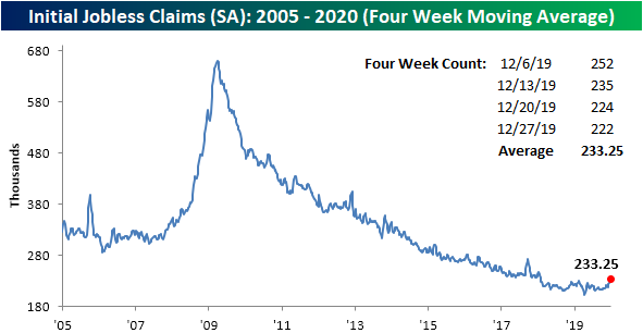
Given the moving average is at its highest levels in some time, it is also now 31.75K above the current cycle low that was put in place in April at 201.5K. That is the widest spread between a cycle low and the moving average since September 2017. Looking at the time period since the end of the last recession (June 2009), while there have been other times this cycle where the spread has been even wider, such as once each year from 2011 to 2013, the amount of time that the moving average has remained above its low has gotten more extended at 37 weeks (second chart below). For the current cycle, that makes for the second-longest streak without a new cycle low in the moving average behind a 42-week long streak that came to a close at the end of 2012.


On a non-seasonally adjusted basis, claims rose this week up to 312.1K from 287.3K as claims near their seasonal peak. In spite of that week-over-week increase, claims are down versus the comparable week last year and the average for the current week of the year since 2000. Start a two-week free trial to Bespoke Institutional to access our interactive economic indicators monitor and much more.

2019 and 2020 Dogs of the Dow
The Dogs of the Dow strategy is a simple, hands-off investment approach that says to buy the 10 highest yielding stocks in the Dow 30 at the start of each year. With the calendar turning over from 2019 to 2020, below is a look at how the Dogs strategy performed in 2019. As shown, the 10 Dogs posted a total return of 19.38% in 2019, which was below the 25% return for the Dow and well below the 28% that the 20 non-Dogs returned. The biggest winner in the Dogs in 2019 was JP Morgan (JPM) with a gain of 47.27%, but Pfizer’s (PFE) decline of 6.92% really hurt overall performance.
The 20 non-Dogs were led by Apple (AAPL), Microsoft (MSFT), Visa (V), and United Tech (UTX), while Walgreens Boots (WBA) and 3M (MMM) were the two non-Dogs that fell in 2019. Start a two-week free trial to Bespoke Institutional to access our Trend Analyzer tool and track key trends in individual stocks and major ETFs.
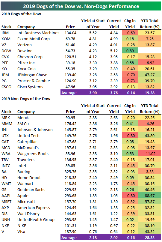
Moving on to 2020, below is a list of this year’s Dogs of the Dow. Eight of the ten Dogs from 2019 remain on the list, while 3M (MMM) and Walgreens Boots (WBA) — the two non-Dogs that fell in 2019 — have replaced JP Morgan (JPM) and Procter & Gamble (PG) — the two biggest gainers of the Dogs in 2019. Dow Inc. (DOW) is the highest yielding Dog at 5.12%, followed by Exxon (XOM), IBM, and Verizon (VZ), which all have dividend yields above 4%.

Full Year 2019, Q4, and December Asset Class Total Returns
Below are the final total return performance numbers for key ETFs across asset classes in 2019. For each ETF, we also include its performance in Q4 and December.
The S&P 500 rallied 2.9% in December and 8.99% in Q4 to finish the full year up 31.22%. The Tech-heavy Nasdaq 100 (QQQ) was by far the best performing US index ETF in 2019 with a gain of 38.96%, and it was the third best ETF in the entire matrix. The title of best performing ETF in 2019 goes to the S&P 500 Technology sector ETF (XLK), which rallied 49.86%. Remember, 40% of XLK is made up of just Apple (AAPL) and Microsoft (MSFT), which gained 89% and 58% in 2019, respectively. The Russia stock market ETF (RSX) was the second biggest winner in the matrix with a 2019 total return of 40.79%.
Everywhere you look across the equity landscape, there were big winners in 2019, but the weakest area of the market was the Energy sector ETF (XLE). Even still, XLE managed to put up double-digit percentage gains on the year at +11.74%.
In the commodities space, we saw oil gain 32.61% in 2019, which actually bested the gain for the S&P 500. Gold (GLD) and silver (SLV) both put in solid gains in the mid-teens, while the perpetually losing natural gas ETF (UNG) was the only ticker in the matrix that fell across all three time frames (December, Q4, and full year).
Looking at fixed income, the aggregate bond market ETFs (AGG and BND) posted total returns of 8%+, while the 20+ Year Treasury ETF (TLT) gained 14% on the year. Q4 and December were tough for fixed income, however, as rates moved higher. Join Bespoke Premium with a two-week free trial for our 2020 outlook and more.

Bespoke’s Morning Lineup – 1/2/20 – Same Rally, Different Year
See what’s driving market performance around the world in today’s Morning Lineup. Bespoke’s Morning Lineup is the best way to start your trading day. Read it now by starting a two-week free trial to Bespoke Premium. CLICK HERE to learn more and start your free trial.
The Bespoke Report — Q1 Pros and Cons Outlook
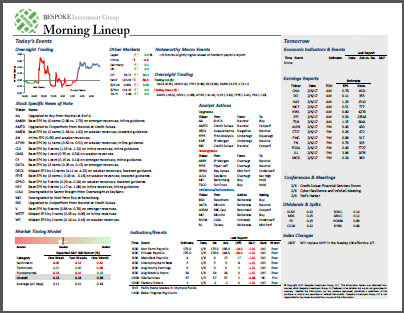
This week’s Bespoke Report is an updated version of our “Pros and Cons” edition as we get set for the first quarter of 2020.
With this report, you’re able to get a complete picture of the bull and bear case for US stocks right now. It’s heavy on graphics and light on text, but we let the charts and tables do the talking!
On page two of the report, you’ll see a full list of the pros and cons that we lay out. Each bullet point is not meant to be weighted equally, but the fact that we have an equal number of pros and cons suggests that we don’t see a clear and compelling case for either the bulls or the bears right now.
To read this report and access everything else Bespoke’s research platform has to offer, start a two-week free trial to Bespoke Premium. Enter “THINKBIG” at checkout to receive a 10% discount once the trial ends. You won’t be disappointed!

The Closer – Best & Worst, Biggest Impact, Home Prices, Confidence – 12/31/19
Log-in here if you’re a member with access to the Closer.
Looking for deeper insight on markets? In tonight’s Closer sent to Bespoke Institutional clients, we close out 2019 with a look at the best and worst asset classes this year as well as which stocks contributed the most to the Dow and S&P 500. Next, we recap October home prices using Case-Shiller data updated today. We finish by going over today’s release of the Conference Board’s Consumer Confidence data.
See today’s post-market Closer and everything else Bespoke publishes by starting a 14-day free trial to Bespoke Institutional today!
Bespoke’s Morning Lineup – 12/31/19 – Just Shy of the Top Ten
See what’s driving market performance around the world in today’s Morning Lineup. Bespoke’s Morning Lineup is the best way to start your trading day. Read it now by starting a two-week free trial to Bespoke Premium. CLICK HERE to learn more and start your free trial.
The Closer – Mean Reversion, Year-End Rotation, GDP, Manufacturing- 12/30/19
Log-in here if you’re a member with access to the Closer.
Looking for deeper insight on markets? In tonight’s Closer sent to Bespoke Institutional clients, we show how the recent pullback in equities has been a function of mean reversion and year-end rotation before reviewing today’s economic data including the trade balance, inventories, and our Five Fed Manufacturing Index.
See today’s post-market Closer and everything else Bespoke publishes by starting a 14-day free trial to Bespoke Institutional today!
Am I Diversified?
One of the primary drivers of the boom in ETFs over the last decade is that they provide efficient diversification to the market and various sectors/groups. While that’s the theory, the reality is that a number of the biggest sector ETF’s aren’t all that diversified at all. The chart below shows the weight of the top two holdings in each of the 11 S&P 500 sector ETFs. Would you believe that the two largest holdings in two ETFs account for more than 40% of the entire ETF, while in the ETFs for another two sectors the largest two components account for more than a third of the entire ETF? That’s right, in the Energy sector, the top two holdings (Exxon and Chevron) account for just under 43% of the entire ETF, while Alphabet (GOOGL) and Facebook (FB) account for 41.8% of the new Communications Services sector ETF (XLC). In the Tech sector, Apple (AAPL) and Microsoft (MSFT) account for just under 40% of the XLK ETF.

The table below lists each of the eleven sector ETFs along with their top two holdings. As noted, in the case of companies with dual-listed share classes in the ETF, we include both share classes as one. In the case of three sectors (Communication Services, Consumer Discretionary, and Energy), the top holding accounts for over 20% of the entire ETF. Normally, when you think about diversification, you would picture spreading out your bets across a variety of different companies so that you aren’t too exposed to any one name. However, when one out of every five dollars invested goes to one stock, we aren’t sure how diversified that really is. Now, the purpose of highlighting these top-heavy ETFs is in no way meant to imply that these ETFs are faulty in their construction. In fact, these ETFs do a very good job of tracking the sectors they are intended to track. Instead, it is an illustration of just how top-heavy the major indices have become. Investing in “the market” or a specific sector is increasingly becoming a concentrated bet on a number of large names. Start a two-week free trial to Bespoke Institutional to access our Trend Analyzer tool and track key trends in individual stocks and major ETFs.
